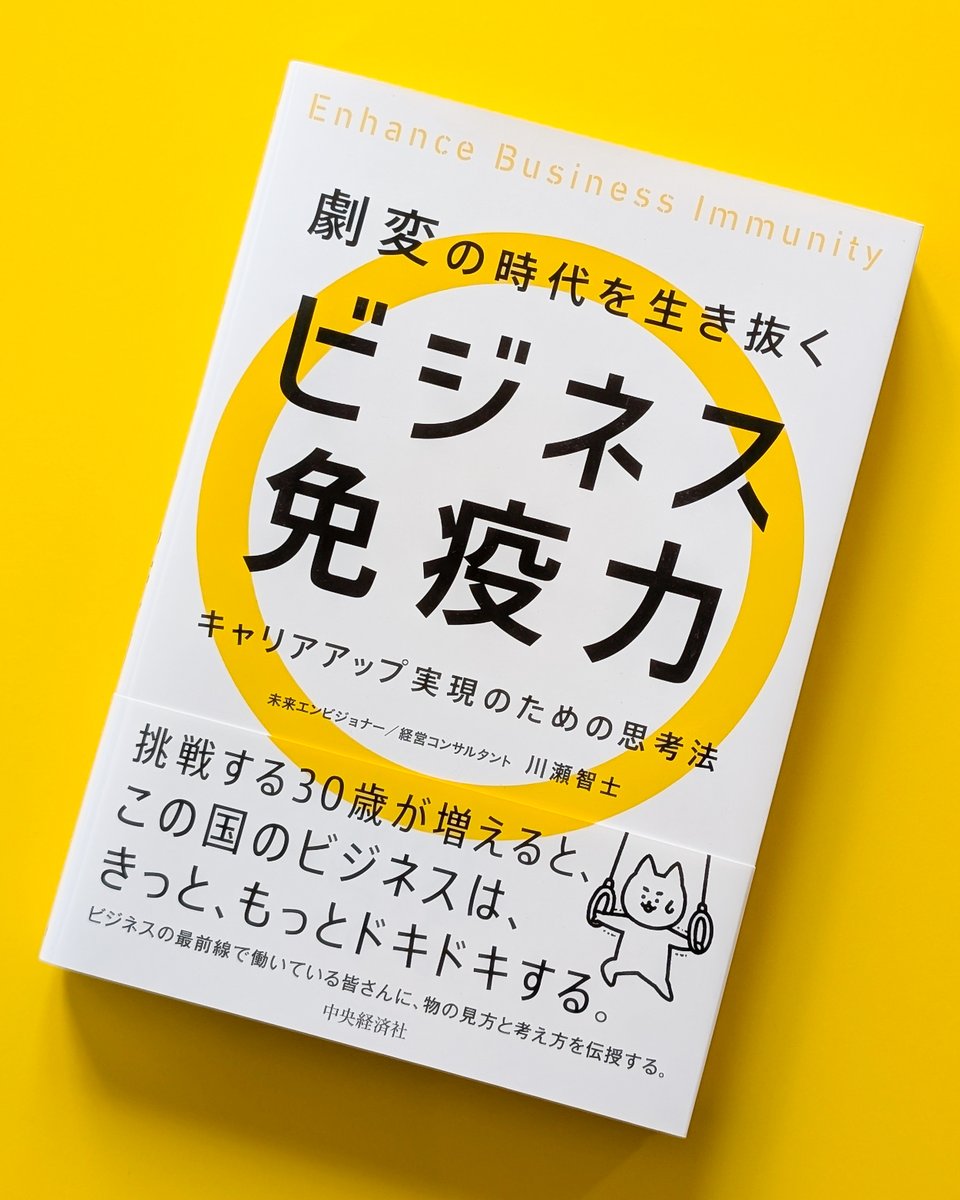
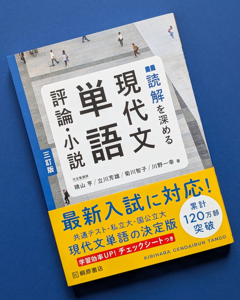
ハナワアンドサンズ/東京のデザイン事務所/グラフィックデザイン/ブックデザイン/装丁
Joined March 2009
- Tweets 1,007
- Following 193
- Followers 358
- Likes 3,549
132 Photos and videos


塙 浩孝|Hiro Hanawa retweeted

Jun 5
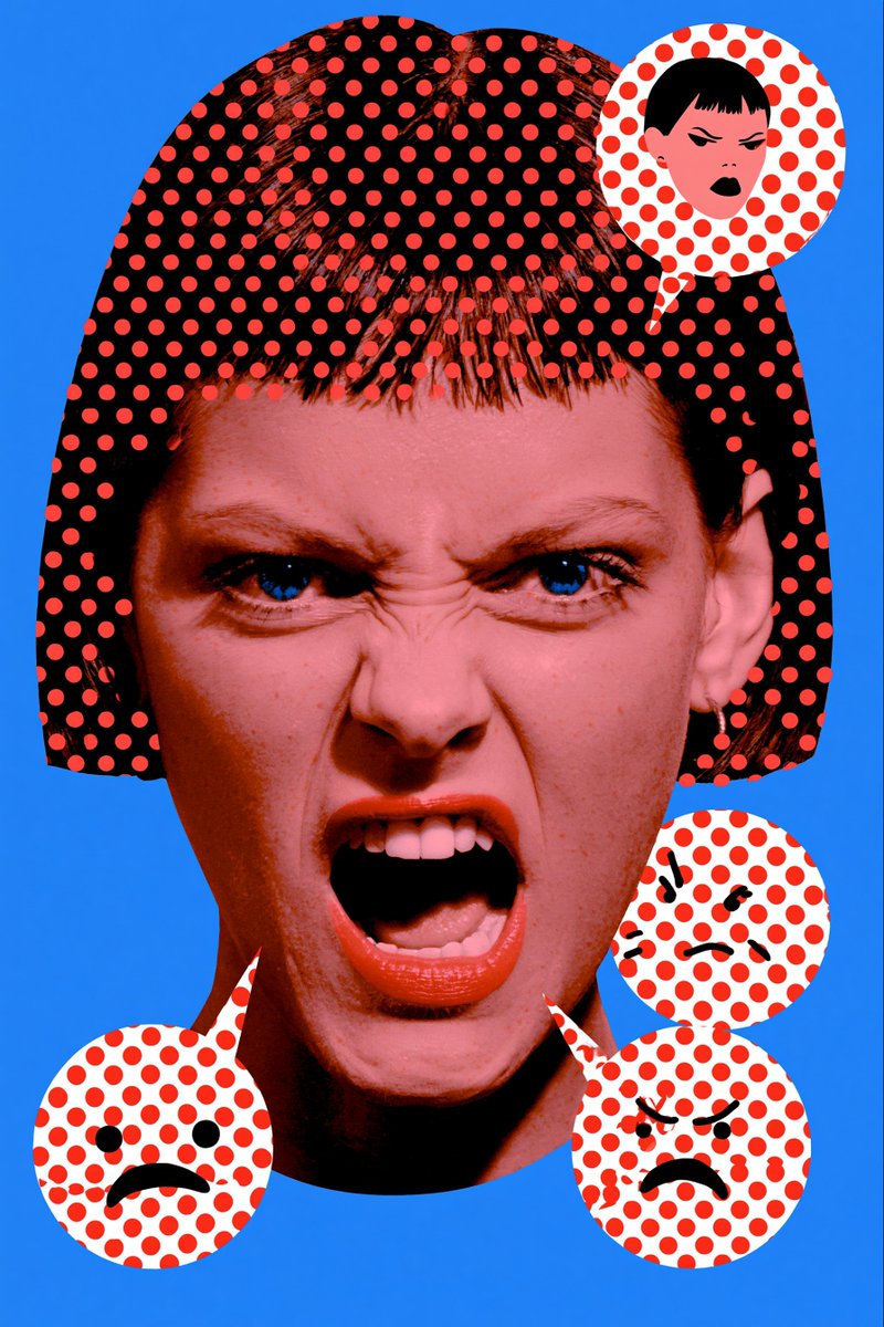
やっぱり本のおもしろいところって、「本ですよ。健全です」みたいな顔して完全に狂っているものが普通に売っていることではないでしょうかね。
157
12,741
111,004
3,262,795
塙 浩孝|Hiro Hanawa retweeted

May 30
Seiichi Horiuchi (1932–1987), a renowned Japanese art director and illustrator, designed the iconic Brutus magazine logo in 1980 for Magazine House. The bold, red logo features letterforms with broken, jagged edges, inspired by the spiked beard of Popeye’s nemesis Brutus, reflecting a rugged masculinity. Horiuchi’s design contrasted with the softer Popeye logo, targeting trend-conscious men aged 20–50. Known for his work on anan and picture books like Gurunpa’s Kindergarten, his Brutus logo remains a cultural symbol, recently celebrated with a design blueprint T-shirt for subscribers, showcasing his lasting influence on Japanese editorial design.
#logodecks

1
92
588
30,972
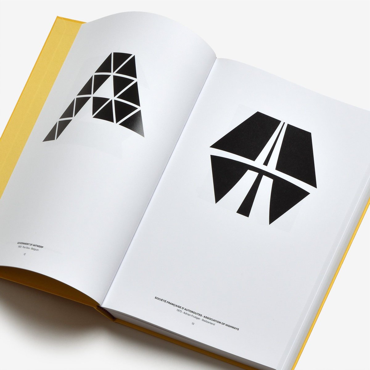
塙 浩孝|Hiro Hanawa retweeted

国際的なロゴコレクション。
『Letters as Symbols』
buff.ly/4XLI4pF
グラフィックデザイナー、ポール・イブー(1939 - 2023)が収集したロゴのコレクション。著名なデザイナーとあまり知られていないデザイナーで区別せず、アルファベット順に構成されています。


3
29
2,483
塙 浩孝|Hiro Hanawa retweeted

May 28
Kris Van Assche
まじで20年前から見た目変わらないの怖い
43
829
46,441

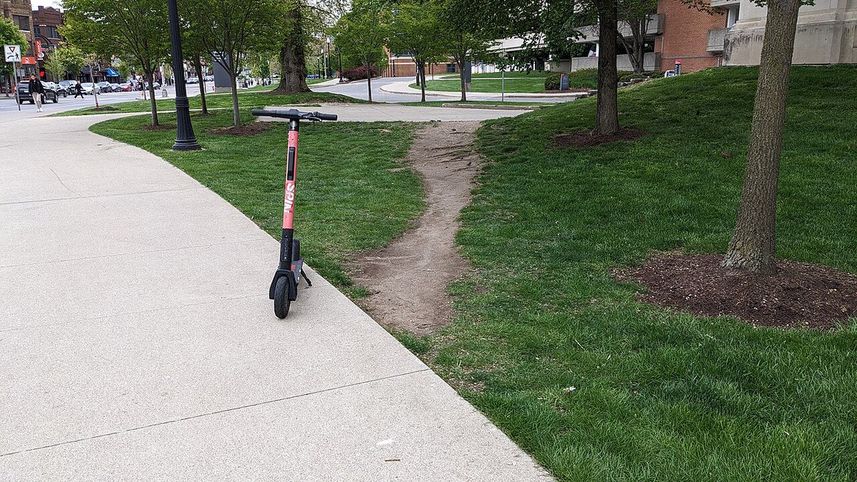
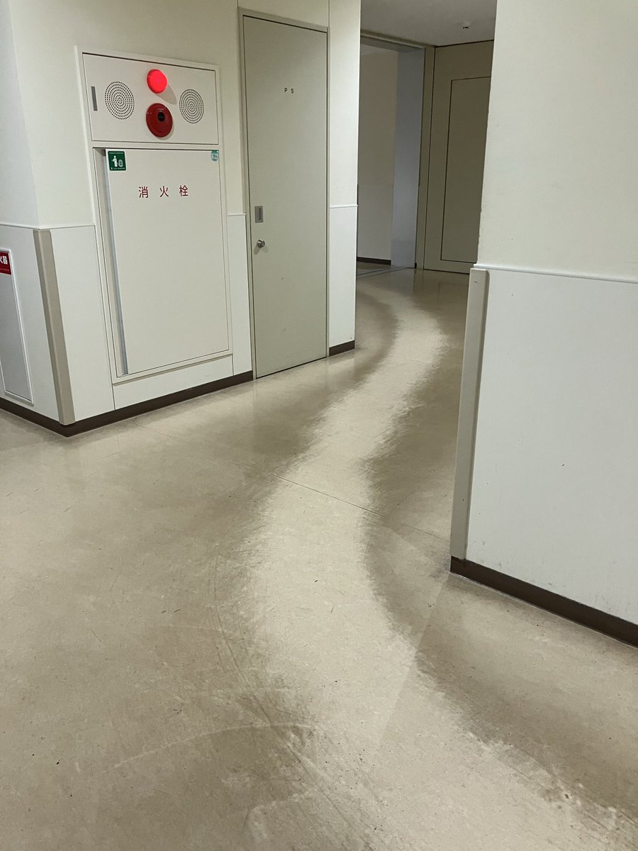
人が"本当に行きたいルート"を歩き続けた結果芝生などにできる非公式な道を「デザイアパス(Desire Path)」という。

46
1,970
17,667
1,497,048
塙 浩孝|Hiro Hanawa retweeted

May 19
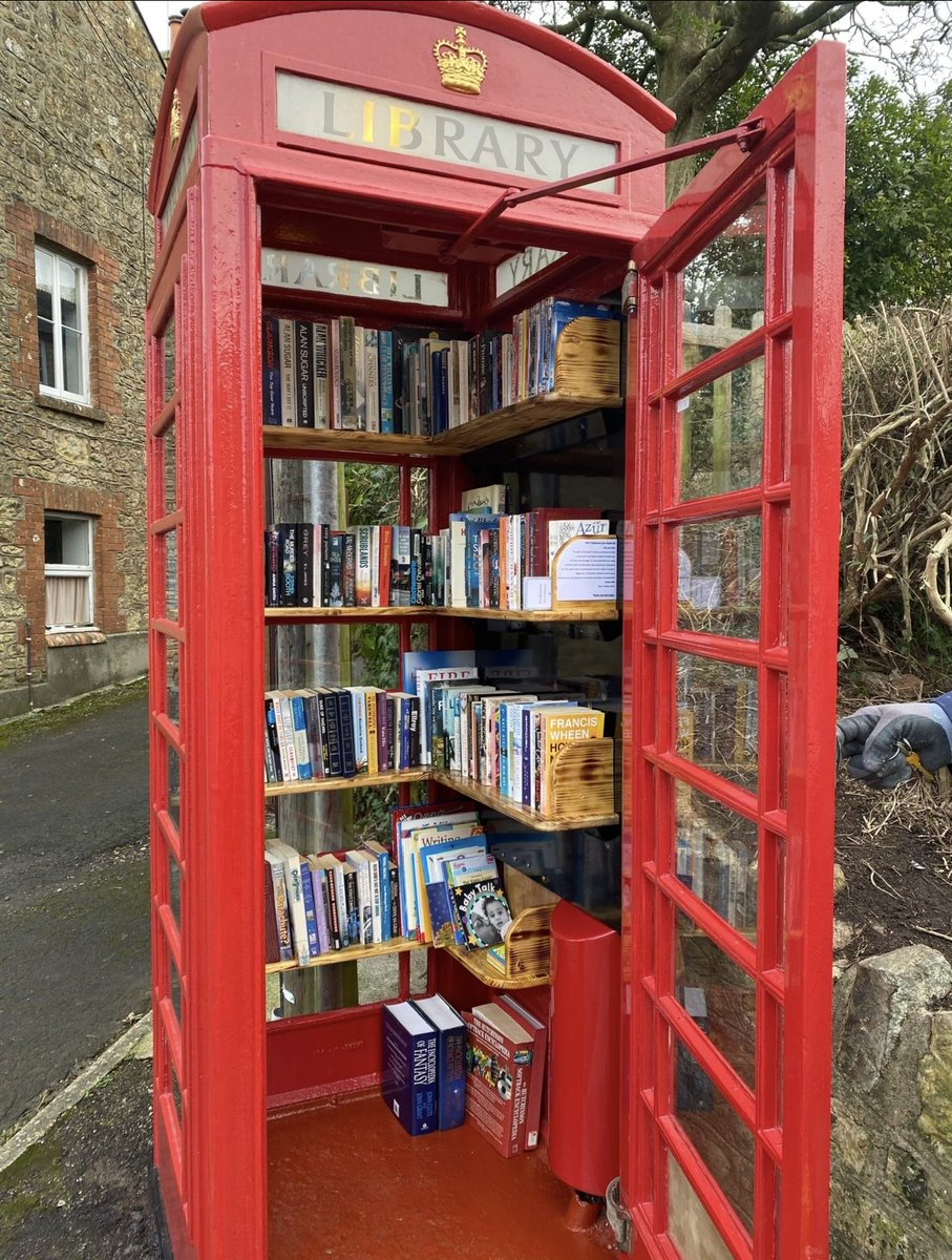
Many villages across the UK have repurposed iconic red telephone boxes into tiny community libraries, where you can take a book and leave one for someone else to enjoy too if you want to
675
6,364
24,233
608,424
塙 浩孝|Hiro Hanawa retweeted

May 18
Fuji X100V → printed → rescanned. The grain you can’t fake in Lightroom.
8
60
1,331
57,330
塙 浩孝|Hiro Hanawa retweeted

May 16
I'm in love with this style
--sref 496991497


18
921
10,041
588,923
塙 浩孝|Hiro Hanawa retweeted

⋰⋰⋰ 𝘕𝘌𝘞𝘚
『急に具合が悪くなる』公開記念
濱⼝⻯介監督特集上映《突然、偶然、必然》
5.22㊎より特集上映決定🎉
──────────────────
現在開催中カンヌ国際映画祭コンペティション部門上映間近の濱⼝⻯介監督最新作『急に具合が悪くなる』の6/19(金)公開に先駆けて、20年以上におよぶフィルモグラフィから珠⽟の17作品を⼀挙上映する「濱⼝⻯介監督特集上映《突然、偶然、必然》」の開催が決定!8ミリ⻘春群像劇『何⾷わぬ顔』から、ヴェネチア国際映画祭銀獅⼦賞(審査員⼤賞)受賞作『悪は存在しない』まで、スクリーンで辿ることのできる貴重な機会をお見逃しなく!
✦上映作品
『何⾷わぬ顔(long version)』(2002)
『PASSION』(2008)
『永遠に君を愛す』(2009)
『THE DEPTHS』(2010)
『親密さ』(2012)
『なみのおと』(2011)
『なみのこえ 新地町』(2013)
『なみのこえ 気仙沼』(2013)
『うたうひと』(2013)
『不気味なものの肌に触れる』(2013)
『ハッピーアワー』(2015)
『天国はまだ遠い』(2016)
『寝ても覚めても』(2018)
『偶然と想像』(2021)
『ドライブ・マイ・カー』(2021)
『Walden』(2022)
『悪は存在しない』(2023)
Bunkamuraル・シネマ 渋谷宮下

479
2,130
211,925
塙 浩孝|Hiro Hanawa retweeted

May 10
price list of a graphic design firm in helsingfors, finland

162
2,277
33,914
3,510,446

May 12
RT @hyoondogam: 유에프오 자료 구경하러 들어가서 사이트 서체가 너무 취향이라 서체 찾음... JetBrainsMono라고 한대요~!
jetbrains.com/lp/mono/

164
塙 浩孝|Hiro Hanawa retweeted

Apr 30
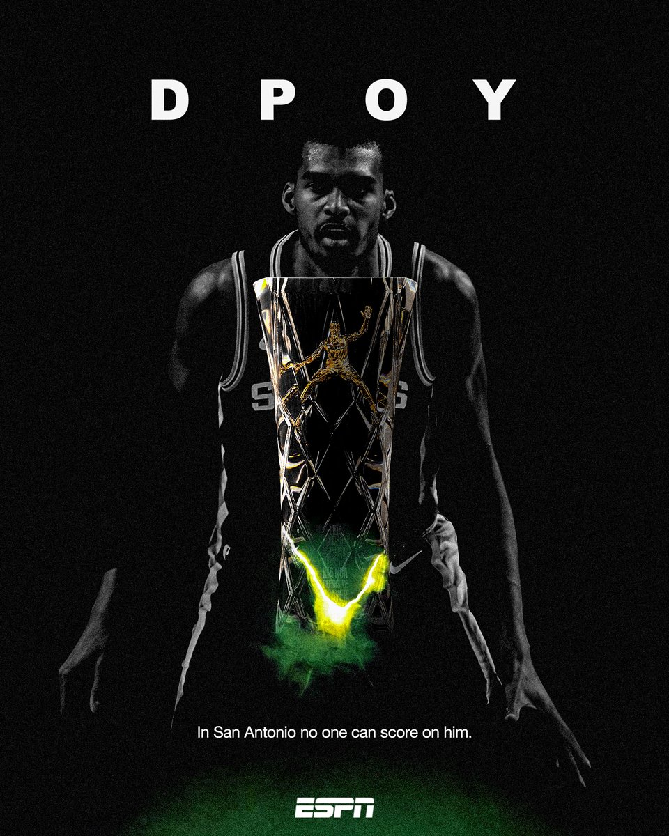
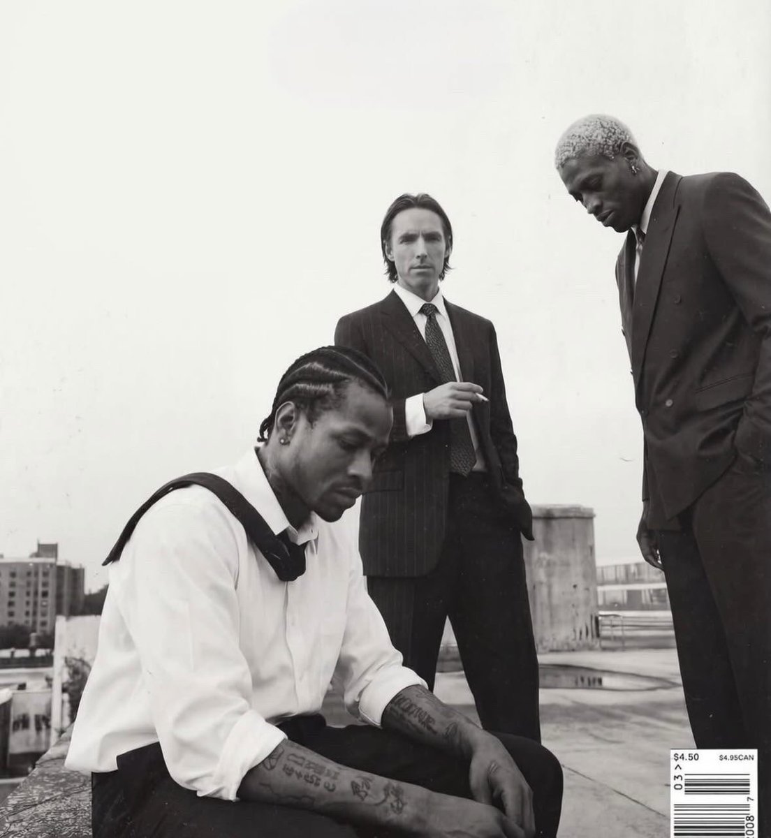
Allen Iverson, Steve Nash, and Dennis Rodman for Sports Illustrated, January 2004.
196
4,431
37,873
1,466,534
塙 浩孝|Hiro Hanawa retweeted
世界最大のデザインコンサルタント「ペンタグラム」によるロゴ。
『1,000 Marks』
buff.ly/tG7Pdjy
大胆なタイポグラフィのワードマークから、絵画的なシンボル、より抽象的なソリューションまで、特徴的なロゴを作る様々なアプローチ。


8
96
5,834
塙 浩孝|Hiro Hanawa retweeted

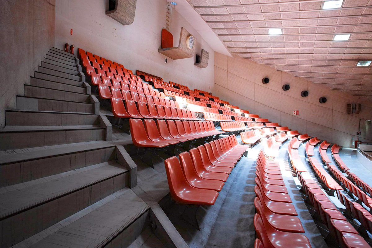
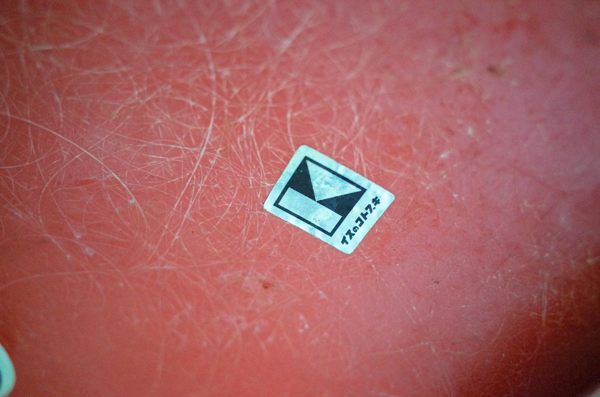
船の体育館の内装の解体が来月から始まるのですが、1200席ある観客席は、ほとんど破棄されるらしいです。
この椅子はインテリアデザイナーの「剣持勇」がこれからは座りやすい観覧に適した椅子が大量に必要になるはずだと、イスの「コトブキ」と共同開発して作られたもの。
モノに愛があれば一脚ずつ脚をつけてオークションをしらた良いのに、本当にもったいない。


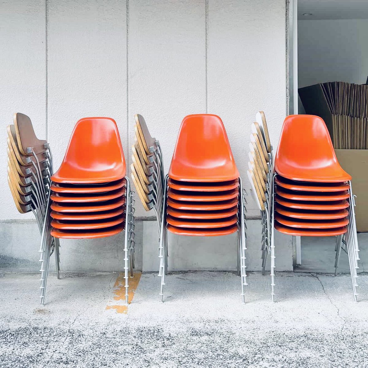
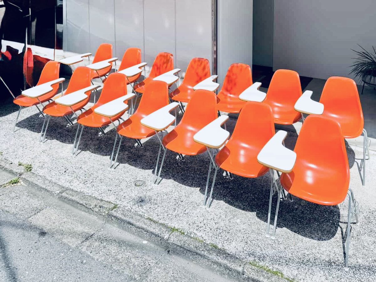
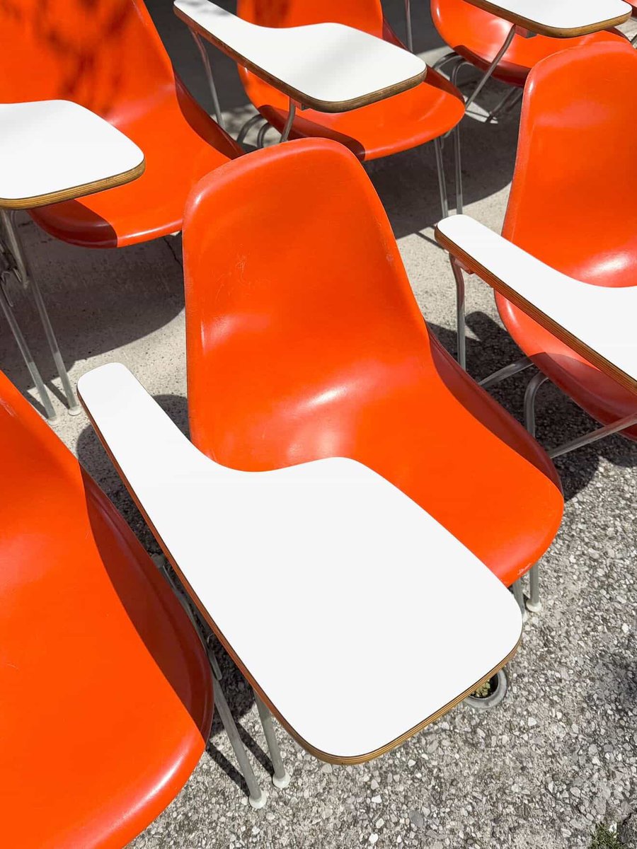
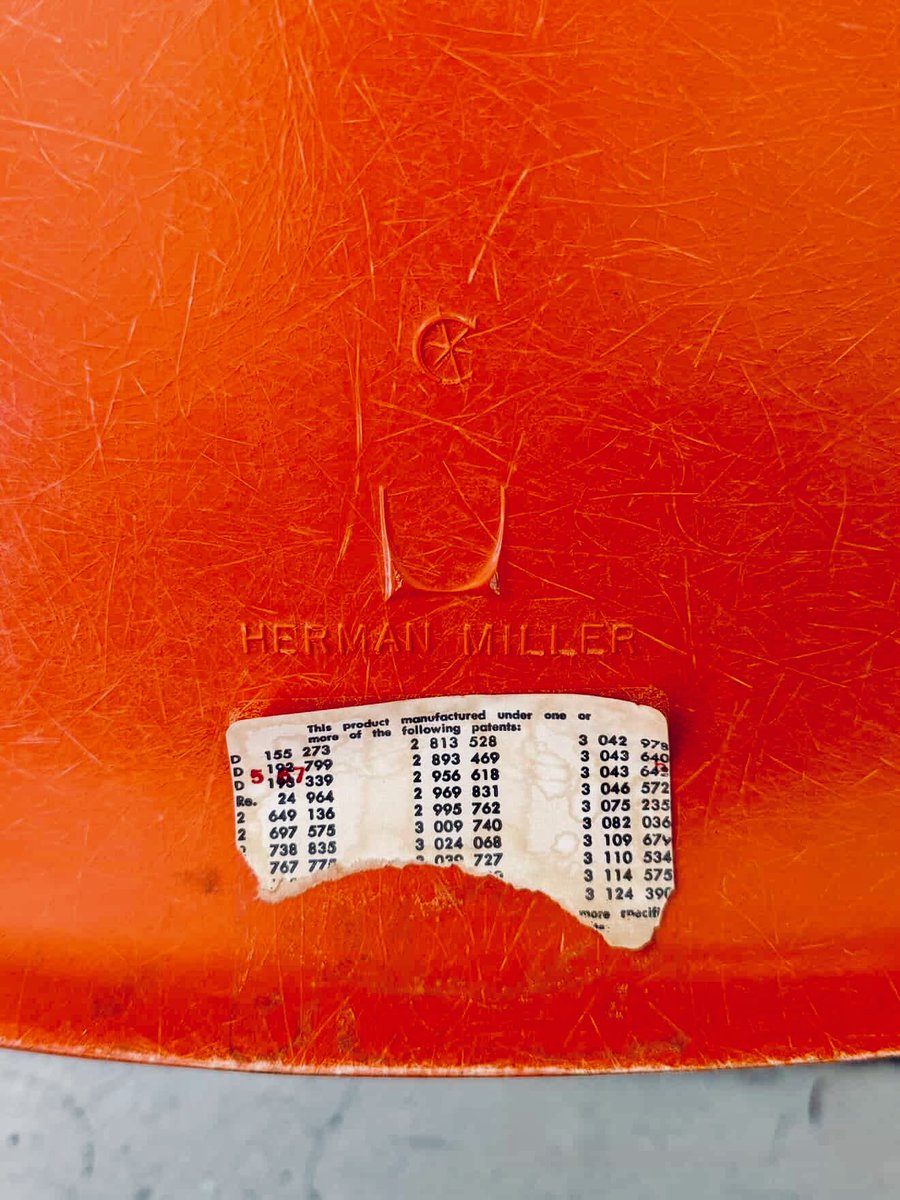
“Herman Miller Eames Chair Orange”
1967年オレゴン州の市庁舎に納められた、サイドテーブル付きの超美品が21脚出てきました。めちゃくちゃ可愛いです。僕は中古車屋なので、この60年間の歴史を考えると、ほんとたまりません。
こういった歴史ある名作の価値を保存して、次の世代に繋いでいくのも僕たちの仕事だと思っています。ヴィンテージ家具は、レトロカーやスポーツカーとも相性が良くて、ガレージハウスの空間作りにも必要不可欠だと思ってます。
家具は価値が上がるものも多いし、この領域もほんと面白いです。車と同じで、家具は人生を豊かにできるアイテムです。こちらの事業もこれから進めていこうと考えています。やりたいことが多過ぎる。
23
859
2,605
1,427,181