
78 Photos and videos


daisyUI retweeted

working on daisyUI 5.6
3 new components a lot of bugfixes and improvements

1
3
20
992

Get yours at
swag.daisyui.com/products/op…
Use code `june15` for 15% discount
1
407
daisyUI retweeted
Have you tried daisyUI Skill?
npx skills add saadeghi/daisyui
2
3
10
870
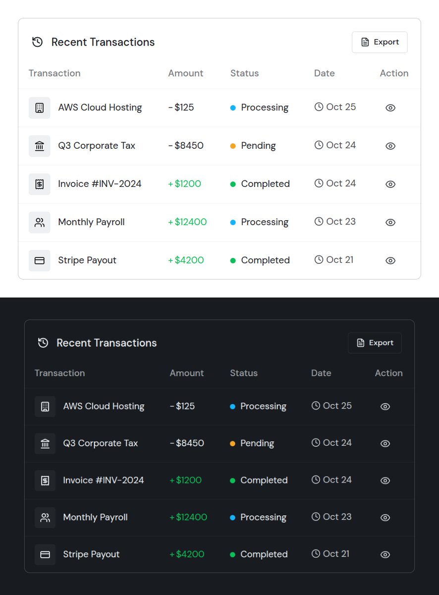
Interaction is not optional.
No matter how advanced an app is, people still expect it to feel human. Small interactions and clear feedback make the experience feel natural and trustworthy.
That’s why we design dashboards with a human-first approach.
- Nexus by @daisyui_
2
2
6
326

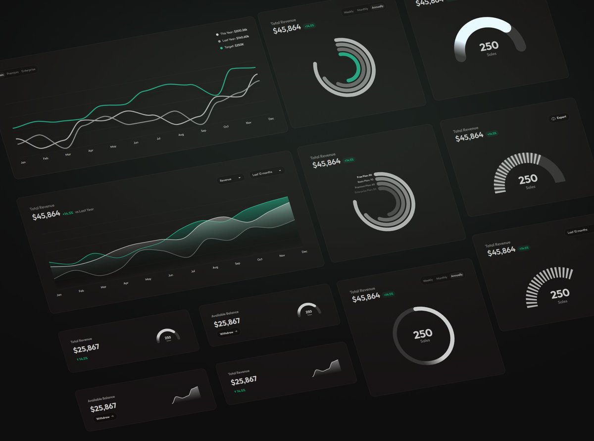
Clean design should never feel boring. It should guide users naturally and keep every interaction clear.
Every detail in a dashboard matters. Small design choices can make information easier to find and understand.
That’s why we built Nexus Dashboard helping users find the data they need quickly, with a clean and intuitive experience.
- by @daisyui_


1
2
5
447
daisyUI retweeted

daisyUI Charts v1.1 is now available🎉
- 12 new chart blocks added (51 total)
- Introducing daisyUI Charts Skill — generate charts with AI using built-in examples, framework syntax, visual descriptions & implementation guidance.
@daisyui_ store:- daisyui.com/store/daisyui-ch…
1
3
10
558
daisyUI retweeted

Every new project I was doing the same thing...
Clean up boilerplate. Install @tailwindcss. Set up @daisyui_. Create folders.
So I made a GitHub template to never do it again 👇
github.com/martinflischman/r…
1
2
6
525
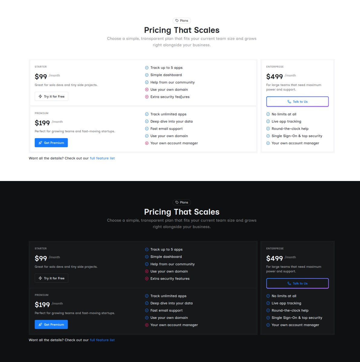
If your pricing page is just another predictable three card grid, your users are probably already ignoring it.
We are building a fresh approach to pricing design. Stop blending in with everyone else and make people actually notice your true value.
Scalo Template - by @daisyui_
1
3
3
350
daisyUI retweeted
The value @daisyui_ provides is even more important when LLM is writing the code.
Less class names means:
- less code
- less LLM token usage
- less cost
- faster code generation
Using daisyUI means:
- UI consistency on all pages (colors, sizes, and other details)
2
2
20
1,095
daisyUI retweeted

Jun 3
I have just started using DaisyUI. so easy to integrate and get started. I cant wait to dive deep

daisyUI 5.6 is in development.
What should be added to daisyUI?
2
5
648
daisyUI retweeted
daisyUI 5.6 is in development.
What should be added to daisyUI?
7
4
9
1,636

daisyUI retweeted
daisyUI Charts compatible with all 32
@daisyui_ themes.
Beautiful, ready-to-use charts — just copy, paste, and ship.
daisyUI store:-
daisyui.com/store/daisyui-ch…
2
11
841
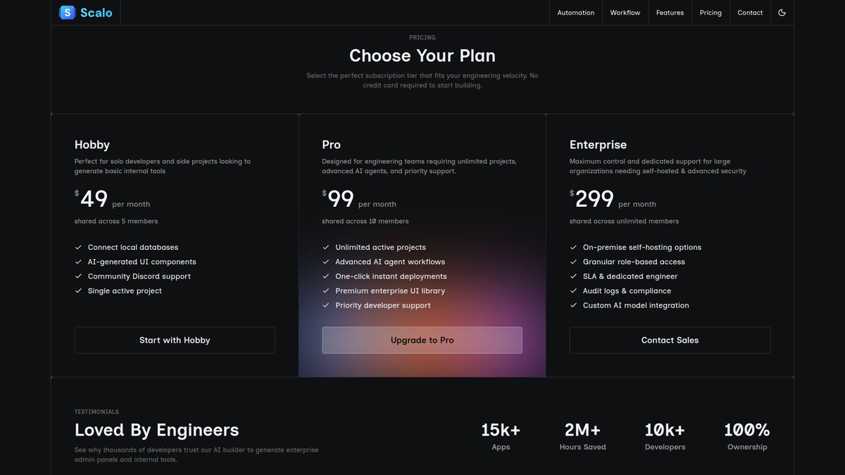
Every product needs a solid pricing section to survive.
I designing one that hooks people the second it loads.
The secret is simple visual contrast. Make your most popular plan look completely different from the rest.
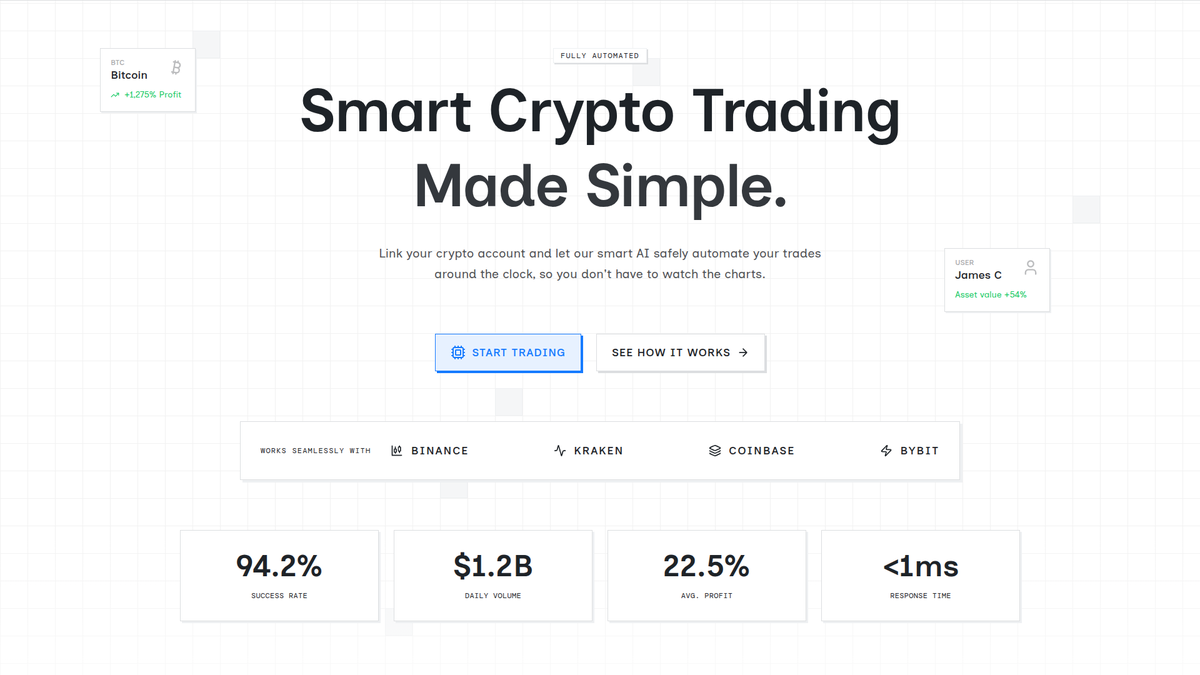
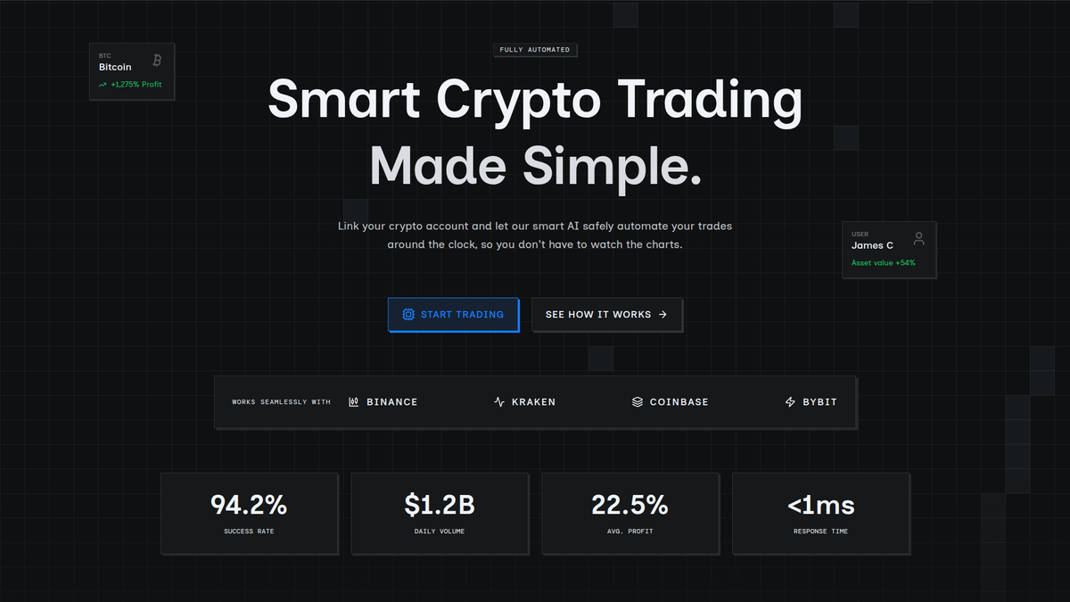
How's the dark version looking?
- Scalo (by @daisyui_)

1
1
4
371
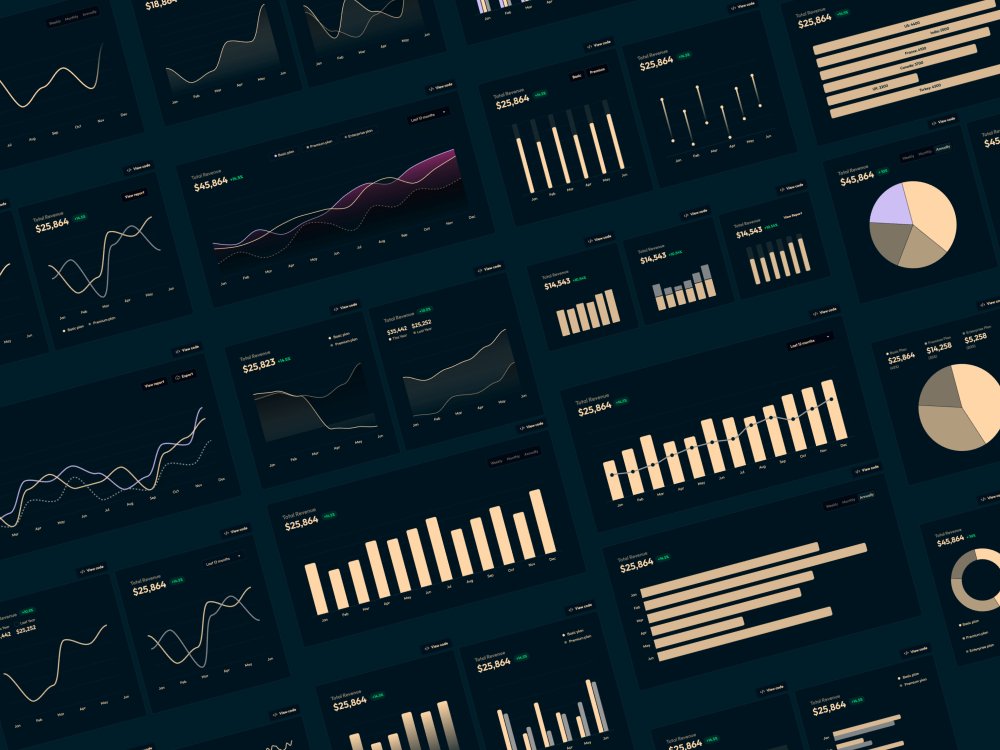
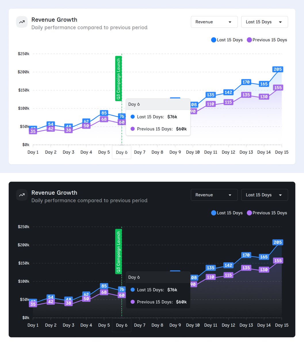
How does this chart design look for a dashboard?
The idea is to show your total business revenue and compare it with past dates. This way, you can see at a glance if your recent moves are actually working or if you need to change things up.
- Nexus 4 (by @daisyui_)
1
2
5
477