
A boutique Power BI and Data Visualisation consultancy, based in Leeds, UK.
Joined July 2021
- Tweets 75
- Following 54
- Followers 9
- Likes 1
24 Photos and videos


10 Jun 2022
Meet our new Data and BI Consultant, Shauna Duffy! A graduate of Ulster University with a BSc in Economics and MSc in Business Analytics from Queens Belfast, Shauna's also plenty of experience in Finance too! We know you'll love working with Shauna over the coming years!
8 Jun 2022
Opportunity or threat? Innovation is perceived as a double-edged sword in the #buildingproducts sector, but the winners will be those who dare to take risks.
Interesting article from @McKinsey.
ow.ly/R1PW50Jsi46
6 Jun 2022
1
3 May 2022
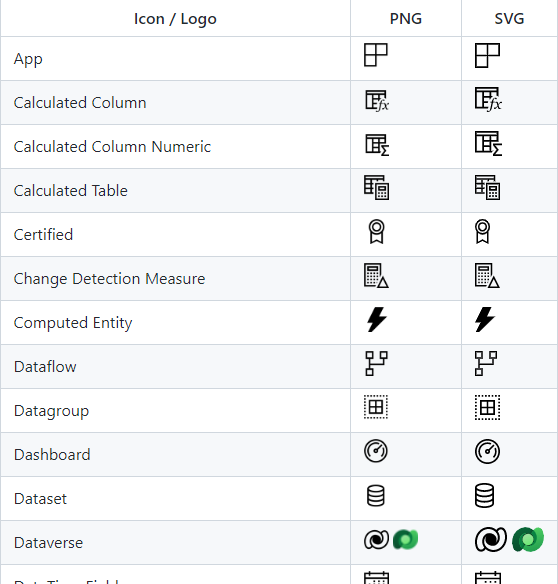
Make your #PowerBI apps and reports POP! Here's a free library of Power BI #icons, maintained by linkedin.com/in/jeroenterhee…. #UI #UX #Design
ow.ly/piK750IXlyX
3 May 2022
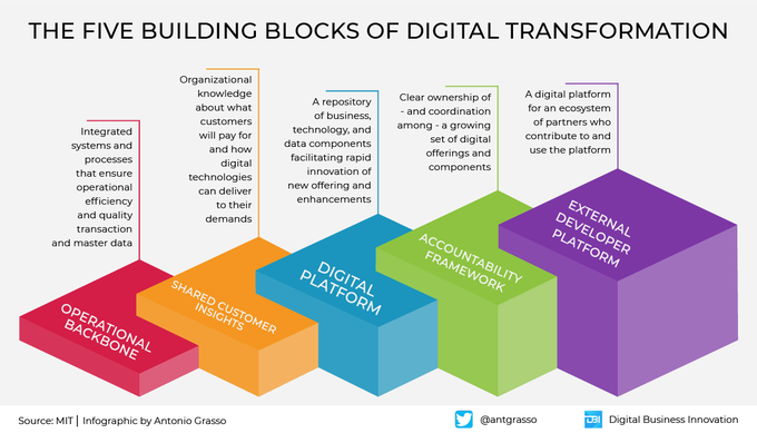
Dare to Digitize?
The five steps to Digital Transformation. Get in touch to see how we can help you on your journey.
#Infographic by @Antgrasso
#DigitalTransformation #Digitalization
1
3
Hopton Analytics retweeted

28 Apr 2022
How did I only find out about this library of Power BI icons maintained by @MarcLelijveld and @jeroenterheerdt today? Great resource for solution designs! lnkd.in/geWY6jie
3
21
141
Hopton Analytics retweeted

16 Apr 2022
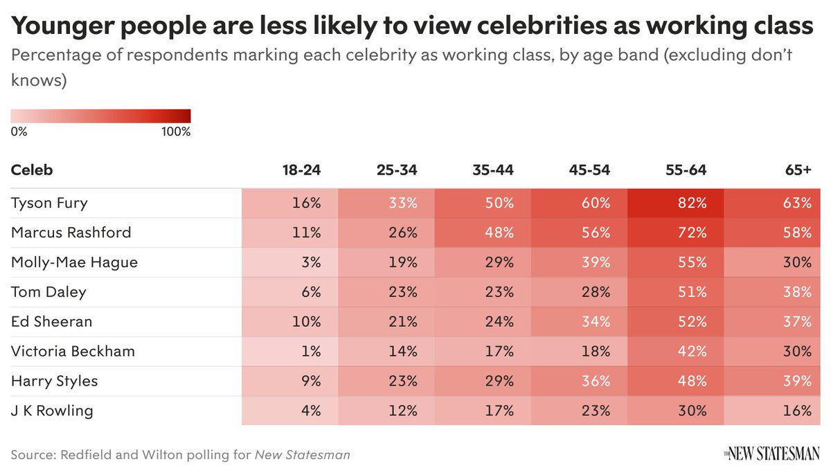
Even celebrities well known for their working-class upbringing are seen chiefly as upper class by younger respondents.
For example, the footballer Marcus Rashford is seen as upper class by 56 per cent of 18- to 24-year-olds compared with 10.3 per cent of those aged 55-64.
19
19
126
26 Apr 2022
Migrating from #Tableau to #PowerBI. Here's a simple guide of what to unlearn from Tableau, and learn in Power BI. Includes video content.
hopton.link/Tableau-to-Power… community.powerbi.com/t5/Com…
25 Apr 2022
Material Symbols is Google’s new library of modern #icons
#uidesign #UI #typography #design #symbol
ow.ly/zybx30shZoU
25 Apr 2022
Conversational #AI tools should unify calling, messaging, analytics and more | #Bots need to connect #data between calls, messages too | via VentureBeat
ow.ly/M8HQ30shZoI
25 Apr 2022
Make better chart choices. A fantastic visual vocab tool developed in Power BI by Jason Thomas (@SQLJason).
#Dataviz #PowerBI
hopton.link/Power-BI-Visual-…
23 Nov 2021
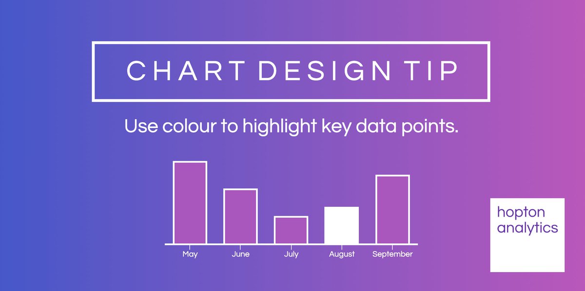
#ChartDesignTip Tuesday! In reality, it's not quite as cut and dry as this, but in certain circumstances, highlighting key data points to help tell your users a story does make a lot of sense.
19 Nov 2021
On Friday afternoon, this an interesting data visualisation covering a very important topic. Sorry, not a Topic, a Freddo... yougov.co.uk/topics/food/art…
18 Nov 2021
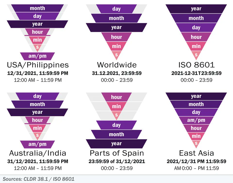
Day-to-day, I use the "Worldwide" date format as a Brit, but I always use the ISO 8601 for filename dates. What date format do you use, and more importantly has this visual changed for your mind?
#dataviz #datefight - (via hopton.link/DateFormat)
17 Nov 2021
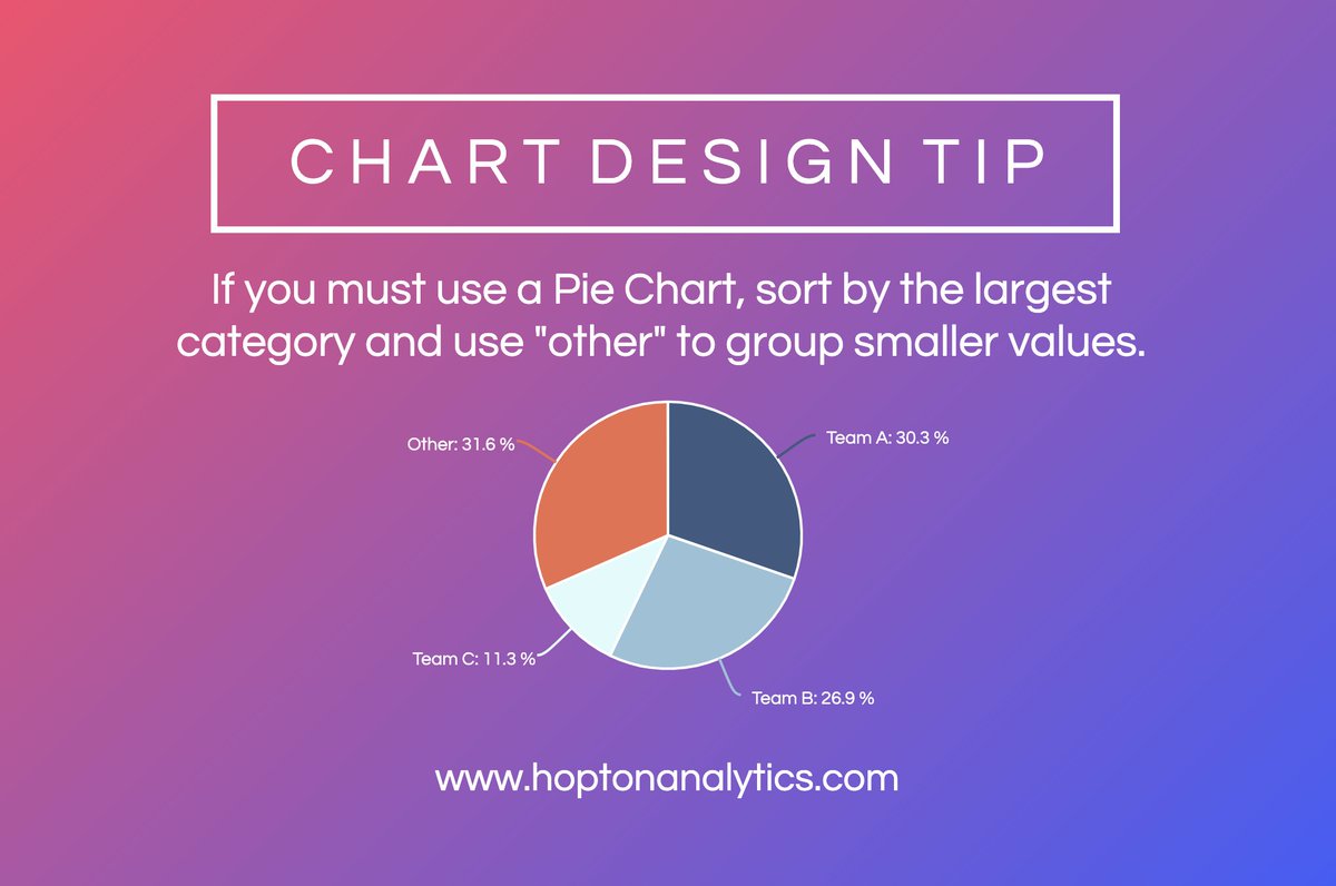
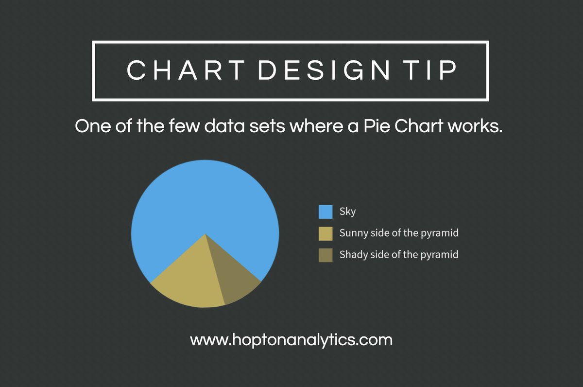
When you do use Pie Charts, consider some basic design rules.
#ChartDesignTip #data #powerbi #designtip #piechart
16 Nov 2021
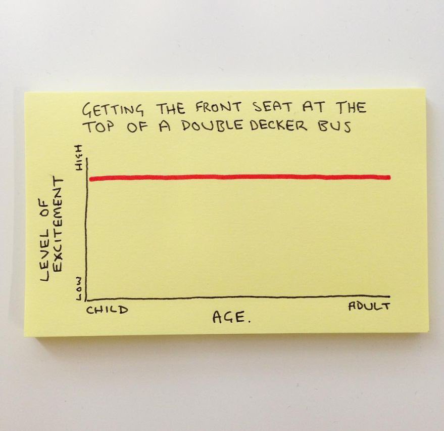
Not entirely accurate, but there's some truth to this #ChartDesignTip
#data #powerbi #designtip #piechart
1