50x larger sets than other icon libraries. 12 years of meticulous craft. Free version available ✨
Joined February 2019
- Tweets 3,894
- Following 148
- Followers 3,569
- Likes 3,168
1,581 Photos and videos


Pinned Tweet

25 Aug 2025
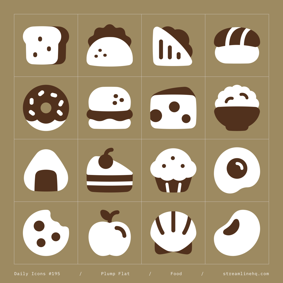
A cheerful mix of essentials ✨

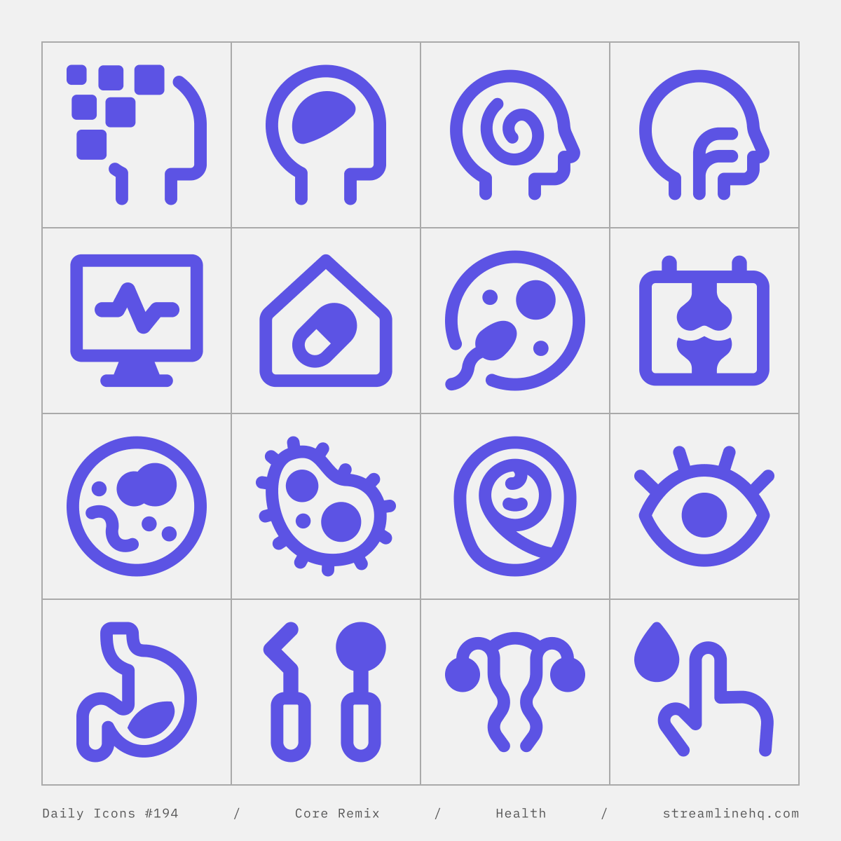
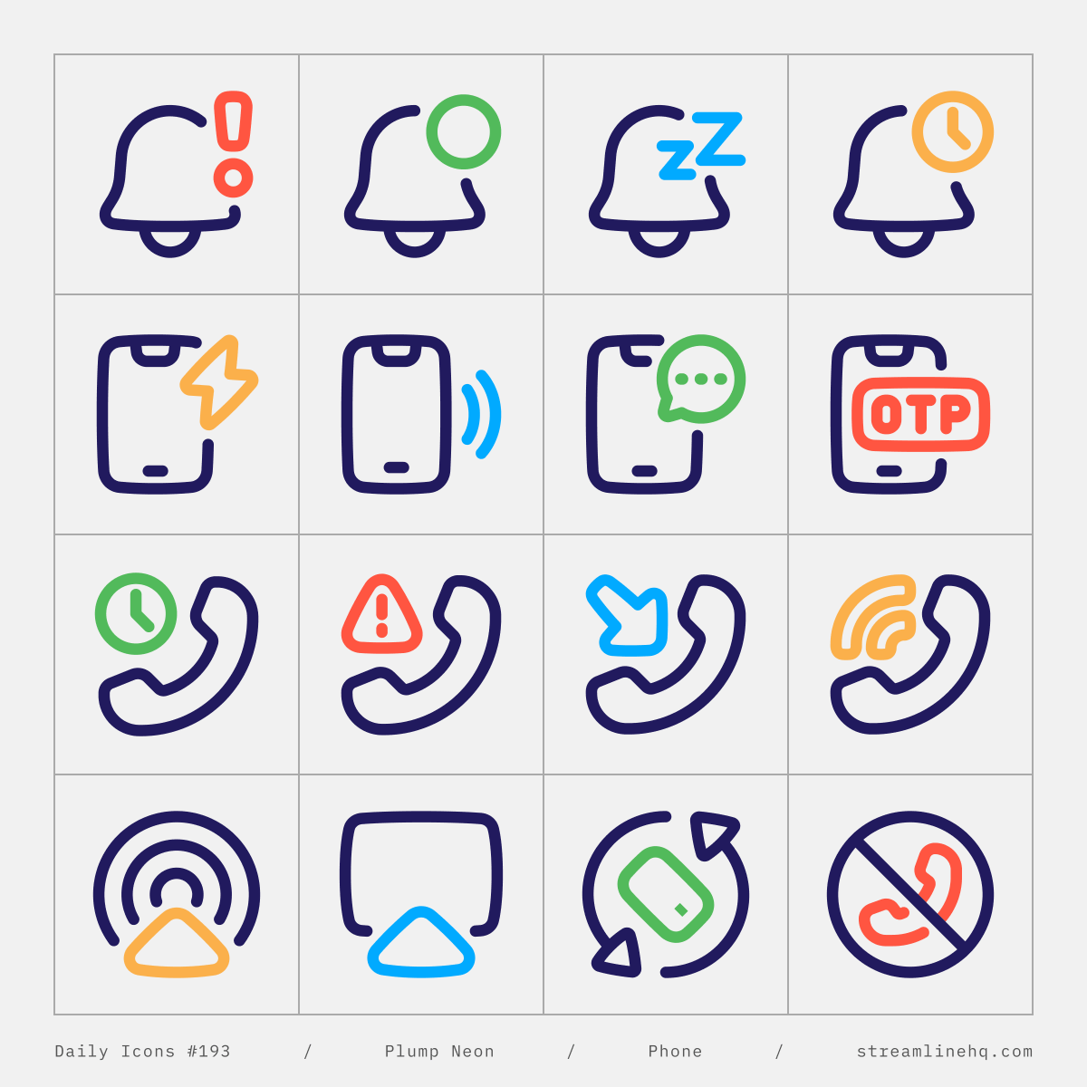
ALT Plump icons in flat style featuring colorful, high-contrast symbols for UI, app, web, dashboard, and creative design. Includes icons for food, travel, media, education, and communication.
15
63
1,165
60,757
Jun 12
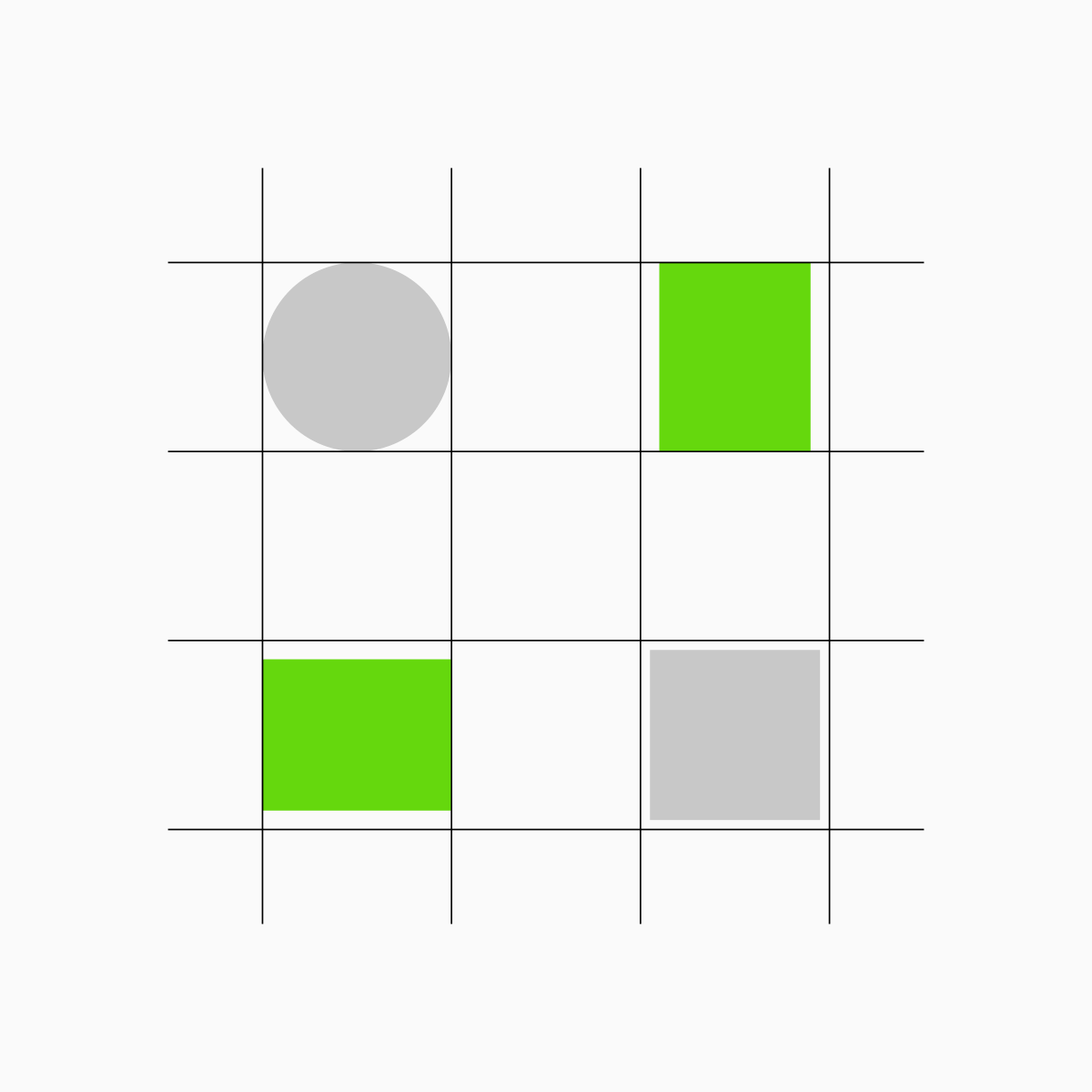
Still on key shapes. When using rectangles, there are two directions to balance.
For a horizontal rectangle, borrow the circle's width and make it slightly shorter than the square.
For a vertical rectangle, borrow the circle's height and make it slightly narrower.
Small adjustments that keep everything feeling proportionally consistent across the set.
The image here shows interactions between different key shapes 👇
1
8
314
Jun 11
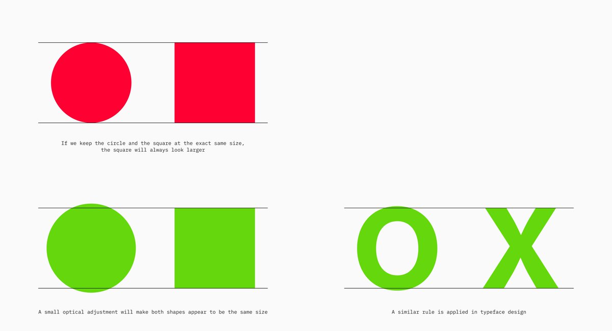
When using circles and squares as key shapes, make the circles slightly larger than the squares.
It sounds counterintuitive, but that small difference is what makes them feel balanced next to each other.
It's the same reason the "O" in typography pokes past the cap height: so it doesn't look smaller than the letters next to it.
2
93
Jun 10
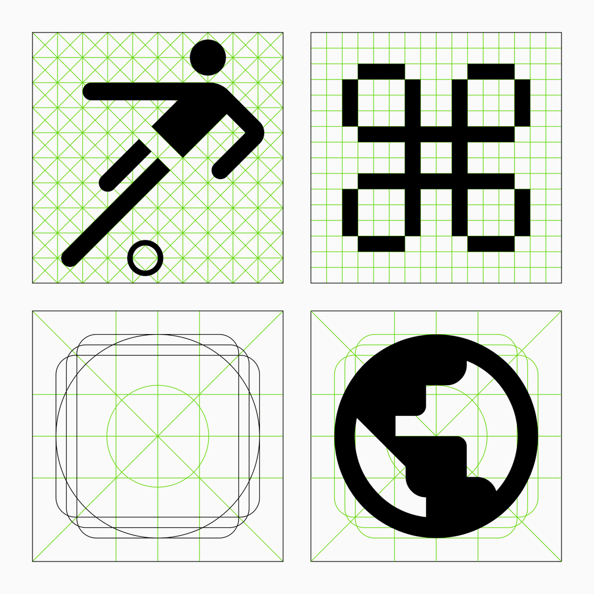
Key shapes are the proportional backbone of an icon set.
Circles, squares, rectangles. Each one defines how much space an icon occupies, keeping the whole set visually balanced regardless of how different each icon looks.
They work alongside the grid, not against it. And like the grid: they're guides, not absolutes. Knowing when an icon feels balanced takes as much practice and visual sensitivity as it does rule-following.
The shapes set the standard. Your eye makes the final call.
This gif here shows basic key shapes aligned to a 24x24 grid 👇
1
21
530
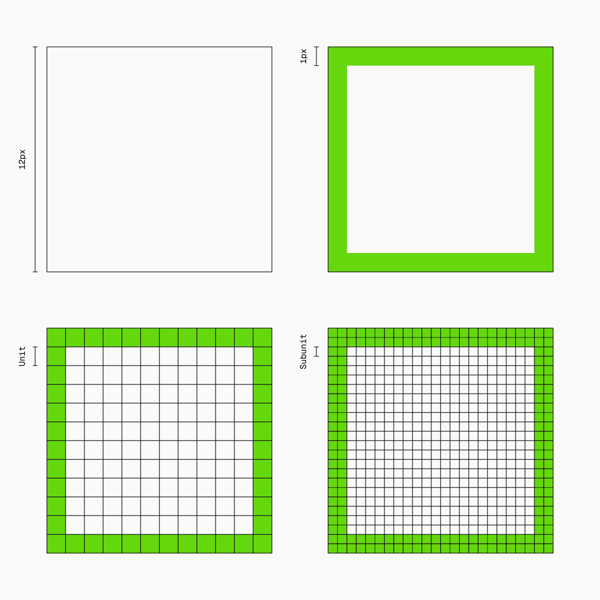
An icon grid is built from four parts:
- the frame
- the safe area
- the primary grid
- and the secondary grid.
The frame sets the boundaries. The safe area protects what matters. The primary grid establishes proportions and alignment. The secondary grid adds finer structure for more detail and flexibility.
Simple enough to start. Deep enough to master.
18
1,184
Good icon design starts with rules.
Grids keep things structured. Key shapes keep things balanced. Together they create the foundation for a coherent, consistent set.
But rules are only useful if you understand them deeply enough to know when to bend them. Grids can be restrictive. Key shapes can be too rigid.
The goal is never blind compliance: it's knowing when the framework serves the icon, and when it doesn't.
Aids, not constraints. That's the difference 👌
1
20
487