Anu Anuja retweeted

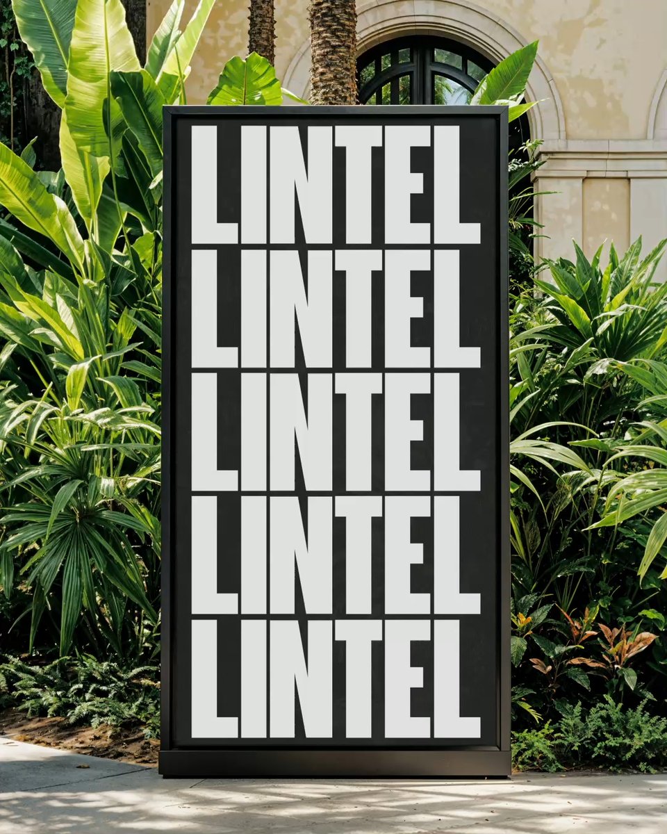
I'm seeing a lot of sloppy AI posters lately. The problem usually isn't the image. It's the Basics. Fixing the typefaces can instantly make AI posters look more polished and intentional. Btw all visuals are generated using ChatGPT Images 2.0
1
1
1
24

authenticity. I chose Lora and Inter as the primary typefaces, combining the elegance and literary character of Lora with the clarity and versatility I found in Inter. I love inter.
Inspired by the richness and diversity of Northern Nigerian heritage, I developed a vibrant and
1
5

Start a design business in 2026:
Software → Figma
Portfolio → Behance
Management → Notion
Scheduling → Calendly
Take Payments → Stripe
Color Palettes → Coolors
Social Media → X/Twitter
Typefaces → Google Fonts
Stock Assets → Adobe Stock
No Code → Framer
2
218

11
Thihan Cho Oo retweeted

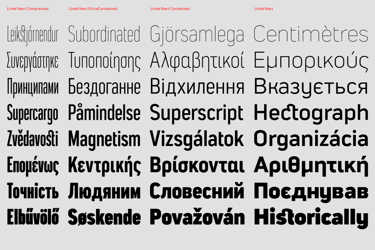
The Northern Block’s Next Series is an ongoing rebuild of the foundry’s typefaces, expanded across scripts and engineered for modern use.

1
1
19
1,379

𝐉𝐚𝐯𝐚𝐣𝐢 𝐃𝐚𝐝𝐚𝐣𝐢 𝐂𝐡𝐚𝐮𝐝𝐡𝐚𝐫𝐢, 𝐭𝐡𝐞 𝐌𝐚𝐫𝐚𝐭𝐡𝐢 𝐁𝐮𝐬𝐢𝐧𝐞𝐬𝐬 𝐓𝐢𝐭𝐚𝐧 𝐚𝐧𝐝 𝐅𝐚𝐭𝐡𝐞𝐫 𝐨𝐟 𝐌𝐨𝐝𝐞𝐫𝐧 𝐃𝐞𝐯𝐚𝐧𝐚𝐠𝐚𝐫𝐢 𝐓𝐲𝐩𝐨𝐠𝐫𝐚𝐩𝐡𝐲 🚩
Javaji Dadaji Chaudhari (1838/1839–1892) was a pioneering Marathi entrepreneur, master type-founder, and founder of the renowned Nirnaya Sagar Press. Born in Umarkhadi, Bombay, his ancestral roots lay in Vidhe village of Murbad Taluka in Thane District. His great-grandfather was a hardworking Maratha farmer who migrated to Umarkhadi after finding it impossible to sustain his family through agriculture alone. Javaji’s father worked as an ordinary peon, and when Javaji was only nine years old, his father’s death placed the burden of supporting the family upon his young shoulders.
Although enrolled in school, Javaji was forced to leave his education at the age of ten and received only a basic schooling. Determined to overcome his circumstances, he entered the printing trade and secured employment as a compositor at Thomas Graham’s printing establishment. He worked there for nearly a decade, diligently learning every aspect of the craft. When Thomas Graham sold the press to the Times of India for twenty thousand rupees, Javaji continued his work in its type department, where he mastered the intricate art of type-making and type-casting.
His growing reputation led to his appointment at the newly established Induprakash Printing House in 1862, where his expertise was sought to help establish a type foundry. After two years there, he joined the Oriental Printing House and further refined his technical skills. Later, in partnership with Ranuji Raoji Aru, he ventured into business for himself, marking the beginning of his entrepreneurial journey.
In 1869, Javaji Dadaji Chaudhari founded the Nirnaya Sagar Press and appointed Ramchandra Amritraya Morey as its manager. What began as a modest enterprise soon grew into one of India’s most influential publishing institutions. Nirnaya Sagar Press became celebrated for its beautifully crafted Devanagari typefaces and for publishing authoritative editions of Sanskrit, Marathi, and other Indian literary works. Through his innovations in typography, printing, and publishing, Javaji helped preserve India’s classical intellectual heritage and transformed the standards of Devanagari printing.
Rising from poverty, limited formal education, and personal hardship, Javaji Dadaji Chaudhari became one of the foremost indigenous industrial pioneers of nineteenth-century India. His contributions to Indian publishing and typography earned him a lasting place in history as the Marathi Business Titan and the Father of Modern Devanagari Typography.

11
40
571


With Brand Archive, discover brand assets past and present. Pull individual assets from over a thousand brands, 1950-2026. Discover colour palettes, typefaces, logos and applications.
Start here 👉 BrandArchive.xyz

2
18
854

19h
Yes! It’s not exactly hard to look up. Also: mockup newspapers that use all the wrong typefaces and layouts.
Yes I am fun at parties!
2
8
2,403

Jun 14

22

i do know of some google typefaces that have a similar vibe! you can try looking at barrio, barriecito, and londrina here: fonts.google.com/?preview.la…
1
1
39


Jun 14
Fine, but can I have a word with their team on typefaces, line height and readability?
1
34

I love blackletter typefaces but this is a horribly designed t-shirt.

1
19

Jun 14
90% of brands making "luxury" digital are making the same 3 typography mistakes.
Tight tracking. Luxury type breathes. If it feels claustrophobic on screen it feels cheap, and anyone with a trained eye will feel it before they've read a word.
Too many typefaces. One serif, one sans-serif, that's it. If you feel like you need a third your first two aren't doing their job. Every addition needs a reason and in this kind of work the burden of proof is high.
Default type scales. The jump between your heading sizes should feel like a deliberate choice, not something that came with the template. Luxury needs drama and most websites don't have nearly enough of it in their typography.
The brands that get this right share one thing. Their type feels chosen, not picked.
There's a confidence in how it sits on the page and that confidence is what makes someone feel like they're in the right place before they've read anything.
What's your go-to typeface pairing?
1
36


The posters/banners on a wooden stick you see at every “leftwing” gathering are produced by the SWP. Various colours & typefaces are used according to whether it’s Stand up to Racism or Just stop Oil or whatever. Like different sections in an orchestra!
27

I love all the old humanist typefaces that rejected the heavy Gothic in favor of light, balance, clarity, & grace.
Garamond has always been my favorite but I also like Janson & Plantin.
2
6
158