

gamedev question, on feedback surveys do people actually sit down and read the "enter your own text" parts or do they just generate like a wordcloud and try to interpret the most common complains from that
34

Heeft de VRT hier inmiddels op gereageerd? Het is meer dan een week geleden. Dit is toch een journalistieke doodzonde zou het überhaupt bij ze binnengekomen zijn. Wij hadden hier de wordcloud van Kaag, dat is ook afgeschud als water van een eend.
2
1
3
565


Jun 10
“What is the first word that comes to mind when you hear AI?” Menti wordcloud at #eahil2026 with a large range of strong emotions let’s say

15


Jun 4
*🚀 Data Analyst Project Series – Part 5*
*Netflix Data Analysis Project*
*🎯 Project Goal*
The goal of this project is to analyze Netflix content data and discover insights related to:
- Movies vs TV Shows
- Most popular genres
- Content trends over time
- Country-wise content production
- Ratings distribution
- Content duration analysis
This is one of the MOST popular beginner-friendly Data Analytics portfolio projects because it combines:
- Data Cleaning
- SQL Analysis
- Visualization
- Storytelling
It is widely used in:
- Entertainment Analytics
- Streaming Platforms
- Media Companies
- Recommendation Systems
*🛠 STEP 1: Choose the Dataset*
*Recommended Dataset*
Search on Kaggle:
- Netflix Movies and TV Shows Dataset
This dataset usually contains:
- Title
- Genre
- Country
- Director
- Cast
- Release Year
- Rating
- Duration
- Type (Movie/TV Show)
*📂 STEP 2: Understand the Dataset*
*Common Columns*
*Show ID* : Unique content ID
*Title* : Movie/Show title
*Type* : Movie or TV Show
*Director* : Director name
*Cast* : Actors
*Country* : Production country
*Date Added* : Added to Netflix
*Release Year* : Year released
*Rating* : Content rating
*Duration* : Movie/show duration
*Genre* : Category/genre
*🧹 STEP 3: Data Cleaning*
Entertainment datasets often contain:
- Missing directors
- Empty cast names
- Inconsistent genres
- Incorrect duration formats
*✔ Cleaning Tasks*
*Remove Duplicate Titles*
Check:
- Duplicate Show IDs
*Handle Missing Values*
Common missing fields:
- Director
- Country
- Cast
Methods:
- Replace with “Unknown”
- Remove rows if necessary
*Standardize Genres*
Example:
- “Sci-Fi”
- “Science Fiction”
Convert into a standard category.
*Split Duration Values*
Examples:
- “90 min”
- “3 Seasons”
Separate:
- Numeric value
- Unit
*📊 STEP 4: Define Netflix KPIs*
*Essential KPIs*
*✔ Total Content*
`COUNT(Show_ID)`
*✔ Total Movies*
`COUNT(CASE WHEN Type = 'Movie' THEN 1 END)`
*✔ Total TV Shows*
`COUNT(CASE WHEN Type = 'TV Show' THEN 1 END)`
*✔ Average Movie Duration*
`AVG(Duration_Minutes)`
*✔ Most Common Rating*
`MODE(Rating)`
*🗄 STEP 5: Analyze Netflix Data Using SQL*
*📌 SQL Query Examples*
*1. Movies vs TV Shows*
SELECT Type,
COUNT(*) AS Total_Content
FROM Netflix_Data
GROUP BY Type;
*2. Top Genres*
SELECT Genre,
COUNT(*) AS Total_Content
FROM Netflix_Data
GROUP BY Genre
ORDER BY Total_Content DESC
LIMIT 10;
*3. Content Added Per Year*
SELECT YEAR(Date_Added) AS Year_Added,
COUNT(*) AS Content_Count
FROM Netflix_Data
GROUP BY YEAR(Date_Added)
ORDER BY Year_Added;
*4. Top Countries Producing Content*
SELECT Country,
COUNT(*) AS Total_Content
FROM Netflix_Data
GROUP BY Country
ORDER BY Total_Content DESC
LIMIT 10;
*5. Highest Rated Content Categories*
SELECT Rating,
COUNT(*) AS Total_Content
FROM Netflix_Data
GROUP BY Rating
ORDER BY Total_Content DESC;
*📈 STEP 6: Build Netflix Dashboard*
Use:
- Power BI
- Tableau
*🎨 Dashboard Layout*
*Section 1: KPI Cards*
Display:
- Total Content
- Total Movies
- Total TV Shows
- Average Duration
*Section 2: Visualizations*
*✔ Pie Chart*
Use for:
- Movies vs TV Shows
*✔ Bar Chart*
Use for:
- Top Genres
*✔ Line Chart*
Use for:
- Content Added Over Time
*✔ Map Visualization*
Use for:
- Country-wise Content Production
*✔ Treemap*
Use for:
- Genre Distribution
*🎛 STEP 7: Add Dashboard Filters*
Add:
✔ Genre
✔ Country
✔ Release Year
✔ Rating
✔ Type
Interactive dashboards improve exploration.
*🎨 STEP 8: Improve Dashboard Design*
*Design Tips*
✔ Use Netflix-style colors (red/black theme)
✔ Highlight important KPIs
✔ Avoid too many visuals
✔ Keep charts clean and readable
*📖 STEP 9: Add Business Insights*
Insights are the MOST important part.
*Example Insights*
✔ Movies dominate Netflix content compared to TV Shows.
✔ Drama and Comedy are the most popular genres.
✔ Content production increased rapidly after 2015.
✔ The United States produces the highest amount of content.
✔ TV Shows generally have higher engagement duration.
*🤖 STEP 10: Advanced Analysis*
To make your project stronger:
✔ Recommendation system analysis
✔ Genre popularity prediction
✔ Viewer trend analysis
✔ Sentiment analysis on reviews
✔ Content clustering
*🐍 STEP 11: Python Analysis*
Use:
- Pandas
- NumPy
- Matplotlib
- Seaborn
*Example Python Tasks*
✔ Genre analysis
✔ Time-series trends
✔ Correlation analysis
✔ Content distribution
✔ Visualization dashboards
*📌 Optional Advanced Libraries*
Use:
- Plotly
- Scikit-learn
- WordCloud
- NLTK
*📁 Final Project Structure*
Netflix-Data-Analysis/
│
├── Dataset/
├── SQL Queries/
├── Power BI Dashboard/
├── Tableau Dashboard/
├── Python Analysis/
├── Screenshots/
├── README.md
*🚀 STEP 12: Publish Your Project*
Upload on:
✔ GitHub
✔ LinkedIn
✔ Tableau Public
✔ Power BI Service
*💡 LinkedIn Post Example*
“Built a Netflix Data Analysis Dashboard using SQL Power BI to analyze genres, content trends, and viewer insights 📊🔥”
*🧠 Skills You Will Learn*
After completing this project:
✅ Entertainment Analytics
✅ SQL Querying
✅ Dashboard Building
✅ Data Cleaning
✅ Visualization
✅ Business Insights
✅ Data Storytelling
*🔥 Interview Questions Recruiters May Ask*
1. Which genres are most popular?
2. Which country produces the most Netflix content?
3. How did you clean duration data?
4. Which KPIs did you use and why?
5. What business insights did you discover?
*🚀 Final Advice*
This project becomes powerful when you:
✔ Focus on storytelling
✔ Create clean dashboards
✔ Explain trends clearly
✔ Add business insights instead of just charts
That’s what makes a strong Data Analyst portfolio 📊🔥
*Double Tap ❤️ For Part-6*
Jun 3

🚀 Data Analyst Project Series – Part 4
Financial Analytics Dashboard Project
🎯 Project Goal
The goal of this project is to analyze financial data and create dashboards that help businesses track:
• Revenue
• Expenses
• Profit
• Budget performance
• Cash flow
• Financial growth trends
This project is widely used in:
• Banking
• Startups
• E-commerce
• Corporate finance
• Accounting departments
Financial Analytics helps businesses make smarter financial decisions and improve profitability.
🛠 STEP 1: Choose a Financial Dataset
Recommended Dataset Types
Search on Kaggle:
• Financial Performance Dataset
• Company Revenue Dataset
• Profit & Loss Dataset
• Retail Financial Dataset
📂 STEP 2: Understand the Dataset
Common Financial Columns
Transaction ID : Unique transaction number
Date : Transaction date
Revenue : Income generated
Expense : Business expenses
Profit : Revenue - Expense
Department : Business department
Category : Expense/Revenue category
Region : Sales region
Budget : Planned spending
Actual Spending : Real spending
🧹 STEP 3: Data Cleaning
Financial data must be highly accurate.
Even small mistakes can create incorrect business decisions.
✔ Cleaning Tasks
Remove Duplicate Transactions
Check:
• Duplicate Transaction IDs
Handle Missing Values
Common missing columns:
• Revenue
• Expense
• Budget
Correct Currency Formats
Examples:
• ₹1,00,000
• $5000
Convert into proper numeric values.
Correct Data Types
Examples:
• Date → Date format
• Revenue → Decimal
• Expense → Decimal
📊 STEP 4: Define Financial KPIs
Essential KPIs
✔ Total Revenue
SUM(Revenue)
✔ Total Expenses
SUM(Expense)
✔ Net Profit
SUM(Revenue - Expense)
✔ Profit Margin
(SUM(Revenue - Expense) / SUM(Revenue)) * 100
Purpose:
Measures business profitability efficiency.
✔ Budget Variance
SUM(Actual_Spending - Budget)
Purpose:
Shows overspending or underspending.
🗄 STEP 5: Analyze Financial Data Using SQL
📌 SQL Query Examples
1. Monthly Revenue Trend
SELECT MONTH(Date) AS Month,
SUM(Revenue) AS Total_Revenue
FROM Finance_Data
GROUP BY MONTH(Date)
ORDER BY Month;
2. Department-wise Expenses
SELECT Department,
SUM(Expense) AS Total_Expense
FROM Finance_Data
GROUP BY Department
ORDER BY Total_Expense DESC;
3. Region-wise Profit
SELECT Region,
SUM(Revenue - Expense) AS Profit
FROM Finance_Data
GROUP BY Region
ORDER BY Profit DESC;
4. Budget vs Actual Spending
SELECT Department,
SUM(Budget) AS Total_Budget,
SUM(Actual_Spending) AS Actual_Spending
FROM Finance_Data
GROUP BY Department;
📈 STEP 6: Build Financial Dashboard
Use:
• Power BI
• Tableau
🎨 Dashboard Layout
Section 1: KPI Cards
Display:
• Total Revenue
• Total Expenses
• Net Profit
• Profit Margin
Section 2: Visualizations
✔ Line Chart
Use for: Revenue Trends
✔ Bar Chart
Use for: Department Expenses
✔ Waterfall Chart
Use for: Profit Breakdown
✔ Pie Chart
Use for: Expense Categories
✔ Gauge Chart
Use for: Budget Achievement %
🎛 STEP 7: Add Dashboard Interactivity
Add filters for:
✔ Region
✔ Department
✔ Expense Category
✔ Financial Year
✔ Quarter
Interactive dashboards help management analyze data quickly.
🎨 STEP 8: Improve Dashboard Design
Design Tips
✔ Use finance-friendly colors
✔ Highlight losses in red
✔ Keep KPI cards large
✔ Avoid cluttered visuals
✔ Use proper spacing/alignment
📖 STEP 9: Add Financial Insights
Example Insights
✔ Marketing department exceeded budget by 15%.
✔ Q4 generated the highest revenue.
✔ West region delivered maximum profit.
✔ Some categories have high revenue but low margins.
🤖 STEP 10: Advanced Financial Analysis
To make the project stronger:
✔ Forecast future revenue
✔ Analyze seasonal trends
✔ Detect unusual expenses
✔ Build profitability models
✔ Compare yearly financial performance
9
1,196

Jun 3
「貸しっぱなしデスティニー」「また帰ってきたケロッ!とマーチ」追加版
#ano #WordCloud

May 28

#ano のディスコグラフィに現時点で載っている全曲(「デリート」〜「愛晩餐」)の歌詞からワードクラウドを作成してみた💭
歌詞内の単語を抽出、出現頻度の高いものほど大きく視覚化してます
全て手で入力していくことで、細かなニュアンスや表現の違いを改めて認識できたように感じます
@aNo2mass

1
2
445

May 31
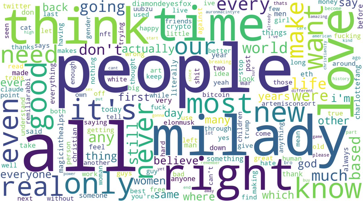
heres the first all time wordcloud before noise reduction:
May 30

i just had the idea of feeding all of my tweets since 2009 into codex and having it make word clouds
3
2
655

May 29
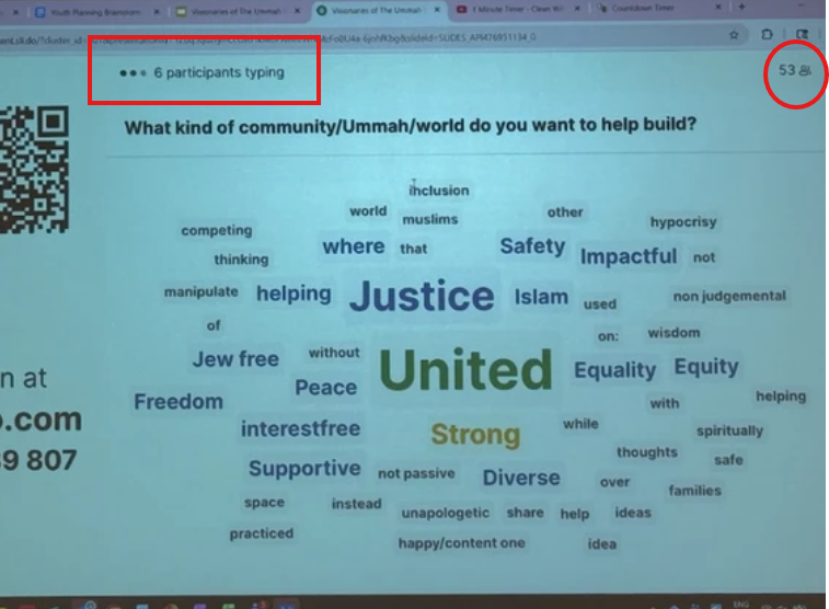
Notice how little participants there are in this wordcloud app: 53
And there's about 50 words onscreen
Looking at the size of the word "jew free", it was probably was only typed by 1 to 3 people max out of 53.
You're making a mountain out of a ant hill for propaganda reasons.
1
1
254


May 21
svelte-wordcloud-docs.vercel…
Svelteで作ったWordCloudコンポーネント
コード全く見てないからえぐいことになっているかもしれないけどとりあえず使えるものにはなってるはず
バカクソ重いデータを食わすとさすがに遅いけど2回目以降はキャッシュを使うので秒で表示される
4
159
