
May 15
- @variational_io 上的rwa可以测试了
测试链接 omni.testnet.variational.io/…
code :TESTCODE
欢迎帮忙测试反馈
1
3
184

May 14
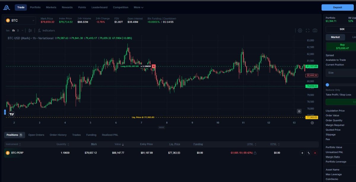
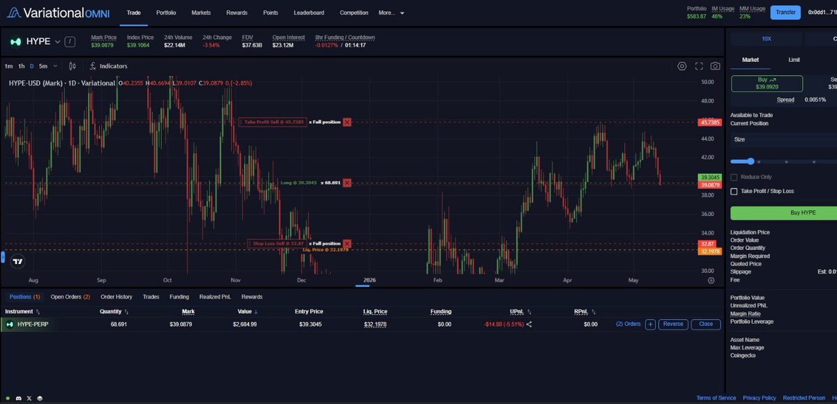
variational's current ui cooks the proposed new one.
i believe i speak for everyone when i say we need the ui to fade into the background and let price action be the focus. and the old ui does that way better.
the new one looks modern at first glance but honestly speaking, the old interface feels cleaner and easier to trade on for long periods. might just be cause i'm already used to the old one tho.
biggest issue is it feels visually shouty. too many elements at the same time. brighter blues and the contrast is just too much, panels are too thick taking up spacing.
some specific things i noticed;
firstly, bring back the "variational OMNI" at the top left.
we should also get to choose if we want out balance to be displayed at the top right, please don't remove it completely.
buttons and highlighted sections draw too much attention constantly.
the right side order panel in old ui feels cleaner and more professional.
the contrast in old version is easier on the eyes fr.
new ui feels more gamified while old one feels more trader focused, and is giving institutional grade standards.
the only thing about the new ui i like is the fact it looks modern. tone down the visual intensity. reduce unnecessary emphasis, soften some contrast, improve spacing and make secondary info quieter.
overall the new ui has potential but old ui currently provides a better trading experience from usability and focus perspective.
if you're yet to try out the new ui on variational
head on to the "more" tab and click "omni testnet"
access the trading terminal with "TESTCODE"
do well to leave your feedback afterwards.
viva la var.
which ui do you prefer
8
41
2,498

May 5
To play around with the new UI, use code TESTCODE on the Omni Testnet: omni.testnet.variational.io
1
8
615


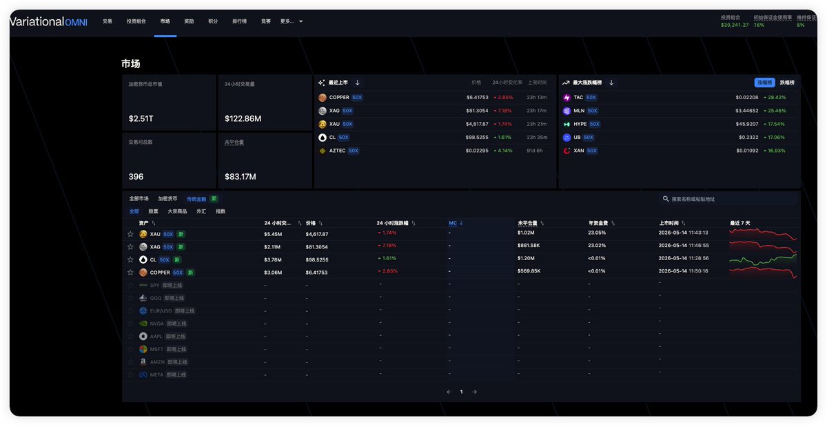
What happened on Variational in the past one week?
It’s another Friday, here are the key updates & strategic progress that happened within @Variational_io in recent past days
TL;DR is in the infographic attached to this post
🔶 Trading Competition #2 started (Apr 23 – May 7, UTC). There is a prize pool of $20K
Registration is compulsory for qualification: omni.variational.io/competit…
Details: x.com/variational_io/status/…
🔶 Leadership Update: Justin Bram joins as Head of Product to drive growth and the shift toward RWAs. Read 👉 x.com/justincbram/status/204…
🔶 UI Revamp in Progress: Test the new interface on testnet: omni.testnet.variational.io (Code: TESTCODE)
Drop your feedback under the post linked below or on the official discord:
x.com/variational_io/status/…
🔶 New Vision Article: Roadmap for 2026 and beyond. Read 👉x.com/variational_io/status/…
Not on Variational yet or opening a new account?
Start ahead with:
• 15% points boost (max boost possible)
• 90-day Silver Tier
Code: OMNISAM
Link: omni.variational.io/?ref=OMN…
Enjoy your weekend with your family and loved ones 🥂


What happened on @variational_io this week?
TL; DR below👇
Have a wonderful weekend 🥂

2
25
2,622

Apr 30
Les French Days sont toujours là !!
Des modèles craquants à des prix attractifs 🤯
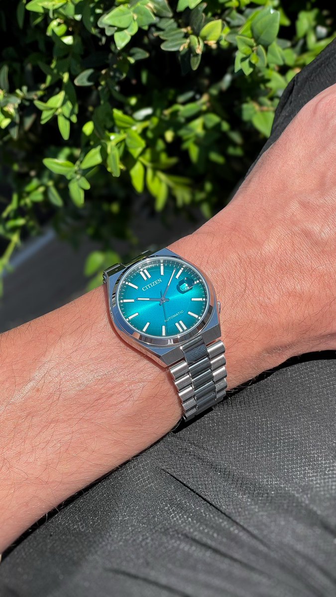
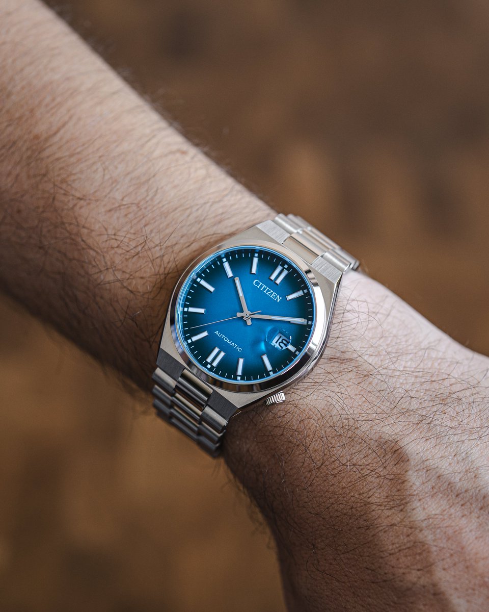
Tsuyosa champ 299€➡️234€
Casio edifice 139€➡️109€
Seiko SRPH47 600€➡️468€
Citizen Series8 1295€➡️1011€
-22% « testcode » 🎁


2
9
89
22,640
Apr 29
Sinon, on a fait aussi une collection spéciale French Days dispo juste ici :
tempusshop.com/collections/p…
Et comme on vous régale jusqu’au bout, « TESTCODE » -22% sur le reste du site, hors produits déjà en promo
C’est cadeau 🎁


Apr 29

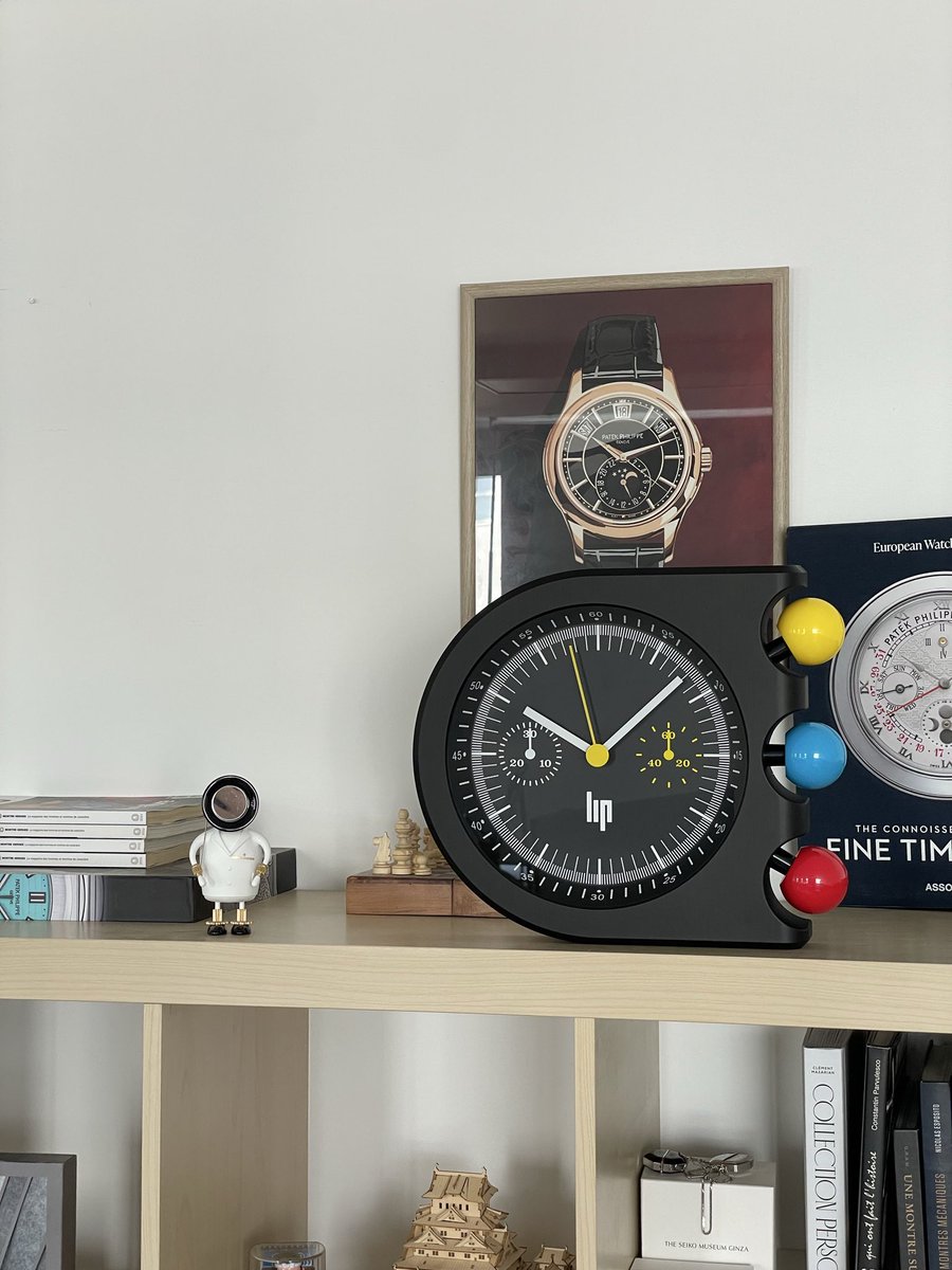
FREEEENCH DAAAAAAYS 🇫🇷
Et bien sûr, qui dit French Days, dit LIP 👀
« FRENCH25 », -25% sur TOUT LIP
tempusshop.com/collections/l…
Faites-vous plaisir les brozer 💪🏼


5
77
35,470

Apr 28
We're putting the finishing touches on our new UI based on the feedback we're receiving from traders.
Give the new UI a try on testnet (code: TESTCODE) and let us know what you think!
The development and design teams will look in the comments of this post for feedback.
Apr 25

UI v3 is up on testnet—please share your feedback! The first of many major changes rolling out in May. Every part of Variational is improving to fully realize our vision of the universal broker.
omni.testnet.variational.io
Code: TESTCODE

23
13
123
14,253
Apr 28
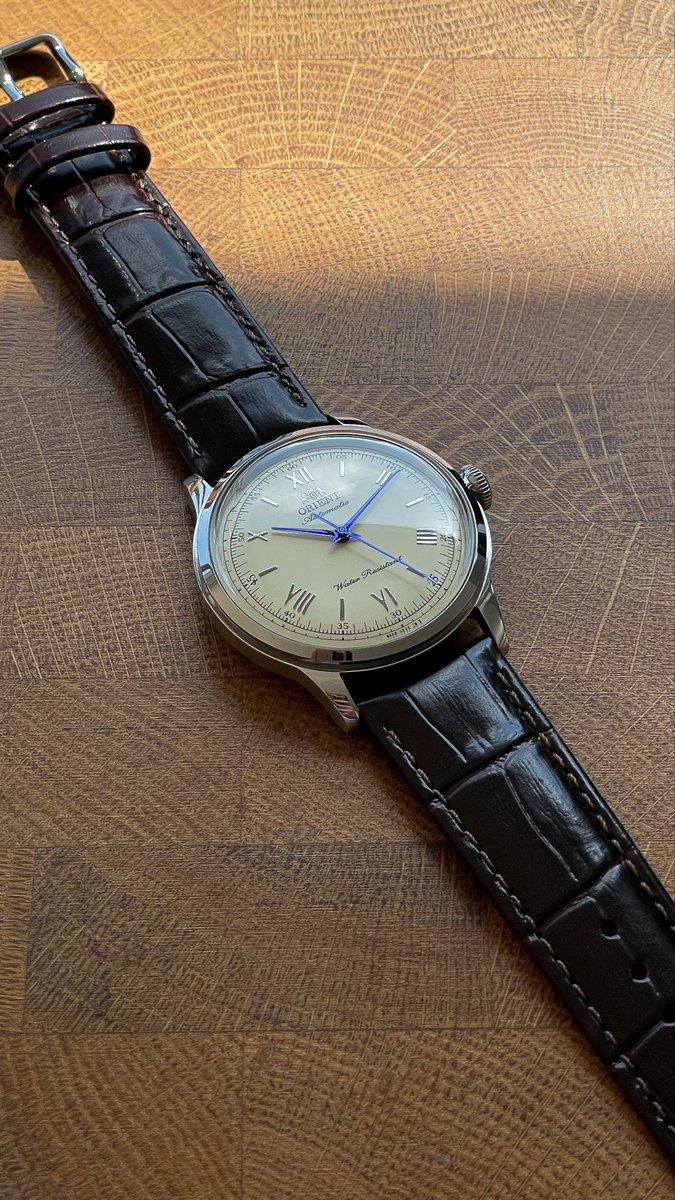
« testcode » -22% (hors produits déjà en promo)
Citizen Tsuyosa 299€➡️234€
Orient Bambino 295€➡️231€
LIP GDG 449€➡️351€
Orient Mako 369€➡️288€
C’est vraiment une folie 🔥


3
70
28,618

Apr 27
Bon j'envoie quoi comme offre ? (utilisez le code : testcode mes ratzs)
4
31,238

Apr 25
omni.testnet.variational.io
Code: TESTCODE
Apr 25
UI v3 is up on testnet—please share your feedback! The first of many major changes rolling out in May. Every part of Variational is improving to fully realize our vision of the universal broker.
omni.testnet.variational.io
Code: TESTCODE
1
4
125

이제 저희 UI v3 테스트넷에서 미리 경험 해보실 수 있습니다! 많은 피드백 부탁드리겠습니다 :)
omni.testnet.variational.io
Code: TESTCODE
Apr 25
UI v3 is up on testnet—please share your feedback! The first of many major changes rolling out in May. Every part of Variational is improving to fully realize our vision of the universal broker.
omni.testnet.variational.io
Code: TESTCODE
2
153
Apr 25
UI v3 is up on testnet—please share your feedback! The first of many major changes rolling out in May. Every part of Variational is improving to fully realize our vision of the universal broker.
omni.testnet.variational.io
Code: TESTCODE
37
7
103
27,613
Apr 24
-22% sur tout le site (hors produits déjà en promo) avec le code « TESTCODE »
Ça ça fait danser les ratz !
tempusshop.com
🐀🐀
Apr 24
code : TESTCODE
Jusqu'à 23h59 uniquement. Jmet pas d'image rien au moins ça reste discret 🐀
3
2
17
8,930
Apr 24
code : TESTCODE
Jusqu'à 23h59 uniquement. Jmet pas d'image rien au moins ça reste discret 🐀
5
3
53
39,843

14 Dec 2025
This proves that with careful macro design, C can have expressive, functional-style constructs while staying close to the metal.
It’s part of my project `dasae-headers`.
TestCode:
github.com/coding-pelican/da…
Source:
github.com/coding-pelican/da…

1
2
174

22 Aug 2025
AI Slop im Testcode für den Linux Kernel, was dazu führt, dass ein Bug im Kernel weiterhin vorhanden ist.
Zeigt erneut die Limitierungen moderner LLMs, die Zusammenhänge oft nicht korrekt verstehen - weil sie einfach nicht intelligent sind.
Linus Crashout einkommend.
20 Aug 2025

You too can crash today's 6.12.43 LTS kernel thanks to a stable maintainer's AI slop. All you need is CAP_SYS_RESOURCE, modern systemd, and this:
40 b7 40 c1 e7 18 83 ef 08 57 57 31 ff 40 b7 07 31 c0 b0 a0 48 89 e6 0f 05 5e ff ce 31 ff b0 21 0f 05
Look at all this extra space!
2
30
8,509

23 Jul 2025
its time, dropping streaming link, lets share this 4 @anoma testcode
who is ready?

11
2
5
310

8 May 2025
Bro this is a great idea, how comes no one has thought of it and maybe it could called some thing like testcode
3
261