
Day 56/111 🚀
Learned advanced React concepts today ⚛️
Worked with:
• useState
• useEffect
• useContext
• useReducer
• Context API
• React Router
• Error Boundaries
Building more scalable and maintainable React applications 🔥
#ReactJS #JavaScript #FrontendDevelopment
1

花了半天用kimi 2.7将前端状态管理从 **React Hooks Context useReducer 自定义 Hook** 迁移到 **Zustand**,
果然是vibe coding爽,技术债该还还得还😂
16

Jun 13
Just wrapped a 2-hour deep dive into React hooks! Learned how useReducer simplifies complex state logic way better than useState for large components. Tomorrow I’ll test this with a side project state management—progress beats perfection!,

2

Jun 12
💡Useful Tips For React Developers💡
✅ Write API calls in separate files instead of directly inside components:
It avoids deep coupling of component and its code. With APIs written separately helps to change their implementation anytime without worrying about breaking the application.
✅ Don't waste time in formatting code:
Install a prettier extension for VS Code and avoid the need of manually formatting code. It formats the code on every file save automatically, after configuring it.
✅ Organize code in better folder and file structure:
Better organization of files for apis, services etc helps to quickly find and update the required information without wasting time.
✅ Use React Developer Tools for Debugging:
Install the React Developer Tools extension in your browser to inspect component hierarchies, props, and state directly, making debugging much easier.
✅ Keep Components Small and Focused:
Break your UI into small, reusable components that each handle a single responsibility. This improves readability and makes components easier to test and maintain.
✅ Use Functional Components and Hooks:
Favor functional components over class components. Leverage hooks like useState, useEffect, and useContext for cleaner and more modern code.
✅ Memoize Expensive Computations:
Use useMemo, or useCallback to prevent unnecessary re-renders for components or functions that handle expensive operations.
✅ Prop-Drilling? Use Context API or State Libraries:
Avoid drilling props through multiple levels by using React Context or state management tools like Redux for global state handling.
✅ Lazy Load Components:
Optimize performance by using React.lazy and Suspense to split your code and load components only when needed.
✅ Follow Clean and Semantic Naming Conventions:
Name components, files, and functions descriptively to improve code readability and collaboration with other developers.
✅ Use useReducer hook instead of States:
Instead of declaring multiple related useState hooks, use useReducer hook to achieve the same.
𝗙𝗼𝗿 𝗺𝗼𝗿𝗲 𝘀𝘂𝗰𝗵 𝘂𝘀𝗲𝗳𝘂𝗹 𝗰𝗼𝗻𝘁𝗲𝗻𝘁, 𝗱𝗼𝗻'𝘁 𝗳𝗼𝗿𝗴𝗲𝘁 𝘁𝗼 𝗳𝗼𝗹𝗹𝗼𝘄 𝗺𝗲.
𝗣𝗦: Source code shown in this Gif is from my 𝗕𝘂𝗶𝗹𝗱 𝗟𝗶𝗯𝗿𝗮𝗿𝘆 𝗠𝗮𝗻𝗮𝗴𝗲𝗺𝗲𝗻𝘁 𝗦𝘆𝘀𝘁𝗲𝗺 𝗨𝘀𝗶𝗻𝗴 𝗥𝗲𝗮𝗰𝘁, 𝗦𝗵𝗮𝗱𝗰𝗻/𝘂𝗶, 𝗦𝘂𝗽𝗮𝗯𝗮𝘀𝗲, 𝗮𝗻𝗱 𝗥𝗲𝗮𝗰𝘁 𝗤𝘂𝗲𝗿𝘆 course. Link in the comment.
#javascript #reactjs #nextjs #webdevelopment
1
43

Jun 12
UseReducer is great but that was part of hooks .... useEffect 😬
Hooks coupled state to presentation which led to ick
112


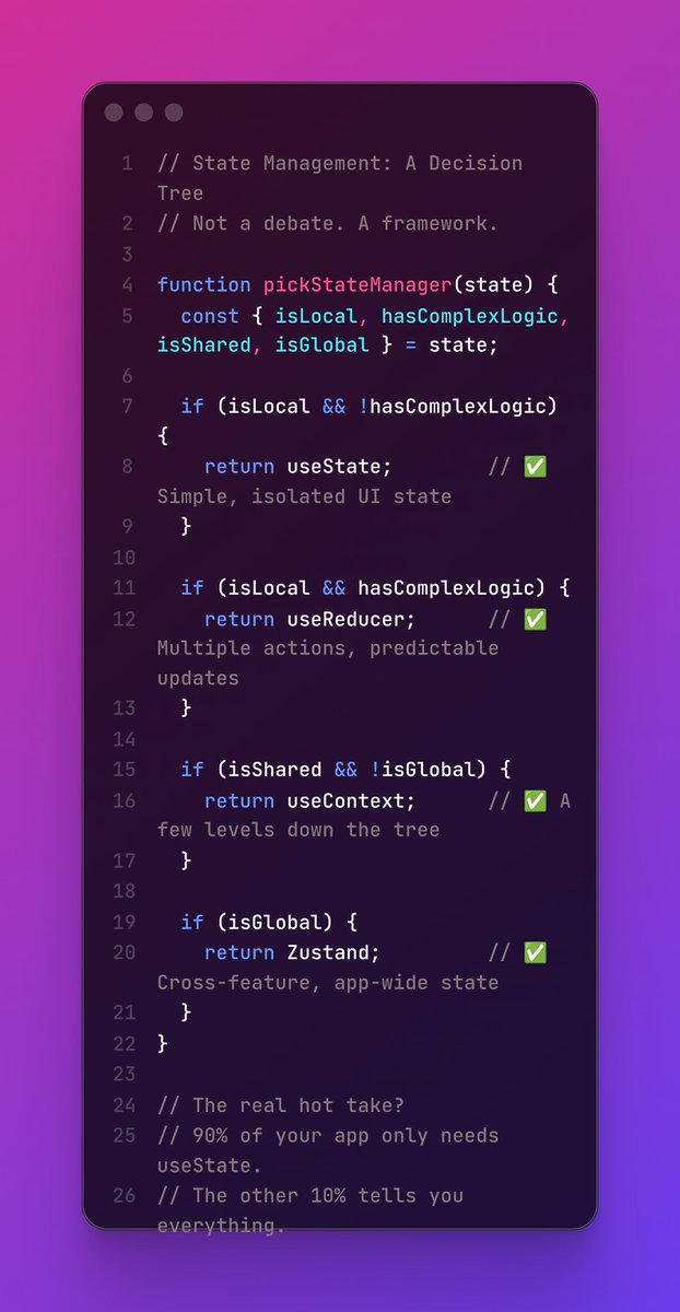
useReducer is useState with a contract. Instead of scattered setX() calls, you dispatch actions. Your state changes become predictable, named, and testable. If your state looks like a mini form or a workflow (idle → loading → success → error), useReducer is the right tool.

You know useState is the wrong tool when:
— You're passing props 3 levels deep
— Multiple setState calls happen together
— Your update logic has conditions inside it That last one is the biggest signal.
Logic inside setState = you need useReducer.
#javascript #reactjs
1
10

Jun 11
State management in 2026 is still unnecessarily complicated for most teams.🫣
You don’t need a fancy library for everything.
Poll: What’s your main state management solution right now?
• React Context useReducer
• Zustand / Jotai / Signals
• Redux / RTK Query
• Server-side only (Server Components / tRPC)
• Something else (comment)
Why did you choose it?
And what’s the biggest pain you’ve faced with state management in the last 6 months? 👇
#React #Frontend #JavaScript #WebDev #Devloper

22
You know useState is the wrong tool when:
— You're passing props 3 levels deep
— Multiple setState calls happen together
— Your update logic has conditions inside it That last one is the biggest signal.
Logic inside setState = you need useReducer.
#javascript #reactjs
useState gets disrespected too much. For isolated, simple state a toggle, an input value, a loading flag useState is PERFECT. Clean. Readable. No overhead. The mistake isn't using useState. It's using it when your state has multiple related pieces that change together.
2
24


Jun 7
State management libraries exist for this reason, Redux lets you create stores for each of these and even ReactJS to a limited capacity lets you use useReducer to simplify complex states.
2
5
976

Claude Design is actually a GREAT tool if used correctly
It creates extremely good designs
Aesthetic, high converting, whatever you want
Here is (explained quickly, will prob make a video around it) how we use it
>>> Find PROVEN landing page designs and frameworks of a specific format (listicles, PDPs and so on)
>>> Export them as PDFs for both mobile and desktop
>>> Load them up on Claude Design
>>> Use the prompt below
You’re designing a high-converting, fully interactive e-commerce product page (PDP) as a reusable template.
This is a design and prototype build — a Shopify port will happen separately, so focus entirely on getting the design, interaction, and motion right.
I’ve uploaded two reference PDFs: one desktop, one mobile. They are two views of the same design system, and your build must match both — each at its own viewport. At mobile widths, the page must match the mobile PDF: its stacking order, section treatment, gallery behavior, and sticky elements. At desktop widths, it must match the desktop PDF: its column structure, gallery placement, buy-box position, and nav. Neither viewport is an afterthought. Reproduce the visual language faithfully — layout, typographic hierarchy, color system, spacing, and component design — so this reads as the same page rebuilt to a higher craft standard.
Then add the layer static PDFs can’t show you: motion. Motion is half of what makes a PDP feel premium and trustworthy. Infer the animation language from the static visual language, then design motion that reinforces it.
How to infer motion from the static references
• Typography weight scale → big confident type usually pairs with slower, weightier transitions (400–600ms eases). Tighter, smaller type pairs with snappier motion (200–300ms).
• Color saturation contrast → muted/desaturated palettes signal restraint → subtle motion, gentle eases. Bold/saturated palettes → more expressive motion, slight overshoot allowed.
• Spacing density → generous whitespace = slower, more deliberate motion. Dense layouts = quicker, more utilitarian motion.
• Corner radii shadows → soft radii and diffuse shadows → soft eases (easeOut, easeInOut). Sharp corners and crisp shadows → more linear, mechanical eases.
• Visual energy overall → calm/clinical (Hims, Function) = restrained, premium motion. Playful/younger (Noom, Bloom) = bouncier, more rewarding feedback.
Pick a coherent motion language based on this read, then apply it consistently. Tell me in your summary what you inferred and why.
Apply motion to (minimum)
• Section reveals on scroll — staged entrances as the user scrolls the page, not everything firing at once. Subtle, never gimmicky.
• Product gallery — image-to-image transition, thumbnail selection state, horizontal swipe on mobile, tap/pinch to zoom.
• Variant selectors (swatches, size/flavor/count pills) — rest → hover → press → selected states. Must feel tactile and physical.
• Quantity stepper — increment/decrement with responsive feedback.
• Subscribe & Save toggle — one-time ↔ subscription transition, with the savings recalculating.
• Add-to-Cart button — idle → hover → press → loading → success. This is your showcase moment. It’s the conversion beat — make the click feel earned and satisfying.
• Cart drawer — slide-in entrance, line-item add animation, quantity changes, subtotal updates. Your second showcase moment — this is where the craft reads.
• Sticky add-to-cart bar — reveals/hides as the user scrolls past the hero, so the primary action is always one thumb-tap away.
• Accordions (description, ingredients, FAQ, shipping) — smooth expand/collapse.
• Review module — star fills, rating-distribution bars animating in, “load more” reveal.
• Trust signals & guarantee — gentle entrance, never flashing badges.
• Ambient motion — subtle hero-product float or ingredient/icon shimmer where it fits the brand. Restraint over spectacle.
Every animation reinforces the brand feeling. No motion for motion’s sake.
MOBILE-FIRST — this is the actual brief, not a footnote
70–85% of e-commerce product-page traffic is mobile, so build at mobile widths first and use the mobile PDF as your starting canvas. Mobile-first describes the build order, not the quality bar — the desktop view gets its own spec below and must match the desktop PDF just as closely.
• Design and build at 375px viewport first. Test mentally at 320px (small phones) and 428px (large phones).
• Sticky add-to-cart bar pinned to the bottom of the viewport (thumb zone) — the primary conversion action is always reachable. Never bury Add to Cart top-right.
• Tap targets minimum 44×44px, ideally 48–56px for primary actions (Add to Cart, variant pills, quantity buttons).
• Swipeable product gallery — horizontal swipe with a dot/counter indicator, tap to zoom. No tiny dead thumbnails as the only navigation.
• Variant selectors sized for thumbs — full-width-friendly pills/swatches, generous spacing so adjacent options aren’t mis-tapped.
• Cart drawer as a full-height bottom sheet or full-screen panel on mobile, not a cramped corner popover.
• Single column always. No horizontal scrolling except the intentional gallery swipe. No fixed desktop sidebars.
• Type sizes: minimum 16px body to prevent iOS zoom-on-focus; headlines scale up from there.
• Compress long content with accordions (full description, ingredient detail, FAQ, shipping/returns) — don’t force mobile users through walls of text.
• Paginate or lazy-load reviews — show aggregate a few, then “load more.” Never dump 40 reviews inline.
• Vertical rhythm tuned for scrolling thumbs, not a mouse cursor.
• prefers-reduced-motion support — degrade to instant transitions, keep all functionality intact.
DESKTOP — a designed view, not a stretched phone
The desktop PDF defines its own layout. Implement it; don’t improvise it.
• Breakpoints: single-column mobile layout below 768px; switch to the desktop layout at 1024px ; treat 768–1023px as a sensible tablet interpolation between the two.
• Match the desktop PDF’s structure. If it shows a two-column hero (gallery left, buy box right), build exactly that — with the buy box sticky within its column on scroll if the reference implies it.
• Desktop gallery: thumbnail rail main image with hover zoom replaces the mobile swipe pattern.
• Hover states are real on desktop — buttons, swatches, cards, nav links, and accordion headers all need designed hover treatments, not just mobile press states.
• Respect the reference’s max content width and gutters — don’t let sections stretch edge-to-edge on wide screens unless the desktop PDF shows it.
• The mobile sticky add-to-cart bar may translate to a sticky buy box or slim sticky header bar on desktop — follow whatever the desktop PDF shows.
Before delivering, verify both views: the build at 375px against the mobile PDF, and at 1280px against the desktop PDF. Where a section is treated differently in the two PDFs, implement both treatments — never pick one and reuse it for both.
Performance interaction polish
• Animate only transform and opacity — never layout properties.
• 60fps target on mid-range mobile.
• Tactile feedback on every tap — no dead-feeling buttons, swatches, or steppers.
• No layout shift — reserve aspect-ratio space for gallery images so they don’t jump on load; no shift on variant change, accordion expand, or sticky-bar appearance.
• Lazy-load below-the-fold gallery images and review content.
• Cart state persists — selected variant, quantity, subscription choice, and cart contents survive interaction and don’t reset.
Sections to include
Build the high-converting DTC stack, top to bottom. Follow the order and inclusion the reference PDFs show; if they’re sparse, this is the standard set:
1. Announcement bar sticky header — logo, nav, cart icon with live item count.
2. Product gallery — swipeable carousel with thumbnails and zoom.
3. Product header — title, star rating review count (taps through to reviews), price with compare-at and a savings badge.
4. Short benefit-led blurb — the one-line promise and 2–4 key claims.
5. Variant selector — size / flavor / count (vary the format to match the reference); clear sold-out and disabled states.
6. Subscribe & Save vs One-time toggle — with the subscription savings called out.
7. Quantity stepper primary Add to Cart.
8. Trust bar — guarantee, free shipping, made-in, third-party tested, etc. Integrated, not bolted on.
9. Value props / why it works — icon headline supporting line.
10. How it works / mechanism — staged or numbered.
11. What’s inside / ingredients — each with a brief rationale.
12. Results / before-after or stat callouts — if the references support it.
13. Social proof — aggregate rating rating-distribution bars 2–4 individual reviews with reviewer name, verified badge, and star rating.
14. Comparison table — vs typical alternatives.
15. FAQ accordion.
16. Money-back guarantee section.
17. Bundle / cross-sell row — “complete the routine” / frequently bought together.
18. Final CTA band.
19. Functional cart drawer — slide-in, line items with thumbnails, quantity controls, subtotal, checkout CTA, and a free-shipping progress bar if it fits the brand.
Visual quality bar
Should feel like a top-tier DTC brand (Hims, Function, Rootine, Noom, Care/of), not a templated theme. Real typographic hierarchy. Generous whitespace. A considered color system — primary a full neutral scale accent semantic states (success, error, and a distinct sale/savings color). A gallery that feels premium. Variant selectors with distinct rest / hover / selected / disabled / sold-out states. A review module that reads as native, not a bolted-on widget. Trust signals integrated into the layout. A consistent shadow-elevation system, consistent corner radii, and icon weight that matches the type weight.
Reusability
• Each section as its own component.
• Centralized config object at the top holding everything swappable: brand colors, fonts, product data (title, price, compare-at, images, variants), subscription options, benefit list, ingredient list, reviews array, FAQ array, comparison data, and motion tokens (durations eases as semantic names like duration.slow, ease.confident).
• Mark every piece of swappable copy {{like_this}} so I can find it later.
• Tailwind utility classes preferred — avoid arbitrary values where possible.
Tech stack
React Tailwind Framer Motion as a single artifact. Use useState/useReducer for cart, variant, quantity, and subscription state. No external state libraries, no routing libraries, no API calls. All images via standard <img> with placeholder URLs. Google Fonts or system stacks only.
Placeholder content
Realistic DTC supplement / skincare / wellness voice. A real-feeling product name, a real price compare-at, plausible variant options, benefit claims that sound like a real brand, an ingredient list with short rationales, review text with names and ratings, real FAQ Q&As, and a populated comparison table. No Lorem Ipsum. No “Product A / Feature 1.”
Deliverable
One React artifact, complete and interactive. Before the code, give me 6–8 lines on: the design DNA you extracted from the references, the motion language you inferred and why, the mobile-first decisions you prioritized, and how your desktop layout maps to the desktop PDF.
Don’t
• Don’t ask clarifying questions — make confident choices and note your reasoning.
• Don’t use generic gradients or glassmorphism unless the references show them.
• Don’t use emoji as primary icons.
• Don’t treat desktop as the primary canvas — but don’t ship it as a stretched mobile layout either. The desktop PDF defines the desktop view.
• Don’t follow only one of the two PDFs. Both references, both viewports, both verified before delivery.
• Don’t fake the cart with an alert() or a console log — build a real, working cart drawer with state.
• Don’t ship a non-functional gallery (dead thumbnails, no swipe, no zoom).
• Don’t lose selected variant, quantity, or cart state on any interaction.
• Don’t dump all reviews or long copy inline on mobile — use accordions and pagination.
• Don’t leave Add to Cart without visible feedback — the button must respond on press and confirm on success
—————
>>> Now generate the design and if it’s good save it as a .zip file
>>> Start a new chat on Claude, load up Shopify Liquid Skills (the official Shopify blogs has them, you can search it up)
>>> Convert the Claude Design .zip file (usually html and jsx) to Shopify Liquid
>>> Push files to Shopify
>>> Make sure the page is working properly
Then you’re done
No need for a designer anymore
You can do this in a hour with Claude Design
10
3
45
5,271

Jun 4
React Context vs Redux debate again. For most apps, Context with useReducer is enough. You don’t need a rocket to cross the street. Use the right tool for the job.
1
1
5
55

Jun 4
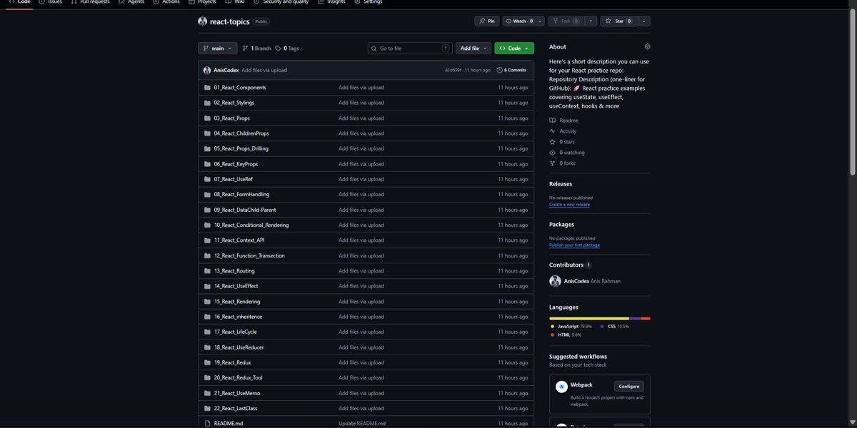
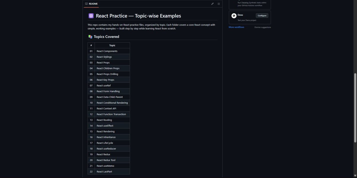
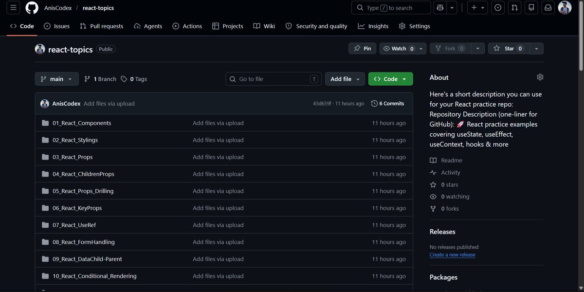
React learners 👋
Free React practice repository with complete source code:
🔗 github.com/AnisCodex/react-t…
Topics: Components, Props, Context API, Routing, useEffect, useReducer, Redux Toolkit, useMemo & more.
⭐ Star if useful.
Follow @AnisCodex 🚀
#ReactJS #JavaScript
3
56

Day 60 ✅
Today I mastered:
• createContext<T> with type parameter
• Context with undefined default
• Custom hooks with error checking
• Context useReducer pattern
• Splitting State Dispatch contexts
• Avoiding unnecessary re-renders
#100DaysOfCode #TypeScript #React

1
7
80
Day 58 ✅
Today I mastered:
• useState<T> with explicit types
• Type inference from initial state
• useReducer with typed State Action
• Discriminated unions for reducer actions
• useRef<HTMLInputElement> for DOM refs
#100DaysOfCode #TypeScript #React

1
6
63


May 25
Em componentes com muito muito estado, vocês vêm utilizando useReducer ultimamente?
7
3
2,548

When your LC visualization state is deeply nested: useReducer Immer. Mutable drafts inside switch cases feel illegal. But seeing O(n²) bubble up in real time without re-render hell? Worth the existential crisis.
2
133

May 21
I’d separate concerns into independent contexts
• AuthContext → authentication/session state
• ThemeContext → UI theme preferences
Use:
• useReducer for predictable updates
• memoized context values (useMemo)
• custom hooks like useAuth() / useTheme()
• provider splitting to avoid unnecessary re-renders
Example:
<AuthProvider>
<ThemeProvider>
<App />
</ThemeProvider>
</AuthProvider>
Key idea:
don’t put unrelated global state into one giant context.
Smaller contexts = fewer re-renders easier testing
May 20

Imagine you're designing a React app that needs to maintain both alobal authentication state and user-selected themes.
How would vou manage this state using Hooks and Context API, while ensuring minimal re-renders and keeping components easily testable?
1
3
113