

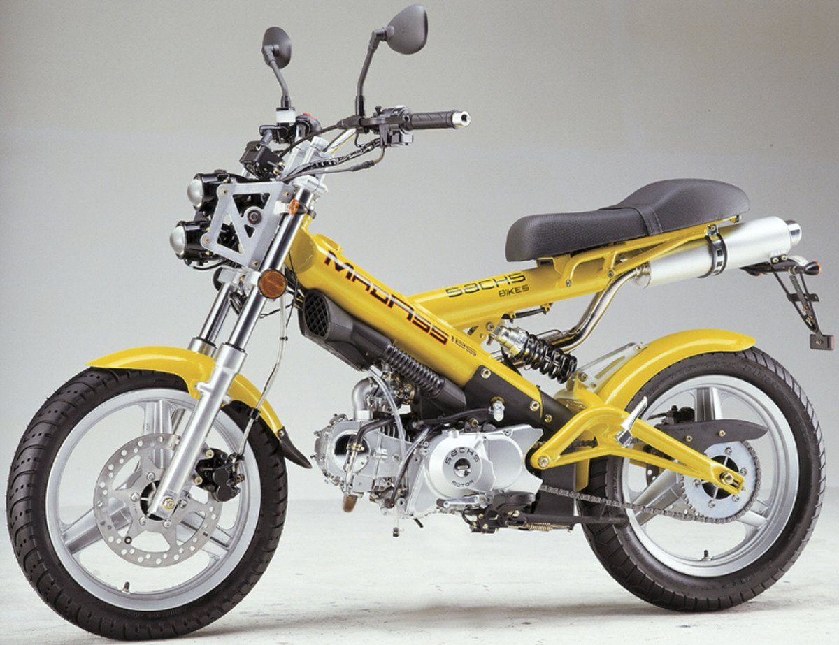

次世代自転車 VanMoof S6 を購入して2ヶ月。
今のところ不調なし。
X3と比べて、特に自動ギアシステムがかなり良い。
ギアチェンジに気づかないくらいスムーズ。
ギアは3段階しかないので、正直ちょっと物足りなさはある。
ただ、従来の壊れやすいeシフターと比べると、ここは割り切りかなと。
個人的にはまったく問題なし。
以前乗っていた電動自転車 Swapfietsの上位モデル と比べると、
・移動時間は体感20%短縮
・疲労度は体感50%以上削減
もう絶対に、電動じゃない自転車には戻れない。
娘を乗せて補習校まで30分運転するのも快適。
運動は、好きなことでやるのが一番。

1
49

I have a VanMoof as well, but have been mainly riding this bike since I got it this year
1
1
70


Jun 11
Android riders, your VanMoof companion is finally here.
Mooflet is live on Google Play.
Dashboard, ASM, music, health tracking. No clutter.
VanMoof Series 2, 3, 5 & 6 supported. iPhone?
It's on the App Store too.

ALT Mooflet is available for iOS and Android devices, for VanMoof Riders
2
403

Jun 9
Kenne Dich seit dem Post mit dem Cowboy vs. vanMoof -Bikes
- damals noch als ‘zutphany’, das sind locker 2 Jahre.
1
1
66


How a bike brand tricked the entire US shipping industry with a 2-cent sticker.
VanMoof had a problem.
A quarter of their bikes were arriving to customers absolutely battered.
Dented tubes. Bust up wheels.
Boxes that looked like they’d been punted off the back of the truck.
They tried everything. Tougher boxes. Better padding. Different couriers.
Still showing up wrecked.
Then one of the founders had a thought: what if handlers just don’t give a shit about bikes?
To some lad in a depot at 3am, your new pride and joy is just another awkward box.
But a massive flat-screen TV?
That gets the white glove treatment.
So they printed a TV on the box.
Damage dropped 80% overnight.
Same box. Same bike. Different picture.
Total cost, Two cents per box.
2
28
5,034

May 29
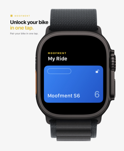
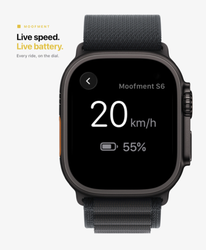
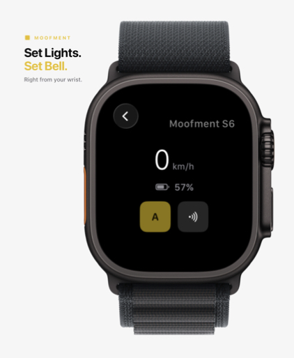
Apple Watch app ⌚️ unlock your VanMoof S6 from your wrist, no phone needed. Live dashboard with speed, battery, range, light bell controls
Add the battery complication to your watch face. Series 5 support coming next.
apps.apple.com/us/app/moofme…
#Moofment
2
2
703


May 26
Their wealth is mostly just a market estimation of *unrealized* asset value. It is not real until it materializes.
Here mr. Famous Economist, search for the VanMoof company case and their "rich" owners.
2
6
262

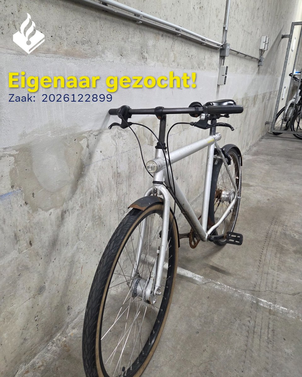
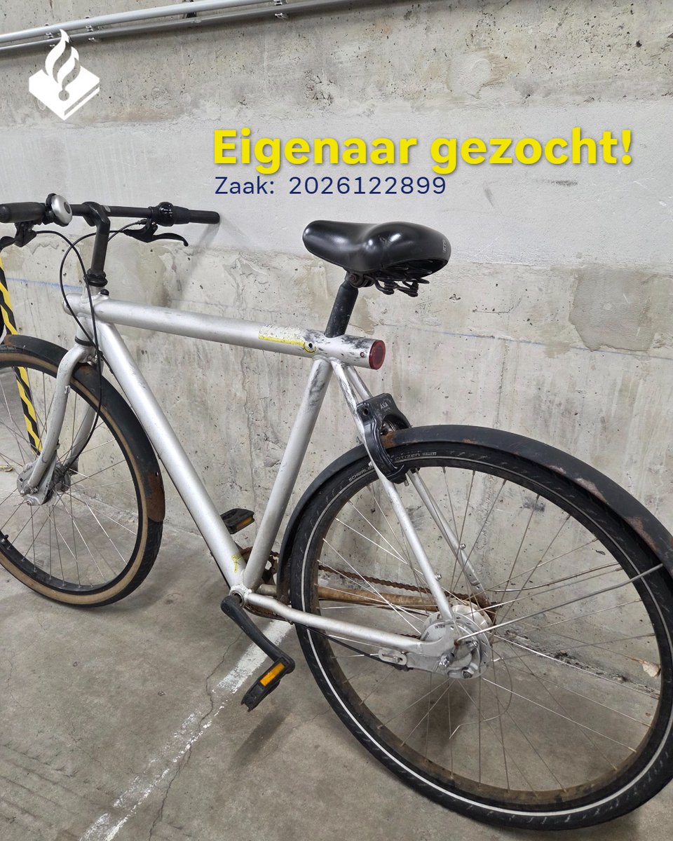
Eigenaar gezocht!: Wij hebben deze @VanMoof -fiets aangetroffen bij een persoon. Wij vermoeden dat de fiets van diefstal afkomstig is.
Is deze fiets van jou? Neem dan contact op via 0900-8844 en vermeld daarbij deze oproep op social media én registratienummer: PL1300-2026122899.
26
12
1,462

May 24
Vanmoof bisikletlere bak bir batersea tarafında yerleri var test edebiliyorsun. Ufaklığıntaşıma aparatları var mı emün değilim ama mutlaka vardır. Çalınmaya karşıda garantiliyorlar dahili gps var
2
194

May 22
今日は #サイクリングの日 「VANMOOF+」を利用、『BROTURES』でメンテナンス etc.|自転車乗りのスタイルハント vol.5
ginzamag.com/categories/fash…


3
53
9,452

May 18
1/3
"Build a bilingual product landing page for “ÚSTECKÁ EDICE”, a premium modern electric bike designed for urban riders, creators, commuters, and people who move through the city with intention.
Use React, Tailwind CSS, Framer Motion for all animations, and Lenis for smooth scroll.
The website must support two languages: English and Czech. Add a clean language switcher in the navigation: EN / CZ. The English version should be the default language. All main content, navigation labels, CTA buttons, product specifications, and section headlines must be available in both languages.
Product concept:
ÚSTECKÁ EDICE is not just an e-bike. It is a modern mobility object inspired by urban architecture, industrial landscapes, sharp city lines, the river, concrete, steel, black asphalt, early morning light, and the raw elegance of Northern Bohemia. The product should feel premium, technical, minimal, powerful, and local without becoming touristy or cliché.
Visual language:
Dark cinematic surfaces with a near-black base (#0a0a0a), deep graphite, matte charcoal, brushed metal, and one distinctive electric accent color inspired by amber streetlights, sodium lamps, or electric copper. Use the accent color sparingly and intentionally as light, reflection, UI highlight, and call-to-action energy.
The bike should be the hero object. It should appear as if floating or standing in controlled studio darkness, lit with dramatic side lighting and soft reflections. The visual mood should feel like a luxury automotive launch, a high-end e-bike campaign, and an editorial design piece combined.
Avoid childish cycling visuals, generic outdoor stock photography, colorful sports branding, cheap eco clichés, gradients, noisy backgrounds, unnecessary decoration, and template-like sections. This should feel like a product page created by a luxury mobility brand.
Typography:
Use an editorial, premium type hierarchy. Oversized display headlines, thin technical labels, precise spacing, and sharp layout discipline. Headlines should feel bold, cinematic, and minimal. Use large typography, generous negative space, thin dividers, small uppercase technical labels, and product-spec inspired microcopy.
Suggested English headline:
“Built for the city. Shaped by the North.”
Suggested Czech headline:
„Stvořeno pro město. Vytvarováno severem.“
Navigation:
Overview
Engineering
Ride
Materials
Edition
Specs
Reserve
Czech navigation:
Přehled
Technologie
Jízda
Materiály
Edice
Specifikace
Rezervovat
Motion:
Use Lenis for smooth momentum scrolling throughout the entire page.
Use Framer Motion for:
Scroll-driven bike movement and rotation
Section reveals that feel like a curtain lifting or a product being revealed by light
Parallax depth between the bike, background shapes, typography, and technical UI elements
Animated specification counters on scroll
Micro-interactions on all clickable elements
Smooth language switch transition
CTA reveal animation
Hover states that feel premium and restrained
Do not use playful bounce animations. Motion should be smooth, precise, cinematic, and intentional. Every movement should feel engineered.
Hero section:
Create a full-bleed hero section with the bike as the main visual object. The background should be almost black, with a single controlled accent light. Use large editorial headline typography and one short supporting sentence.
English hero copy:
“An electric bike for sharp streets, long days, and quiet power.”
Czech hero copy:
„Elektrokolo pro ostré ulice, dlouhé dny a tichý výkon.“
Add two CTA buttons:
English:
Explore the Edition
Reserve Ride
Czech:
Prozkoumat edici
Rezervovat jízdu
Engineering section:
Tell the story through numbers and technical performance. Use animated counters on scroll.
Suggested specs:
Range: up to 120 km
Motor: 250 W silent drive
Torque: 85 Nm
Battery: 720 Wh integrated cell
Charge: 80% in 90 min
Weight: 18.7 kg
Frame: lightweight aluminum / carbon-inspired geometry
Assist modes: Eco, City, Flow, Boost
The specs should feel like luxury automotive data, not a cheap comparison table.
Ride section:
Create a cinematic section about movement through the city. Use large typography, minimal copy, and a feeling of silent acceleration. Include visual cards or panels for:
Morning commute
Night ride
Riverside route
Hill climb
Weekend escape
Czech equivalents:
Ranní dojíždění
Noční jízda
Trasa podél řeky
Výjezd do kopce
Víkendový únik
Materials section:
Show the bike rotating or shifting perspective as the user scrolls. Highlight key surfaces:
Matte graphite frame
Integrated battery line
Hidden cable routing
Minimal cockpit
Precision brake system
Premium saddle
Reflective edition details
Use very close product-detail shots or abstract close-ups. Make it feel like a premium watch, car, or high-end audio product page.
Edition section:
Explain the “ÚSTECKÁ EDICE” identity. It should be local, but refined.
English copy direction:
“Inspired by concrete, steel, river light, and the raw geometry of northern city streets.”
Czech copy direction:
„Inspirováno betonem, ocelí, světlem nad řekou a syrovou geometrií severního města.“
Use abstract background details inspired by:
Industrial silhouettes
River line
Urban concrete
Evening streetlight
Sharp hills and roads
Technical map-like lines
Do not use obvious tourist photos or cheesy city landmarks. Keep it premium and abstract.
Colorways section:
Create 3 refined color variants with instant background and lighting reaction on hover.
Suggested colorways:
Graphite Black
Industrial Copper
River Silver
Czech:
Grafitová černá
Industriální měď
Říční stříbrná
Hovering over each colorway should subtly change the accent light, background reflection, and bike detail highlights.
Specification section:
Create a clean technical specification block with tabs or grouped categories:
Power
Battery
Frame
Ride System
Safety
Connectivity
Czech:
Výkon
Baterie
Rám
Jízdní systém
Bezpečnost
Konektivita
Connectivity features:
Mobile app pairing
GPS tracking
Anti-theft lock
Ride statistics
Battery health
Service alerts
CTA section:
The final CTA should feel like a dramatic reveal, not a basic form. Use a large product silhouette, a single headline, and a minimal reservation module.
English CTA:
“Reserve the first ride.”
Czech CTA:
„Rezervovat první jízdu.“
Include fields:
Name
Email
Preferred language
City
Message
Czech:
Jméno
E-mail
Preferovaný jazyk
Město
Zpráva
Footer:
Minimal footer with:
Product name
Language switch
Social links
Legal links
Newsletter input
Short brand statement
Design references:
Bang & Olufsen product pages, Apple product storytelling, VanMoof, Cowboy Bikes, Polestar automotive pages, Teenage Engineering, Dior fragrance campaign visuals, luxury mobility editorials, Awwwards-level product websites.
Responsive behavior:
The website must be fully responsive for desktop, tablet, and mobile. On mobile, the product should remain visually dominant, but sections must become clean, readable, and easy to scroll. The language switcher must remain accessible.
Quality bar:
This should feel like a premium launch website for a modern electric bike brand. Every section should feel considered. Every motion should have a reason. Every pixel should support the feeling of silent power, urban precision, and refined local identity.
Build the page as a polished, production-ready frontend with excellent spacing, hierarchy, animations, responsive design, and bilingual content structure."
1
3
1,149

May 11
This was the exact prompt:
"Build a unicycle company product website. React, Tailwind CSS, Framer Motion for all animations. The product is a sculpture — present it like one. Balance and rotation visualized through interaction, not gimmicks. Frame, hub, and wheel engineering explored through scroll. The site should feel kinetic even when still. Smooth scroll with Lenis or locomotive-scroll. Micro-interactions on every interactive element. Fully responsive. References: Kris Holm Unicycles, Qu-Ax, Vanmoof, Pinarello. This should be Awwwards-level quality — blow the user's mind with motion, interaction, and visual polish."
2
16
905

Wat ik vreemd vind is dat er geen snelheidsbeperkende borden bij de ingang van het park staan. Maar er een woonerf van. Ik mag op mijn racefiets nog steeds met dertig plus door de meute knallen. Zelfde geldt voor de vanmoof cowboys en -girls. 15 km p/u lijkt me voldoende.
1
1
5
442

🗓 La journée d’Edouard, journaliste à Libé.
09:45. Edouard arrive à la rédaction de Libé, nichée dans un quartier tellement gentrifié que même les pigeons mangent du quinoa bio. Il troque son casque de vélo électrique VanMoof contre un café éthique sourcé dans une coopérative autogérée du Salvador. Il salue Philippine, la chef de rubrique "Société", et Enguerrand, le stagiaire (fils d'un ambassadeur, mais "très ancré à gauche").
11:30. C'est l'heure de la conférence de rédaction. Le sujet tombe : "La France des territoires : pourquoi les prolos aiment-ils autant les zones commerciales ?" Baudouin ajuste ses lunettes et s'exclame avec une émotion contenue : "C'est fascinant cette esthétique du bitume, c'est presque du néo-réalisme prolétarien". Il n'a pas mis les pieds dans un Intermarché depuis 2012, date à laquelle il s'est perdu en allant dans sa résidence secondaire du Luberon.
13:00. Déjeuner avec une sociologue du CNRS (qui s'appelle d'ailleurs Marie-Clotilde) dans un restaurant fusion "sans gluten". Entre deux bouchées de tofu mariné, ils théorisent sur la nécessité de la mixité sociale dans les banlieues. "Il faut briser les ghettos, Marie-Clotilde. C'est crucial pour le vivre-ensemble". Le soir même, il retournera dans son 85m² du 11ème arrondissement, un immeuble où le seul habitant qui ne possède pas de MacBook est le livreur Deliveroo qu'il ne regarde jamais dans les yeux.
16:00. Rédaction du papier. Le titre est une masterclass de condescendance bienveillante : "Zones artisanales : le cri de détresse d'une France qui s'oublie entre le Buffalo Grill et le Action". Il utilise des mots comme "intersectionnalité", "gentrification subie" et "stigmatisation systémique". Il se sent tel un nouveau Victor Hugo, le défenseur des misérables, tout en vérifiant si sa demande de détaxe fiscale pour les journalistes a bien été validée.
19:30. Afterwork dans un bar à vins "nature" où le verre coûte le prix d'un plein d'essence pour la Twingo de Célestin. Il soupire, fatigué par sa journée de "combat social". "C'est dur de porter la parole des sans-voix, Philippine". Elle acquiesce en ajustant son foulard Hermès hérité de sa grand-mère.
1
4
38
2,182