
Joined May 2025
- Tweets 11,916
- Following 63
- Followers 1,393
- Likes 15,942
1,401 Photos and videos
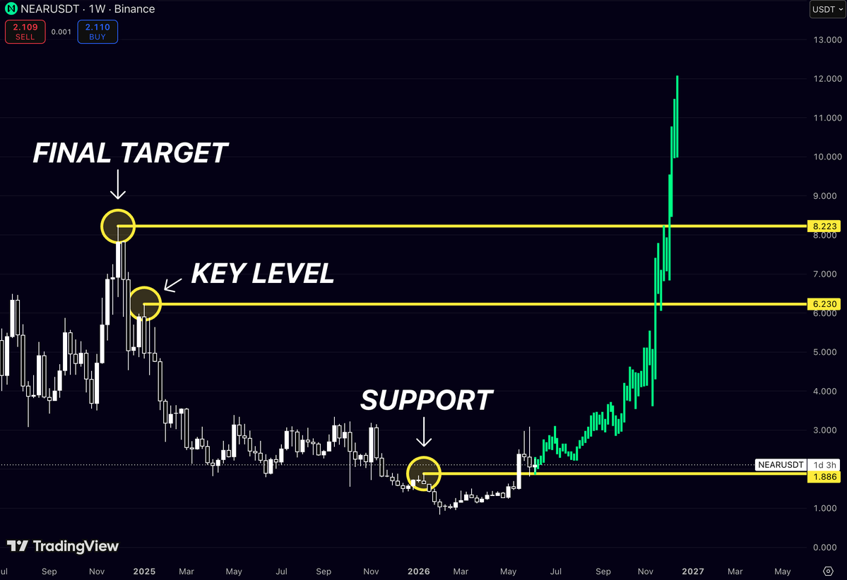


$NEAR is sitting at the exact place where people usually lose interest
Not at $6
Not at $8
Around $2
right above the support zone that could decide the whole structure
The chart is simple:
🟡 $1.88 - support
🟡 $6.23 - key level
🟡 $8.22 - final target
Nothing major has been reclaimed yet
But that’s exactly why I’m watching it
Most traders only care after the first huge candle
By then, the clean entry is usually gone
$NEAR has already spent months bleeding, chopping, and shaking people out near the lows
Now it’s sitting above support while the real upside levels are still untouched
If buyers defend this zone, the next move can get very interesting fast
The market loves obvious charts
The best trades usually start before they become obvious
1
4
291

16h
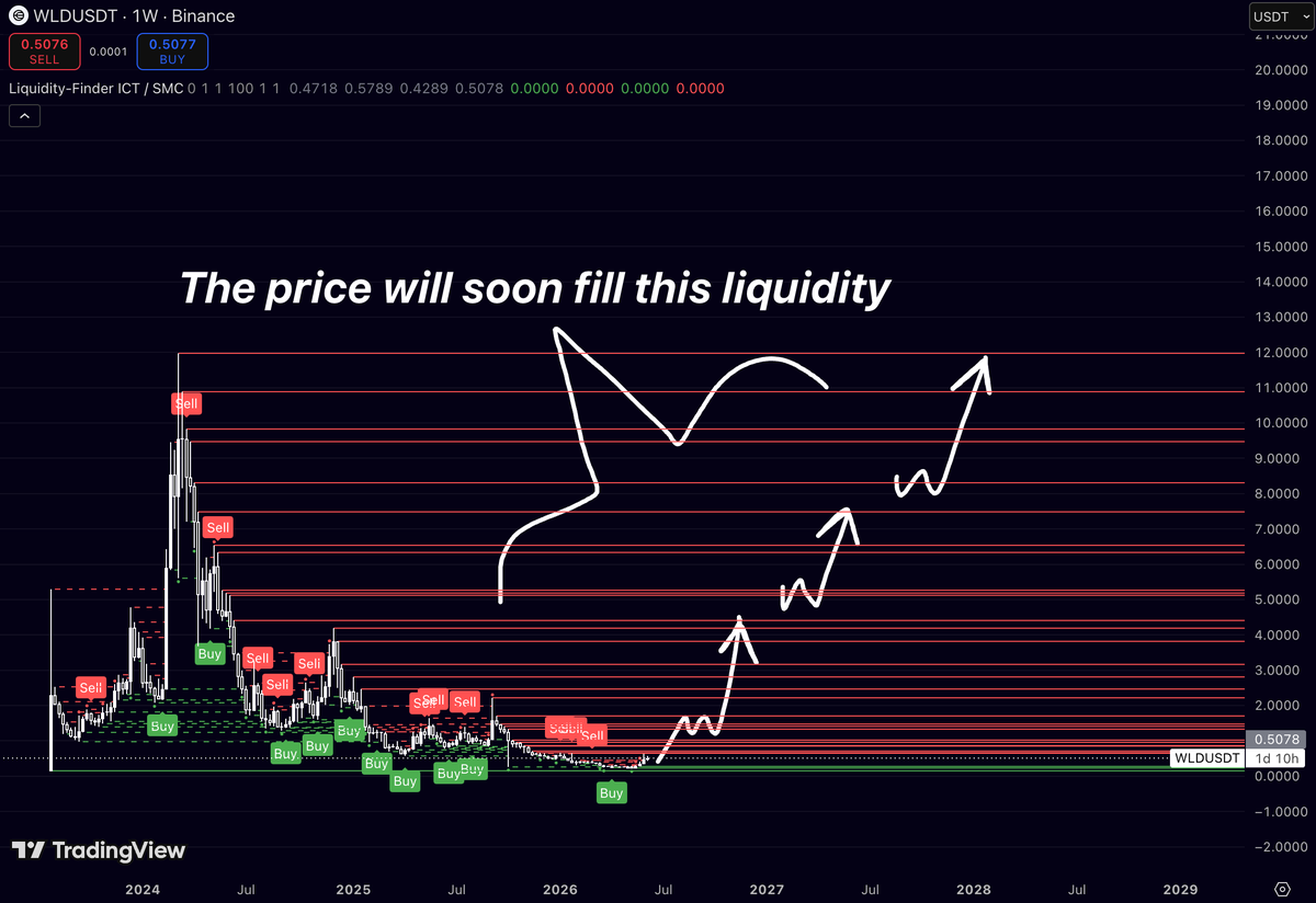
$WLD is sitting on one of the largest liquidity pools in crypto
And the funny part?
Almost nobody cares
Every red line above price is a zone where liquidity was left behind during the collapse from the 2024 highs
The market spent more than a year bleeding lower, trapping buyers at every level on the way down
Now price is sitting near the bottom of that entire range
That’s where things get interesting
Most traders look at $WLD and see a token that’s down 95% from its highs
Smart money sees something else:
A chart with virtually no overhead resistance until the first major liquidity clusters start getting swept
First liquidity zone: ~$1-2
Major liquidity zone: ~$4-5
Massive liquidity pool: ~$10-12
Markets have a tendency to revisit unfinished business
And right now there’s a lot of unfinished business above current price
The crowd spent months selling into fear
If sentiment flips, those same levels become magnets
Nobody is talking about Worldcoin while it’s trading around $0.50
They’ll be talking about it when it’s 5x higher and sweeping the liquidity they ignored
That’s usually how these moves play out
2
293
20h
$NEAR is sitting right on the level that matters
Not $6
Not $8
Right here
The same area that acted as support before the market completely lost momentum
Now price is back above it and trying to turn it into a foundation for the next leg higher
What catches my attention is how clean the roadmap looks from here:
🎯 $1.88 - support successfully defended
🎯 $6.23 - major historical resistance
🎯 $8.22 - final target on this structure
Most traders spend their time chasing candles after a breakout
Meanwhile the best risk/reward usually appears while price is still building acceptance above support
The chart doesn’t need a miracle
It just needs to hold the level it already reclaimed
Do that, and the path toward $6 starts looking a lot more realistic than most people think
3
11
776
Jun 11
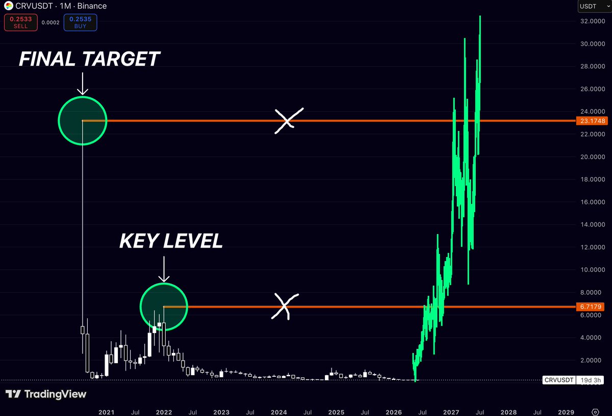
$CRV is still sitting before the REAL move
After years of bleeding and compression
$CRV is sitting near the bottom while two massive historical levels are still above:
📍 $6.7 - first real reclaim zone
📍 $23.1 - final macro target
The market already traded there before
Now the question is simple:
Can $CRV wake up and start taking back old territory?
Most traders will only care after the first breakout
But the best risk/reward usually appears before the chart looks obvious
9
8
109
7,566
Jun 11
$FET has a habit of doing the same thing every cycle
Look at the highs
ATH #1 → ATH #2 → potentially ATH #3
What’s interesting isn’t just the price action
it’s the trajectory
Every major cycle peak has formed along the same rising path
with each bull market pushing $FET into a higher valuation zone than the previous one
📍 ATH 2021: ~$1.3
📍 ATH 2024: ~$3.5
📍 Next projected zone: ~$6
Right now $FET is sitting almost 97% below that projected area
Most people see a dead chart
I see an AI token that already survived multiple market cycles and consistently printed higher highs whenever the sector caught attention again
If the AI narrative returns in force, the next major expansion could be targeting territory the market has never seen before
The chart says one thing:
Higher cycle highs have been the rule, not the exception
5
27
160
5,181
Jun 11
$XLM is one of those charts that nobody talks about at the bottom…
and everybody remembers near the top
The funny thing?
The first target isn’t even ambitious
📍 $0.63
That’s literally where the last major weekly rejection happened in late 2024
A move from current levels to that zone alone would already put $XLM back on a lot of watchlists
Then comes the level that really matters:
📍 $0.79
That’s the 2021 cycle resistance
The place where buyers got trapped and momentum died
If $XLM starts reclaiming that area, the conversation changes completely
Because above $0.79 there’s not much historical structure until the previous cycle highs
Most people see $XLM as a “boomer coin”
That’s exactly why it becomes dangerous
Nobody expects leadership from assets that spent years doing absolutely nothing
But every cycle has a few names that wake up from the dead and outperform expectations
$XLM has already shown twice that when liquidity rotates into it, the moves aren’t gradual
They are violent
The market spent years forgetting Stellar existed
That usually creates the best risk/reward setups
2
245
Jun 9
The scary part about $TEL isn’t how far it has fallen
It’s how much of the chart still sits above current price
Look left
$0.012 was a major turning point
$0.036 was another
$0.065 marked the peak of the entire cycle
For years, the market has respected these levels
And today, $TEL is still trading below every single one of them
That’s why this chart is interesting
Not because something already happened
Because nothing has happened yet
No reclaim
No breakout
Just three levels that could completely change the conversation if price ever starts taking them back
1
11
16
836
Jun 9
Most traders are looking for the next narrative
I’m looking at the same three levels the market has respected for years
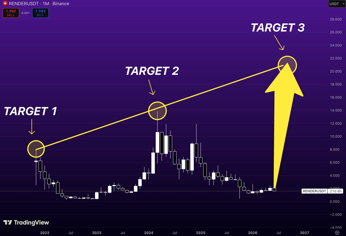
On the monthly chart, $RENDER has already shown where major expansions tend to stall:
Target 1 → ~$8
Target 2 → ~$14
Target 3 → ~$21
Those aren’t random numbers
They’re the exact zones where previous rallies lost momentum and supply overwhelmed demand
Right now, price is nowhere near them
That’s what makes this chart interesting
The upside roadmap is already visible
If $RENDER can build a sustainable trend from these lows, the first major test sits around $8
Above that, the next historical objective is $14
And beyond that lies the final cycle resistance near $21
The market doesn’t need new levels
It already gave us the map
The only question is whether buyers can start the journey
1
14
50
1,769
Jun 9
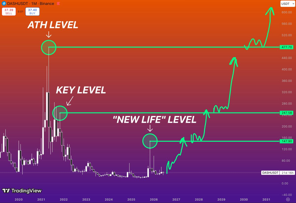
$DASH spent almost 4 YEARS building a base
Most people see a dead coin
The chart tells a different story
Three levels have controlled every major move in $DASH history:
$148 - the level that marked the final breakdown of the previous cycle
$248 - the major distribution zone from 2021-2022
$478 - the all-time high supply level that started the entire collapse
Right now, $DASH is still trading far below all three
Nothing has been reclaimed
Nothing has been confirmed
That’s exactly why it’s interesting
The market spent years compressing near the lows while volatility disappeared and sellers exhausted themselves
Those conditions rarely create continuation lower.
They create expansion
The first real signal comes if $DASH can reclaim the $148 region
That’s where higher-timeframe structure begins to change
Above that sits the “new life” level around $248
A successful reclaim there would place $DASH back into territory it hasn’t held since the bear market began
And if that zone eventually flips into support, the path toward the historical supply around $478 opens up
The biggest moves don’t start after everyone agrees a trend has changed
They start when nobody is paying attention to a market that’s spent years building a foundation
$DASH is still in that phase
5
12
581
Jun 7
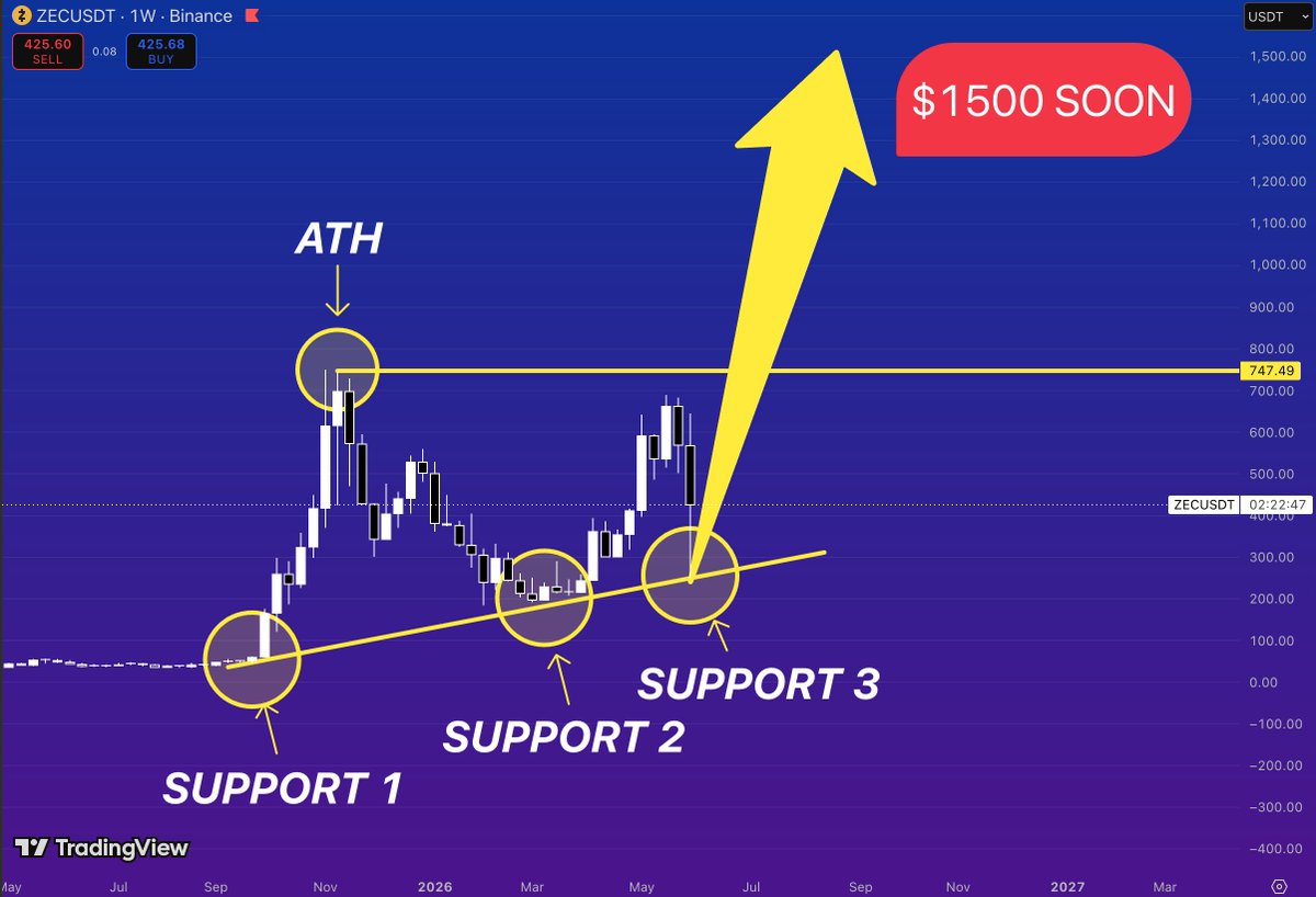
$ZEC might be setting up one of the most OVERLOOKED breakout structures in crypto
Everyone is watching the recent rally
I’m watching the trendline
Since the cycle low, $ZEC has respected the same rising support multiple times
Every major pullback has been bought higher than the previous one
creating a clear sequence of higher lows
That’s not random price action
That’s accumulation
Now zoom out
The next major obstacle sits near the previous all-time high region around $750
A level that rejected price during the last cycle
A level that most traders will likely sell into
A level that hasn’t been tested in years
The interesting part?
Price is approaching that resistance while standing on the strongest structure it’s had in a long time
Three successful support defenses
Higher lows across the entire trend
Momentum returning
If bulls can reclaim the ATH zone around $750, the chart enters price discovery territory
And when an asset spends years building a base before attacking historical highs
the move that follows is often much larger than most expect
The market is focused on where $ZEC has already gone
The real opportunity is what happens if $750 finally breaks
That’s when the conversation shifts from resistance…
to discovery
9
11
67
4,991
Jun 7
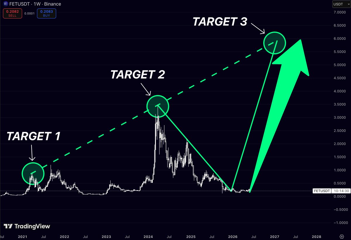
$FET has one of the most obvious repeatable structures in the AI sector
Look at the last three major cycle peaks:
🔹 2021 → ~$0.97
🔹 2024 → ~$3.47
🔹 Projected next expansion → ~$6
The interesting part isn’t the targets
It’s the progression
Every cycle has produced a significantly higher high than the previous one
After the 2024 blow-off top
price spent months bleeding out while most market participants lost interest
Now $FET is sitting near the same accumulation zone where previous major expansions started
If the historical pattern continues:
📍 Target 1: ~$0.97
📍 Target 2: ~$3.47
📍 Target 3: ~$6.00
From current levels, even a move back to the 2024 high would represent a massive revaluation
And if AI narratives return to center stage during the next leg of the bull market
those historical highs may become stepping stones rather than final destinations
No fancy indicators
No complex models
Just a chart showing a market that has repeatedly rewarded patience after long periods of boredom
The biggest moves usually begin when nobody is paying attention
4
26
202
8,696
Jun 7
Most traders are chasing charts that already moved
I’m watching $ONDO
Not because it’s at new highs
Because it’s still sitting below the levels that mattered most during its entire trading history
Current price: ~$0.34
Key levels above:
📍 $0.49
📍 $0.70
📍 $1.17
These aren’t random targets
They’re the exact zones where buyers previously lost control and sellers stepped in
The market has a habit of revisiting those levels when momentum returns
From current prices:
$0.49 = ~40% upside
$0.70 = ~100% upside
$1.17 = ~240% upside
The funny thing about charts like this is that nobody gets excited while they’re building
People get excited after the breakout
After the headlines
After the easy part is gone
Right now $ONDO is still trading well below its major historical resistance zones
If those levels start falling one by one, sentiment will change a lot faster than price did
2
263
Jun 5
$XLM has followed a remarkably consistent pattern across multiple market cycles.
The chart highlights three major support zones that repeatedly acted as the foundation for large impulsive moves higher.
Each time price returned to this rising support structure, a new expansion phase eventually followed.
The first major support zone formed in 2020.
After a prolonged period of compression, buyers stepped in aggressively and launched the rally that carried $XLM into its 2021 cycle highs.
The second support zone appeared in 2024.
Once again, price returned to the same long-term ascending structure before producing another significant recovery move.
Now the market is testing Support Zone 3.
This area sits directly on the same multi-year rising trendline that has supported every major bullish phase shown on the chart.
What makes this setup interesting is that all three support zones developed at progressively higher prices.
That suggests long-term demand has continued strengthening despite multiple bear market cycles.
The structure itself is straightforward:
Support Zone 1
The foundation that preceded the 2021 expansion.
Support Zone 2
The higher low that launched the next recovery phase.
Support Zone 3
The current accumulation area sitting on the same long-term support trendline.
If history continues to rhyme, this third interaction with support could become the launching point for another major move higher.
Markets often revisit the same structural areas because that is where long-term buyers consistently accumulate positions.
For bulls, the thesis is simple:
hold the rising support structure, maintain higher lows, and allow momentum to build above the multi-year trendline.
If that pattern remains intact,
$XLM could be preparing for another powerful expansion phase and potentially challenge the upper boundary of the long-term structure once again.
1
5
6
391
Jun 5
$CHZ has spent years trading in the shadows of its previous cycle highs.
But the chart continues to highlight three historical resistance zones that could define the next major expansion phase.
The first major objective sits at $0.16730.
This level acted as an important reaction point during the 2024 recovery attempt and represents the first serious resistance standing between current prices and a broader trend reversal.
A move into this zone would signal that long-term accumulation is beginning to translate into momentum.
The second target is located near $0.33098.
Historically, this was one of the strongest resistance areas after the 2021 cycle peak.
Previous rallies repeatedly stalled here as sellers stepped back into the market.
If $CHZ can reclaim this level, the conversation would likely shift from recovery speculation to a genuine bull market structure.
The final target stands at $0.65698.
This is the most significant resistance zone on the chart and the level where previous major rallies ultimately lost steam.
A move into this area would represent a full return to prices not seen since the early stages of the previous cycle.
The progression is straightforward:
$0.16730 - Target 1
The first major breakout level and confirmation that bullish momentum is returning.
$0.33098 - Target 2
A key historical resistance zone that could determine whether the recovery becomes sustainable.
$0.65698 - Target 3
The ultimate long-term objective and the level that would complete the full recovery structure shown on the chart.
What makes this setup interesting is that $CHZ has spent multiple years compressing near cycle lows while attention shifted toward newer narratives.
Markets often ignore assets for longer than expected.
But when liquidity rotates back into forgotten sectors, price tends to move rapidly between historical resistance zones.
For bulls, the roadmap remains simple:
break Target 1, reclaim Target 2, and then challenge Target 3.
If that structure unfolds,
$CHZ could evolve from one of the market’s most overlooked legacy tokens into one of the stronger recovery stories of the next cycle.
2
5
12
860
Jun 5
$INJ may have already completed the hardest part of the cycle.
After a prolonged downtrend that erased the majority of its previous gains
the chart is now showing what looks like a classic macro bottom formation followed by the early stages of a trend reversal.
More importantly, price is beginning to move back toward the same historical levels that defined the previous cycle.
The first major objective sits at $16.42.
This level acted as a key support area before the broader market breakdown and represents the first major test for the current recovery.
A successful reclaim would confirm that the recent rally is more than a temporary bounce.
The second target stands at $35.19.
Historically, this was one of the most important reaction zones on the entire chart.
It served as a major turning point during the previous cycle and could become the level that separates a recovery from a true bull market expansion.
The final target is located at $53.03.
This is the level where previous bullish momentum reached its peak before the long decline began.
Revisiting this zone would place $INJ back among the strongest performers in the market and complete a full return to one of the most important resistance areas in its history.
The roadmap is straightforward:
$16.42 - Target 1
The first major confirmation that the bottom is behind us.
$35.19 - Target 2
A critical historical resistance zone that could validate a new macro uptrend.
$53.03 - Target 3
The ultimate recovery target and the level where the previous cycle topped out.
What makes this setup interesting is the symmetry.
The same levels that acted as support during the decline now become the milestones of recovery.
Markets often move in cycles of destruction and reconstruction.
And when an asset survives the destruction phase, the rebuilding process can be surprisingly powerful.
For bulls, the structure remains simple:
Reclaim Target 1.
Break through Target 2.
Challenge Target 3.
If that sequence unfolds,
$INJ could transition from one of the biggest casualties of the bear market into one of the strongest comeback stories of the next cycle.
3
135
Jun 3
$XLM might be one of the most underappreciated charts in crypto right now
Most people look at Stellar and see a coin that hasn’t done much
The chart tells a different story
Look closely:
🎯 Target 1 - ~$0.35
The first major cycle peak
Back in 2018, this was enough to make people feel like geniuses
🎯 Target 2 - ~$0.80
The 2021 blow-off zone
This is where FOMO started hitting harder than common sense
🎯 Target 3 - ~$1.80
Now we’re talking about unexplored territory
A level that would put $XLM into full price-discovery mode
and likely have crypto Twitter posting “Why didn’t I buy more?” every five minutes
The funniest part?
$XLM is currently sitting near the same boring range where people usually lose interest
But crypto history has a habit of repeating itself:
First nobody cares
Then everybody notices
Then everybody pretends they saw it coming
If Stellar can reclaim its old cycle momentum
the path toward $0.35 → $0.80 → $1.80 becomes a lot less crazy than it sounds today
Right now the chart looks quiet
The last time $XLM looked this boring before a breakout, it didn’t stay boring for long
4
17
41
1,062
Jun 3
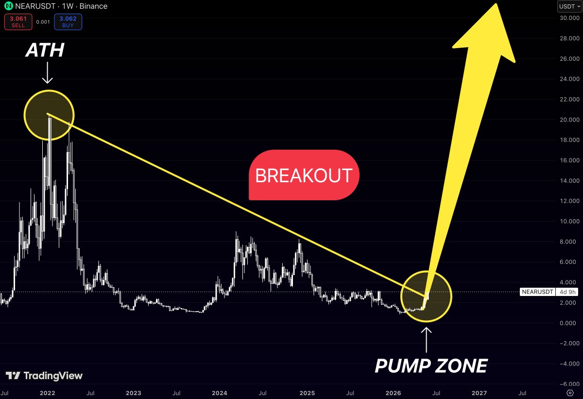
$NEAR just did something that almost nobody is paying attention to
While most traders are busy chasing the latest narrative
$NEAR is sitting right on top of a breakout level that has been building for years
And that’s not an exaggeration
The chart shows a descending trendline connecting the major cycle highs all the way back to the 2021 ATH
For years, every rally ended the same way:
Price pumped
Traders got excited
The trendline said “not today.”
And the move died
Until now
The interesting part is that $NEAR is no longer trading beneath that structure
It’s attempting to break above a resistance line that has controlled the entire bear market
That’s why the highlighted zone on the right side of the chart matters so much
It’s not just another support area
It’s the place where a multi-year downtrend could officially become a new uptrend
If buyers hold this breakout, the chart starts looking very different
The same trendline that acted like a ceiling for years suddenly becomes irrelevant
And when a market escapes a structure that has suppressed it for multiple cycles
the move that follows is often much larger than most people expect
The funny thing about breakouts is that nobody believes them at the beginning
They only become “obvious” after the price has already doubled
$NEAR may be approaching that moment right now
1
16
97
3,315
Jun 3
$SEI may have already completed the hardest part of the cycle
The crash is behind it
Now the chart is starting to resemble a full trend reversal
Most traders focus on where $SEI has fallen from
What matters now is where the previous selling waves ended
The chart shows a clean sequence of lower highs that defined the entire downtrend:
Target 1 - $0.38
Target 2 - $0.75
Target 3 - $1.20
Each of these levels comes directly from previous rejection zones where rallies lost momentum and sellers regained control
What’s interesting is that the pattern of lower highs appears to be complete
Price has spent months building a base near the lows, and the market is no longer making new downside extremes
That’s often the first sign that a bear trend is running out of fuel
The first major obstacle sits near $0.38
This level marked the final lower high before the last major breakdown
Above that, $0.75 becomes the next key area
It’s the zone where a powerful rally was rejected during 2024, sending price back into the broader downtrend
But the real test is waiting higher
$1.20 represents the most important resistance level on the entire chart
It’s where the larger decline began and where sellers last had complete control of the market structure
Markets often move from one major pivot point to the next
And once a long-term downtrend breaks, former rejection zones tend to become the roadmap for the recovery
If buyers continue defending the current reversal structure
$SEI could be entering the early stages of a move toward all three historical resistance levels
The downtrend took years to build
Sometimes the reversal takes less time than anyone expects

2
3
24
1,334
Jun 1
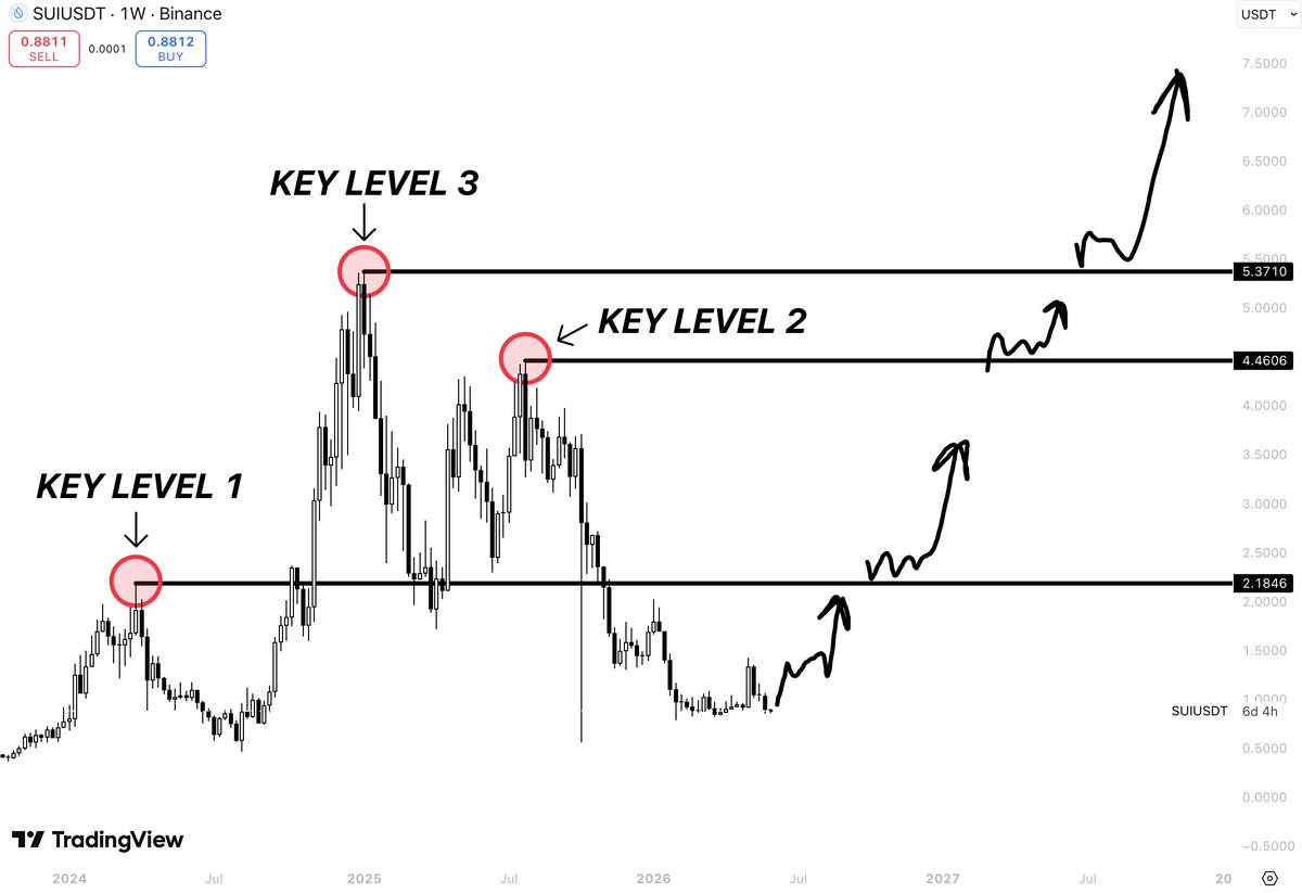
$SUI is approaching the chart like a lock with three doors
The first door sits at $2.18
The second at $4.46
The third at $5.37
What’s fascinating is that all three levels were former rejection zones
Every major rally in $SUI history eventually ran into one of them and failed
Now price is approaching those same levels from below
Not as resistance
As checkpoints
The roadmap on this chart isn’t predicting a vertical move. It’s outlining a sequence:
Reclaim $2.18
Consolidate and break $4.46
Retest $5.37
Enter price discovery above previous cycle highs
Most traders look at $SUI and see an 80% drawdown from the top
This chart looks at the same asset and sees three levels standing between today’s price and a new all-time high
Sometimes the difference between a bear market chart and a bull market chart is simply which side of the level you’re standing on
1
15
618
Jun 1
$SUI is sitting at the same level that triggered every major rejection in its history
The question isn’t whether buyers can reach $2
It’s whether they can break what stopped every rally before
This chart highlights three key resistance zones that have repeatedly dictated $SUI market structure:
Target 1 - $2.00
Target 2 - $4.41
Target 3 - $5.38
These aren’t random price levels
Each one marks a previous swing high where momentum stalled and sellers stepped in aggressively
That’s why they matter
Markets often revisit old resistance before deciding whether a trend has enough strength to continue higher
If SUI starts reclaiming these levels one by one, the structure changes completely
The roadmap is simple:
Break above $2.00
Reclaim $4.41
Challenge the major resistance zone near $5.38
A clean move through all three levels would place $SUI back near the strongest prices it has traded at since launch
For now, all eyes are on the first target
Because every major rally starts with the first breakout

3
8
565