
Joined March 2011
- Tweets 20,416
- Following 986
- Followers 574
- Likes 4,632
2,100 Photos and videos


Pinned Tweet

1 Aug 2025
ARTSTATION makoto-yasumasa.artstation.c…
Proko (drawing) proko.com/@yasumasamakoto/al…
blog(職歴&簡易スケジュール) fresche.xsrv.jp/blog/
効率よく!Blende習得レッスン マニュアル
form.run/@learning-blender-l…
5
7,934
vfxの有名な講座を購入したく思うけどさすがに高い…買い切りならいいけど、サブスクの値段じゃない…なぜバラ売りしてくれないのですか?🙄
63
筋肉痛になると全てのやる気が失せます
When I'm sore, I don't feel like doing anything.
2
45

practiceに練習以外の意味があるのを知らんかった
in practice 実際には
他にも業務、慣例、実践など
思いっきり誤訳しました!
1
63
安正まこと@freelance Blender Helper retweeted

I recommend watching the full video with more details and more examples of avatar interactions here:
youtu.be/rxuubGAwG4U
2
5
1,055
安正まこと@freelance Blender Helper retweeted

Jun 13
1
86
821
40,793

now with nested parentheses! #geometrynodes
4
7
64
3,007
これだよ、この何度も何度も同じ問題を出してくれるのを求めてた!Vectorをマスターしつつ英語の表現も覚えられる一石二鳥
数字に弱すぎて単語がわかっても耳からは状況を全く理解できません。日本語でも頭のなかで声を反復しないと理解できないよ。
1
70
安正まこと@freelance Blender Helper retweeted

Jun 11
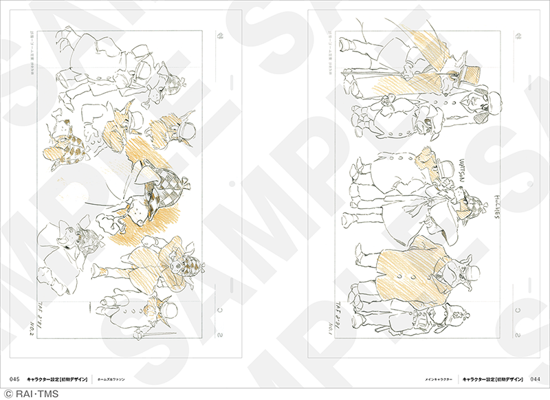
設定資料は宮崎監督体制で制作が進められていた初期制作話数のものと、後に御厨恭輔監督体制で制作された20話分のものの両方を収録。現存するイラストも載せました。そして、制作初期の全26話エピソード構成案も収録。初出資料が満載です。


1
4
14
1,527
自分過渡期(transition period)のことを繁忙期(busy time, hectic days)と同じニュアンスがあると思っていました。しかも両方とも漢字の読み方を間違えて覚えていたよ。
日本語の熟練度が足りません
1
63
フレームのスタート位置が1じゃないとSimulationのGridsが保存されないとかある?この問題にはまって時間を無駄にしている
71
ボーンやオブジェクトに追従するように頑張ってたけど、ギズモを用意して任意の場所にパーティクルを動かして操作してもらうのが一番簡単で楽じゃんね?
失敗からの学びは多いけど時間のロスがきつい
1
90
安正まこと@freelance Blender Helper retweeted

6
115
1,150
21,394
audible と coming through の表現を教えてもらったよ
日本語はキーボード(の音)が向かってくるイメージはないから面白いね
キーボードが音を出しているなら言えるけど
1
3
142

これはゲームのドット絵でも同じことが起こった。パレットが全数百色から数万色になった時点で多くの色彩設計は逆に散漫になった。好きな色が選べる、ということは必死に色を探す、組み合わせるという必然性が減ったからである。我々は色彩そのものに惹かれるのではなくて、限られた選択肢の中での配色の妙に惹かれていたのだ。

standard anime coloring looks terrible in general now but it's most evident in characters with dark skin bc of how important the undertones are in that context


279
944
51,555
自分の担当でしかやらんと割り切ってめっちゃ細かくアニメーションをつけるのは有りかもしれない
皆と共有する素材!って考えるから表現が狭まるのだよ!
限界チャレンジしよ?
1
58
timeエリアを触ったことがなかったのでそこで再生スピードを変更できるのを知らなかった
blender.stackexchange.com/qu…
1
68
Blebder5.1.1のビデオ編集で動画の最終フレームを簡単に静止画で伸ばす方法が知りたいよ
Shift Kの挙動も変わってなんかよくわからなかった
88