
Alpha Exchange is a podcast series by Dean Curnutt to explore topics in financial markets, risk management and capital allocation in the alternatives industry
Joined February 2020
- Tweets 5,266
- Following 1,038
- Followers 19,128
- Likes 52
2,471 Photos and videos


Pinned Tweet

Apr 4
"The Shock Heard 'Round the World: US Government Bonds"
Airpods out of charge? Substack:
alphaexchange.substack.com/p…
Airpods working: Apple:
podcasts.apple.com/us/podcas…
Spotify:
open.spotify.com/episode/1pW…
2
13
9,019
When you are long vol during a market crisis, you have to realize that the very trade you have on is benefitting from the same chaos that policymakers are squarely focused on quelling.
The success of the trade becomes its vulnerability.
The @AnthropicAI blogpost below has me thinking that the long AI trade may similarly become a victim of its own success.
It seems likely that some form of significant regulation is inevitable. When David Sacks validates some of the thinking of an arch-rival like Bernie Sanders on AI, we should notice.
Is any of this risk priced? I don’t think so. These valuations are vulnerable to any number of sources of disruption. Regulatory change is one of them.
anthropic.com/institute/recu…
4
1
31
2,886
100 years of market history in 2.5 mins…a walk down memory lane.
3
22
2,788
wrote this piece to bring together some thoughts on the recent MacroMinds Symposium I hosted...
linkedin.com/pulse/reflectio…
1
5
1,126
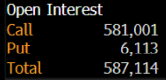
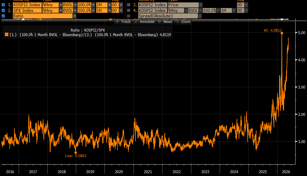
the only thing higher than the ratio of open interest in calls to puts in SK Hynix is the ratio of views of this tweet to words in the tweet. I'll be brief going forward.
x.com/Alpha_Ex_LLC/status/20…
Jun 12

SK Hynix ratio of open interest in calls to puts...roughly 100 to 1. Not sure there's ever been anything this extreme.
2
44
7,758
"Elon's a trillionaire...barely"... check out this comedic genius from Gary Gulman
youtube.com/shorts/izUWMqUd6…
4
1,935
Jun 12
Excellent to host this podcast discussion with @ColinLancaster, Global Co-Head of Discretionary Macro and Fixed Income at Schoenfeld Strategic Advisors.
Lots of insight from Colin not just on markets but also on sourcing talent, building infrastructure, managing risk, and constructing portfolios within the multi-manager model.
Apple pod:
podcasts.apple.com/us/podcas…
Spotify:
open.spotify.com/episode/2BG…
YouTube video:
youtu.be/fYupVYeH2vM?is=LQi-…
1
22
2,422
Jun 12
SK Hynix ratio of open interest in calls to puts...roughly 100 to 1. Not sure there's ever been anything this extreme.
26
106
794
347,204
Jun 11
Brilliant
“Elon just came in and said what the price was . . . there was no price discovery,” said an executive at a large US hedge fund.
I’ve got front month implied vol between 125 and 175 for the first week or so after the options are launched next week. Just a guess.
1
6
49
8,517
Jun 11
Another solid pod from @JackFarley96, this one focused on energy supply with Kepler’s Matt Smith.
The big question: given the epic supply disruption, why isn’t crude higher? There are a bunch of factors here (US supply, decreased demand from China, among them).
But what if crude isn’t higher because of Trump? Getting too long risks being on the wrong side of a tweet that’s good for a 5% (or greater) rally. Jack suggests that Trump has imposed sort of a forward guidance impact on prices. It’s clear he’s looking for the off-ramp and that’s likely on the price.
Here’s the problem that I see: The lack of signal from price removes the urgency to end the conflict. If crude were at 150 and a gallon of gas at 7, the onslaught of media coverage and, perhaps, an even worse expected outcome for the Republicans at the midterms would motivate de-escalatory action. But gas is down 43 cents from the peak.
The “oil vigilantes” can’t motivate Trump via price because he himself can cause these same prices to reverse via a single tweet. If they run up too much, he panics and imposes a rally.
The issue, however, as Matt Smith does a great job of walking through, is that time is the enemy. Price isn’t telling us about the fast worsening supply backdrop. But fast worsening it is.
It’s framed as potentially “sleepwalking into a crisis”.
This isn’t a perfect analogue at all, but monetary policymakers and IMF types epically misread a VIX of 10 in 2006 as a sign of safety and resilience in the system, rather than the opposite.
Is today’s lower than expected level of crude vulnerable to a similar misread? It certainly dissuades action from Trump. Crude vol - way down from its peak - similar disregards the potential for a spike in prices.
podcasts.apple.com/us/podcas…
5
23
4,917
Jun 11
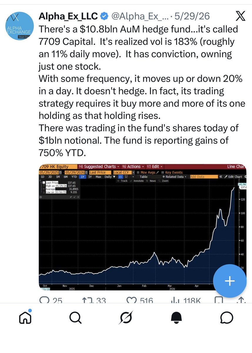
in passive investing, the price is never right or wrong, it just is. you take what the market gives you. if it's early 2000 and the NDX has a trailing P/E of nearly 75 and you are an index tracker, you simply buy the index. you are agnostic to price.
we can say the same about the Fed and also about those indexed to the Barclays Agg circa Aug 2000 when it yielded just north of 1%. there's no contemplation of value in passive.
we can say the same about the leveraged ETF robots. they are there to deliver 2x (and even 3x) the daily return on their underlyings come rain or shine. they are a form of passive as well.
the hedging strategy can lead to some outrageous outcomes, especially when an asset is moving up fast. when this happens, the notional size required to deliver that leveraged return gets enormous.
the market cap of the $SOXL recently reached 30bln (on 6/3). in order to deliver on its 3x mandate, it would have to have 90bln of exposure at the end of that day. that is roughly 55bln of additional exposure versus 2 months prior.
there's a lot of good open debate about the impact of passive investing on market prices. while that goes on, we can definitively say that passive, pricing agnostic investing of the leveraged ETF format is an amplifier of volatility, especially when the ETF is large, returns are very strong and the underlying asset is especially volatile.
27
2,919
Jun 11
$SOXL ... not your father's ETF (or even leveraged ETF) market... a rare 3x daily with 22bln in AuM...its 10 day realized vol is 250. If we take 250 and divide by 16, it's moving 15% a day...That's a lot of daily VaR!
Are there options on this beast? C'mon, of course there are. And they trade in pretty good volume. ...1m implied vol is higher than at any other time than the Tariff Tantrum and Covid Crash.
In summary... we have an index called the SMH with highly correlated, highly volatile names in it, most all of which are enveloped in very strong spot up vol up episodes.
Next, we have not just a 2x but a 3x daily product written on top of that with huge AuM which sometimes sees daily volume exceed 100mln shares. It's rebalancing protocol is robotic and amplifying, buying (a lot) on up days and selling (a lot) on down days.
A one-day move of 14% or greater in the SOXL has happened at least once each of the last 4 weeks. It experienced a 30% loss on 6/5.
Next, we have options on the 3x leveraged ETF. 1m implied vol here has doubled from 90 at the start of 2026 to 180 now. Yesterday 163k options traded, quite a bit given the share price of 180.
===>We've got to appreciate the overlay of these mechanical strategies that introduce short gamma. And zooming out, but keeping VaR close at hand, the 10d realized vol of the QQQ was 12.2 as of last Thursday's close. It's now 32.
That's an enormous jump -- it's the market making your portfolio larger. You have 3 choices... 1) assume this spike in vol will very soon pass and do nothing 2) don't assume it will pass but decide anyway to be larger in VaR terms 3) reduce size to get VaR back on target.
Just as the massive explosion of returns, volatility and volume in gold and silver earlier this year were the market telling you to reduce exposure, there's a similar message here.
3
6
55
12,797
Jun 10
some guesses on the pricing of $SPCX options to be listed next week...
1. one month implied vol between 125 and 175. that means 1m call and put prices (ignoring interest rates) are both roughly between 14 and 20% of spot. at 150 vol, the 1m straddle costs 34%. sounds kind of cheap even, but these are very high levels for a company with a market cap well north of a trillion.
2. the termstructure of vol will be strictly downward sloping. I will put 1m/2m/6m/12m implied vol at 150/125/100/90
3. the 1m strike skew will be flat from the 25 delta put to the 25 delta call, middled at 150. but higher at 10d and 5d points on both the put and call as it is really difficult to be short the tail in either direction.
4. price discovery to be quite healthy, even at low delta points. there's something about very high vol assets that allows the market makers to make tight prices on the wings. I think it's because there will be keen interest from speculators as well, creating 2-way flow. We saw this very much happen in $IBIT and $CRCL on launch.
5. a pretty low put/call ratio. because...what are puts anyway? this stock could literally go "to the moon"...or Mars, at least.
history tells us that these initial levels (again, just guesses) will normalize over time. 150 vol will be difficult to sustain as it requires a nearly 10% move each day in SPCX. the inverted termstructure of vol suggests this.
my guess is that over the course of 3-6 months, it becomes an 80 vol asset...still extraordinarily high for a company with so much market cap, but this is entirely unique.
3
1
39
3,850
Jun 10
updated chart showing ratio of VIXEQ to $VIXY which has moved sharply lower after reaching an extreme.
seeking insights on these (nerdy but important) dynamics in markets is why I hope you follow.
there are few indicators of unsustainable price moves better than a sharp "spot up, vol up" episode. Crude in 2008, Gold in 2011, Bitcoin in 2017, the VIX in 2020, GME in 2021, Silver in 2026, KOSPI in 2026... Each of these featured a feedback loop in which the asset rallied sharply and brought much higher levels of implied vol with it.
x.com/Alpha_Ex_LLC/status/20…
Jun 5
timing risk off episodes is very challenging and it's easy to be "over-insured" in markets (and life). my approach around risk is one that seeks a "balance of evidence" to gain conviction.
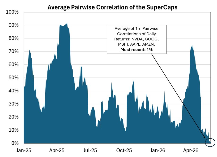
the main question: "is the price of insurance out of step (either too high or low) versus the risks that might materialize?" nothing is a slam dunk, but there are times when the setup yields conviction and for me, tracing the never seen before degree of "spot up, vol up" in chips and memory stocks, the ridiculous trading in leveraged ETFs, and the impossibly low correlation among stocks got me there this time.
note: the $QQQ had realized 16 vol (1% daily move) over the last month and had a move today 5x that. Vol lurching from ultra quiet to an enormous move doesn't happen without feedback from market positioning and the products that exist within the market.
x.com/Alpha_Ex_LLC/status/20…
1
5
39
6,830
Jun 8
You have to love the “I’ll steal the content but move it from Twitter to LinkedIn so no one catches me business plan”

3
1
98
7,536
Jun 8
Thanks for the shout out @tracyalloway
Jun 8

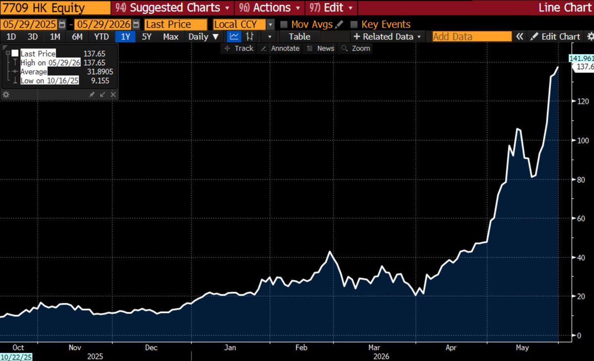
VIX spiking, SK Hynix down 20% since I wrote this
13
5,451
Jun 8
One thing we did new this year for the MacroMinds Symposium was to give our "Premier" Sponsors (at 10k level or higher) an opportunity to contribute some thought leadership to the event. Have a look:
Barclays – Volatility Risk Premia in the VIX Options
Citadel – The Return of Momentum and Retail Influence
CBOE – The VIX Index Decomposition
Morgan Stanley – A New Paradigm for Risk Mitigation Portfolio Overlays
Nasdaq – 100 Index® Micro & Macro Volatility Analysis
Nomura – Why Most Portfolios are Short Interest Rate Volatility
macrominds.org/thought-leade…
1
1
16
5,526
Jun 8
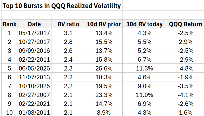
"Move fast and things break"... markets are not good at going from very low vol to something much higher-->
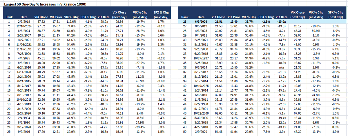
Friday marked the 5th largest "vol burst" ever in the $QQQ. I calculate that as the ratio of Friday's 10d realized vol (26.6) to that of Thursday (11.3). At 2.6x, there are only a few greater. Table below. Also worth noting, Friday was the 26th largest one-day % move higher in the VIX ever.
1
2
49
10,416
Jun 7
26th largest $VIX one-day percentage move higher since 1990...of the top 50 shown below, the average next day move in the VIX is down 5.3% with the SPX up, on average, 53bps.
3
3
37
5,075
Jun 7
Opening remarks for the MacroMinds Symposium I hosted last Thursday.
305 attendees were there to learn, engage, and contribute. Our efforts pushed us over $2mln in total funds raised on behalf of 15 organizations expanding opportunities for students.
vimeo.com/1198827958
2
2,381
Jun 5
timing risk off episodes is very challenging and it's easy to be "over-insured" in markets (and life). my approach around risk is one that seeks a "balance of evidence" to gain conviction.
the main question: "is the price of insurance out of step (either too high or low) versus the risks that might materialize?" nothing is a slam dunk, but there are times when the setup yields conviction and for me, tracing the never seen before degree of "spot up, vol up" in chips and memory stocks, the ridiculous trading in leveraged ETFs, and the impossibly low correlation among stocks got me there this time.
note: the $QQQ had realized 16 vol (1% daily move) over the last month and had a move today 5x that. Vol lurching from ultra quiet to an enormous move doesn't happen without feedback from market positioning and the products that exist within the market.
x.com/Alpha_Ex_LLC/status/20…
Jun 2
There's so much to say about this chart. it shows to very related measures: the ratio of the single stock VIX (VIXEQ) to the $VIX versus SPX 1m implied correlation.
The higher the ratio the lower the implied correl and you can see we are an absolute extreme.
You might say the market is "complacent" by way of the record low IC. Agree the sense that there is a disregard for the potential for a macro shock that hits all assets at once. Said shock would move the current level down and to the right in the chart.
But what's really driving the ratio up and IC down is the level of single stock implied volatility. The number of stocks enveloped in a "spot up, vol up" dynamic is significant. Thus, the VIXEQ is higher now than at the peak of the market shock in late March!
When a stock surges, investors who want to stay long but are worried the rug may be pulled out start looking at call options. They allow you to walk away if things reverse. That demand forces implied vol higher. From the option seller's standpoint, stocks are exhibiting huge one-day "up shocks" that are both difficult and costly to hedge. That gets priced in.
I am reposting my Tweet here on "SK Hijinks" because it' may be the strongest example of the feedback loop between price, implied vol and the overlay of short gamma products.
I think we are getting closer to a tipping point and there's a sharp, tradable reversal forthcoming.
x.com/Alpha_Ex_LLC/status/20…
3
2
49
7,153