
Joined March 2021
- Tweets 794
- Following 104
- Followers 24
- Likes 5,473
7 Photos and videos


Animus.Veritatis retweeted

28 Jan 2025
Boom is supersonic. On Jan. 28, 2025 at 8:31am PST / 16:31 GMT, XB-1 broke the sound barrier.
Chief Test Pilot Tristan “Geppetto” Brandenburg safely and successfully achieved supersonic speed in XB-1, the first civil supersonic jet made in America.
✅New top speed: Mach 1.122 (652 KTAS)
✅New max altitude: 35,290 ft.
✅Flight time: 34 minutes
✅Airspace: Bell X-1 Supersonic Corridor and the Black Mountain Supersonic Corridor in Mojave, CA
XB-1 demonstrates that Boom has the team, technology, and tools to deliver supersonic commercial travel with Overture, cutting travel times in half.
Congratulations to the Boom team on making aviation history!


264
1,209
7,855
1,558,706
Animus.Veritatis retweeted

22 Jan 2025
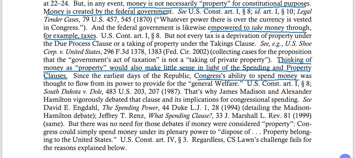
Just about fell out of my chair when I saw this footnote in a brief from the U.S. Department of Justice.
The U.S. Department of Justice apparently takes the legal position that money isn’t property (for “constitutional purposes,” whatever that means). And the DOJ gives three rationales for that argument: (1) the government creates money, so you can’t own it; (2) the government can tax your money, so you don’t really own it; and (3) the constitution allows the government to spend money for the “general welfare.”
Honestly, these arguments read like a libertarian’s fever dream nightmare.
The first argument: Now that the government is off the gold standard (note the prominent citation to the Legal Tender Cases — which upheld laws making paper currency legal tender for payment of debts), fiat currency is just a legal fiction that the government as easily destroy as create.
The second argument: Since we can tax it, we can destroy it.
The third argument: Since we can spend it for the general welfare, you don’t really own it.
But this isn’t a libertarian’s fever dream. This is a real argument made by a real lawyer employed at the honest-to-god U.S. Department of Justice. You can’t make this stuff up.
102
353
1,182
121,073
Animus.Veritatis retweeted
8 Dec 2024
I wrote a thing: De-banking is the visible symptom of a vast and mostly invisible federal surveillance program. If we want to stop de-banking, we should end surveillance and protect financial privacy. ij.org/bank-closure-federal-…
4
7
45
11,419
Animus.Veritatis retweeted
8 Dec 2024
Today let's take a little break from the body-camera footage. Here's an email where a Pasco deputy candidly lays out the objective: "The goal is to get them to move away or go to prison on new charges we discover."
In other words, if they can't actually prove that the people on their list did something wrong, the goal is to make their lives so miserable they move out of the county.
That's what happened to Robert Jones. He was arrested four times on bogus charges, never convicted of anything, but moved his family out of Pasco.

1
4
12
1,193
Animus.Veritatis retweeted
7 Dec 2024
No trial on Saturday, but I would have been working preparing to be back in court next week. So let's keep going.
This is that same December 26 visit. Robert and his family turn off the lights, so the deputy decides to concoct an excuse to arrest Robert.
1
3
12
1,723
Animus.Veritatis retweeted
6 Dec 2024
Today, let's keep going with that same December 26 visit to Robert's house.
Here, deputies knock on the windows and talk to kids inside. They ask one for his name (through the window), accuse him of running from the police by moving from the back of the house to the front of the house, and, when he asks if all this might possibly violate the Fourth Amendment, tell him -- "you're an idiot, you're inside of a house, how are you being detained moron."
1
3
12
3,517
Animus.Veritatis retweeted

26 Nov 2024
I wished that there was a Starship landing video where the framing was better, color was accurate, and the lens wasn't distorted. So I made it.
51
156
2,136
120,287
Animus.Veritatis retweeted

25 Nov 2024
📢 World-first achievements in plasma compression! Peer-reviewed results demonstrating our achievements in creating fusion through MTF are now published in the scientific journal "Nuclear Fusion." Read our announcement: generalfusion.com/post/gener…
2
7
32
1,692
Animus.Veritatis retweeted

24 Nov 2024
San Diego Zoo is the best one
5
3
121
4,114

Animus.Veritatis retweeted

20 Nov 2024
No way he’s still eating 😭
494
13,079
103,219
7,493,261
Animus.Veritatis retweeted

20 Nov 2024

41
242
3,391
75,733

11 Nov 2024
"No property gives unlimited rights. My fee simple in Greenacre does not give me a right to engage in nuisance behavior; tort law gives my neighbors a remedy against that. My ownership of a baseball bat does not give me a right to swing it into the headlight of your car; criminal laws prohibit that. My ownership of a gas station does not give me the right to agree with my competitor about the price we’ll both charge for gas; antitrust laws forbid that. Property rights are always limited rights." - I.P. Law: Cases and Materials, Loren & Miller.
22
Animus.Veritatis retweeted

1 Nov 2024
Something about last night's Halloween aurora is really bugging us...
7
42
358
31,204

Animus.Veritatis retweeted

19 Oct 2024
Uploading some videos from Polaris Dawn.
This first one shows a view over the Middle East through both of Dragon’s side windows, along w/ some ominous-sounding words from the flight surgeon as @annawmenon & @KiddPoteet snake an endoscope up their noses in the name of science.
99
246
2,858
198,878
Animus.Veritatis retweeted

19 Oct 2024
Okay, this is actually the most insane eighth-baked charting I've ever seen, so here I go.
Heinous reporting by WP data science - at best, it just tells half the story of pumping the system unilaterally with debt during COVID. Without even looking at the source data itself -
1) I think this is really bad: the x axes are slightly different ranges which they obfuscate in the labeling. The first is 64 - 18 (46y), and the second is 69 - 18 (51y). In contrast the labels suggest 46y and 44y, respectively.
As a result, the second graph has higher visual slope for the same real period - thus appears to show steeper rates of growth.
2) In any case, this should all be plotted on one coherent x axis (age intervals) with dual-tone histograms showing the extension of net worth (hint: != net future wealth) from 2019-2022.
3) The sample set for each cohort changes for each measurement. By 1989, the average Boomer was 34yo, and the eldest was 43yo. So for x < 43, the set of Boomers is (increasingly) clipped.
At least for the youngest they got the starting age right - you can see data correctly begins at 25yo.
4) Extension of 2. In 1989, the eldest Millennial is EIGHT YEARS OLD. They don't enter the data until 1999. The last ones enter at 2014.
So from this alone, what you're really showing is that real net worth of a median (1989) Millennial - who comes into this dataset in 2007 - didn't grow at all relative to a median (1955) Boomer who enters the dataset in 1973.
That is, until COVID. At which point the Boomers (aged 56 - 74) massively outperformed their parents who held fewer properties and risk assets. And Millennials (aged 24 - 39), holding an even higher proportion of risk assets than the elder Boomers, slightly pulled ahead.
So in median terms, despite massive compound gains in productivity, that's 48 years (2020 - 1972) with NO ZERO ZILCH relative growth in wealth creation across generations. If you assume that roughly the same numbers hold for the eldest Boomers, it's 56 years of stagnation in wealth creation.
The same is NOT true for the Boomers relative to the Silent Generation, but their outperformance is not in the data either because the youngest of that cohort is already 44yo by 1989.
Doesn't that seem....really, really fucked? Wasn't the pitch a better outcome for *all* future little-Johnnys?
Ok moving on. We're not done quite yet.
5) This growth in property and equity values, which is the only damn thing these charts show, is hugely financed by public debt - I've heard that by some measures 85% of $5-7 trillion in COVID stimulus money was saved and invested, not spent.
So if you really want to see what's going in net future wealth terms, you have to discount the numbers shown here in some way by the debt burden on the future tax base. Since the majority of that debt falls on people who have longer remaining lifespans, it disproportionately destroys the Millennials - especially those without equities.
The YOUNGEST Boomers have 16 years left according to average USA lifespan. The median more like 7. The eldest? Been dead for two years.
So here's the thing.
At this point, the story is obvious. We feel it in our inflation, and we hear the strain when talking to anyone under 45yo. We sense it the birth rate, and how society boils over in strange, strange ways.
Millennials in America should be swimming with wealth from multiplicative productive gains and lubricating the economy, to the benefit of their entrepreneurial children, with their spending.
Instead those decades of gains are (almost) entirely hoarded by their parents (which of course drives up rent costs, but I don't even have the energy left to dig into that factor).
So if you thought these charts told a good story, you really need to update your priors.
Misallocation of resources has pushed this society to the fucking limit, and it really shows.
After all, the data doesn't lie.

1
2
35
2,856
Animus.Veritatis retweeted

17 Oct 2024
We've won a flight award for our Trash Compaction and Processing System. NASA plans to test the tech on the ISS in 2026. The system compresses trash into solid square tiles that can be used for radiation protection, while recovering 98% of water.
Release: bit.ly/4f96PJu

6
33
170
6,489