Product designer helping products improve conversion & retention through UX Research | UX Audits | Websites, mobile & web apps | amayinde40@gmail.com
Joined February 2022
- Tweets 542
- Following 939
- Followers 403
- Likes 875
Photos and videos
Pinned Tweet

22 Aug 2025
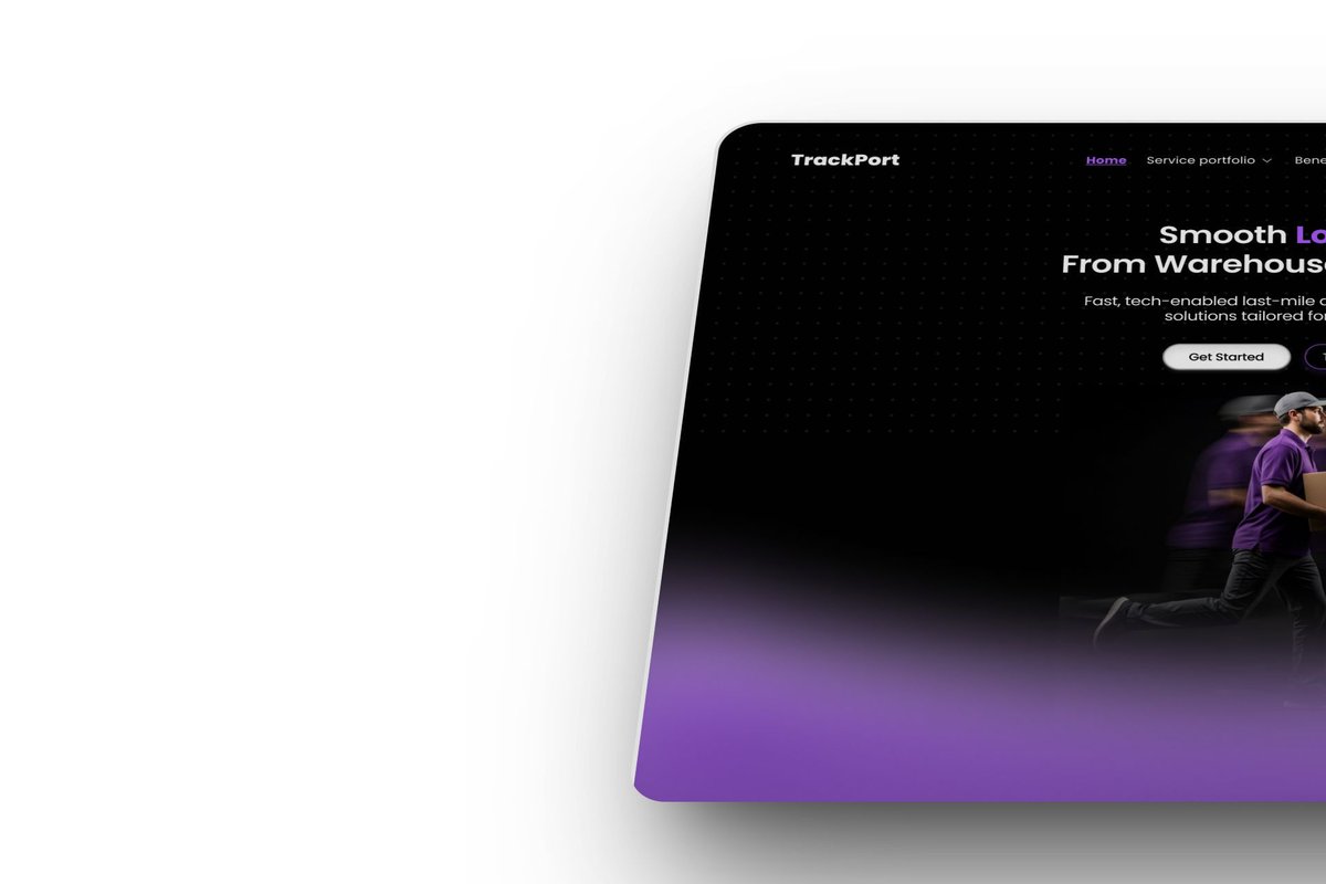
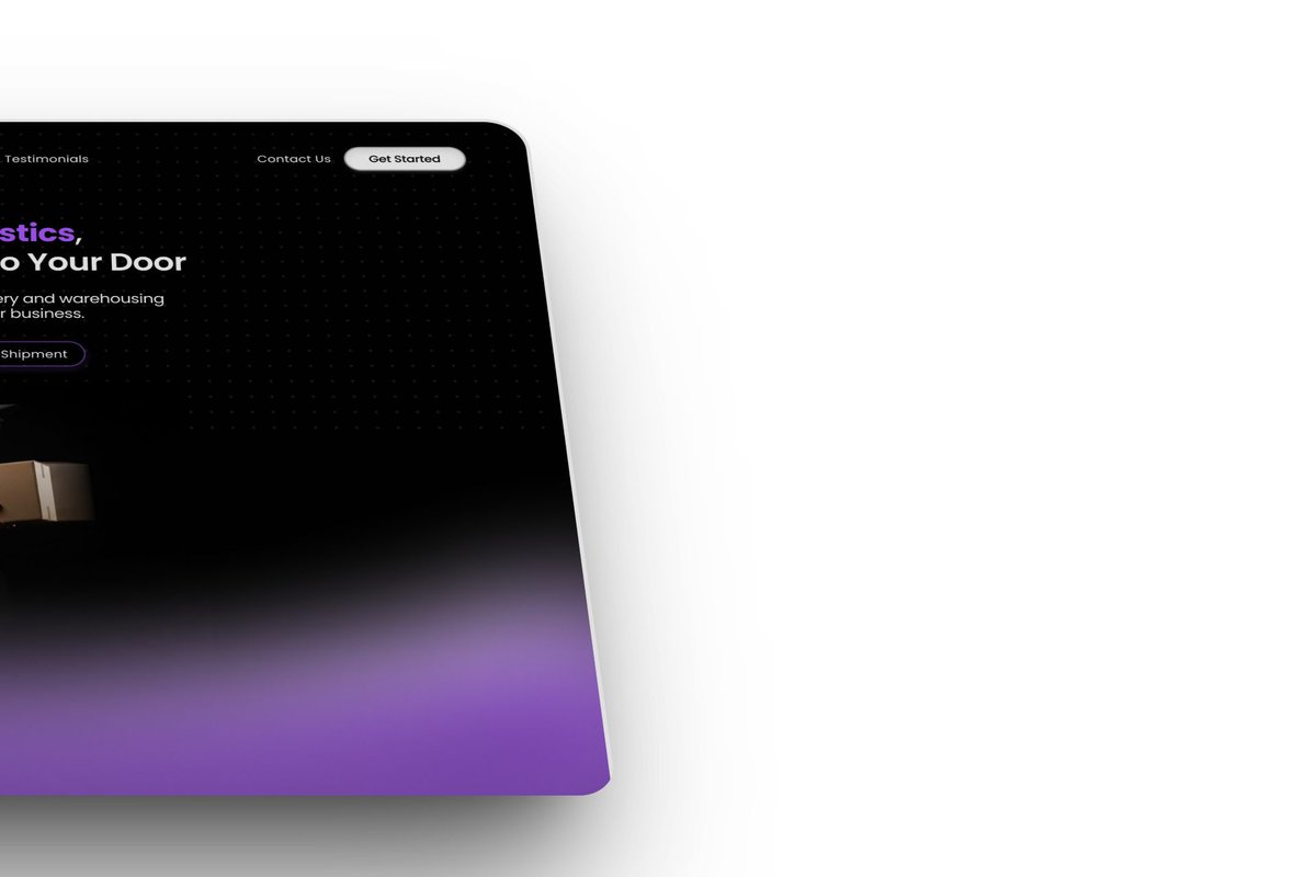
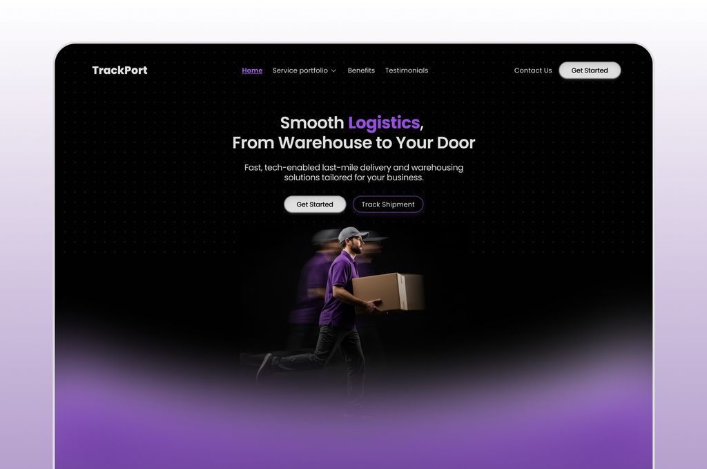
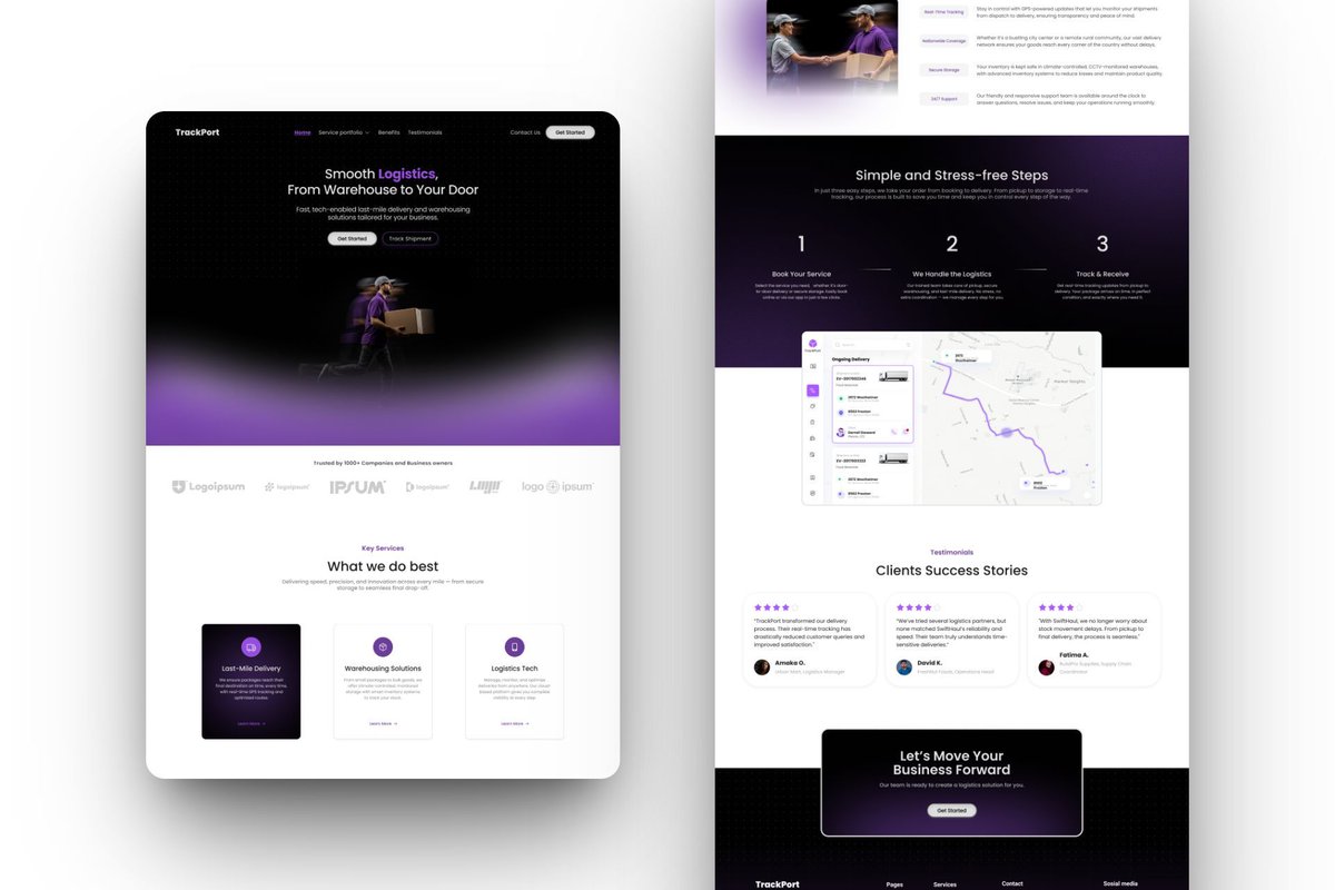
A landing page isn’t just about looking good, it’s about guiding visitors, telling your story, & turning clicks into action. Here’s a landing page design that blends clarity, visuals & strategy for results that matter.
Let’s create a website that not only attracts but converts.
2
1
16
733
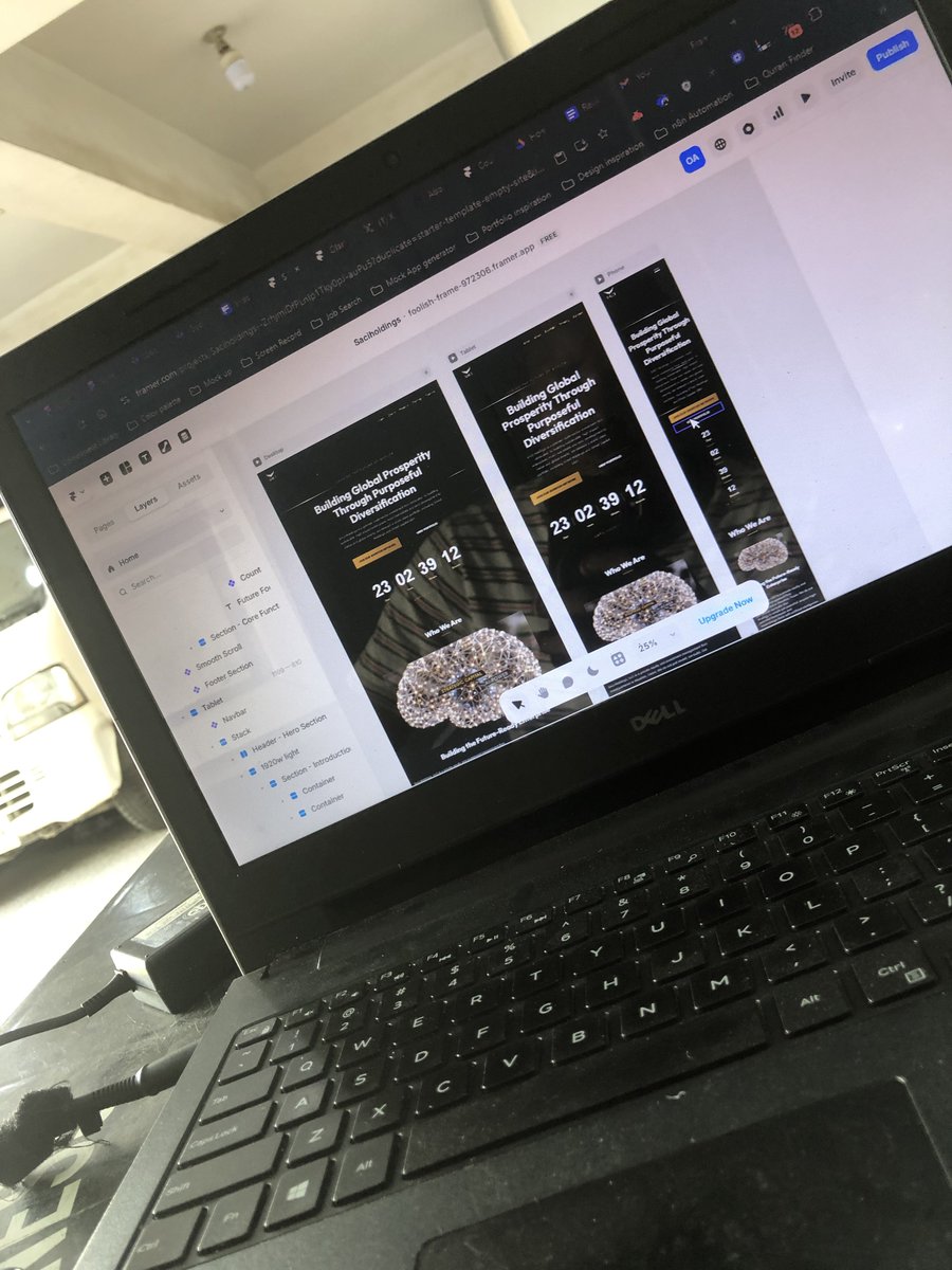
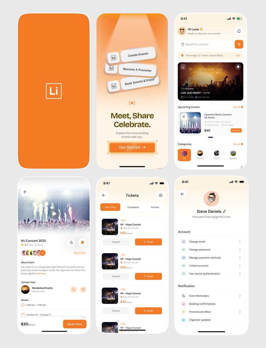
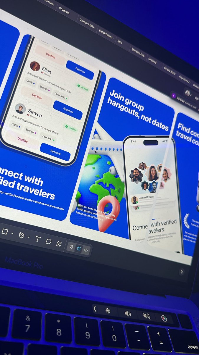
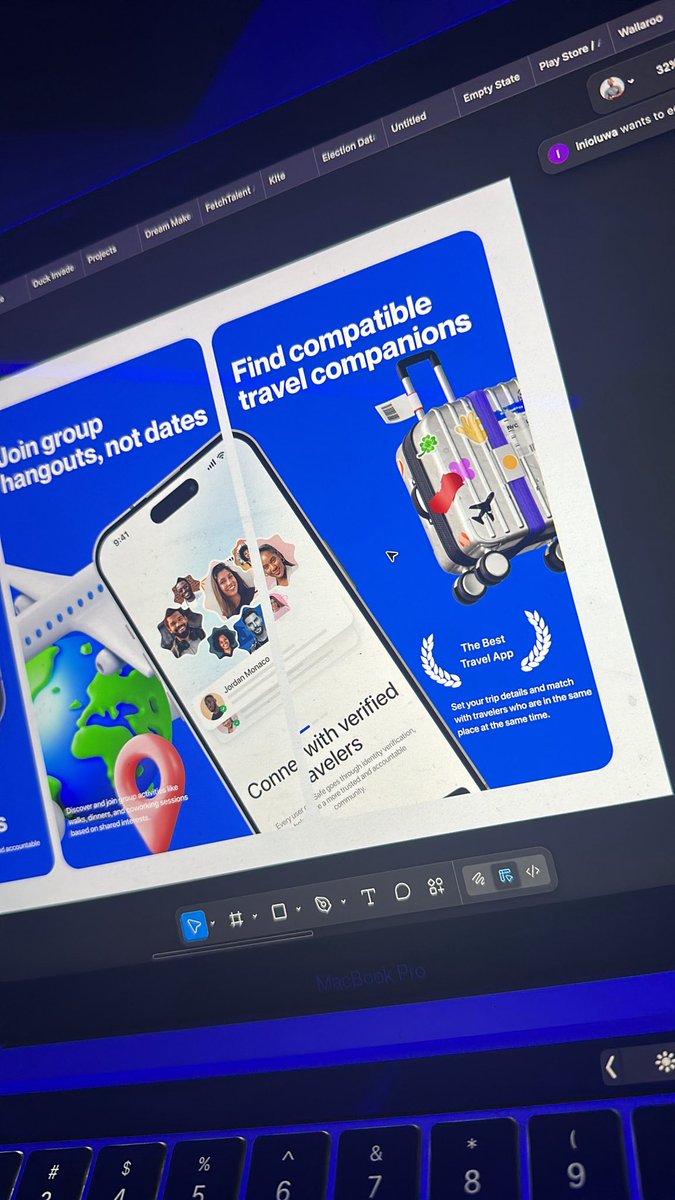
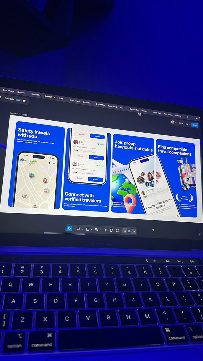
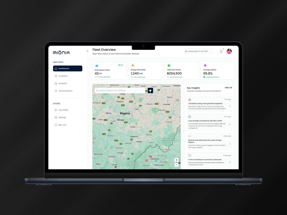
Just published a comprehensive case study on Mionia mobile application.
Mionia mobile app was designed to help users monitor, manage, and optimize their access to their Mionia Powerbox.
Check out the case study here:
behance.net/gallery/24519678…
2
31
Same here..
My testimony is sooooooo near already.
Mar 3

The number of 'I got the job' tweets l have seen today ehn
It just has to be a sign 🥹
Wow!! Big congratulations to everyone.
3
23
Congratulations Saga 🎉
I'll keep congratulating people until it gets to my turn.

My turn is finally here🥹🥹
I just secured my first international full time role.
The perfect way to start the new month💃🏻💃🏻💃🏻
1
10
1,694
You'll think AI will take my job until you feed it rubbish.
1
17
Started my full course meal on digital marketing over the weekend.. really just have to find a way around marketing myself and my skill.
GM.
2
4
116
Even on weekends.. I just can’t afford to close this laptop for too long..
At least, not yet.
22
Ayomide | UX/UI Designer retweeted

Feb 9
Stop designing prototypes to validate your designs! ❌
5
10
113
4,845
Absolute truth 📌
Feb 10

I used to think mastering Figma mattered. It doesn’t.
Understanding problems matters.
Asking better questions matters.
Communicating decisions matters.
Tools change. Thinking doesn’t.
#Figmadesign
1
1
4
184
Ayomide | UX/UI Designer retweeted

Feb 9
Designing apps needs so much details✨
Who agrees?
47
16
264
5,847
The loads of things i want to learn this year scares me but we go harder 📌
1
1
33
Ayomide | UX/UI Designer retweeted

So this is the tool I was talking about. It notifies me instantly when jobs are posted on Upwork.
In a single day, I can get 200 alerts from jobs in my niche based on my keywords and bio.
It can also generate custom proposals and lets me brainstorm responses.
This gives you a serious leverage point.
t.me/UseOutbidBot?start=CROW…
Repost and share for more reach


You guys, I just found a tool that can completely change your Upwork game.
I’ll be sharing more details about it tomorrow. Stay tuned.
30
75
518
62,170
Ayomide | UX/UI Designer retweeted

Feb 9
I love creating great product design
68
74
1,225
43,702
Ayomide | UX/UI Designer retweeted

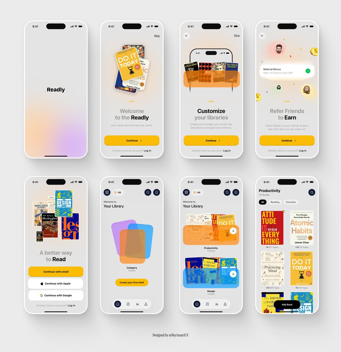
Screens that sell the product before the download.
App Store screenshots. 🚀
37
24
405
14,418
Ayomide | UX/UI Designer retweeted

GM guys
What are you working on today?
23
6
73
1,090
Ayomide | UX/UI Designer retweeted

Feb 10
Good morning ☀️
It’s another day to keep showing up.
Design Tip 116: Consistency reduces friction. When patterns feel familiar, users move faster and with more confidence.

Good morning ☀️
It’s another day to keep showing up.
Design Tip 115: Color isn’t just decoration. Use it to guide, inform, and create meaning for your users.
7
6
41
1,956
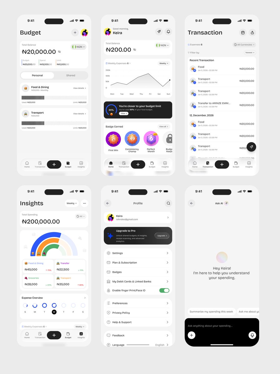
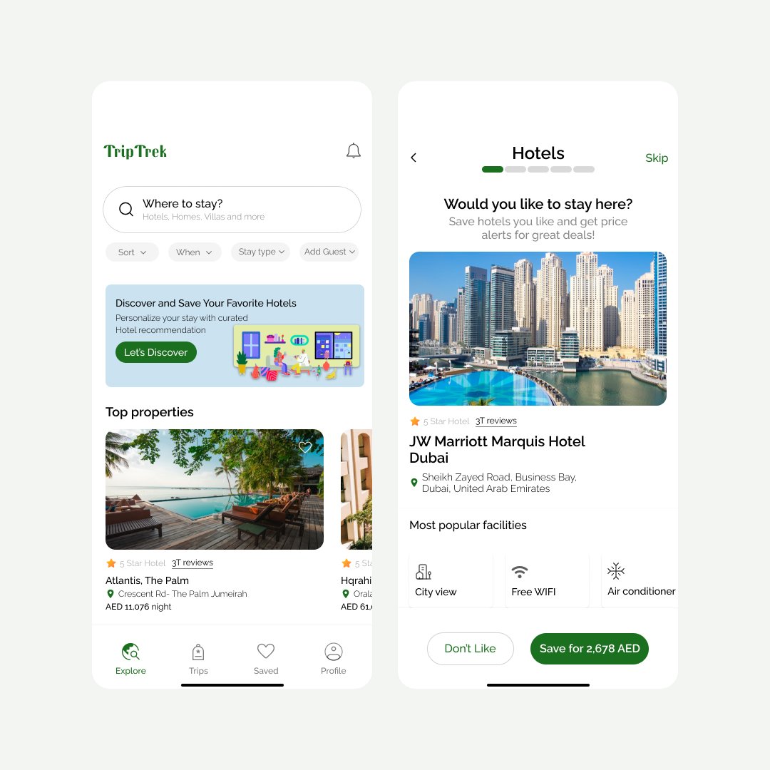
Designing dashboards for energy systems taught me one thing fast:
clarity beats cleverness every time.
For Mionia’s cloud platform, the focus was simple: Strong hierarchy, calm & neutral foundations, color used only where it truly matters (alerts, performance, anomalies).
1
18

Ayomide | UX/UI Designer retweeted

Finally set up proper color variables yesterday and… yeah, I have seen the light😂
26
10
193
3,345