
Joined April 2026
- Tweets 251
- Following 51
- Followers 44
- Likes 182
17 Photos and videos


Pinned Tweet

Apr 29
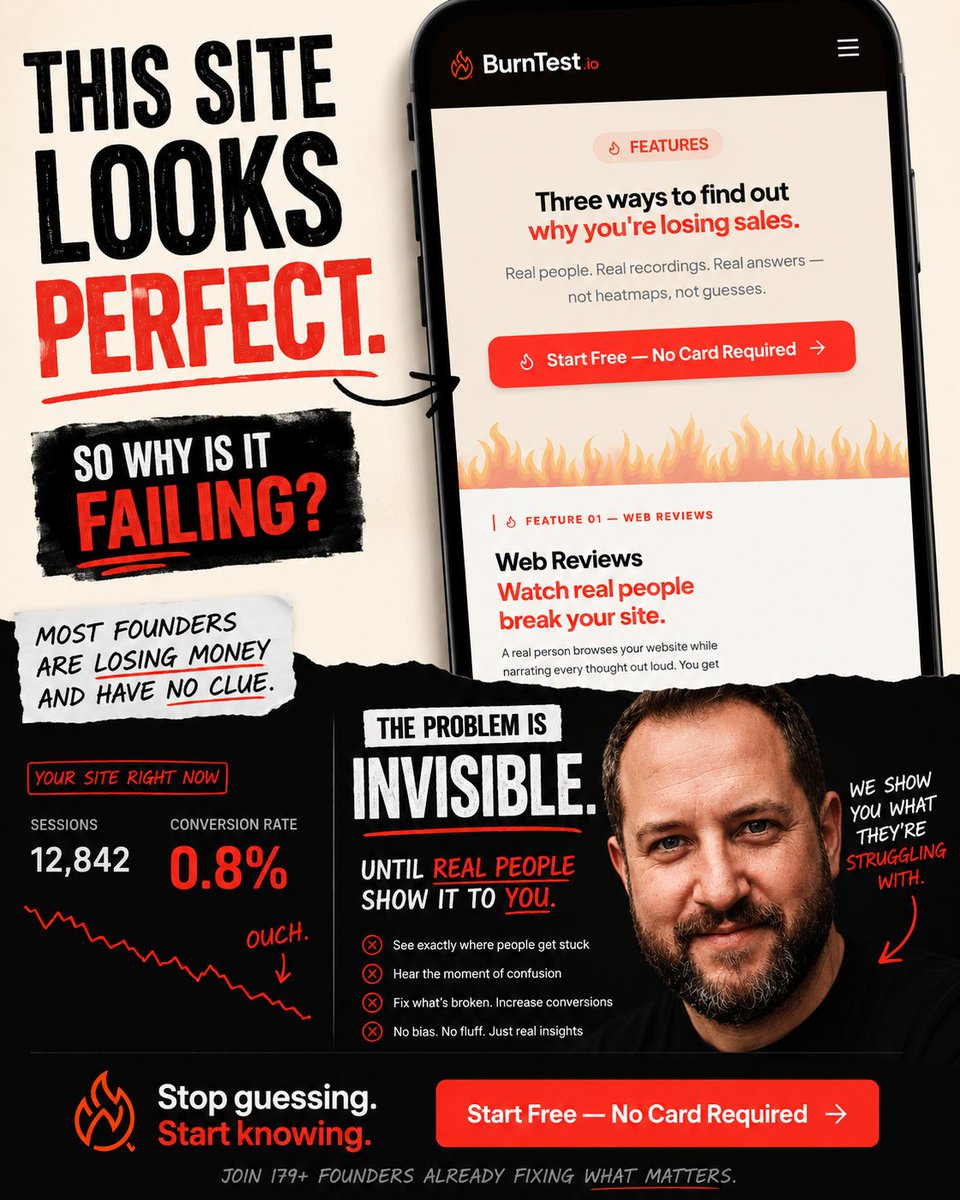
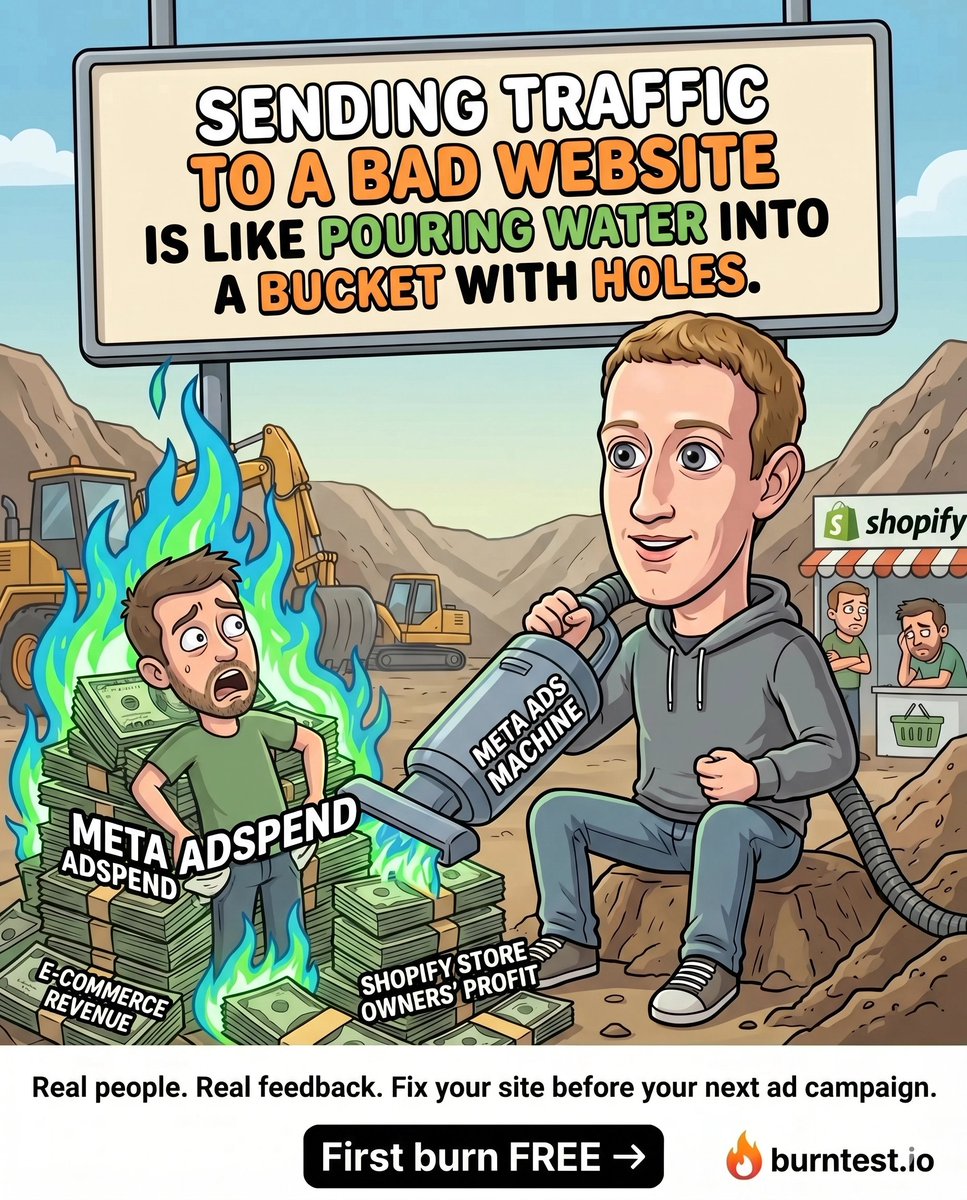
Dropping $7 on coffee while your site burns $3k in ad spend... Priorities right?
Get brutally honest UX vocal feedback review from a real human, backed by AI tactical fixes, for the price of your daily caffeine addiction.
First burn is free 🔥 (No credit card required)
6
27
127
2,158,543
Your privacy policy isn't just a legal document. It's a trust signal. If it's buried, unreadable, or full of jargon, people assume you're hiding something. Make it accessible and easy to understand. Show them you respect their data. Or they'll just bounce.
1
Jun 14
Which design trend is most likely to kill conversions? - Parallax scrolling
- Auto playing video
- Hamburger menu on desktop
- Overly complex animations
1
Jun 13
That little "password strength" indicator? It's not just a UI element. It's a conversion tool. If it's always red or just says "weak," people get frustrated and bail. Give them clear, actionable feedback. Suggest what to add. Make it a game they can win, not a wall they hit. Redu
4
Jun 12
Your mobile menu isn't just a list of links. It's a lifeline. If it's a tiny hamburger icon in a corner, or a sprawling mess of 50 items, people will ditch your site. Prioritize. Group. Make it thumb friendly. Your mobile users are busy. Don't make them work for it.
3
Jun 11
Your website isn't a gallery for your design team's latest trends. It's a sales tool. If it looks "cool" but doesn't clearly guide visitors to action, it's a failure. Stop prioritizing aesthetics over conversions. Pretty doesn't pay the bills. Clarity and purpose do.
4
Jun 10
That little loading spinner on your site? It's not just a placeholder. It's a perception game. If it hangs too long or just sits there, people think your site is broken. Give them progress. Show a percentage or a fun animation. Manage their impatience. Or they'll just close the t
4
Jun 9
That little chat icon on your site? It's not just support. It's a conversion tool. If it's static or hidden, you're missing out. Make it proactive. Trigger it with a helpful message after 10 seconds or on exit intent. Answer questions before they leave. Don't wait for them to ask
2
Jun 8
That generic "Submit" button on your forms? It's a conversion killer. What am I submitting? My soul? Change it to "Get My Free Guide" or "Start My Trial." Tell people exactly what they're getting. Clarity beats ambiguity every single time. Stop making them guess.
1
9
Jun 7
Stop thinking of your website as a brochure. It's a machine. Every page, every button, every headline has a job: to move someone closer to a goal. If it's not doing that job, it's broken. Fix your machine. Or it'll just sit there, looking pretty and making zero money.
4
Jun 6
Which is more important for a high converting website? - Design aesthetics
- Content quality
- Technical performance
- User experience (UX)
7
Jun 5
What's the *biggest* conversion killer on a website? - Bad copy
- Slow loading
- Poor navigation
- Ugly design
4
Jun 4
Your website's favicon isn't just a tiny logo. It's a persistent brand reminder and a trust signal in a sea of tabs. If it's the default browser icon or missing, you look amateur. It's a tiny detail with outsized impact. Don't overlook it. It tells people you care about the small
13
Jun 3
Your hero section isn't just a pretty picture. It's prime real estate. If your main headline isn't crystal clear about what you do and who it's for, you're wasting valuable seconds. Don't make them guess your value. Spell it out. Immediately. Or they're gone.
6
Jun 2
Your "About Us" page isn't a company history lesson. It's a conversion opportunity. People visit it to build trust, not read your founder's bio. Show them *why* they should care, *who* you help, and *how* you solve their problems. Make it about *them*, not just you.
9
Jun 1
Your website's footer isn't just for copyright info. It's a second chance. People scroll there looking for specific things: contact info, privacy, or key categories. If it's a barren wasteland, you're missing an easy win. Make it useful. Guide them to what they're actually lookin
4
May 31
What's the *most* important element for a website's conversion success? - Clear value prop
- Fast load speed
- Intuitive navigation
- Compelling CTA
8
May 30
Your first click behavior on a page sets the tone. If users have to hunt for the main action or decipher what to do next, you've already lost. Make the primary CTA obvious. Don't make them think. Guide their eye. Every millisecond of hesitation is a step closer to them leaving.
6
May 29
Your website's scroll depth isn't just a number. It's a clue. If users aren't scrolling past your hero, your value proposition isn't landing. If they stop halfway, your content is boring or confusing. Don't just track it. Analyze *where* they stop and *why*. Then fix it.
5
May 28
Your privacy policy page isn't just legal boilerplate. It's a trust signal. If it's buried, unreadable, or looks like it was written by a robot from 2005, you're eroding confidence. Make it easy to find and understand. Show users you respect their data. Or watch them bounce.
7
May 27
Your website's navigation isn't a sitemap. It's a guided tour. If you're just listing every page, you're making users work too hard. Curate the path. Highlight what matters most. Don't force them to explore when they're trying to accomplish something. Lead them.
4