
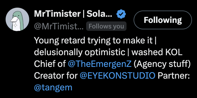
I write posts you'll want to steal ▸ The content strategist & ghostwriter behind your favourite brands ▸ Just typing...
Joined March 2024
- Tweets 65,884
- Following 1,883
- Followers 7,218
- Likes 93,292
1,999 Photos and videos


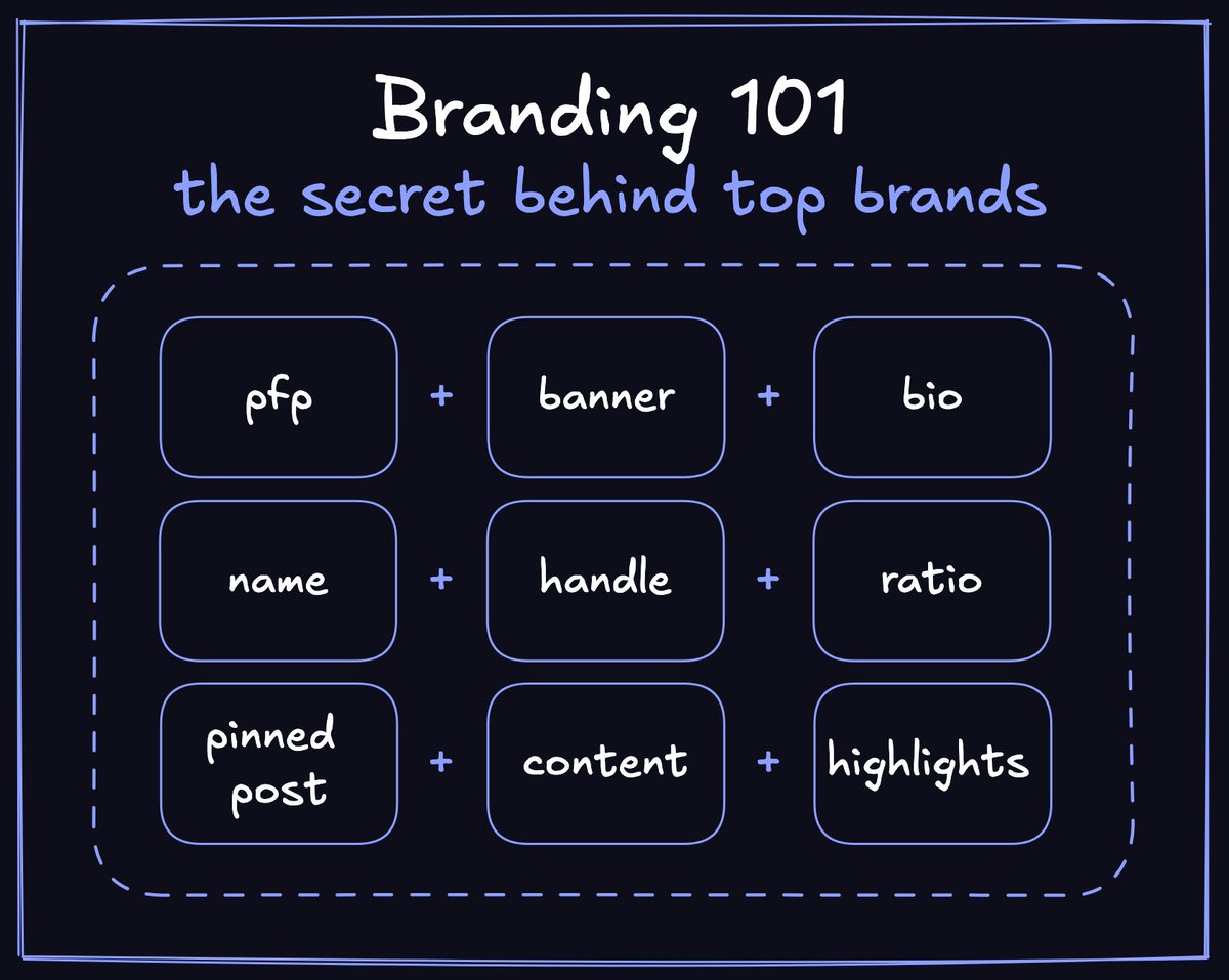
Your profile is the reason people don’t follow you
their first impression on your profile decides if they stay or leave
if your profile is messed up, most people will never follow you
but you can fix it easily
here’s how to make a strong first impression that makes people follow you:
> get a clean pfp. you can use ai for it, but make sure it doesn’t look sloppy
> get a good banner, if you don’t know how to make it look good, then just keep it minimalistic, it looks good in 80% of cases
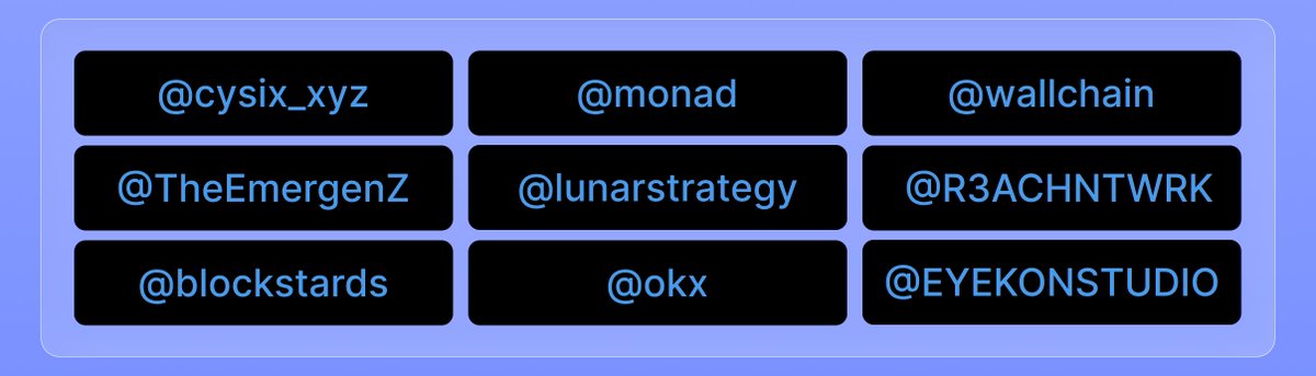
> make a clean bio, and never use these words in your bio “airdrop”, “farmer”, “yapper”. also don’t tag too many projects, you’re not a billboard
> make sure your username is short, unique, and easy to remember
> make sure your handle is not random, it should be related to your name. also i wouldn’t recommend adding any numbers to your handle
> your followers:following ratio should not be worse than 2:1 or 3:1. for example, if you have 2k followers, you shouldn’t follow more than 1k people
> get a strong pinned post. i recommend pinning big wins, strong achievements or educational content that shows you’re an expert in some niche
> make sure your content isn’t slop. don’t repost too much and don’t post too many promos. if someone scrolls your profile and sees too many ads, they won’t follow you. also, visuals are important, learn how to make them look good
> clean up your highlights. if you pinned low quality posts before, you should remove them
and the best advice for people who already have a poor reputation:
- do a rebranding
it works really well. people might have stereotypes about your pfp. the only way to remove them is by rebranding and starting to post better content
this is the only post you need to make your profile look better
now go fix it
105
1
374
23,563
I’ve been posting a lot less lately
not because i’m bored of crypto or twitter
i just spent the last few days working on a new content strategy and figuring out where i want to be in the next few months
set my goals for the next 3 months and from today i’m locking in more
time to run it back
109
143
1,740
Starting to think this is all wale's fault
Jun 7

If you didn't extract a couple million dollars from crypto yet you should probably start soon
102
1
179
2,793
Buzz retweeted

Jun 9
if you ask me who had the biggest impact on me in CT
my honest answer :


85
3
134
2,565
A lot of crypto brands have good products and terrible content
they spend months building something
and 10 minutes ai slop posting about
that’s why they fail.
their distribution isn’t good enough
and that’s exactly why these brands need interns, SMMs and ghostwriters
79
120
1,183


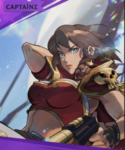
Buzz retweeted

Jun 8
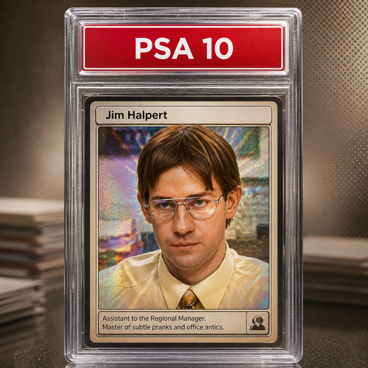
That's what my pfp would be if it were a card
show me yours

101
2
173
12,375
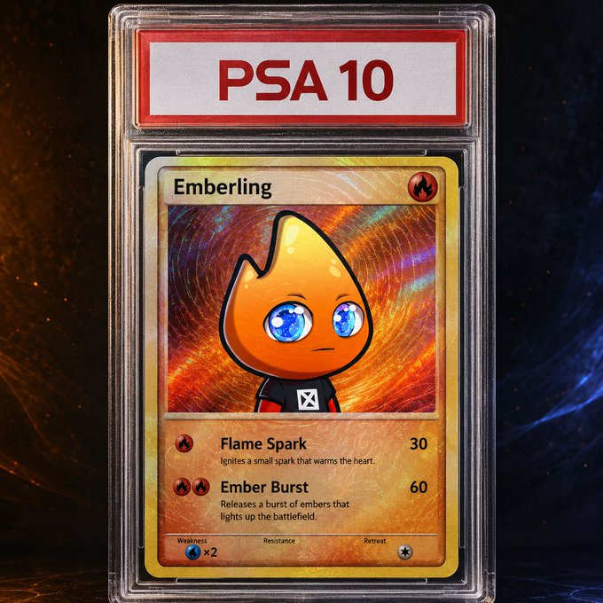
That's what my pfp would be if it were a card
show me yours


84
126
16,382
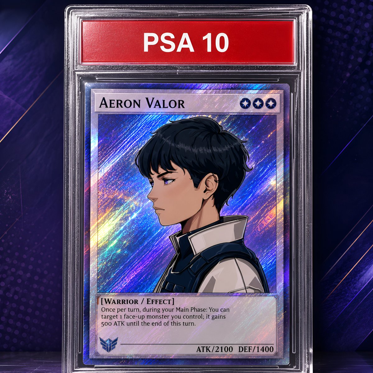
the prompt: x.com/ClutchPacks_io/status/…
Jun 8
Transform the uploaded PFP into a premium graded trading card inside a highly realistic plastic graded slab case, inspired by real collectible trading cards and PSA-style slab presentation.
The final image must be square (1:1). The slabbed card should dominate the composition and occupy around 90% of the total image area. Keep the slab centered, large, clean, and highly readable, with only a small amount of background visible around it.
Use the uploaded PFP as the source identity for the card art. Preserve the key identity of the PFP: face, silhouette, expression, main colors, and recognizable design details. Reinterpret it as a polished trading card illustration, but keep it clearly recognizable.
The slab must look convincingly realistic: transparent hard plastic, proper thickness, layered casing, subtle reflections, clear edges, clean highlights, and premium collectible presentation. It should feel very close to a real graded slab.
At the top slab label area, display only:
"PSA 10"
Do not include any other slab-label text. No serial numbers, no barcode, no year, no manufacturer, no extra metadata.
Inside the card itself, place the card title in a normal traditional trading-card name field at the top of the card, above the artwork, like a regular TCG card layout. The title should use a clean, normal, readable font, not a fantasy logo font, not an ornate banner, and not a decorative metal plate. The title should feel like a proper standard card name.
The card title must be derived from the uploaded PFP’s character, archetype, or theme. Generate a short fitting title based on the PFP.
Very important: remove the extra decorative gold frame around the PFP artwork. Do not use an ornate golden inner frame, no heavy luxury border, and no fantasy-style card frame surrounding the character art. The PFP artwork area should be cleaner and more like a standard trading card illustration window, with a simple elegant card structure.
The inner card layout should feel like a real TCG card:
- title field at the top of the card
- main artwork window below it
- clean card structure
- tasteful border treatment
- subtle collectible feel
- but no ornate gold frame around the character art
The featured card art should be based on the uploaded PFP and remain the visual focus. It should feel like a premium TCG illustration, clean and collectible, without changing the identity of the character.
The background outside the slab should not repeat the character. Do not place a second version of the PFP in the background. Instead, create a background inspired only by the PFP’s style, palette, mood, and visual energy. It can be abstract, graphic, textured, or atmospheric, but it must not duplicate the character.
Apply a random collectible TCG finish effect to the card surface. For each generation, randomly choose 1 or 2 effects from this list only:
holo, foil, full foil, reverse holo, cosmos holo, galaxy holo, mirror holo, rainbow holo, glitter holo, swirl.
Use only 1 or 2 randomly selected effects per card, never more than 2. The selected effects should enhance the collectible premium look of the card, while keeping the character art, title, and layout readable. The finish effect should feel like a real printed TCG card surface treatment, not like random glowing VFX. Keep it tasteful, premium, and believable.
Overall style: premium collectible slab card, clean TCG presentation, sharp details, realistic plastic slab, elegant card layout, readable typography, no clutter, no AI slop.
Important priorities:
1. The slab must look highly realistic and close to a real graded plastic case.
2. The slabbed card must occupy around 90% of the image.
3. The uploaded PFP must remain recognizable.
4. The card title must appear in a normal trading-card name field above the artwork.
5. Use a normal readable font for the title.
6. The top slab label should only say "PSA 10".
7. Remove the extra ornate gold frame around the artwork.
8. The outer background must be inspired by the PFP style only, without repeating the character.
9. Randomly apply 1 or 2 finish effects from the approved TCG effect list.
10. Keep all text and artwork readable even with the finish effects.
Aspect ratio: 1:1.
10
713
Starting a little crypto experiment today
i'm putting $1k into crypto over the next 20 weeks
$50 every week split across:
> btc: 50%
> eth: 25%
> sol: 15%
> hype: 10%
i don't really care about the price
i'll be buying the same amount every week no mater what happens
if it goes well, i might increase the amount after the 20 weeks are over
let's see where we end up
i'll keep y'all updated
102
3
163
3,352


