
1,743 Photos and videos


DXN retweeted

Jun 5
June is off to a beautiful start so...
I'm giving away 5 FREE $100k Zero accounts with @Alpha_Futures_
To enter ⬇️
- follow me @Alpha_Futures_
- comment code PJ
- retweet this
- tag 2 people
Winners announced Tuesday.
Good luck 🔥

1,209
1,010
925
25,924
DXN retweeted

22 Jul 2025
Honoring the legacy of the Prince of Darkness 🦇

58
58
257
6,781


DXN retweeted

12 Jul 2025
Chills running down my spine... thanks @cabralcf_ & @zubic_eth
The SE 3 years in the making...
Golden Don Mega aka degentuna aka the trait megalodon of @SpaceRidersXYZ

40
34
144
3,363
DXN retweeted

21 May 2025
Global Market Trends
Global markets wobbled on May 21! 🌍 US policy uncertainty & rising yields hit equities. Japan’s Nikkei slipped with 0.7% GDP contraction, while China holds firm on stimulus hopes. Tariff fears linger. #GlobalMarkets #Finance
1
2
172
DXN retweeted

13 May 2025
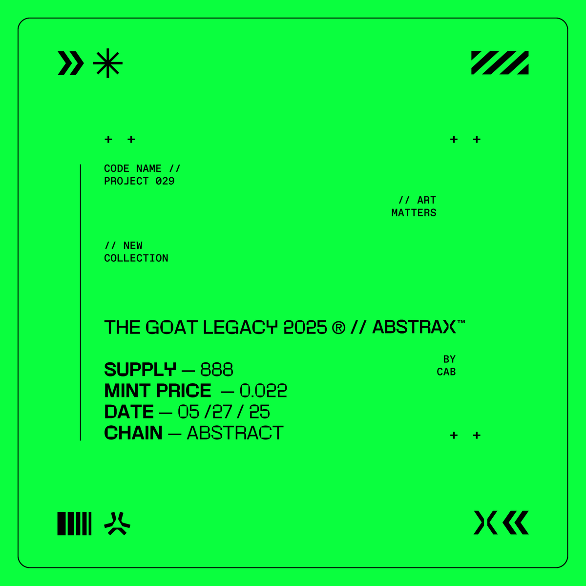
// MESSAGE RECEIVED
// [MINT DETAILS]
CODE NAME // PROJECT 029
THE GOAT'S LEGACY 2025 ® // ABSTRAX™
SUPPLY: 888
MINT PRICE: .022
DATE: 05 / 27 / 25
⛓️ : @AbstractChain
ART MATTERS.
22
20
49
2,327
DXN retweeted
12 May 2025
Second class (2/5) CODE NAME // Exalted
// Born of The GOAT’s final design, the Exalted were shaped to echo its legacy, sentient vessels of memory, purpose, and the spark of what must awaken.

23
26
58
1,638
DXN retweeted

23 Apr 2025
Space Riders™ — Branding / ORIGINS 🧵
This was the first branding approach I created for Space Riders, and it’s the one we used during the early stages of the project. It also served as the origin of some of the gradients I now use for specific traits. The lines—representing what would later be known as the Path of the Ancients (although it wasn’t called that at the time)—as well as the logo, were there from day one. Once we locked in the theme and the Rider concept, I had a very clear vision for the branding moving forward.


21
24
68
1,358


I’m starting a trading discord for like minded traders from beginners to vets. Posting setups for crypto, stocks, and futures.
25 Mar 2025

The gates are open. Beta Discord is LIVE. Be part of the first wave of traders to help shape this community from the ground up.
🔥 Early access to tools & strategies
🔥 Direct feedback with the team
🔥 Founding member perks
This is your chance.
discord.gg/n4BqPnEK
2
478
As a 90s kid I would watch Jackie Chan movies and 100% believe I could parkour around my house like that.
x.com/i/status/1816020495768…
24 Jul 2024

A compilation of the greatest stuntwork of the legendary JACKIE CHAN. Credit: Unknown.
3
74
DXN retweeted

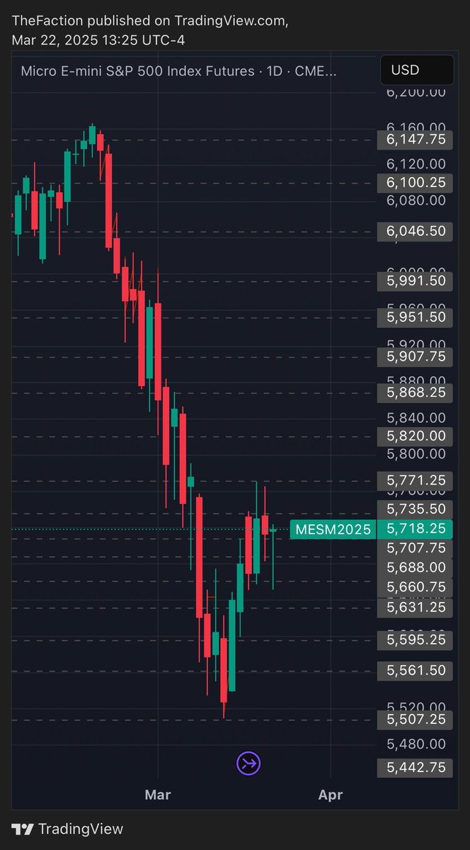
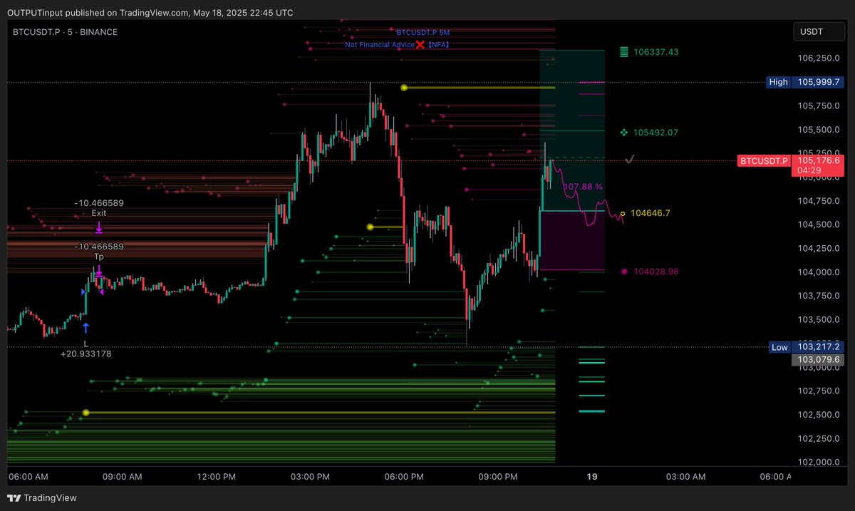
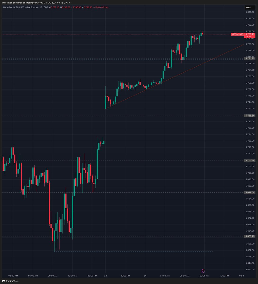
24 Mar 2025
ES is cooking overnight. Check out our key levels to watch and analysis on more tickers in the discord.
#futurestrading
1
10
205
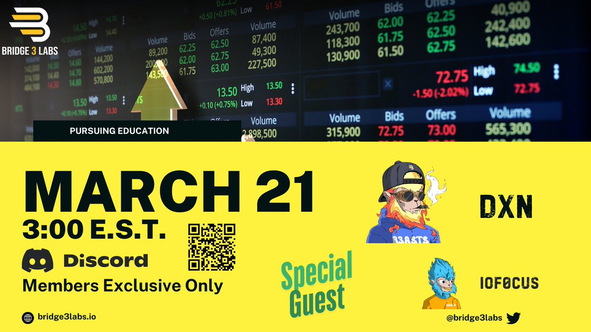
Thanks for having me on this week!
21 Mar 2025

I enojed this with @DXNdraws in @Bridge3Labs
Thanks friend , look forward to putting to practice
1
38
GM crypto fam. Live streaming this afternoon with @ioF0cus Walking through my TA methods on ES futures in the @Bridge3Labs discord. Join us!
19 Mar 2025
Super stoked to be doing this with @DXNdraws
Friday 21st , in the @Bridge3Labs discord.
Come join us this week !
1
1
58