
Practical CSS and design tips that helps in building future-proof user interfaces. A project by @shadeed9
Joined December 2021
- Tweets 40
- Following 1
- Followers 6,091
- Likes 36
9 Photos and videos


Now up in the front-end track is @shadeed9, talking about @DefensiveCSS which he published earlier this year.
defensivecss.dev
#WebDirections
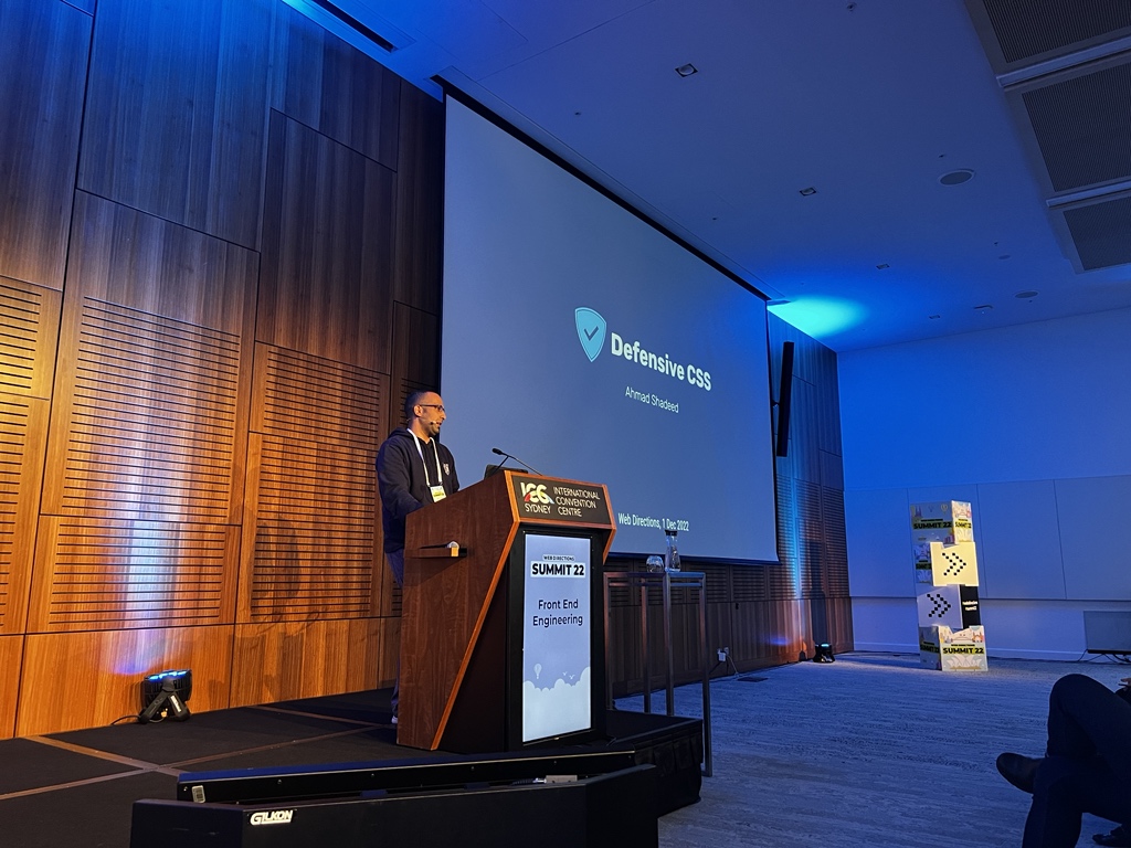
ALT Ahmad on stage
1
2
7
Defensive CSS retweeted

18 Nov 2022
CSS allows you to build any layout you want. Unfortunately, we still don't care too much about preventing CSS issues upfront. So at Summit @shadeed9 will outline defensive CSS, a term he coined to describe CSS that is future-proof and defensive.
buff.ly/3KwIrn1

ALT Twitter banner for Ahmad Shadeed's presentation. Image shows a photo of Ahmad Shadeed and text that reads 'Ahmad Shadeed Design Engineer Freelancer Defensive CSS. WEB DIRECTIONS SUMMIT 2022 Sydney, December 1st and 2nd, 2022. product, design, front-end engineering, and more! Sydney, December 1st and 2nd, 2022'
3
10

18 Oct 2022
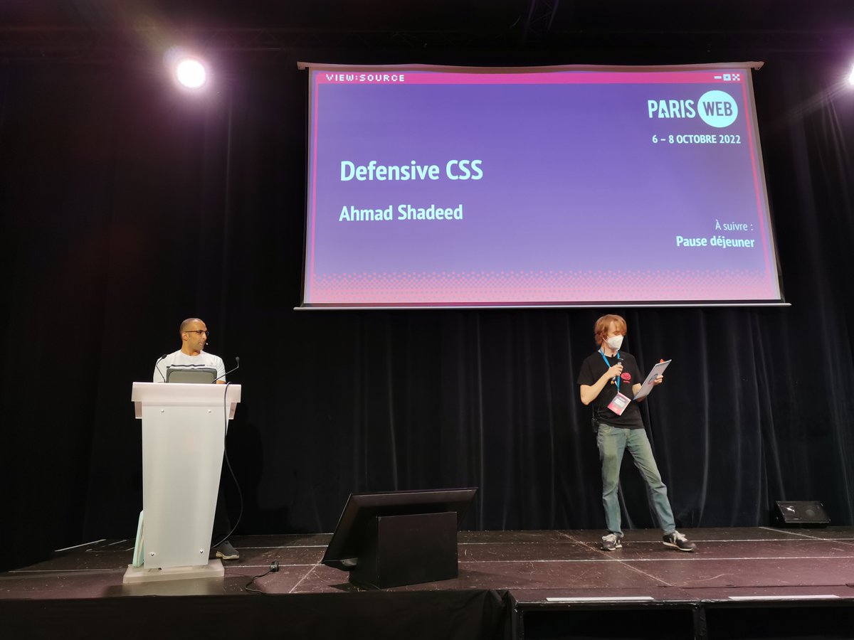
It was an honor talking about Defensive CSS @ParisWeb.
You can watch the talk here (It's a part of a live stream):
youtube.com/watch?v=ym2sI8Jl…
10 Oct 2022

Hello 👋
I got back home today from my trip to @ParisWeb! It was a great experience for a first-time speaker! I learned a lot, and glad that I met @mmatuzo, @klohFR, and @ffoodd_fr in person 🤩
Photo credit: the amazing @mmatuzo
9
30 Sep 2022
Looking forward to speak about Defensive CSS next week in Paris! 🤩

Designer et développeur front-end, @shadeed9 nous fera l'honneur de partager son expertise #CSS pour la toute première fois en France. Et ce sera à #ParisWeb le 7 octobre prochain ! paris-web.fr/2022/conference…
Inscrivez-vous pour assister à sa conférence : inscriptions.paris-web.fr
ALT « Defensive CSS » par Ahmad Shadeed
2
12
Defensive CSS retweeted

10 Sep 2022
I have updated defensivecss.dev and added a speaking section. It's amazing how quickly a simple idea can take off! 🤩
I am so excited for what is to come for @DefensiveCSS 🔥

1
8
45
9 Sep 2022
🌟 New Tip
When working with multilingual websites, make sure to account for short content lengths by setting a minimum size.
In this example, the button "Done" become too small in Arabic. We can fix that by setting a min-width in CSS.
Read more: defensivecss.dev/tip/button-…
3
25
162
Defensive CSS retweeted
1 Sep 2022
So excited to speak about @DefensiveCSS at Xpand conf in Jordan 🙌
1 Sep 2022

Ahmad Shadeed will be speaking at Xpand!
Ahmad is a well known product designer and front-end developer whose work has been recognized and featured by well-known websites and newsletters like Smashing Magazine, Laravel, CSS-Tricks, Codrops, HTML5 Weekly, CSS Weekly, SidebarIO

2
3
18
24 Aug 2022
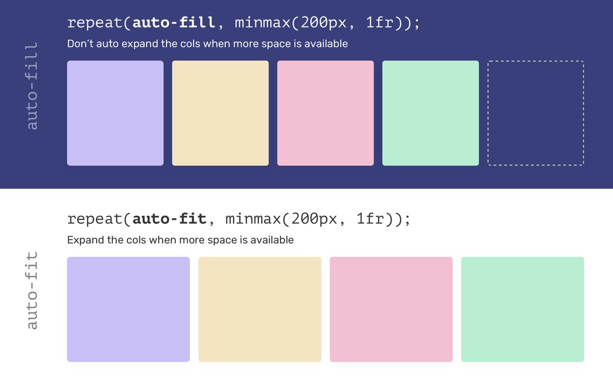
💡 In CSS grid, we can choose between auto-fill and auto-fit for how a grid item should behave. The keyword auto-fit is risky, specially when we don't know the number of grid items.
Read more in this defensive CSS tip:
defensivecss.dev/tip/auto-fi…
1
59
347
Defensive CSS retweeted
21 Aug 2022
It was an honor for me to give a talk on Defensive CSS to the @Supermetrics development team in Helsinki, Finland.
This is a great experience for me and looking to spread the word even more about @DefensiveCSS 🤩

2
3
71
14 Jul 2022
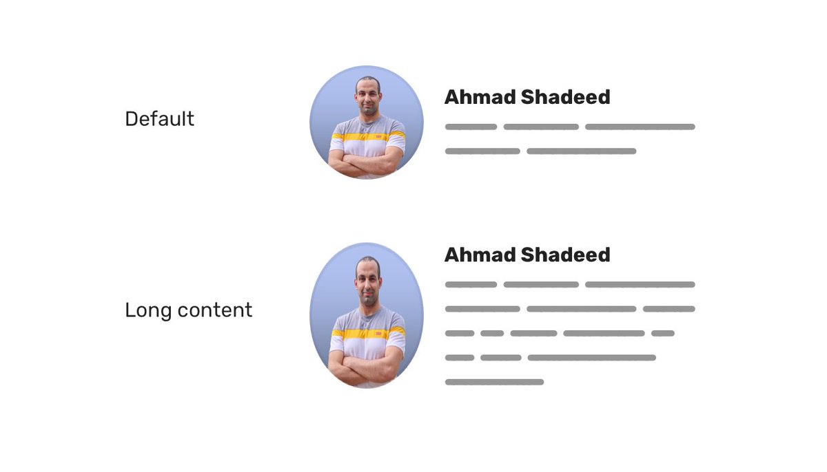
It's a common mistake to use display: flex and forget about it. When the content gets longer, flex items will stretch to fill the parent.
That's what happened to the image here. The fix is to use align-items or align-self depending on the use case.
🔗 defensivecss.dev/tip/default…
1
12
125
Defensive CSS retweeted
6 Jul 2022
Looking forward to talk about @DefensiveCSS at Paris Web later this year.
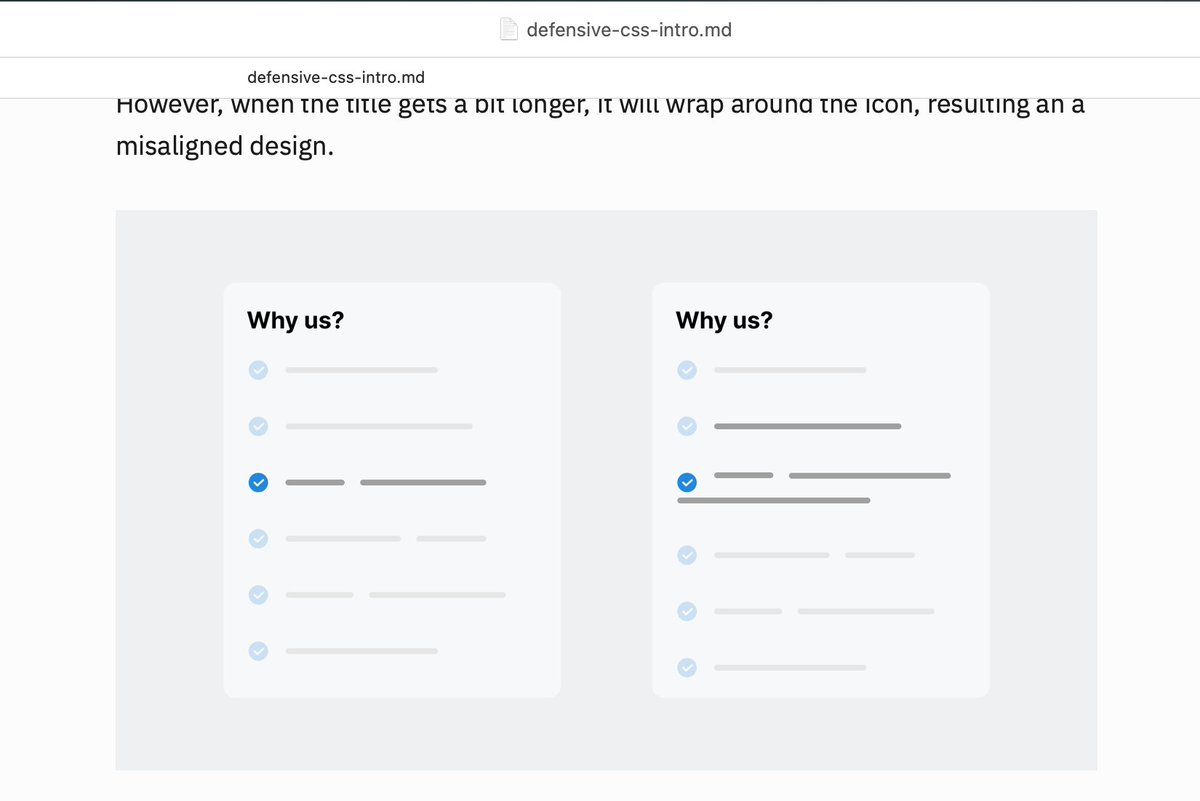
#ParisWeb conference: on October 7th, we will have the pleasure to welcome @shadeed9 who will introduce you to the idea of Defensive CSS: Ways and techniques we can use right away to prevent potential layout bugs.
paris-web.fr/2022/conference…

ALT “Defensive CSS” by Ahmad Shadeed
1
2
18
4 Jul 2022
Have you ever tried using position: sticky with CSS grid and it didn't work? You need to override the default behavior of CSS grid by applying align-self: start to the aside.
✍️ Find out more in this defensive tip: defensivecss.dev/tip/positio…
7
47
374
Defensive CSS retweeted

4 Jul 2022
A little late and sorry for that, but here are all the links mentioned during @shadeed9's talk:
Slides: drive.google.com/file/d/1CgH…
ishadeed.com/
defensivecss.dev/
x.com/defensivecss
caniuse.com/mdn-css_properti…
amazon.com/Bulletproof-Web-D…
4
9
29 Jun 2022
⚠️ By default, flexbox will let its child items take up as much space as the content. This can lead to overflow issues.
Learn more about how to prevent that.
defensivecss.dev/tip/flexbox…
3
20
121
Defensive CSS retweeted
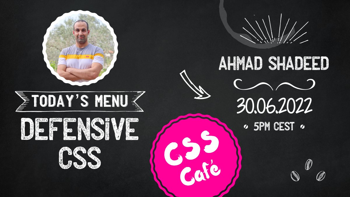
26 Jun 2022
I will be speaking about @DefensiveCSS at the CSS Café (@CSS__Cafe) meetup this Thursday. I'm looking forward to it! 🤩
Details: meetup.com/de-DE/css-cafe/ev…
11
52
25 Jun 2022
✍️ This article provides an overview of what Defensive CSS is and what problems it solves. Hope you enjoy it!
defensivecss.dev/articles/in…
4
29
133
24 Jun 2022
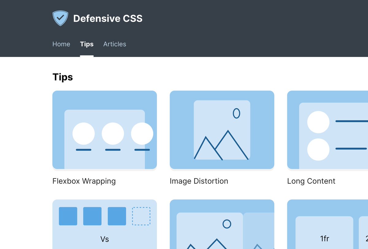
Hello world, I’m happy to publish Defensive CSS! 🥳
It's a resource explaining how to write CSS defensively, and how it can be used as a strategy for every front-end project.
✍️ More content is on the way!
defensivecss.dev/
21
236
1,002
18 May 2022
Current status: working on the introductory article for Defensive CSS ✍️
I'm really excited to publish the project soon 🤩
1
2
95
30 Apr 2022
I'm having so much fun creating these abstract covers for each CSS defensive tip! 🤩
7
81
1,006