
I help AI & SaaS startups fix where users drop off and turn more traffic into signups.
Joined January 2026
- Tweets 1,591
- Following 21
- Followers 151
- Likes 2,574
179 Photos and videos


Pinned Tweet

May 27
hot take:
most Product Hunt launches don’t underperform because the product is bad. they underperform because users subconsciously classify the product too early from the gallery slides alone.
people think slides are visual support material.
they’re not btw.
they’re perception architecture.
on PH where users scroll fast and cognitively bucket products within seconds your screenshots silently decide things like:
- is this another AI wrapper?
- does this feel trustworthy?
- does this look operationally heavy?
- is this for me?
- is this polished enough to trust?
- is this a toy or infrastructure?
- does this reduce friction or create more?
before users even enter the website and sequencing matters way more than most founders realize.
the first slide shouldn’t explain everything.
it should control category interpretation.
the second should reduce ambiguity.
the third should accelerate trust.
only then should deeper workflow/capability layers expand.
So lot of launches accidentally frontload features before emotional clarity exists.
that creates cognitive friction insanely early.
for AI/SaaS especially products where users already arrive with category fatigue.
#ProductHunt #AI #SaaS #Launch
1
4
290
May 24
users subconsciously classify you before consciously understanding the product
#ProductHunt
1
4
657
May 23
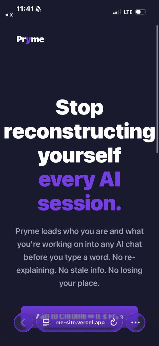
Been looking at how AI continuity products emotionally position themselves lately and @Simple_Assets_ quietly does something really smart with Pryme.
Stop reconstructing yourself every AI session immediately lands closer to identity preservation than productivity tooling. That framing is strong because users dont actually experience context loss as an organization problem. They experience it as cognitive discontinuity with themselves.
But there’s also a subtle conversion risk underneath:
the hero section emotionally frames Pryme as continuity of self across AI sessions… then the page slowly shifts back into extension/infrastructure language (“works across platforms”, “local storage”, “Chrome extension”, etc).
So the product briefly feels psychologically bigger than the category it later explains itself back into. Even a small sequencing adjustment there could probably raise conversion because the emotional interpretation already wants to happen.
Would genuinely love to go deeper on Pryme btw, really interesting positioning surface here.
#Startup #ProductHunt

2
1
4
134
May 22
interesting tension in AI infra launches rn:
sometimes the bigger the technical breakthrough, the easier it is for users to emotionally misclassify it as “another API deal”.
with products like @TetiAI_ / Pixserp the real shift is probably not search/news/images in one endpoint.
its removing orchestration complexity from the mental model of building AI products altogether.
but if the first emotional anchor users see is credits/pricing/promo language, the brain can subconsciously downgrade the category before the architectural implication fully lands.
thats a very subtle launch risk because technically the messaging is correct, but psychologically the product may get interpreted smaller than it actually is.
#startup #ProductHunt
2
3
140
May 15
most founders think users abandon products because the feature set is weak. a lot of the time they abandon because the category label formed incorrectly in the first 10 seconds.
once a product gets mentally classified as:
“another dashboard”
“another AI wrapper”
“another analytics tool”
every later interaction gets filtered through that assumption. Thats why positioning failures are often visual before theyre verbal. People dont read their way into trust first, they feel their way into it.
#BuildInPublic #Startup #ProductHunt #AI #SEO #Devs #Infra #BuildingInPublic
3
8
369
May 7
One thing I noticed after analyzing dozens of Product Hunt launches lately: Most products don’t fail because the idea is bad. They fail because users don’t reach the “oh shit, this is actually useful” moment fast enough.
Founders usually optimize:
→ features
→ AI capabilities
→ integrations
→ design polish
But users decide emotionally first:
Do I trust this?
Does this feel worth learning?
Am I already seeing value?
And tiny onboarding / positioning details completely change that decision. The interesting part:
A lot of products with real potential quietly lose users before the core value even clicks.
Been spending a lot of time studying:
activation moments
expectation gaps
delayed payoff
trust formation in onboarding. Honestly makes you see Product Hunt launches very differently 👀
#SaaS #ProductHunt #BuildInPublic
1
6
411
May 3
Most early products don’t fail because of lack of traffic.
They fail because users dont get it fast enough. I’ve been noticing a pattern:
people try.
dont hit a clear this is useful moment.
never come back.
Even if the product is actually good. So lately I’ve been doing small focused UsersExperience audits
just looking at the first 1–2 minutes of the experience and almost every time there are a few simple gaps:
unclear first action,
no immediate proof of value,
too much thinking before doing,
Fixing those usually has way more impact than adding new features. Curious if others are seeing the same with their early users
3
258
Apr 26
Launching on Product Hunt is not the hard part.
The hard part is what happens after.
You get traffic.
People land.
They click around for a bit.
And then…
they leave.
Not because your product is bad
but because its not obvious what to do next. I’ve been looking at a lot of PH launches lately, and the pattern is always the same:
strong idea
decent traction
weak activation
Most products dont have a traffic problem.
They have a what now? problem. If a new user has to think for even a second about what to do first you’ve already lost them. The difference between a good launch and a wasted one is simple
how fast users reach their first oh this is useful moment
Curious for those who launched recently:
what’s your current activation rate looking like?
#SaaS #Startup #ProductHunt
1
4
483
Apr 25
Most SaaS products dont have a traffic problem.
They have a “what do I do next?” problem.
Users land - click around - hesitate - leave.
Not because the product is bad.
Because the next step isnt obvious enough.
I’ve been going through early stage SaaS lately and one pattern keeps showing up:
01. Strong features
02. Decent UI
But no clear path to action
So users never reach the aha moment.
And when that happens:
no activation - no retention - no revenue
Im testing something this week:
I’ll break down where users get stuck in your product
and point out 2–3 concrete fixes that can improve activation.
Short Doc. No fluff.
If you’re building something drop a link 👇
#SaaS #Startup #Buisness #Users
1
4
169
Apr 24
I reviewed a few Product Hunt launches this week
same issue every time:
users don’t know what to do after landing
→ they explore instead of acting
→ no action = no conversion
most teams think its a traffic or feature problem
its not
it’s missing direction
fix the first action → everything else improves
#SaaS #ProductHunt
5
8
557
Apr 9
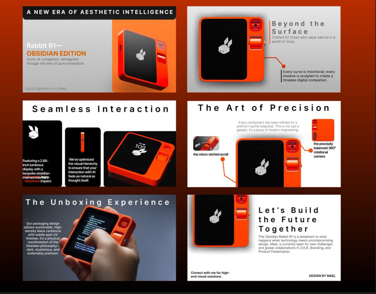
Why 90% of Product Hunt Launches are Dead on Arrival (And how I fixes it)
Product Hunt has become a graveyard of ambition. Every day I see dozens of innovative AI tools that get their 500 upvotes, a "Product of the Day" badge… and then ghost their users within a month.
The real reason? It’s not bad code. Its not lack of market fit.
It’s Logic Leakage.
Founders are so in love with their features that they forget one thing a user doesnt buy your AI, they buy the solution to their pain. But between Sign up and Value there is an interface that is literally draining the user’s mental energy.
I call this Cognitive Friction.
When I perform my Surgical UX Audits, I dont care about pretty buttons. Forget gradients. I look for where the user’s brain trips.
If a user does't grasp the value in 5 seconds thats a leak.
If onboarding requires more thinking than doing thats friction
If the interface lacks Visual Authority the user wont pay. Period. They won't trust their data to a system that feels like a weekend project.
My approach is Surgery, not Cosmetology.
Most designers aim for beautiful. I aim for airtight. My Obsidian Framework is built for one purpose, turning a chaotic set of features into a seamless logical system. Eliminating a single micro leak can boost paid conversions by 20% without spending a single dollar on extra marketing.
A PH launch is just the beginning. If you hit #1 but your Retention is zero congratulations you just burned your most valuable traffic.
I help builders stop guessing. My $60 audit isnt design feedback. Its a high precision map of exactly where your product is losing money right now.
Don’t build pretty products. Build logical ones.
#ProductHunt #SaaS #BuildInPublic #UXAudit #ObsidianFramework
7
328
Apr 7
Most startups don't have a traffic problem. They have a Visual Authority problem.
You spend months building a killer engine, only to wrap it in a UI that screams amateur
When a user lands on your page, they make a decision in 3 seconds.
If they feel Cognitive Friction, they leave.
If your Identity Architecture is weak, they dont trust you with their data or money
I’ve spent the last few weeks dissecting dozens of products in public. I see the same patterns everywhere:
❌ Cluttered dashboards killing Cognitive Velocity.
❌ Misplaced Visual Weight hiding the core value.
❌ Interface noise that drowns out the vibe.
Your UI isn't just pixels. It's your conversion floor.
I’m opening 5 slots this week for a Surgical UX Audit.
For $60, I’ll strip down your main flow and show you exactly where you're losing users. No fluff, just high-precision fixes to boost your authority.
#SaaS #BuildInPublic #ProductHunt #Startup
3
158
Apr 2
Most founders launching on Product Hunt spend weeks building the product, but the gallery slides are often made in a hurry. Clean, well-structured slides with low cognitive load can noticeably improve first impressions and upvotes.
#ProductHunt #SaaS
2
4
564
Mar 30
Most SaaS and AI products lose users in the first 8–10 seconds.Not because the idea is bad but because the landing or dashboard throws too much information at once. Too many headlines, benefits, buttons and features fighting for attention.This is what I call Cognitive Density Nightmare.I fix it with Surgical UX Audits 10 clean, focused slides that show exactly where the friction is and how to remove it.
#SaaS
5
4
180
Mar 29
Most AI dashboards are Cognitive Density Nightmares.
They force founders to scan 47 metrics before understanding what actually matters.
I fix that with Obsidian-style Surgical Filters:
• One hierarchy that guides the eye in <1.5 seconds
• Zero visual slop — only Mechanical Authority
• Every element kills friction instead of creating it
Design isn’t decoration.
It’s a high-conversion engine that makes investors say “yes” faster.
What’s the biggest cognitive leak in your current interface?
#startup #BuildInPublic #SaaS
1
2
117
Mar 26
Stop Shipping Visual Slop. 🦾
Code is only half the battle. If your interface creates Cognitive Friction, you are losing users, revenue, and trust every second.
I don't just "design." I build Mechanical Authority into your product.
I'm opening 3 tiers of Surgical Design Support for founders:
1. The Surgical Audit ($60) A 10-slide high-fidelity PDF teardown. I find your product’s "leaks" and provide industrial-grade concepts to fix them. Perfect for active launches.
2. PH Gallery Pack ($199) 6 premium, surgical-grade assets for your Product Hunt gallery. Move from "Just another AI" to "High-Fidelity Standard."
3. The Obsidian Pitch Deck ($500) Ultra-premium deck for those seeking $1M funding. Minimalist, industrial aesthetic (Starlink/Nothing vibe). Silence the noise, win the capital.
Visual Trust is won in seconds. Don’t waste yours.
DM to level up. 📥
#BuildInPublic #SaaS #Design #ProductHunt #VentureCapital

1
3
255
Mar 25
Stop adding features. Start killing friction.
Every extra click is Cognitive Leakage. Every unnecessary gradient is Visual Hijacking. The most powerful tools are the ones that disappear into the workflow.
Build for Development Velocity, not for "Dribbble likes." High-fidelity utility is the ultimate Identity Architecture. ⚡️📐
#SaaS
1
6
160
Mar 24
Most tools suffer from Cognitive Leakage.
If you have to "think" about how to use an interface, the design has already failed. True Visual Trust is won through structural integrity, not flashy gradients. I building the Identity Architecture of the future. Less noise, more Surgical Logic. Speed is a byproduct of clarity. ⚡️📐
#SaaS #ProductHunt #VentureCapital
4
110