
Diseñadora, charlatana y fan de la tipografía. Activista de la crema del cielo y flamante portadora de una cantidad considerable de pecas • (She/her)
Joined January 2012
- Tweets 1,478
- Following 251
- Followers 379
- Likes 2,759
153 Photos and videos


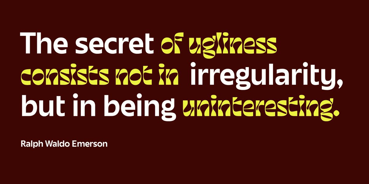
Hay que dejar de robar al menos 2 años con eso de armar un reel de trabajos y meterlo en cualquier conferencia para zafar 2min de charla y meter un pase de porfolio sin que nadie te acuse de hacer un pase de porfolio. No importa que tan cool sea la música.
Lo digo por su bien(?)
1
1
242
fer cozzi retweeted

6 Sep 2024
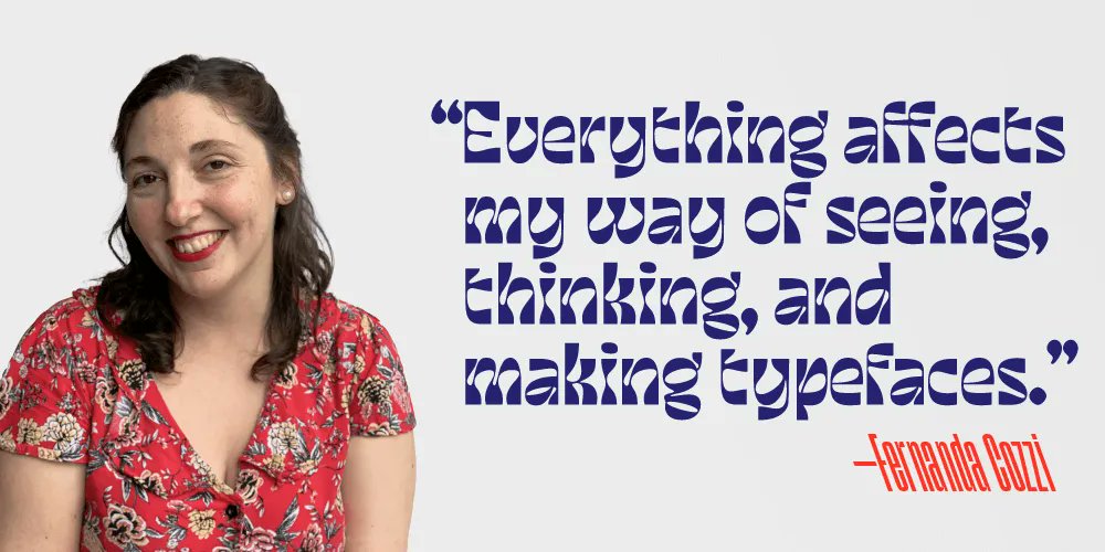
"I loved the idea of giving different flavors or sensations by combining fonts... That is still how I think about letters when I draw them." - TN partner @fercozzi on how design led her to typography.
👉Read the interview here: buff.ly/46V0j68


1
4
429

fer cozzi retweeted
30 Oct 2023
Meet Gabriella: the bold, wide, and emotional typeface from Fer Cozzi. Make your message unmissable with its strong, inclusive charm. Let Gabriella's spirit dance through your designs today. License it here: buff.ly/46HZ5up

4
40
3,127
fer cozzi retweeted
31 Aug 2023
"I loved the idea of giving different flavors or sensations by combining fonts... That is still how I think about letters when I draw them." - TN partner @fercozzi on how design led her to typography.
👉Read the interview here: buff.ly/3OMKIgt
3
21
1,421
fer cozzi retweeted
14 Jun 2023
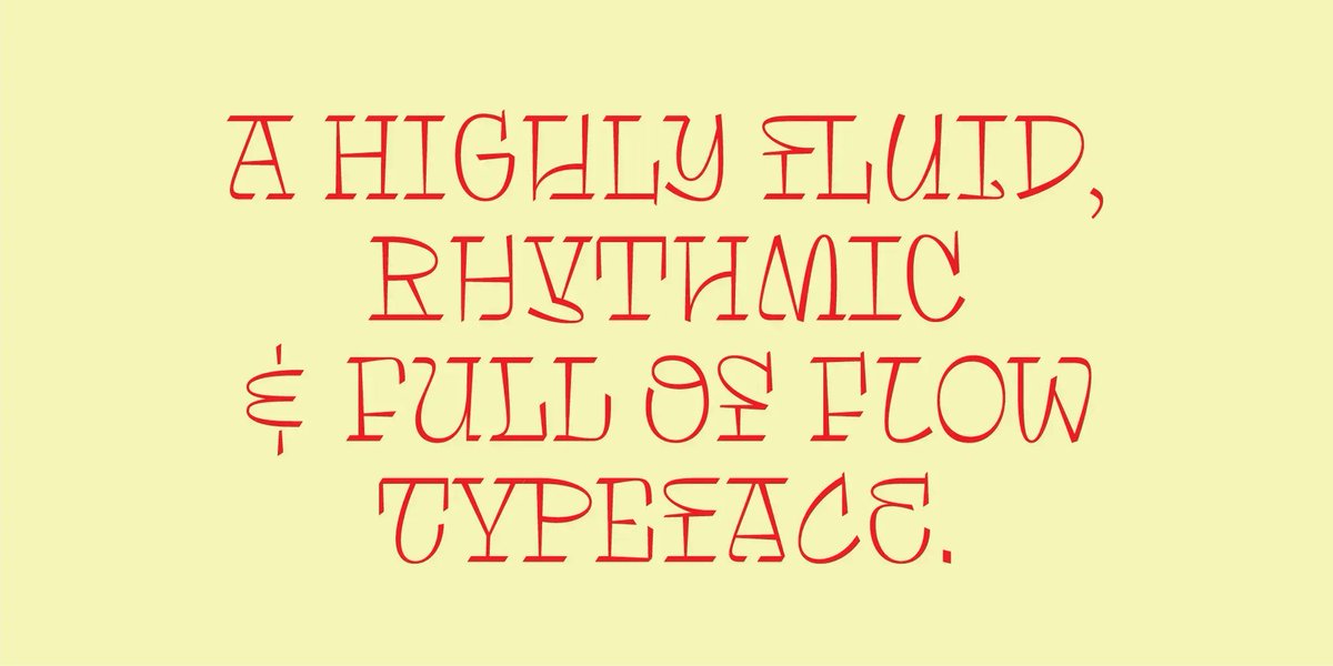
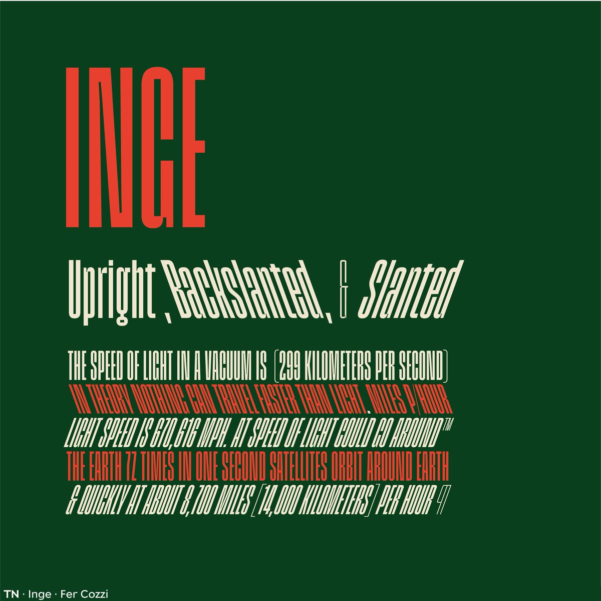
Discover Inge by @fercozzi : a powerful, rhythmic font with solid texture. Ideal for large-scale designs, it balances acceleration and strength, just like its namesake, Inge Lehmann.
License Inge here: buff.ly/3JaxXdE

1
9
1,182
La frase es mía.
La gráfica de Olivetti es de Rubén.
La magia es de Argentina(?)

Rubén asked us to design communication systems for one of Argentina’s many indigenous peoples at the end of the course. It was a challenge to make a usable visual system that would make sense for the user community—as opposed to something cool and shiny but inconvenient to use.
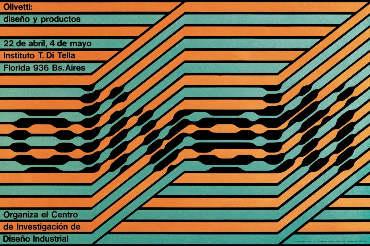
ALT Olivetti poster designed by Juan Carlos Distéfano, Rubén Fontana and Carlos Soler, 1968.
1
6
529
*sigh and remembers*
Typography classes taught by Rubén were very popular. One of his exercises was prompting us to observe a leaf for a minute, then asking us to draw it in detail by heart. There was no way to do it right or wrong, but we exercised to focus our attention and create visual memories.
1
264
fer cozzi retweeted
29 Mar 2023
“I believe that there is no particular Latin American style, but there is a way of thinking that unites us: We can do what we want, and no one will tell us otherwise!” — @fercozzi on what distinguishes Latin American type style
Read the interview: buff.ly/40kMb2a
5
20
1,406
fer cozzi retweeted

.@fercozzi is one of the confirmed speakers of the upcoming ATypI conference in Paris, May 9–14 (Sorbonne Campus Jussieu). Join us! 🇫🇷 Early Bird tickets extended through April 7. atypi.org/paris
#ATypIParis #ATypI2023

1
11
760
6 Mar 2023

“There is no particular Latin American style, but there is a way of thinking that unites us: We can do what we want, and no one will tell us otherwise!” — @fercozzi
👉 Read about her and our other Latin American partners here: buff.ly/3kFcjoH
1
255
fer cozzi retweeted
2 Nov 2022
"I loved the idea of giving different flavors or sensations by combining fonts... That is still how I think about letters when I draw them." - Newest TN partner @fercozzi on how design led her to typography.
👉Read the launch interview here: buff.ly/3SHTmNo
1
8
fer cozzi retweeted
2 Nov 2022
When asked about her design process @fercozzi explained, "I try to force myself to be uncomfortable, not to repeat formulas or take the same process from one project to another."
👉 Read the interview with @TypeNetwork's newest partner here: buff.ly/3Ufav1T
1
10
Here you’ll find me talking about things that may or may not make any sense 🫣
@FerCozzi on the educational mission of Rubén Fontana:
‘The typography programs Rubén founded at the UBA (@ubaonline) are an example of how to instigate change and promote the importance of typographic design outside English-language and European models.’
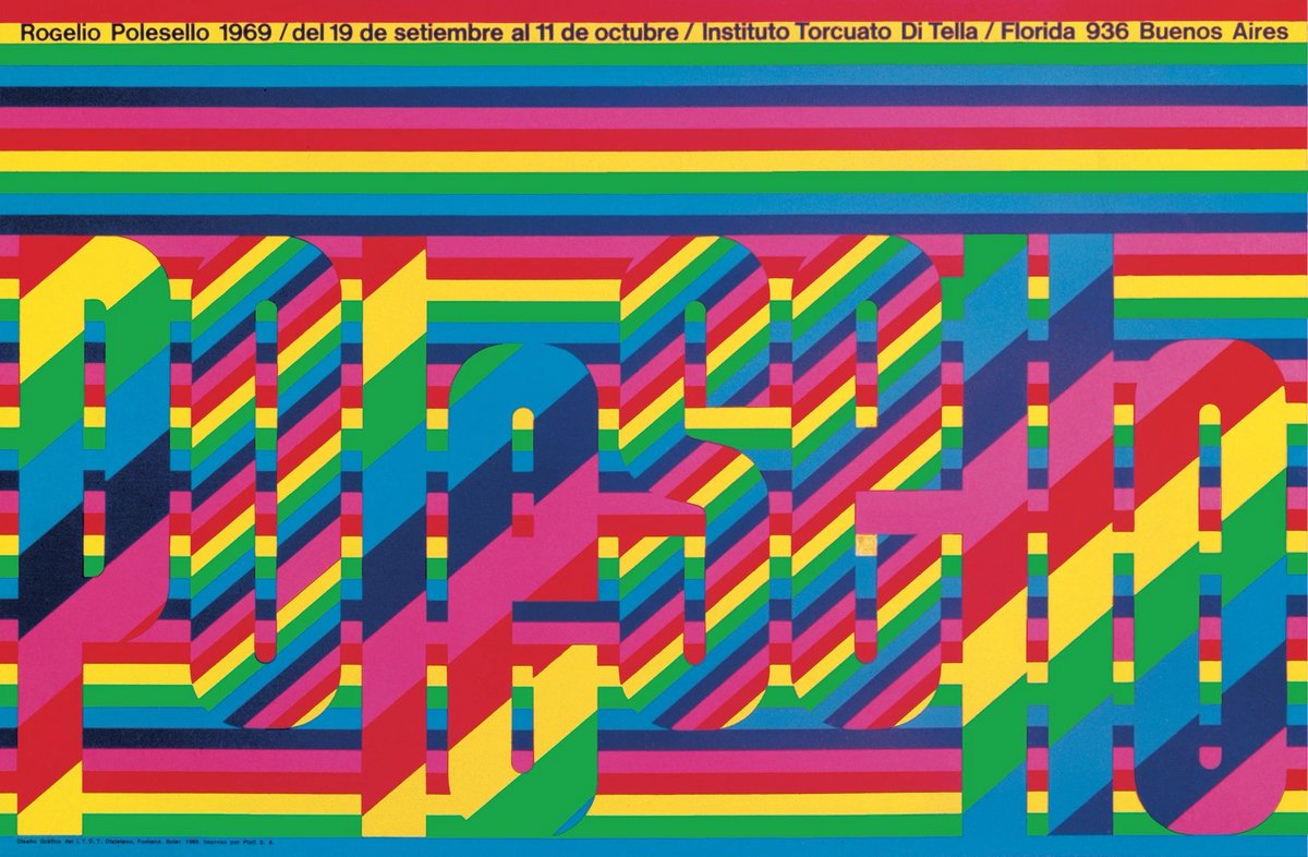
ALT Polesello poster designed by Juan Carlos Distéfano, Ruben Fontana and Carlos Soler, 1969.
4
*opens twitter and gasps in spanish*
I'm the newest foundry at @TypeNetwork
Yes.
Me.
My type.
At TypeNetwork.
Now.
💫
27 Oct 2022
Welcome our newest foundry, @fercozzi! Fer learned type design by making graffiti with her friends, working on her high school newspaper, and—more rigorously—through the master’s program at the @UBAonline.
👉 Read our interview with Fer here: buff.ly/3TZGEdK
8
3
59