
Joined July 2025
- Tweets 109
- Following 94
- Followers 22
- Likes 92
34 Photos and videos


Pinned Tweet

Mar 3
Finally, AI design just moved onto the canvas.
Meet Flato — the first canvas-native AI designer.
Built for real human–AI collaboration.
Layout, motion and video, everything exists as one continuous system on one canvas.
You are free to try: flato.ai/
8
3
7
255
May 26
Wide-angle isn’t just a lens effect — it’s a new way of storytelling for products.🌟
Distinctive perspective, layered composition, and dramatic visual tension. Turn simple product displays into impressive creative artworks.
Who’s obsessed with wide-angle product visuals? Drop a comment below!📱📱
Expand your vision rich templates = Flatoai✨ #CommercialDesign #VisualArt #ArtDesign #MarketingDesign

2
12
May 14
Super easy 2-minute tutorial!
Create premium minimalist & eye-catching product visuals step by step 📸
No tricky software, no lengthy AI prompts required.
Total AI newbies can nail it in one click & copy-paste directly.
Works perfectly for social media, e-commerce & content creation.
Bookmark right now — don’t miss this game-changing hack!#DesignTips #HowToDesign #Template
2
63
May 14
Stunning homepage web templates
✨One‑click to make your profile eye‑catching & high‑end
No coding needed, beginner‑friendly
Perfect for personal pages, portfolios, brand sites & creator homepages
Boost your vibe instantly, save now!
All your ideas live in Flato AI
#WebDesign #HomepageTemplates #NoCode #Portfolio #DesignHacks #FlatoAI


2
39
May 11
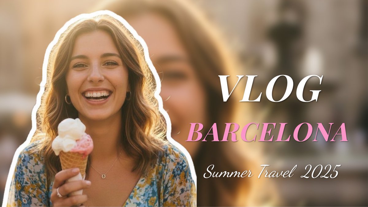
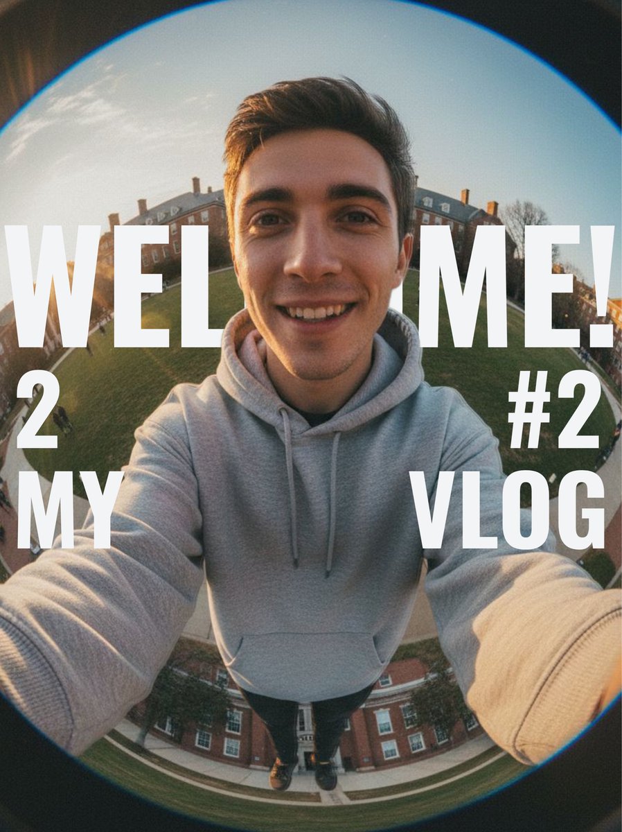
3 mins only ✨ Level up your Vlog cover game!
Massive stylish templates ready‑to‑use
Pre‑made layout, color & font for you
Ditch boring covers & grab more views instantly🔥
Try now to boost your traffic!#vlog #VlogCover #ContentCreator #DesignTemplate #VlogTips #CreatorTools
👇 Explore more templates on FlatoAI~
template link:flato.ai/share/9JTvTPGKw6r5
flato.ai/share/5XXi08u1HgDf
flato.ai/share/3wV3rqEqEaI6
3
115
May 8
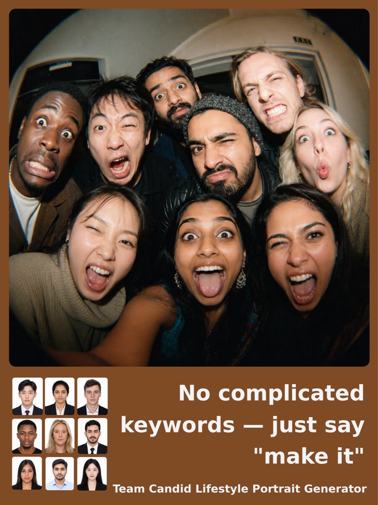
Turn this 👇
Corporate headshots nobody likes
Into this 👇
Natural candid team photos that actually feel alive.
Our AI generates lifestyle-style group portraits from simple employee headshots.
Just upload photos and say:
“make it”
That’s it.
No prompt engineering.
No photographers.
No editing.
Built for startups, recruiting teams, and modern brands that want authentic company visuals.
2
228
Apr 29
Drop in your product image. Let Flato generate the rest.
These templates are pre-designed to give you stronger scenes, better compositions, and more creative results without writing a long prompt.
Explore templates →flato.ai
47
Apr 28
Drop your product image on the left. Type "Make it." Flato turns it into the lifestyle shot on the right.
This is canvas awareness, visualized.
We built a set of templates like this. The layout is the instruction — no prompting required. The AI reads the canvas, identifies the source, reads the reference, and executes. You set up the page. It figures out the rest.
Canvas awareness means the AI isn't blind to your workspace. It sees the full page: what's there, where it sits, what role each element plays. The canvas holds the context so you don't have to carry it in your prompt.
More templates like this in Flato.
Try it → flato.ai
1
48
Apr 28
Taste is "this looks good."
Design decision is "this is right for this problem."
Taste is pattern recognition.
Design decision is knowing which pattern to break and why.
Apr 27

more design discourse
everyone saying "design is automated" and "design is dead" because models can spit out good landing pages and understand layout / typography etc. are telling on themselves that either:
1) they never knew what the purpose of designers were in the first place.
2) their products are not design challenges.
and that is fine. even in a world where all craft is automatable and gpt 10 can produce stunning assets in one shot, the point of a designer on a team is to have someone make design *decisions* (this is not the same as taste, although it's a part of it). and if you are fine offloading all decision making to an AI system, that's probably fine, but you are operating blindly.
it's the same reason you hire a lawyer to represent you in court or to verify a claim in a contract. it's also the same reason you have a CTO despite all your code being written by models. you need someone who knows what they are doing to make a decision and be held accountable! and if you don't, you are either in a business where direct supervision over these decisions doesn't matter to your business's success (which is fine, and probably 95% of cases), or you are paving yourself a path towards slop city.
producing assets was never the job. it is the *side effect* of the design process.
50
Apr 27
Most templates help you start.
Flato templates help you keep going.
Free to use. Edit, refine, and make it your own.
Try it out→Flato.ai
25
Apr 27
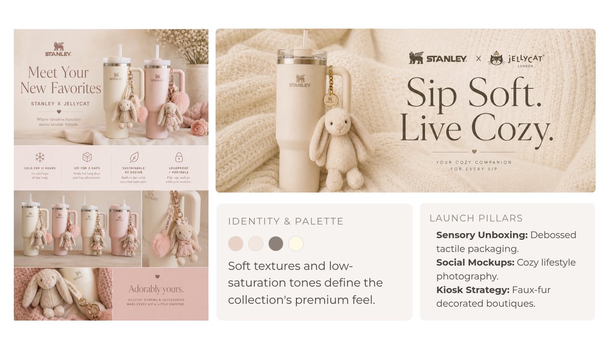
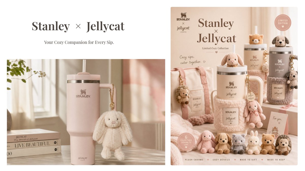
10 minutes in Flato.ai, with GPT Image 2 now built in, and suddenly Stanley × Jellycat feels like it should be real.
My idea was pretty rough: limited-edition cups, plush charms, fluffy holders, soft muted colors.
Instead of jumping straight into random creative execution, Flato helped structure it into a mini campaign direction.
Not final, but honestly very pitchable.
Try it out→ flato.ai
54
Apr 23
GPT Images 2.0 is now live in Flato.
With the model upgrade, Flato can now generate better:
-more stable text rendering
-stronger visual coherence
-more polished, readable outputs
-better results even from simple prompts
Try it in Flato → flato.ai
1
2
43
Apr 22
Spent some time testing GPT images 2.0 vs Nano Banana 2. GPT is on another level.
Here are my tests and takeaways:
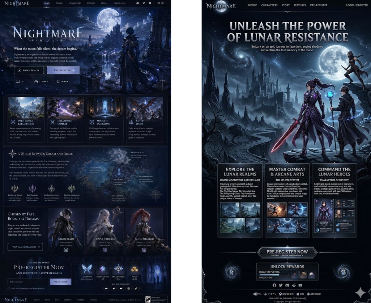
1. Promotional game landing page
GPT understands the functional anatomy of a landing page. Notice the clear sectional scrolling logic, the distinct UI component segmentation, and the typographic hierarchy. It isn't just drawing a picture; it's architecting a Web Interface. The details are insane, the aesthetic is premium, and the text is actually legible.
My prompt was dead simple, yet GPT delivered an almost ready-to-ship high-fidelity wireframe. NB2 just gave me a generic illustration with UI elements haphazardly slapped on top. This highlights a massive gap in prompt comprehension.
See my prompt at comment.
3
2
6
168
Apr 22
What stood out to me most:
1. Text Stability: The era of hallucinatory gibberish is over. This is likely due to the underlying LLM's robust semantic grounding—it doesn't just know what to draw, but how to architect the typography.
2. Depth & Coherence: The generated visuals aren't just aesthetically pleasing; they boast incredible information density and logical readability.
3. Prompt-Agnostic Excellence: GPT is no longer heavily reliant on prompt engineering. Even with a minimal prompt, its completion capabilities yield surprisingly curated results. NB2, conversely, remains highly prompt-dependable; simple prompts often result in sterile, uninspired outputs.
1
1
48
Apr 22
Prompts#1: A promotional landing page for a 3D fantasy game similar to Genshin Impact, titled "Nightmare." The page should have a strong visual impact and rich textual detail. Visual style: a dark night-sky background, with moonlight illuminating a highly detailed 3D in-game environment.
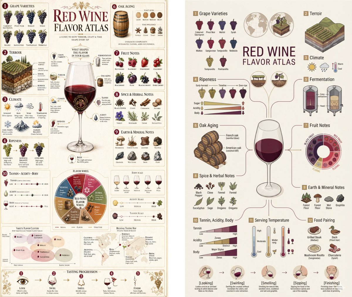
Prompts#2: Vertical 9:16 isometric cutaway infographic "Red Wine Flavor Atlas". A scientific visual map of red wine flavor, centered on a large elegant wine glass
and branching flavor system. Show vineyard, grape clusters, oak barrels, fermentation tanks, soil layers, climate icons, aroma wheels, tasting structure charts, and food pairing icons. Style: editorial atlas sommelier training poster luxury wine education chart,
warm off-white paper background, burgundy / deep plum / muted gold / olive accents,
crisp vector-like lines, premium typography, refined labeling, balanced negative space, 8K.
No photorealistic people, no clutter, no messy layout, no cyberpunk, no gibberish text.
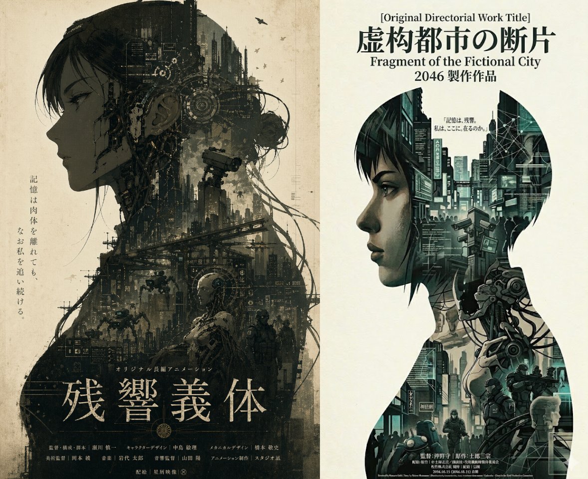
Prompt#3: A high-finish, epic original cyberpunk animated film poster, vertical format, with a double-exposure composition and a warm off-white background. A large side-profile silhouette of an original female cybernetic operative dominates the composition. Within the silhouette, seamlessly integrate futuristic skyscrapers, mechanical neural networks, surveillance systems, tactical armored units, small spider-like autonomous mechs, data streams, cybernetic anatomy, abstract interface graphics, and urban infrastructure. The overall palette is dominated by dark moss green, earthy brown, and smoky charcoal black. The mood is oppressive, calm, resolute, and fatalistic, with a strong sense of existentialism. Use generous negative space and a restrained composition. Add fine print grain, subtle paper texture, and the premium finish of a high-end theatrical animated film poster. All typography should be styled in a Japanese poster aesthetic.
94
Apr 20
When did "xxx is dead" become the default launch narrative for every new AI product?
1
52
Apr 19
Yes, especially when everyone is pulling from the same prompt patterns, the same references, and the same visual shortcuts. That’s when things start collapsing into the same aesthetic.
You can already see it in a lot of the Claude UGC demos. Many of them look oddly similar. Maybe people are moving fast and not spending much time defining aesthetic direction, but the sameness is noticeable. Even if Claude or Stitch are still mostly demo-like tools, they’re already shaping a certain visual sameness.
Design.md is another example. It makes design more reusable for both AI and humans, but it could also make homogenization worse.
Prompts are starting to function a lot like templates. If that’s where this is going, then AIGC probably needs better rules around reuse, clearer systems for licensing and attribution.
Apr 18

honest question. if everyone’s using AI for design, won’t things start to look the same after a point?
1
63