
Joined December 2022
- Tweets 4,540
- Following 203
- Followers 739
- Likes 2,061
1,199 Photos and videos


11h
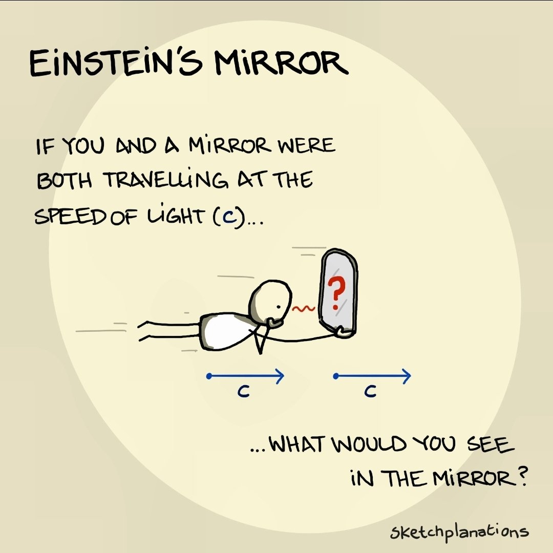
Consider this:
When you look into a mirror, there is a photon zooming by you at the speed of light.
From the frame of reference of that photon, you and the mirror are moving at the speed of light...
And your reflection in the mirror looks normal to you, despite your "speed."
18h

Physicist here.
You would see your reflection as usual, because the mirror is stationary relative to you, since you have the same velocity. Like playing catch in a moving car.
You and the mirror are moving at light speed relative to something else, but not moving at all from each other's frame of reference.
48
18h
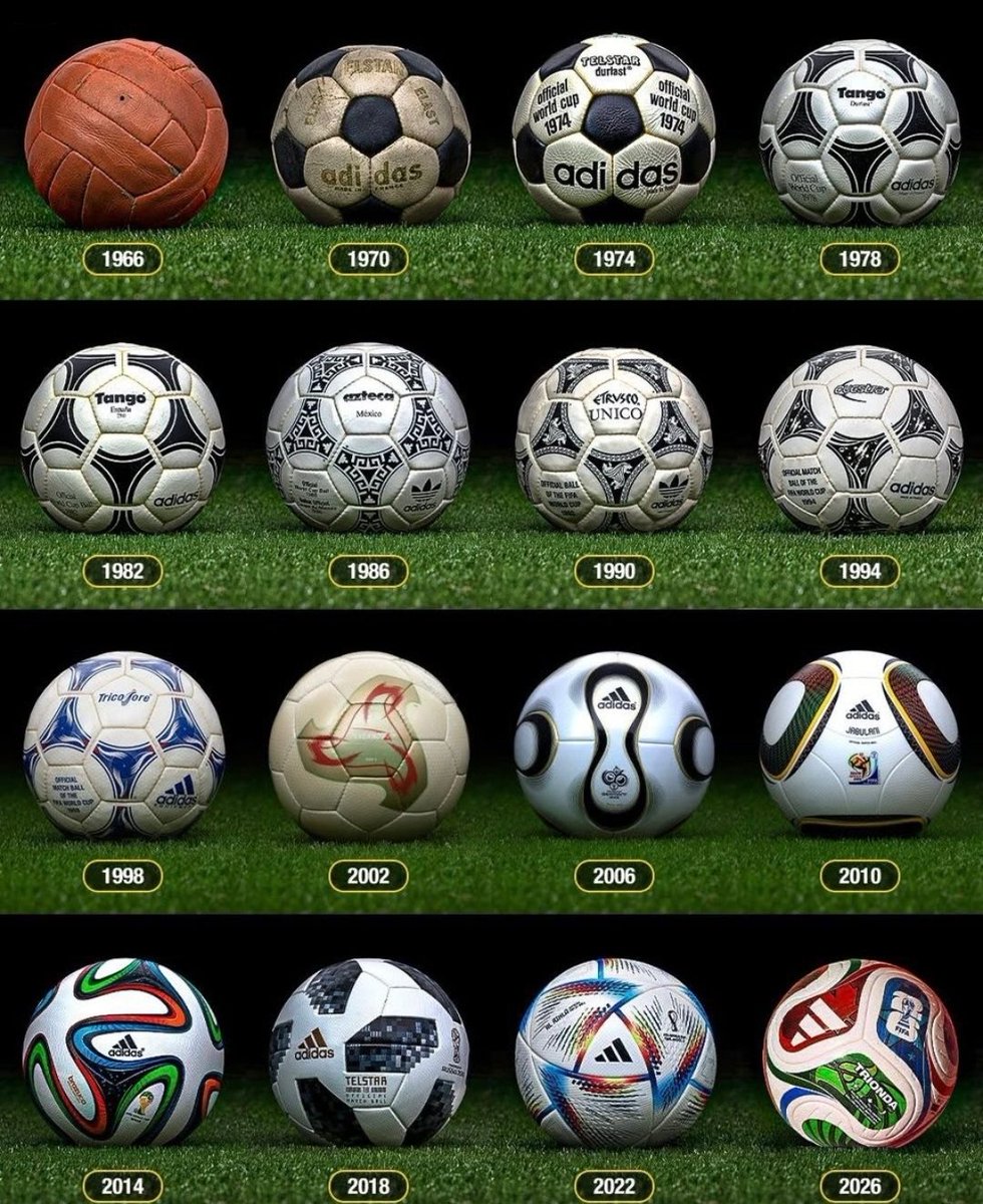
Changing the way the ball is sewn, changes its aerodynamics, with soccer/football players having to adapt.
The classic pentagon and hexagon design worked for decades. Ever since FIFA change it, there has been no new consistent design.
Maybe it shouldn't have been changed?
54
19h
Canada's fertility rate recently reached an all time low, but there's signs of recovery.
Plus, an error in the data analysis reveals what may be the reason for the decline. It has to do with how society perceives young people.
See my lecture for details:
youtu.be/MWmwa6WaOYk
395
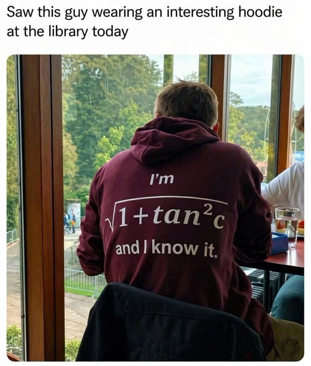
Jun 14
Math is √(1 tan²C)
Jun 13
Mathematician here to explain.
cos²C sin²C = 1
Divide both sides by cos²C.
1 sin²C/cos²C = 1/cos²C
Since:
sin(C)/cos(C) = tan(C)
and,
1/cos(C) = sec(C),
we get:
1 tan²C = sec²C
Hence:
√(1 tan²C) = sec(C)
sec(C) is pronounced "sek see" just like "sexy."
1
1
70
Jun 12
Data is often presented graphically, but different visual aspects, like color or scale, evoke different emotions that affect how people interpret the data.
Scientists take this into consideration, whether to deliver information accurately, or to deliver the message they want.
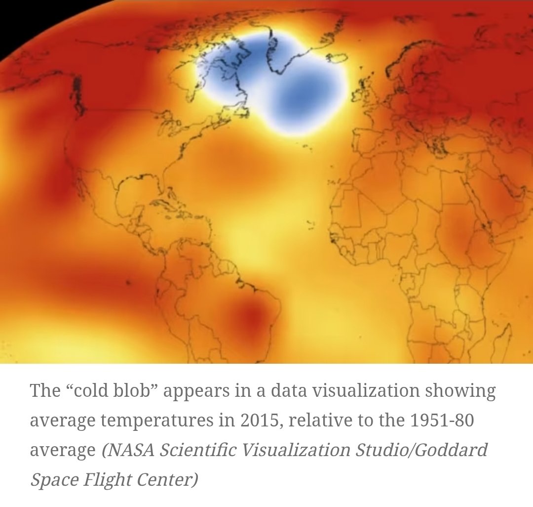
Jun 12
Physicist here.
This is a very odd coloring scheme.
Usually, temperature maps gradually shift from red to blue, with most areas green/yellow.
This map, almost entirely red/orange, and a single white/blue blob with no transition through green, looks more like art than data.
1
110
Jun 12
Alien: Isolation was a major innovation in artificial intelligence.
The Xenomorph's AI studies and adapts to the player, to better hunt them down.
Alien: Isolation 2, coming out in the age of AI, could be a game changer. That's the subject of this video.
youtu.be/UT04I4RzkLQ
1
265
Jun 12
The Legend of Zelda: Ocarina of Time, often called the best video game of all time, transcends generations like a fairy tale.
Now a full remake is coming out for the Switch 2.
This week's video discusses the deep hidden meaning of this eternal story.
youtu.be/Hw1U9mujhAI
1
973
Jun 12
It's been a busy week in the gaming industry.
Teaser trailers for Alien: Isolation 2, and the Switch 2 remake of The Legend of Zelda: Ocarina of Time, released this week.
So, G Labs will be releasing two Youtube videos this afternoon. One on each game.
1
56
Jun 10
With the Bank of Canada announcing that it's keeping the interest rate the same, I'm re-sharing my video on an earlier announcement of the same policy.
It explains what the descision has to do with the economy, tariffs, and trade negotiations with the US.
youtu.be/TbUrv_Ws9r0
2
616
Jun 10
The art of the analogy... or lack there of.
Some comparisons make a complex idea elegantly clear, while other comparisons make a simple idea seem confusing... or just misrepresent the entire thing.
Jun 9
Mathematical physicist here to decipher the analogy.
It implies:
"If everything grew in scale, such that atoms became the size that peaches are now, then peaches would become the size the world is now."
Problem is, atoms and peaches come in different sizes. Especially atoms.
79
Jun 9
My lecture on opening brackets. Also known as expanding.
A very powerful mathematical tool.
Enjoy!
youtu.be/aWcyXR_Gs2I
1
1
171
Jun 9
NASA's Artemis III mission is on the horizon, to test docking and human landing systems from Earth orbit, in preparation for Artemis IV which will land humans on the Moon.
To catch up on the Artemis II mission's accomplishments, check out my video below.
youtu.be/DRGVoCu71FY
531
Jun 9
Alien: Isolation isn't an ordinary video game.
Instead of the player defeating NPCs by finding patterns in their actions, it flips the standard script upside down, and has the player being hunted down by an enemy which uses AI to find patterns in the player's actions.
Jun 6
Many don't realize that Alien: Isolation was a major innovation in AI, before it was "cool".
The xenomorph uses AI to learn and adapt to the player's patterns of behavior, to hunt them down better.
This flipped the script of the standard video game formula, where players typically look for patterns in NPC enemy behavior to defeat them.
It's very exciting to imagine what Alien: Isolation 2 could be like, now that AI is so much more advanced.
40
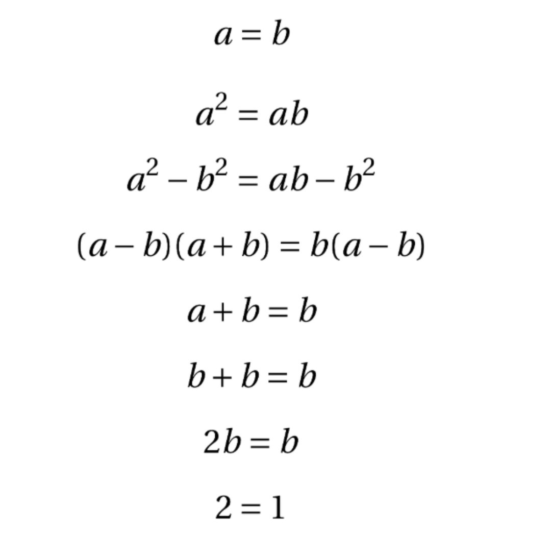
Jun 9
In many math puzzles that prove the impossible, and ask you to find the error in the proof, that error is a step where one divides by zero.
Below is an example like that.
Jun 8
Mathematician here to explain.
The error is the transition from line 4 to line 5.
Canceling out (a-b) is dividing both sides by (a-b).
Since a=b, then (a-b)=0.
Hence, dividing by (a-b) is dividing by 0, which is undefined.
Hence, this "proof" is flawed and invalid.
50
Jun 9
The art of the insightful comparison.
This one is for that small niche of people who are Alien movie fans and also beer connoisseurs.
Come to think of it, there's probably a lot of overlap there.
Jun 8
Prometheus is to science fiction movies, as Hoegaarden is to beer.
People either love it or hate it.
There's no in between.
45
Jun 8
Canada is in a recession, and faces many other issues, but the Liberal party that has been in charge for a decade sees a lot of support, according to political polls.
My latest video analyzes the polling data to explain this paradox.
Enjoy!
youtu.be/JFlx9l08Kc0
66
Jun 8
My lecture on why you can't divide by zero... usually.
Specifically, why division by zero is typically undefined.
Enjoy!
youtu.be/bwkUCXmdCyc
235