
⚾️ 🏀🏒⚽️ 🎥 ⭐️ Recognized design disruptors. Sports branding pioneers. Event animation all-stars. NBA. WNBA. MLB. NHL. NFL. MLS. US Polo. Founded in 2004.
Joined May 2009
- Tweets 43,638
- Following 3,925
- Followers 3,937
- Likes 25,088
16,681 Photos and videos


Gameplan Creative retweeted

Back to the drawing board. Start here!
1
1
1
260
It’s a disease. AI wizard creating AI slop. Disgusting 🤮
1
4
342
Gameplan Creative retweeted

@mitchell_ness @warriors @BrooklynNets @ATLHawks @Timberwolves @NBA @SLAMonline @GamedayGrails @GameplanChicago @TOGradyCHI

What the fuck is wrong with you.
You're missing a lot of the TOP 10 1990's sets.
Half the assholes replying won't even know these stunners...

1
1
301
Gameplan Creative retweeted
Congratulations! You will wear it loud and proud I’m sure!!!!!!👍
1
192
Gameplan Creative retweeted

Jun 14
@GameplanChicago WE DID THAT

Jun 10

Getting the token logo tattooed when we win so appreciate you
1
1
1
291
Gameplan Creative retweeted
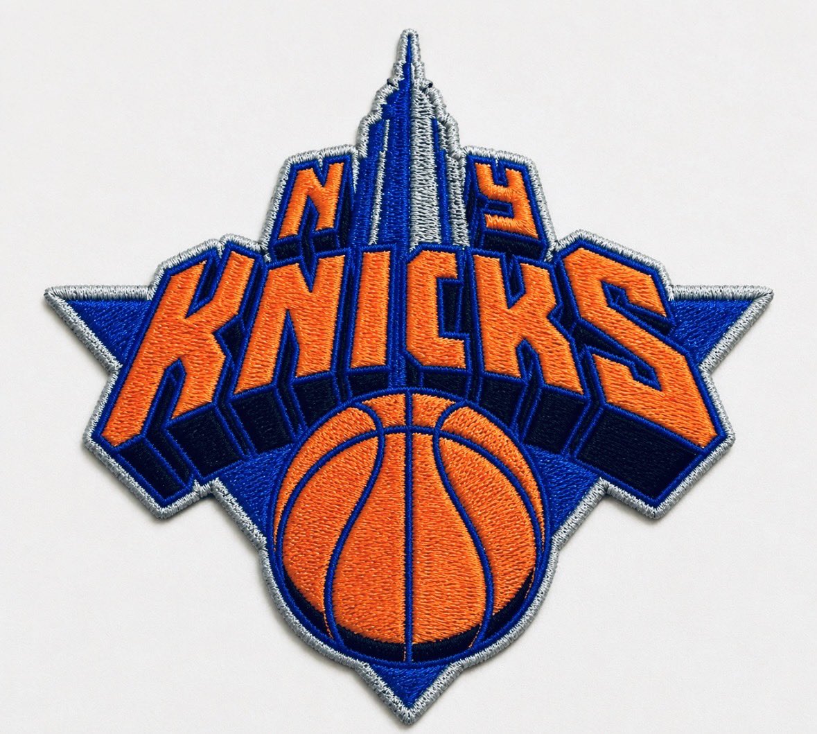
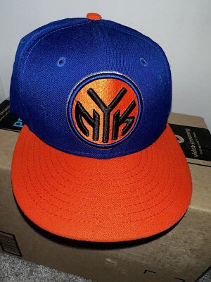
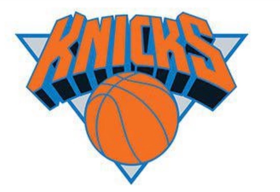
During my 13-year run as @NBA creative director I designed or art directed the @nyknicks on court brand identity from 1990-2002.
-Introduced black/silver.
-Modernized Knicks logo.
-Designed 3 uniform updates.
-Oversaw NYK token icon.
-A modern classic.
instagram.com/reel/DYAqZ-Yv0…


The three project mandates for Doret. I asked him to explore different creative paths. So much great work - but many of the ideas were too retro.
Knicks wanted a modern look.
Empire St. N Y design was perfect but legal issues killed that icon.
About me: instagram.com/reel/DYAqZ-Yv0…
12
31
350
44,632
Gameplan Creative retweeted
Jun 10
Getting the token logo tattooed when we win so appreciate you
1
1
1
1,070
Gameplan Creative retweeted
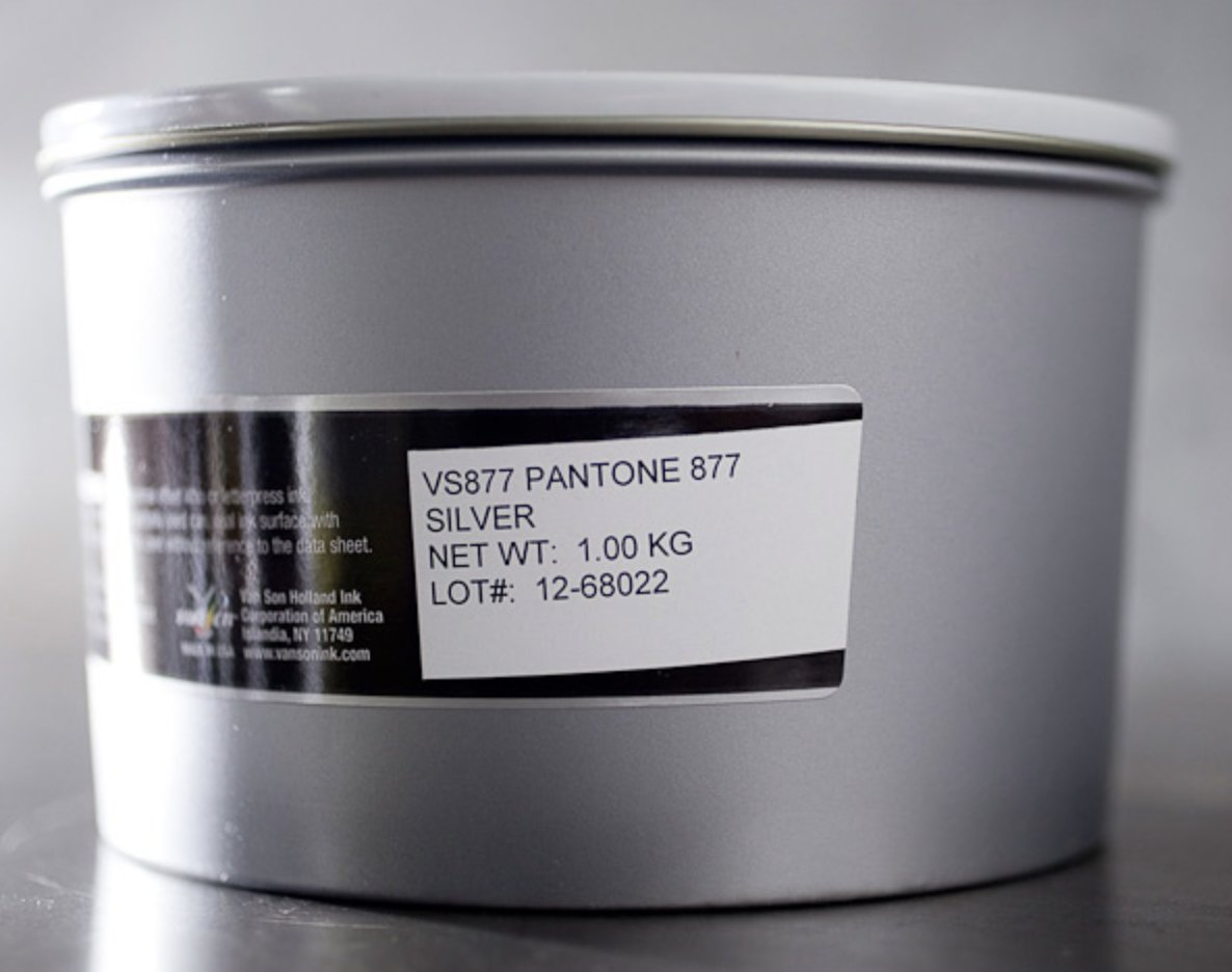
@spurs primary logo history favors the 2002 through 2016 version created by @GameplanChicago
Good concentration of PMS 877 metallic silver.
Decorative border treatment.
Best interpretation of a spur on a boot.
Easily applied across many medias.
Grade: 9 out of 10.


2
9
463
Close!
I have always played at a higher level team branding wise. It’s my identity really. Sketch on a recent flight thinking about the Cavaliers identity.

3
1
100
18,692
I have always played at a higher level team branding wise. It’s my identity really. Sketch on a recent flight thinking about the Cavaliers identity.
2
47
25,409

During my 13-year run as @NBA creative director I designed or art directed the @nyknicks on court brand identity from 1990-2002.
-Introduced black/silver.
-Modernized Knicks logo.
-Designed 3 uniform updates.
-Oversaw NYK token icon.
-A modern classic.
instagram.com/reel/DYAqZ-Yv0…
The three project mandates for Doret. I asked him to explore different creative paths. So much great work - but many of the ideas were too retro.
Knicks wanted a modern look.
Empire St. N Y design was perfect but legal issues killed that icon.
About me: instagram.com/reel/DYAqZ-Yv0…
12
31
350
44,632


Gameplan Creative retweeted
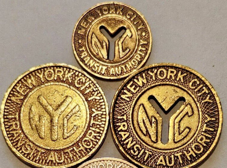
And this was before the NYK Knicks subway token secondary logo was adopted.
We were firing on all brand cylinders in those wonderfully creative ‘90s!


1
3
13
646
Gameplan Creative retweeted
An alternate concept that would ring the registers at retail.
1
1
8
808
Gameplan Creative retweeted
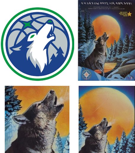
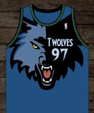
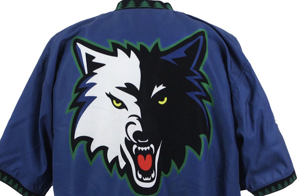
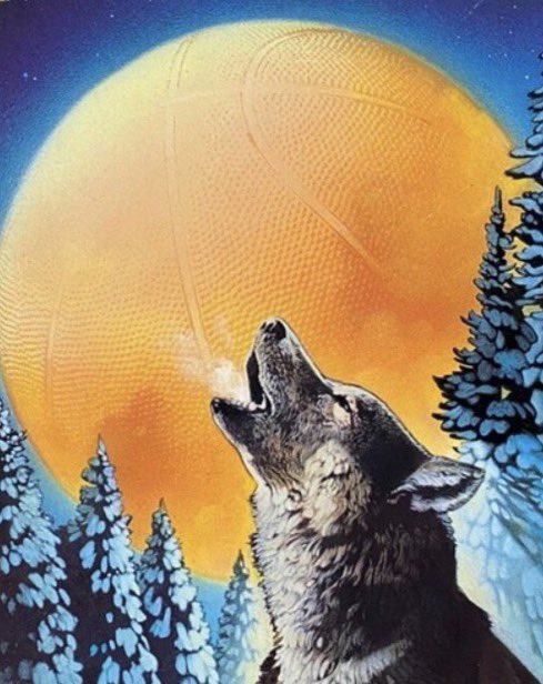
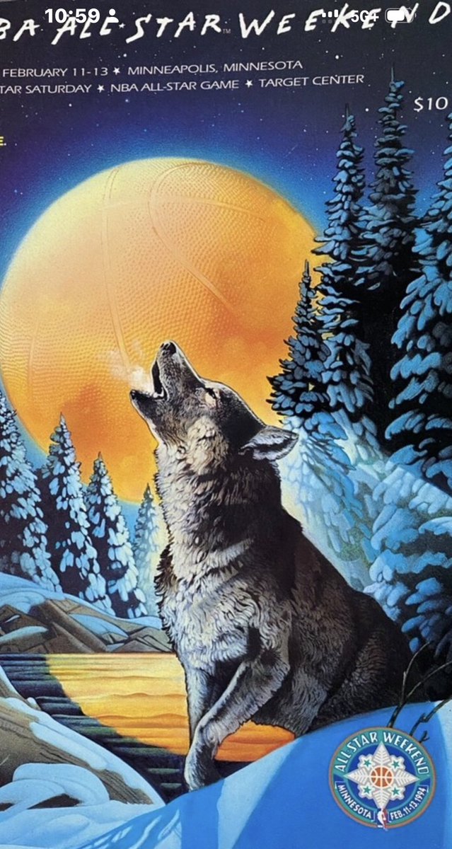
It’s a graphic interpretation of the 1994 NBA All-Star Weekend official theme artwork designed by NBA creative director icon Tom O’Grady and illustrated by nationally acclaimed illustrator Robert Rodriguez. O’Grady also designed the timberline uniforms.
sportsdesignagency.com/work/…


1
7
653
Gameplan Creative retweeted
LIVE NOW!
sportsbranding.substack.com
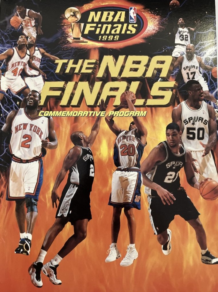
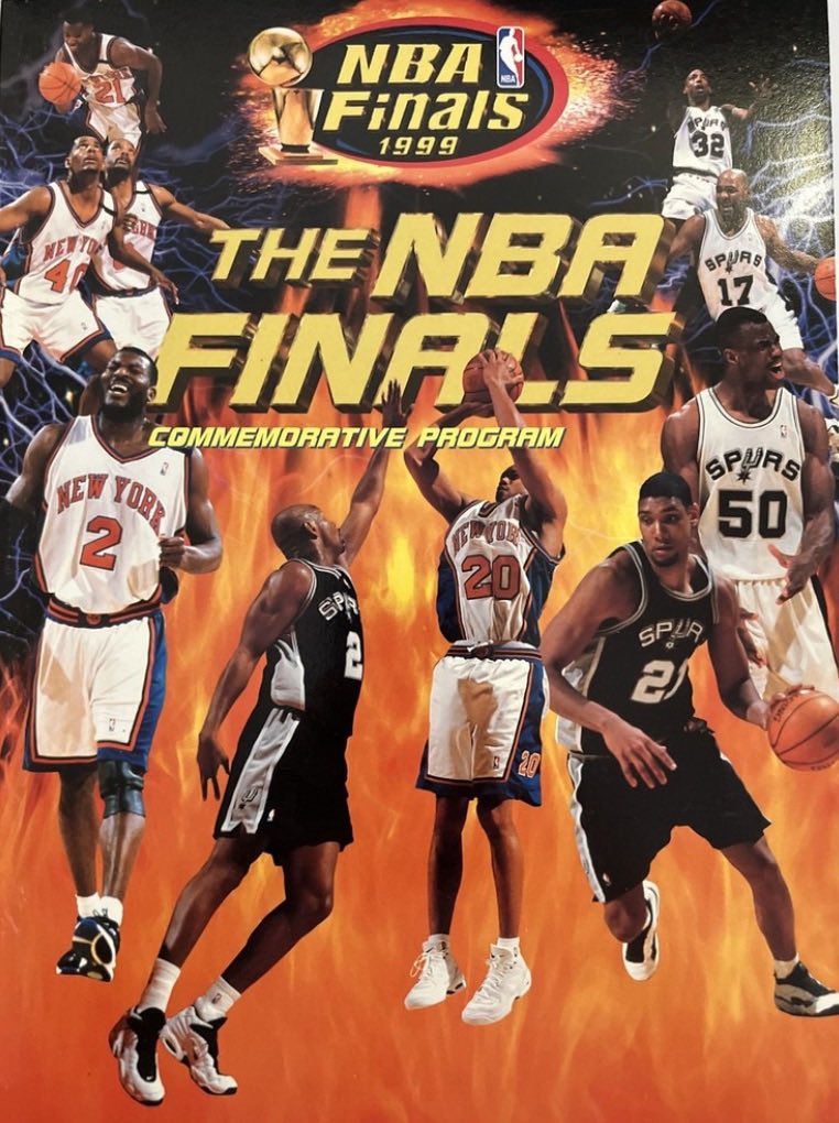
Episode 56. The NBA Finals 1999 vs. 2026.
How the fan experience has fundamentally changed the past 27 years.
Please like, subscribe, and comment at the Sports Branding Podcast.
tinyurl.com/nhersf85
@GameplanChicago @NBA @NBAonNBC

1
1
6
597
Episode 56. NBA Finals 1999 vs. 2026. How the Fan Experience Has Changed. open.substack.com/pub/sports…

231
LIVE NOW!
sportsbranding.substack.com
Episode 56. The NBA Finals 1999 vs. 2026.
How the fan experience has fundamentally changed the past 27 years.
Please like, subscribe, and comment at the Sports Branding Podcast.
tinyurl.com/nhersf85
@SportsDesignUSA @NBA @NBAonNBC
2
294