
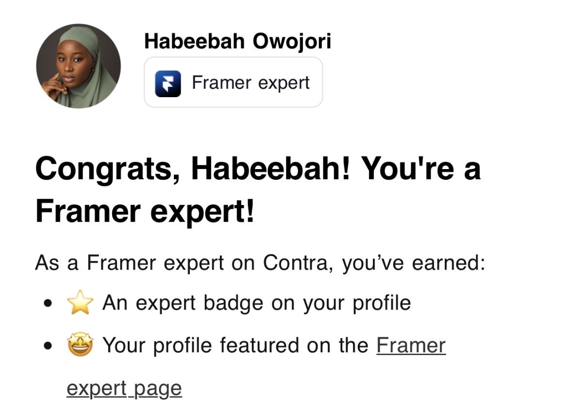
Product designer || Framer developer || Anime / animation lover || love art and enjoy sketching
Joined November 2019
- Tweets 733
- Following 724
- Followers 283
- Likes 1,890
132 Photos and videos


Jun 12
8
36
556
framer build. written and developed by me.
ŌURA — a botanical skincare concept I made to show what's possible with no-code.
beedsgn.framer.website
6
122
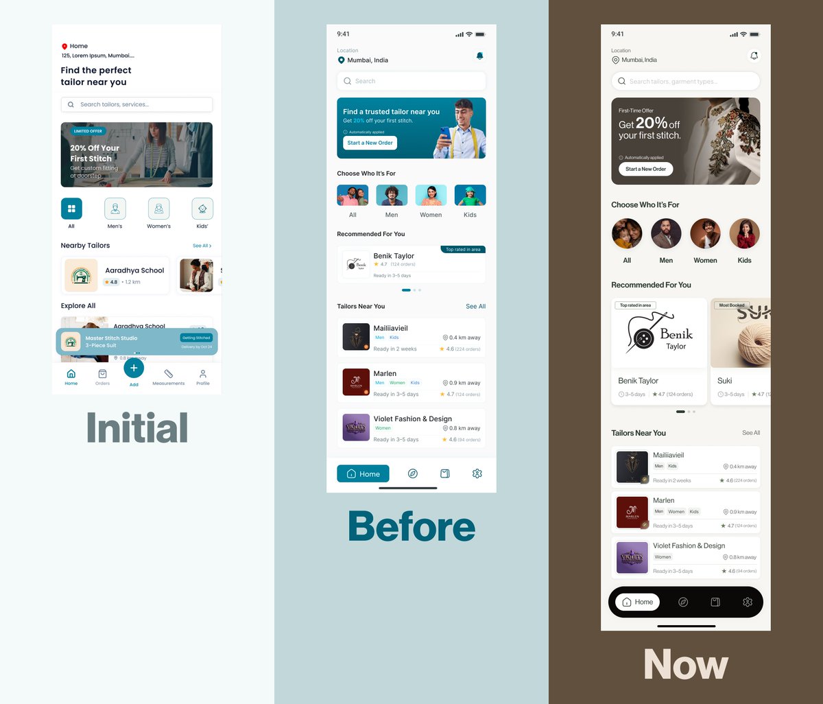
WIP: homepage for LumaFlow, a digital yoga platform designed around real life, not ideal life.
1
4
180
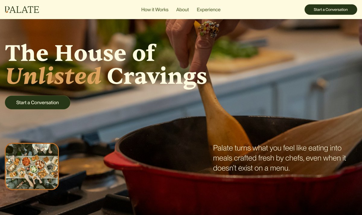
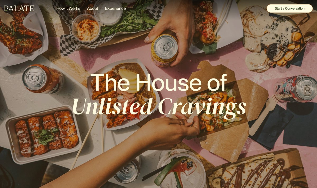
Hero section exploration for Palate.
Which do you like best? 🤔


3
43
May 16
Designed in Figma.
Built in Framer.
Would love to hear your thoughts on conversational experiences in industries outside traditional AI products.
🔗 palatea.framer.website/
1
2
15
570
Habeebah Owojori retweeted

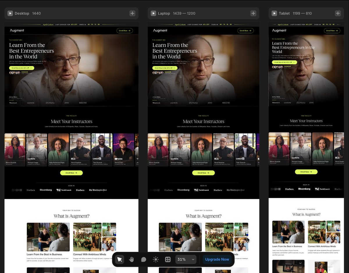
💼 WIP — shaping a platform where learning meets real-world impact.
Built to highlight instructors, build trust, and make enrolling feel like the obvious next step.
👉 Let’s bring your product to life → contra.com/studioduo
2
16
409
Habeebah Owojori retweeted
Averoo is now live on @framer
Designed with clarity, motion, and precision at its core
A premium template for brands that value simplicity done right
Take a look below👇
4
2
12
578
Apr 16
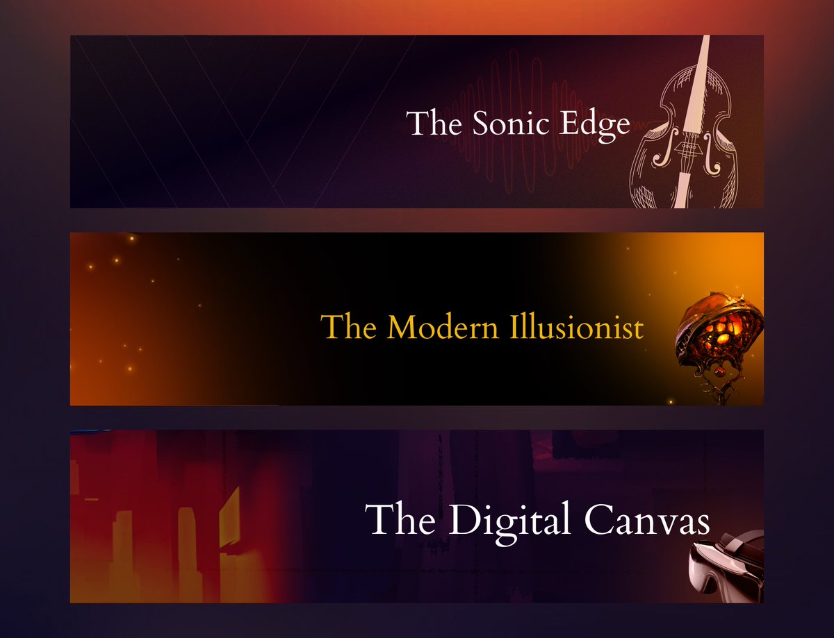
Most LinkedIn banners look good.
Very few actually say something.
I designed this series for a brand in the “avant-garde corporate entertainment” space, where mystery, sound, and digital experiences all live under one identity.
Three banners.
One system.
No noise—just intention.
4
87
Apr 15
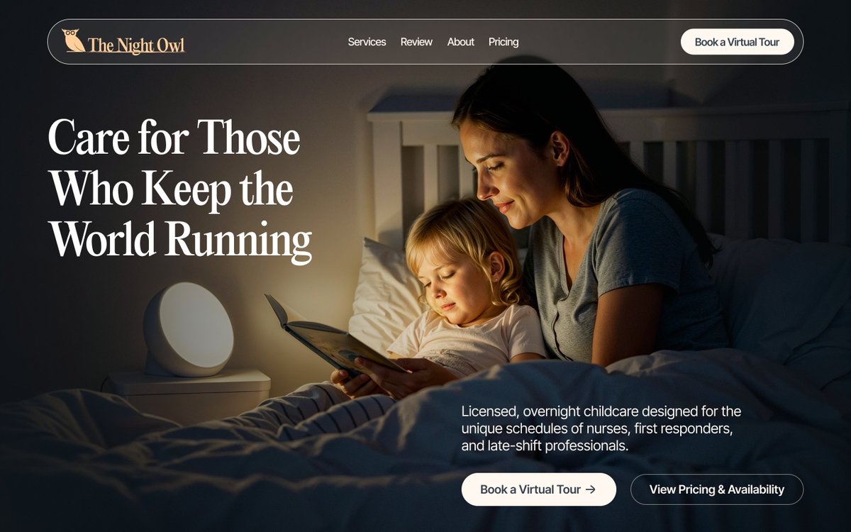
Not every childcare service should feel bright and playful.
Some should feel safe enough to sleep in
11
57
Habeebah Owojori retweeted
Built in Framer.
Structured for clarity.
Crafted for brands that want to stand apart.
This isn’t another layout.
It’s a statement.
1
2
10
470
Habeebah Owojori retweeted
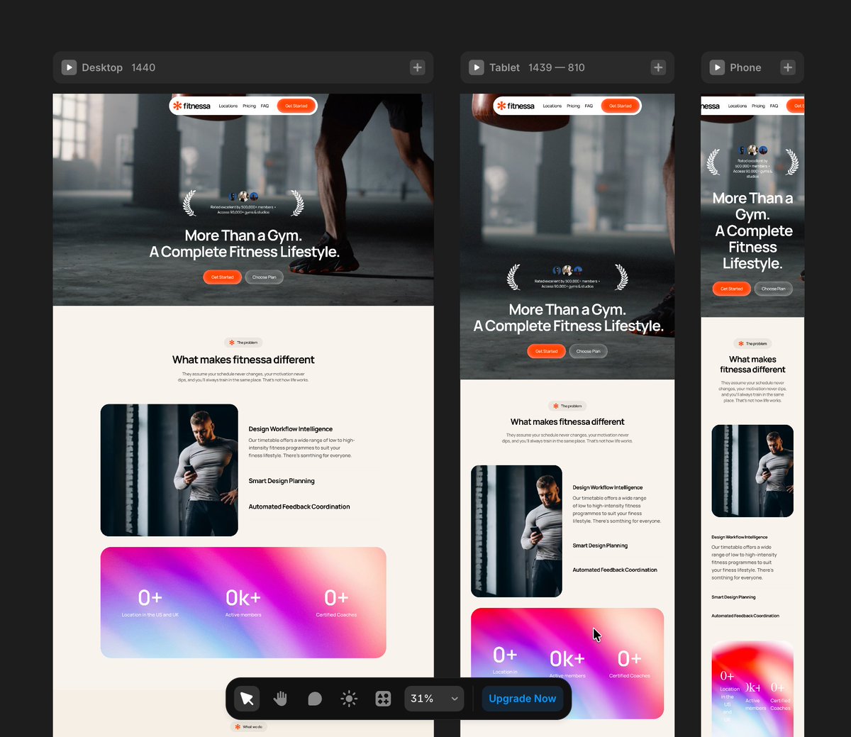
🚧WIP - Fitnessa 🏋️
8
5
59
1,196
Milestone unlocked 🎉
I’m now a Top Rated UX/UI Designer with a 100% Job Success score on Upwork.
Behind that badge are hours spent refining user flows, improving information architecture, and designing intuitive experiences.
For me, great design isn’t just about visuals, it’s about creating clear, user-centered product experiences that actually work.
The numbers reflect the commitment. And numbers don’t lie.
If you're building a product and need thoughtful UX/UI design, I’d love to connect.
#UXDesign #UIDesign #ProductDesign #Upwork
2
1
26
487
Habeebah Owojori retweeted
Today’s practice: Search component.
I designed the UI, then used @jittervideo to explore how motion can support focus, feedback, and clarity.
Small interactions. Real UX value.
#ProductDesign #MotionDesign #UIAnimation #Jitter #UXDesign
3
1
15
189
Habeebah Owojori retweeted
Feb 28
I got a contract on Upwork to redesign the flow and interface of an app, while still retaining the brand feel.
I restructured the experience to be more intuitive and user-friendly. It made sense. It worked.
Then we went ahead to do user research.
And that’s when we realised something.
The app felt too techy for the industry it was in.
So we went back to the drawing board.
This time, the structure was solid. The foundation was there. But the interface? It didn’t feel like where it belonged.
That phase gave me sleepless nights.
At first, I kept playing around with colours. Trying different palettes. Adjusting tones. Going back and forth. Hoping something would click.
Nothing did.
After a good number of front and back, I had to pause and rethink my approach.
Instead of asking, “What colours work?”
I started asking, “What kind of branding would truly resonate with this platform and its audience?”
That shift changed everything.
It felt like wandering in a desert and finally finding water.
Because once the brand direction became clear, the interface started designing itself.
Sometimes the problem isn’t the layout.
Sometimes it’s the identity.
#ProductDesign #UIUX #UXDesign #BrandStrategy #UserResearch #AppDesign #DesignJourney
1
7
135
Habeebah Owojori retweeted
🚧WIP - Truflation

1
8
424
Jan 19
Reverse engineering world-class design to level up my UI skills. This weekend: Ogaki (beauty) and Groth (interior design). Replicated both in Figma, now moving to Framer to master their interactions. You can't fake understanding when you're rebuilding from scratch.
The Context:
While advancing my Framer skills, I realised I needed to go deeper into the fundamentals: typography hierarchy, colour psychology, layout composition, and visual design systems.
My strategy? Find conversion-driven designs and reverse engineer them. Study why elements are positioned the way they are. Understand how typography creates information hierarchy. See how layout influences user behaviour. Then replicate them completely to feel every decision.
This Weekend's Deep Dive:
Ogaki (Beauty Industry): Experimental layouts that break conventional grids. Groth (Interior Design): Typography as the primary design system.
What Makes Ogaki Fascinating:
Their layout approach is unconventional. They're creating visual rhythm through intentional asymmetry and negative space. But where they really shine is in interaction design.
I've replicated the designs in Figma first to understand the static layout choices. Now I'm taking them into Framer to break down each interaction, understanding what makes them work at both a technical and psychological level.
What Makes Groth Powerful:
They've built their entire visual system around typography. The restraint in their colour palette (mostly black, white, earth tones) forces your attention onto the type hierarchy and spatial composition.
When you rebuild a design first in Figma, then implement it in Framer, you can't skip the hard questions:
- Why does this font size create the right emphasis?
- How does this spacing affect visual flow and scannability?
- What makes this interaction feel intuitive versus gimmicky?
- How does this layout guide where users look first?
- Why does this colour choice influence decision-making?
The Figma phase forces you to understand the static design decisions: typography, layout, hierarchy. The Framer phase is where you learn how motion and interaction elevate the experience.
Both sites prove that minimalism is strategic, not stylistic. Every element earns its place. White space creates focus. Typography establishes hierarchy. Layout directs behaviour. Colour triggers emotion.
The Pattern I'm Seeing:
Conversion-driven design isn't accidental. These sites understand:
→ User psychology and cognitive load
→ Visual hierarchy and F pattern scanning
→ Colour theory in conversion optimisation
→ How micro interactions reduce friction
→ The relationship between aesthetics and trust
What's Next:
Taking both designs from Figma into Framer. Going especially deep on Ogaki's interaction system to understand how they've orchestrated animations to feel so cohesive.
1
7
103