
Joined August 2025
- Tweets 7,075
- Following 993
- Followers 1,059
- Likes 13,614
296 Photos and videos


Pinned Tweet

Apr 7
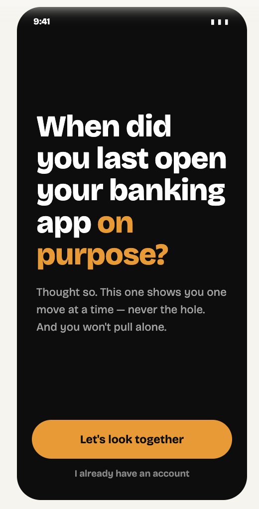
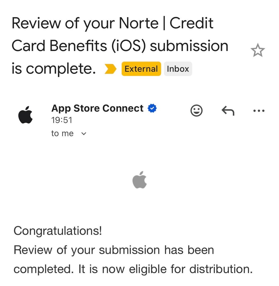
Norte is live on iOS.
For anyone who's ever paid for rental car insurance at the counter and then found out their card already covered it: this is for you. 🧵
25
1
61
2,021
Jun 16
Your premium card comes with a 24/7 personal concierge.
→ Restaurant reservations.
→ Sold-out tickets.
→ Emergency travel help.
Anywhere in the world. Free to call.
You only pay for what they book. Most cardholders have never dialed the number.
Jun 2

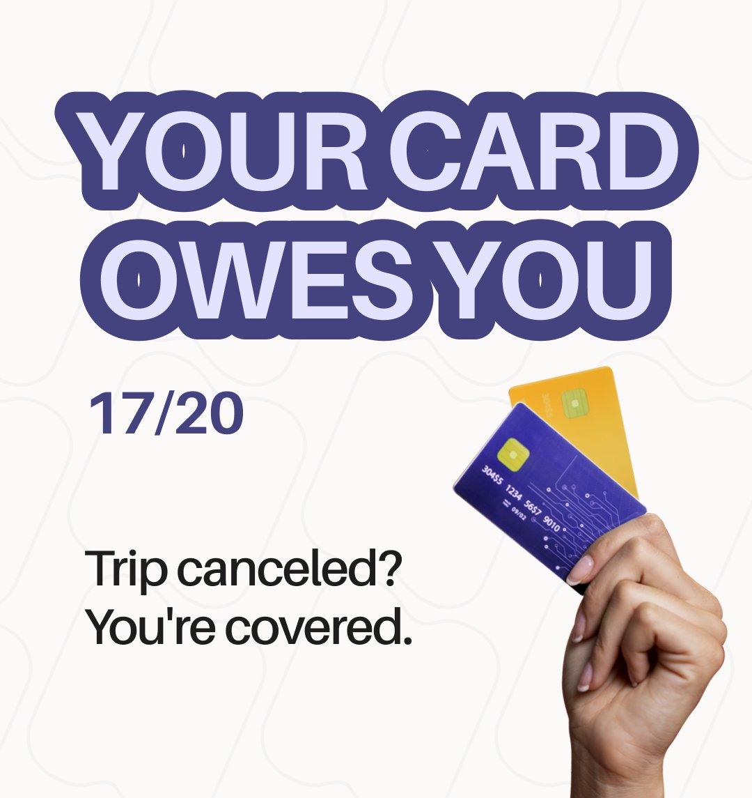
You wake up sick before a $3,000 trip. Hotel is nonrefundable. Flights are paid.
Before you eat the cost, check your card. Many premium cards cover up to $10,000 per person in trip cancellation.
Most people never file.
2
1
2
65
Jun 16
Real stories from Reddit:
→ Visa Infinite concierge found a rental van for 6 people in Key West before a hurricane. Rental agencies said no cars. Concierge confirmed in 45 minutes.
→ Chase concierge helped stranded travelers in Rome find transport after the last train left.
1
37
Jun 16
Save the number on the back of your card to your phone now. Next time you're stuck somewhere, call before you Google.
Have you ever used your card's concierge?
9
Jun 15
The type of notification that helps you keep going 🙌
Tried Norte Premium for a week, decided to keep it and pay for it 🔥
2
7
230
Jun 12
I asked Reddit about financial stress, this is what people said:
(1) Some open the bank app, see the number, close it, and do nothing useful for 20 minutes.
(2) Some brain-dump to an AI: relief without action.
(3) Some comfort-eat: stress produces spending.
Next step? 👇
3
4
161
Jun 11
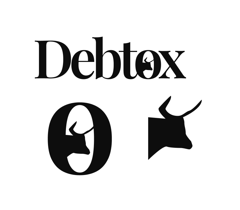
I have been rebuilding the onboarding flow for Debtox and playing around with the mascot today. Can't wait to hit publish and getting users testing the new product!
6
10
451
Jun 10
Today I built the 4-screen onboarding flow for a new app:
A gamified financial challenge app that helps people reduce debt or save more money through adaptive weekly challenges.
Also drafted a logo and icon for it for V1. Would you like to give it a try?
7
10
212
Jun 9
The only people worth reading right now are the ones where you can feel their judgment in every line. Their taste. Their point of view.
AI or not, it doesn't matter. You can tell there's a real person making decisions behind it.
4
7
347
Jun 5
I built a fintech app in 3 hours yesterday during an AI buildathon.
What came out: Debtox.
A financial app that gives you a personalised Monday morning plan: three actions, one estimated saving.
Should I keep building? Would you use it?
6
7
97
Jose Sanchez retweeted

Jun 4
DistFunnel is now LIVE!
I've spent the past few months building my own content operating system with 150 proven content formats, editorial frameworks, and rewrite templates. We currently support X & LinkedIn.
You can start your free trial here 👇

8
12
29
1,728
Jun 2
You wake up sick before a $3,000 trip. Hotel is nonrefundable. Flights are paid.
Before you eat the cost, check your card. Many premium cards cover up to $10,000 per person in trip cancellation.
Most people never file.
May 20
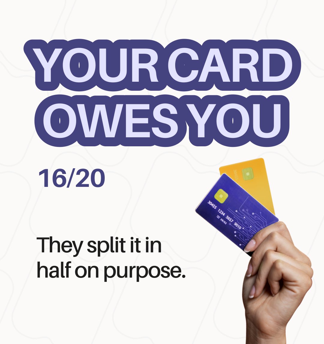
Your card advertises "$600 hotel credit." Sounds generous.
What it actually is: $300 per half-year. Miss one window and half the value disappears. No rollover.
They do this with everything. Monthly. Quarterly. Semi-annual. Every split is another chance you forget.
2
1
3
186
Jun 2
What's NOT covered on any card:
→ "Changed my mind" — never a covered reason
→ Work conflict — rarely covered
→ Fear of travel — not covered
→ Pre-existing conditions — usually excluded if treated in last 60-180 days
You need standalone CFAR travel insurance for those.
1
1
16
Jun 2
How to file:
→ Cancel your reservations as soon as you know
→ Get documentation: doctor's note, weather report...
→ Call the number on the back of your card or file at the benefit administrator's site
→ File within the limits
Book everything on the card.
1
17
May 31
This weekend I shipped time with friends.
I’ll check my dashboards tomorrow again, but this time, with a lifted heart ♥️
3
4
71
May 29
Reviewed and approved in just 24 hours!
Norte v1.0.1 is out!
May 27
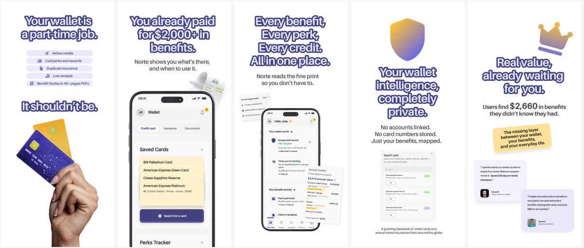
You don't always need new features to make a product feel brand new.
Just spent 3 weeks rebuilding Norte's UX from the ground up. The database is the same, but with an entirely different hierarchy, motion, and feel.
Shipped to Apple today:
• Value Ring: Replaced a static grid. Fills as you log perks, flips color at break-even.
• 2-Tap Selector: Pick category, enter amount, see best card. Live on Overview & Planner.
• Backfills: Log past credits to drain the ring to your true state.
• AI Wallet Audit: Per-card breakdown deep-links into Assistant with a pre-filled prompt.
Now, we wait for the review.

9
13
719
May 27
You don't always need new features to make a product feel brand new.
Just spent 3 weeks rebuilding Norte's UX from the ground up. The database is the same, but with an entirely different hierarchy, motion, and feel.
Shipped to Apple today:
• Value Ring: Replaced a static grid. Fills as you log perks, flips color at break-even.
• 2-Tap Selector: Pick category, enter amount, see best card. Live on Overview & Planner.
• Backfills: Log past credits to drain the ring to your true state.
• AI Wallet Audit: Per-card breakdown deep-links into Assistant with a pre-filled prompt.
Now, we wait for the review.
2
1
6
782