
Joined March 2012
- Tweets 2,119
- Following 1,515
- Followers 1,102
- Likes 3,745
68 Photos and videos


Pinned Tweet

25 May 2023
25 May 2023

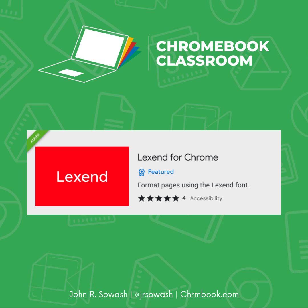
Lexend is a font that has been shown to increase reading speed and comprehension.
This Chrome extension uses Lexend as the default font when you browse the internet.
Install: chrome.google.com/webstore/d…
#ChromebookEDU #GoogleEDU #TeacherTwitter
1
11
19
2,134
Bonnie, EdD retweeted

14 Nov 2025
> "Would serif vs sans-serif fonts help kids distinguish b vs d? Which do you use?"
In Mentava, we start with Lexend font (sans-serif font designed to support dyslexics and struggling readers) and then introduce serif fonts later.
Using visual cues as training wheels makes a lot of sense, but I wouldn't want to use font serifs, because we don't want kids to learn to rely on them as a crutch. Instead, we want to use supports that we can fade out over time.
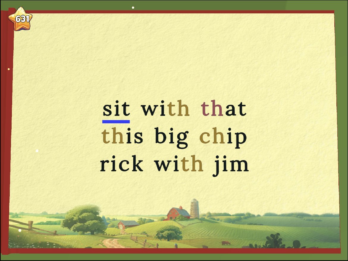
For example, when kids begin learning digraphs, they need to learn to process "th" as a single unit, rather than splitting into "t" and "h".
This is a difficult skill, because they've been used to looking at and reading one single letter at a time. Now there's a new dependency: the sound a letter makes changes based on what letter follows it!
To help kids parse words correctly, we colorcode digraphs to make them more obvious (see image). The nice thing about colorcoding as a support is that we can fade it out, like training wheels.
We begin with bright colors, then fade to dim colors, then fade to shades of greyscale, and eventually when the child has mastered the digraph, we can remove the support entirely.
For us, the key question when deciding on additional supports is: Are we capable of teaching this skill quickly?
If yes, we just get the student to mastery as quickly as possible and move on.
If it's a skill that's going to take a long time to master, then we build in additional supports.
For telling "b" and "d" apart, we still believe that we can get kids to a mastery level fairly quickly. So we don't add in extra supports, just extra practice.
But if it turns out we're wrong and kids need additional supports then we would probably build them out using color rather than serifs.
2
1
10
675
Bonnie, EdD retweeted

15 Nov 2025
خط مبتكر صُمم لتحسين قابلية القراءة وزيادة سرعة الفهم 👓
تم تطويره بدراسات علمية ليساعد في جعل النصوص أوضح وأسهل على العين.
🧠 مثالي لتجارب المستخدمين، التعليم الإلكتروني، والمواقع التي تهتم براحة القارئ
lexend.com/
1
1
238
Bonnie, EdD retweeted

9 Nov 2025
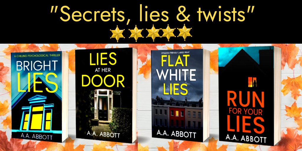
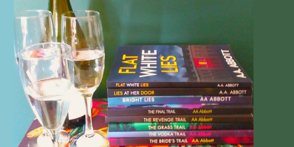
Choose your fave format for my latest #PsychologicalThriller book!
Hardback mybook.to/LiesBetweenFriends…
Paperback mybook.to/LiesBetweenFriends…
#LargePrint mybook.to/LiesBetweenFriends…
#Dyslexia-friendly #Lexend font mybook.to/LiesBetweenFriends…
#Ebook mybook.to/LiesBetweenFriends…
#christmas #books

1
19
15
278
Bonnie, EdD retweeted
8 Nov 2025
Hi! They're formatted in accordance with British Dyslexia Association guidelines, and use #Lexend, a font developed for dyslexics. As it's a large, simple font with plenty of space, you should find them easier to read than other books. For Irlen, you may need a coloured filter.
1
1
1
23
Bonnie, EdD retweeted
28 Sep 2025
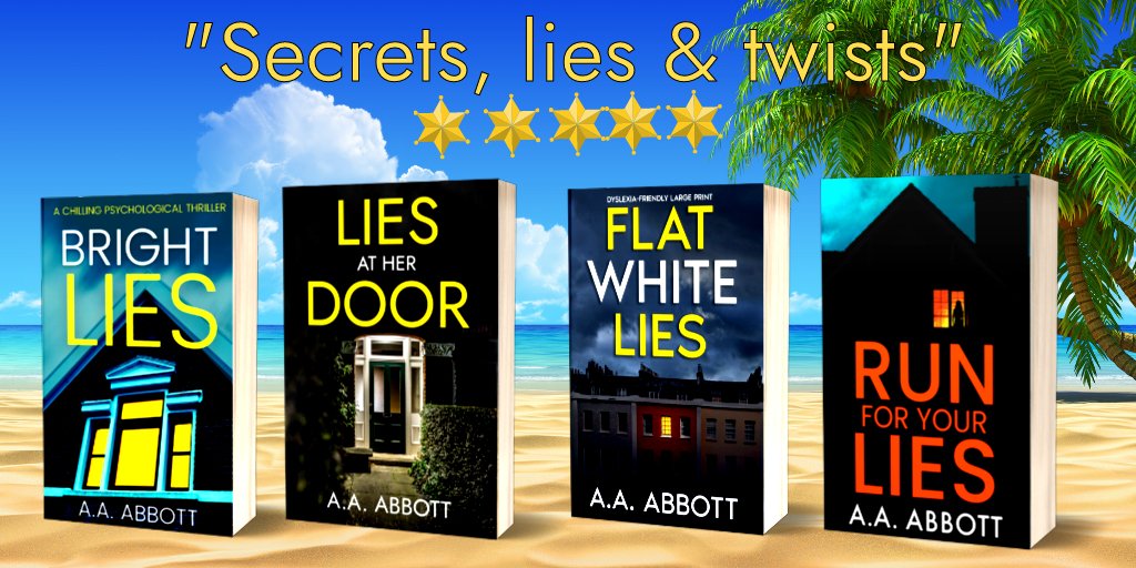
Curl up with a #book!
Choose one of my #thrillerbooks in #ebook, #KindleUnlimited, paperback, large print or #dyslexia-friendly #Lexend font. Some in hardback & #Audible too.
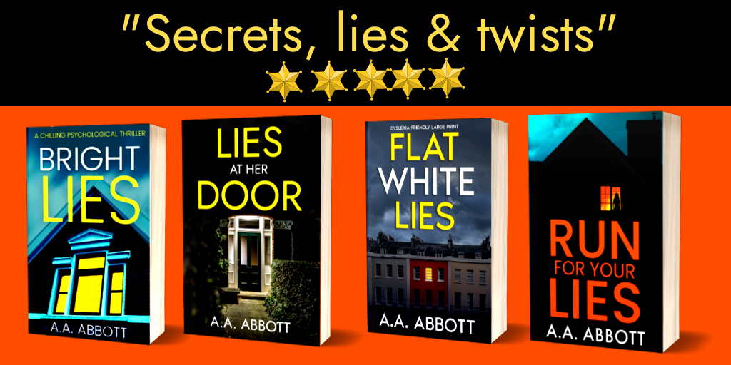
⭐️⭐️⭐️⭐️⭐️"Secrets, lies & twists"
⭐️⭐️⭐️⭐️⭐️"Unputdownable"
⭐️⭐️⭐️⭐️⭐️"I was hooked"
#brumhour
12
7
692
Bonnie, EdD retweeted
7 Sep 2025
Looking for an #autumn read?
Grab my #thrillerbooks in ebook, paperback, large print, or #dyslexia-friendly #Lexend font. Some are in hardback and #Audible too.📚
⭐️⭐️⭐️⭐️⭐️"Secrets, lies & twists"
⭐️⭐️⭐️⭐️⭐️"Unputdownable"
⭐️⭐️⭐️⭐️⭐️"I was hooked"
#BrumHour #Birmingham #books

1
10
9
391
Bonnie, EdD retweeted

23 Aug 2025
Planning an upcoming video series for #TikTok and I see that Lexend is an available font for captions that makes me super excited.
New series for instructional coaches around productivity starting this week you’re gonna wanna follow .
tiktok.com/@fieldingnotes?_t…

ALT Screenshot of the TikTok interface with Lexend font highlighted.
1
1
8
234

Bonnie, EdD retweeted
17 Aug 2025
Looking for #holiday #reading?✈️🏖️
Pack one of these #thrillerbooks, or download an #ebook!
⭐️⭐️⭐️⭐️⭐️"Secrets, lies & twists"
⭐️⭐️⭐️⭐️⭐️"I was hooked"
⭐️⭐️⭐️⭐️⭐️"Thrilling"
#Free in #KindleUnlimited. Also in paperback, #LargePrint & #dyslexia-friendly #Lexend font.
#BrumHour

3
16
23
529
Bonnie, EdD retweeted
6 Jul 2025
Chill out with a #thriller!🍸🌞📖
Grab these in ebook, paperback, large print, or #dyslexia-friendly #Lexend font. Some are in hardback and #Audible too.
#Free in #KndleUnlimited.
⭐️⭐️⭐️⭐️⭐️"Secrets, lies & twists"
⭐️⭐️⭐️⭐️⭐️"Unputdownable"
⭐️⭐️⭐️⭐️⭐️"I was hooked"
#BrumHour
1
17
16
442
Bonnie, EdD retweeted

4 Jul 2025
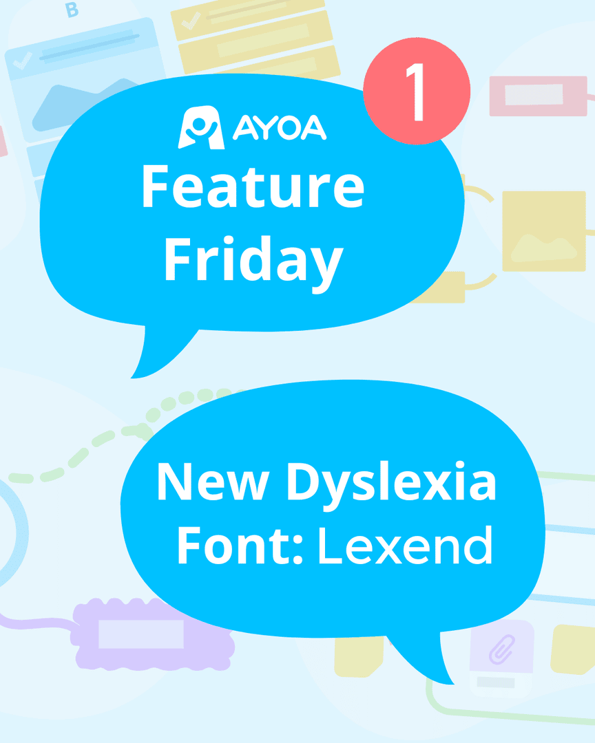
Feature Friday 🌟
New Dyslexia-Friendly Font Lexend Now Available! We're excited to introduce Lexend, a research-backed, dyslexia-friendly font designed to improve reading speed and reduce visual stress for all users.
1
1
92
Bonnie, EdD retweeted
8 Jun 2025
Pack a #book for your holidays, or save space with an ebook!
Grab these in ebook, paperback, large print, or #dyslexia-friendly #Lexend font. Some are in hardback and #Audible too.
⭐️⭐️⭐️⭐️⭐️"Secrets, lies & twists"
⭐️⭐️⭐️⭐️⭐️"Unputdownable"
⭐️⭐️⭐️⭐️⭐️"I was hooked"
#BrumHour

12
11
340
Bonnie, EdD retweeted
15 Jun 2025
Are you in a #book group? 🍷📖Get #BookClub notes for my #thrillers on my website. Download for #free, and start the conversation!
aaabbott.co.uk/questions-for…
All titles in ebook, #KindleUnlimited, paperback, #LargePrint, #dyslexia-friendly #Lexend font & more.
#brumhour #Reading

1
8
6
259
Bonnie, EdD retweeted
25 May 2025
Looking for #BankHoliday #reading? Grab my psychological #thrillers! All in ebook, paperback, large print, and #dyslexia-friendly #Lexend font. Some in hardback and #Audible.
⭐️⭐️⭐️⭐️⭐️"Secrets, lies & twists"
⭐️⭐️⭐️⭐️⭐️"Unputdownable"
⭐️⭐️⭐️⭐️⭐️"I was hooked"
#BrumHour #Amazon
9
10
264
Bonnie, EdD retweeted
25 May 2025
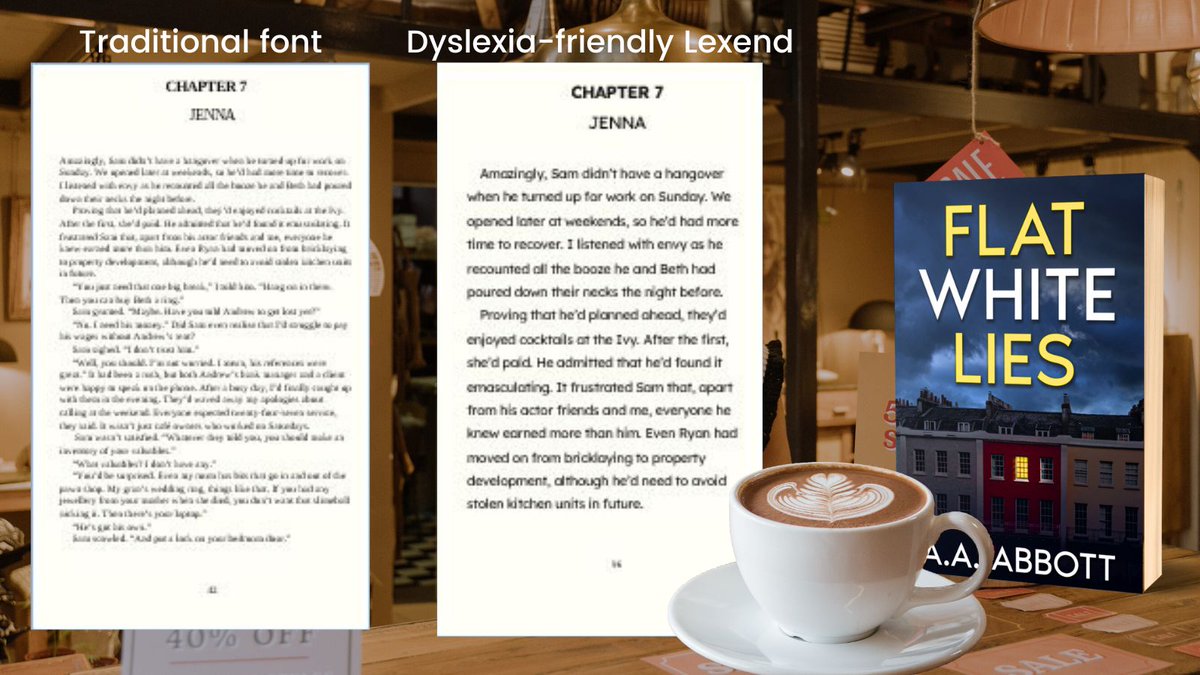
Like all my #thrillerbooks, FLAT WHITE LIES is available printed in #dyslexia-friendly #Lexend font. Look inside here: mybook.to/FlatWhiteLiesDysle…
Also in #ebook, #KindleUnlimited, hardback, paperback & large print.
⭐️⭐️⭐️⭐️⭐️"I could not put this #book down."
#brumhour #reading

7
9
212

ATS Coach Ruth says bye-bye Times New Roman! Loved Calibri, but hello Aptos! That little tail on the lowercase 'l' boosts readability, making it more accessible! Almost perfect, but Lexend's true 'a' also champions accessibility, keeping it tied at the top for us. #A11y
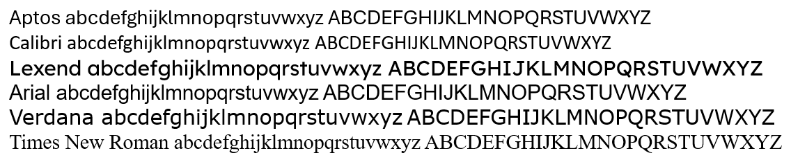
ALT sample of the following fonts using both upper and lower case alphabet. Aptos, Calibri, Lexend, Arial, Verdana, Times New Roman
1
2
178
Bonnie, EdD retweeted
11 May 2025
Like all my #thrillerbooks, FLAT WHITE LIES is available printed in #dyslexia-friendly #Lexend font. 📖Check it out.
mybook.to/FlatWhiteLiesDysle…
Also in #ebook, #KindleUnlimited, hardback, paperback & large print.
⭐️⭐️⭐️⭐️⭐️"I could not put this #book down."
#brumhour #thriller
11
8
471
Bonnie, EdD retweeted
11 May 2025
Are you in a #book group? 🍷Get #BookClub notes for my #thrillers on my website. Download them #free, and start the conversation!
aaabbott.co.uk/questions-for…
All titles in ebook, #KindleUnlimited, paperback, #LargePrint, #dyslexia-friendly #Lexend font & more.
#brumhour #reading
1
7
7
319
Bonnie, EdD retweeted

10 May 2025
EdTech Links from the Week of 5/5/25 - controlaltachieve.com/2025/0…
🈴 Little Language Lessons
📖 Lexend Font
💻 Favorite Portable Monitor
🤔 THInC Forum
➡️ New Brisk Resources
📰 What's New in Google
🤖 M2 from Swivl
#edtech

1
8
20
1,704
Bonnie, EdD retweeted
7 May 2025
My weekly EdTech newsletter just went out - mailchi.mp/controlaltachieve…
🈴 Little Language Lessons
📖 Lexend Font
💻 Favorite Portable Monitor
🤔 THInC Forum
➡️ New Brisk Resources
📰 What's New in Google
🤖 M2 from Swivl
#edtech

3
2
12
766