
LogoDesign is the no.1 readymade #logodesign marketplace where you can sell or buy professionally created logo designs without any hassle.
Joined February 2018
- Tweets 1,158
- Following 322
- Followers 5,063
- Likes 328
806 Photos and videos


Jun 12
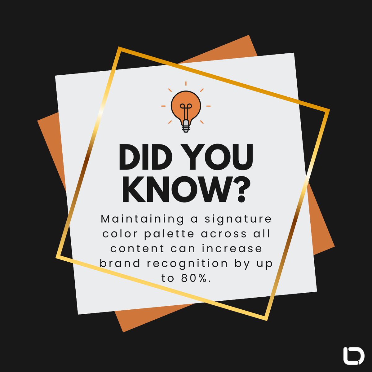
People remember what they see repeatedly. Using the same brand colors across your website, social media, and marketing materials can increase brand recognition by up to 80%. A little consistency goes a long way. 🎨
#Branding #BrandIdentity #MarketingTips #LogoDesign
11
What do AI startups, robots, and brilliant branding have in common? They all need a logo that turns heads. 🤖
Explore 100 AI startup logos and discover the design trends shaping the future of tech branding. See which styles stand out and spark your next big idea.
60
Think a logo needs an icon to be memorable? Some of the world's most recognizable brands built their identity using nothing but their name and great typography.
Find out what makes wordmark logos work in our blog: logodesign.net/blog/wordmark…
#WordmarkLogo #LogoDesign #BrandIdentity
20
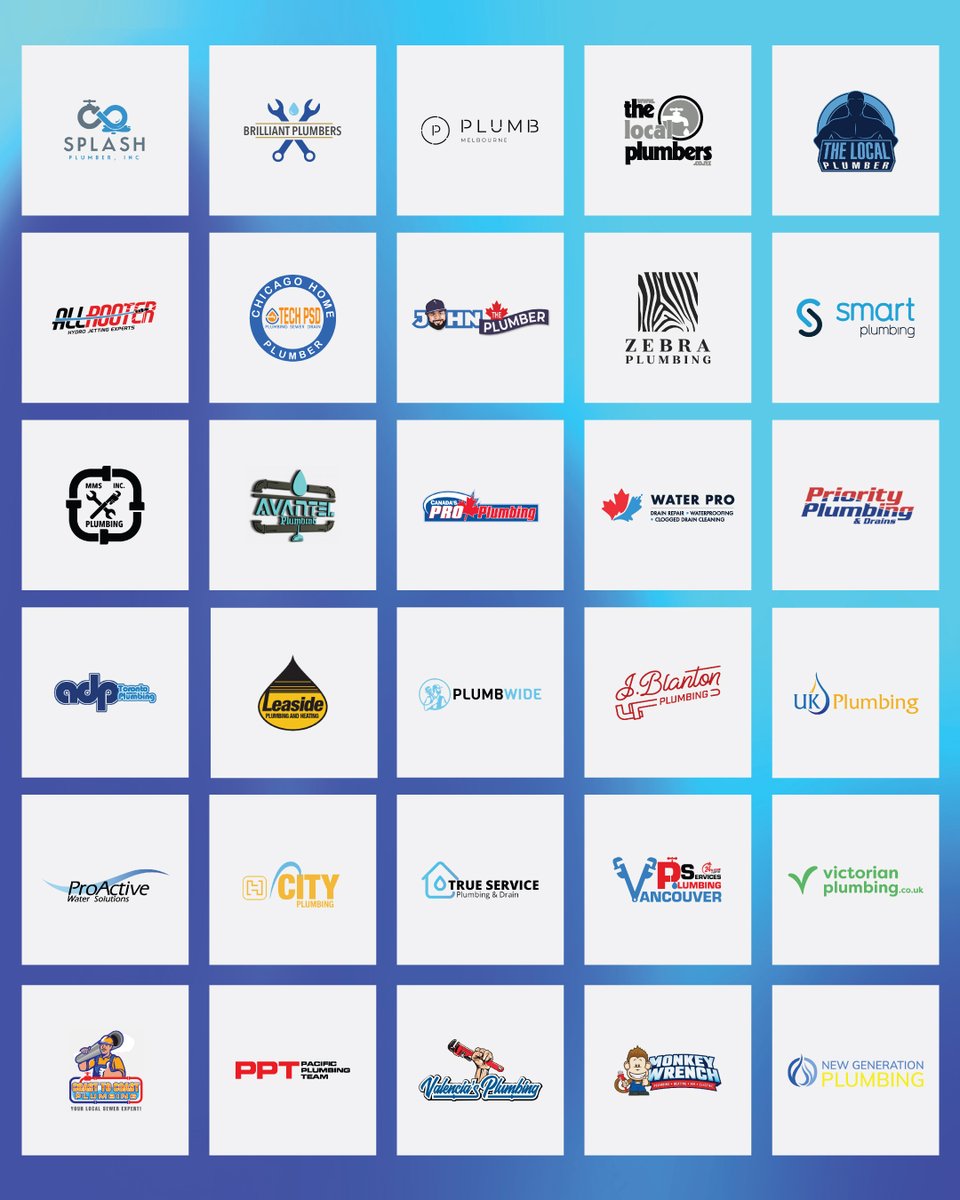
Who said plumbing logos have to look boring? From bold pipes to clever water drops, these 100 logo ideas prove even wrenches can have style. 💧🔧
Check them out here: logodesign.net/blog/100-plum…
#LogoDesign #Branding #PlumbingLogo #DesignInspo
37
May 29
Turn an idea into a logo without slowing down the process. Pick a style, shape it your way, and get a finished design ready to use across your brand.
Start now with the LogoDesign.Net logo maker:
logodesign.net/logos
#LogoDesign #LogoDesignNet #Branding #DesignTools
71
May 22
Metallic logos have that “wow” factor, but the trick is making them look rich, not overdone. Done right, they can feel sleek, modern, and built to last, rather than something that belongs on an old billboard.
Our blog shows how to strike that balance: logodesign.net/blog/how-to-c…
14
May 19
AI logos are the new normal. Small businesses can now create a brand identity in minutes, not days. Try it today: logodesign.net/logos
#LogoDesign #AIDesign #SmallBusiness #BrandingTips
34
May 15
Political logos are a mix of patriotism, psychology, and bold fonts. Once you notice the patterns, you start spotting the same branding tricks everywhere.
We broke it all down in our latest blog: logodesign.net/blog/how-to-d…
#LogoDesign #PoliticalBranding #PoliticalLogos
20
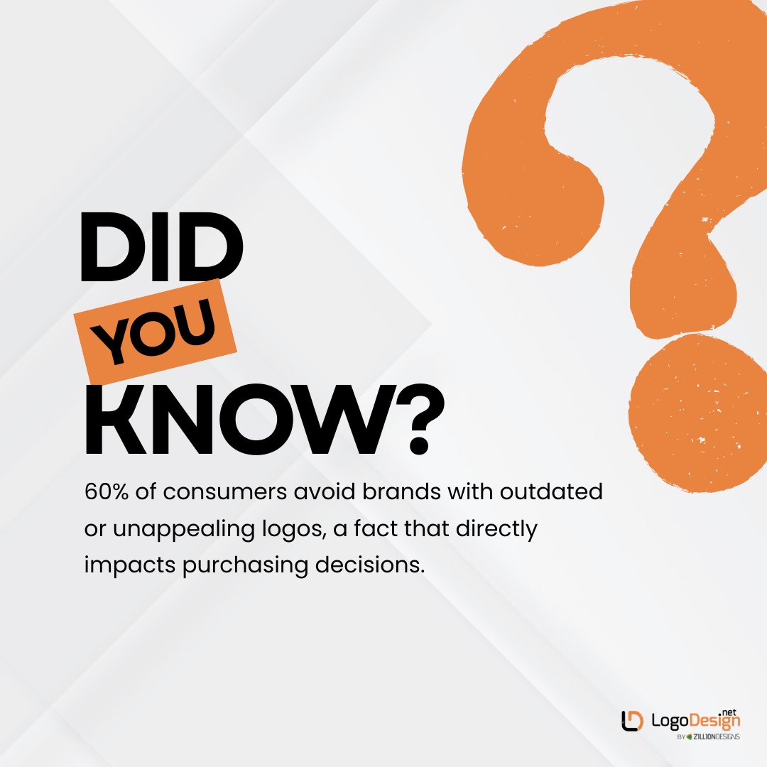
May 12
More than half of consumers avoid brands with outdated or unappealing logos. Your logo is not just decoration; it shapes trust before a customer even clicks, walks in, or buys. If your brand looks stuck, your audience may move on.
#LogoDesign #BrandIdentity #Rebranding
19
Sustainability shows up in the details. 🍀The way a brand simplifies, chooses symbols, and avoids excess often says more than a slogan. These logos reflect that thinking in different ways.
Take a closer look: logodesign.net/blog/100-envi…
#Sustainability #LogoDesign #Branding #Design
27
Blue leads logo colors, followed by black and red. It is a go-to choice because it feels familiar and easy to trust at a glance. Most top brands also keep things simple, using two colors or fewer to stay clear and consistent everywhere.
#LogoDesign #Branding #DesignFacts
28
Every website follows a structure, even if you do not notice it. From F and Z patterns to single- and multi-page layouts, each type shapes how users read, scroll, and act.
Knowing them helps you design with purpose, not guesswork.
#WebDesign #UXDesign #UILayout #DesignTips
15
Apr 28
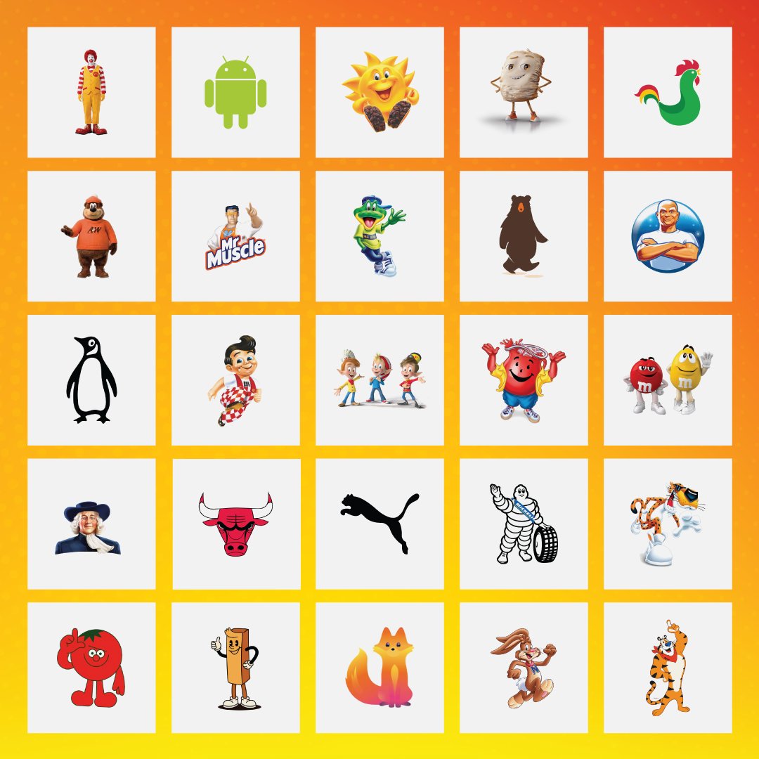
They don’t just sit in logos; they stay in memory. 😍
Mascots give brands personality, emotion, and a face people connect with. Explore 100 mascot logos that bring brands to life: logodesign.net/blog/100-masc…
#LogoDesign #BrandIdentity #Mascots #DesignInspiration
49
Apr 24
Ever noticed how some logos feel… a little too familiar?
From subtle inspiration to near twins, these brand lookalikes might surprise you. Spot the similarities and rethink originality in design.
Read our blog to know more: logodesign.net/blog/logo-loo…
#LogoDesign #Branding
27
Apr 21
Green just feels right, fresh, calm, and easy to trust. 💚
No surprise so many brands stick with it. Here are some of the most recognizable green logos that made the color part of their identity.
#LogoDesign #Branding #DesignInspiration #GreenLogos
17
Apr 20
One logo, one look, everywhere? That feels outdated fast.
Today’s strongest brands use logo systems that change shape but keep recognition sharp.
Read more in our blog: 👇
logodesign.net/blog/logo-sys…
#LogoSystems #ModernBranding #DesignTips
21
Apr 14
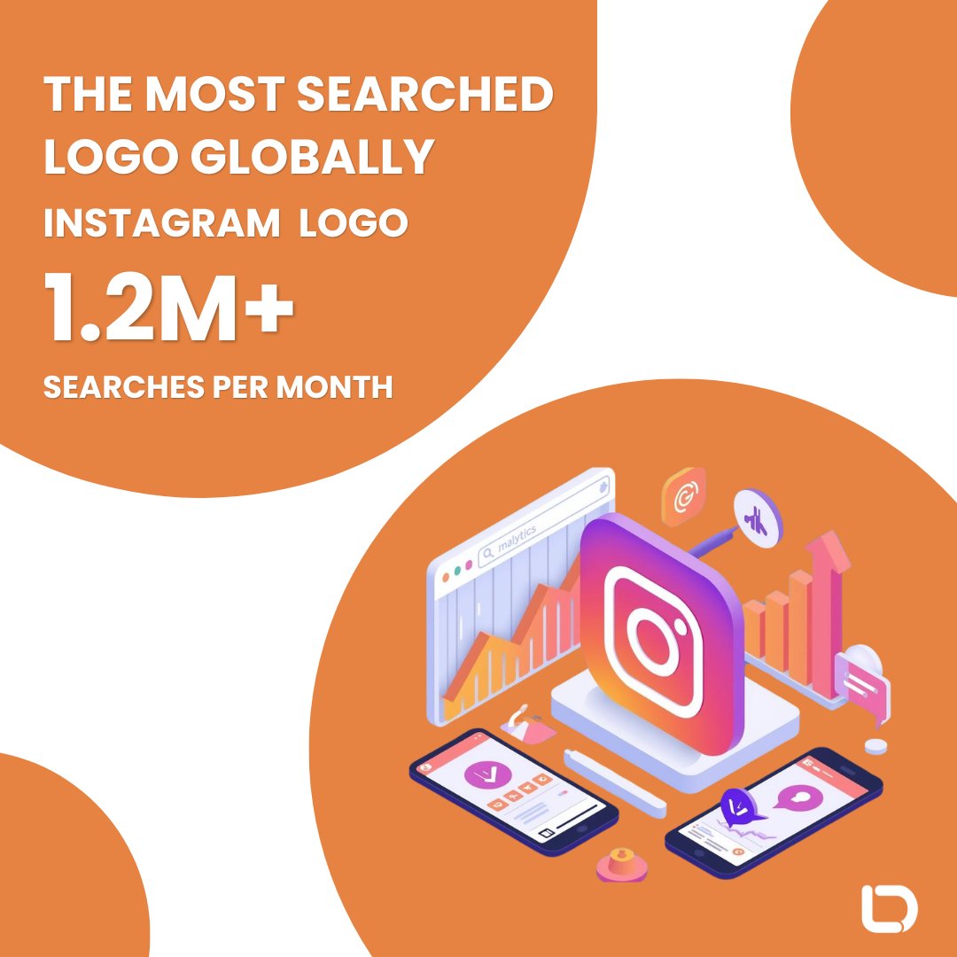
Did You Know? 🤔
Instagram’s logo is the world’s most searched brand icon, with over 1.2M monthly searches—beating YouTube, Facebook, Apple, and Nike. Its “squircle” design is everywhere!
#InstagramLogo #LogoDesign #Branding #DesignTrends
1
30
Apr 10
Colors got you stuck? Not anymore. 🎨
We’ve gathered 100 color tools every designer secretly wishes they knew about. Palettes, gradients, inspiration—you name it, it’s here.
Check it out: logodesign.net/blog/color-to…
#GraphicDesign #ColorTools #DesignInspo #Creativity
1
55
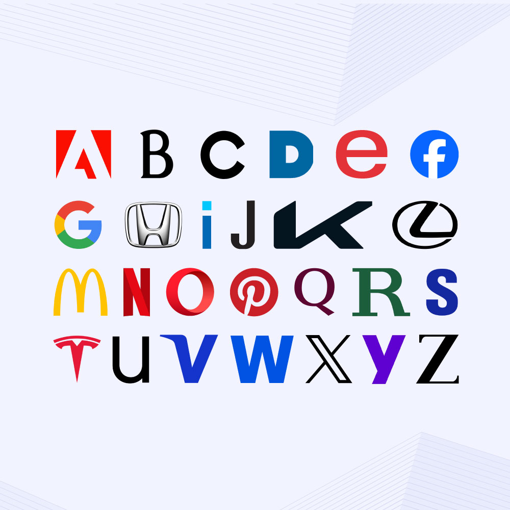
Some logos say everything with just one letter… but not every brand can pull it off. Alphabet logos can be iconic or forgettable. It all comes down to design and context.
Find out where your brand stands: logodesign.net/blog/why-alph…
#LogoDesign #AlphabetLogos #GraphicDesign
25
Mar 31
Some logos pull you in instantly. Often, it is the shapes doing the work.
🟡 Rounded: unity, softness
🔺 Angular: strength, precision
🍀 Organic: creativity, freedom
🪢 Lines: movement, direction
Create your shape logo: 👇
logodesign.net/logos
#LogoDesign #BrandIdentity
51