
Joined March 2026
- Tweets 242
- Following 1
- Followers 1,177
- Likes 177
149 Photos and videos


Pinned Tweet

Introducing Meditations in Color.
An archive of the color of art history.
A drawing system that builds new work from its palettes.
Visit meditationsincolor.com
4
11
54
5,095
Odilon Redon, Beatrice (1885).
Pastel on paper.
Unlike the Impressionists, Redon rarely painted outdoors. He preferred literature, dreams, and memory as sources for imagery. Here he turns to Dante's Beatrice, a symbol of spiritual love and enlightenment.
5
11
331
Johannes Itten, Circles (1916).
Oil on canvas.
Long before he became known as a teacher, Itten was a painter obsessed with color as an autonomous force. Painted before the Bauhaus, this work treats color relationships as the subject itself.
7
27
600
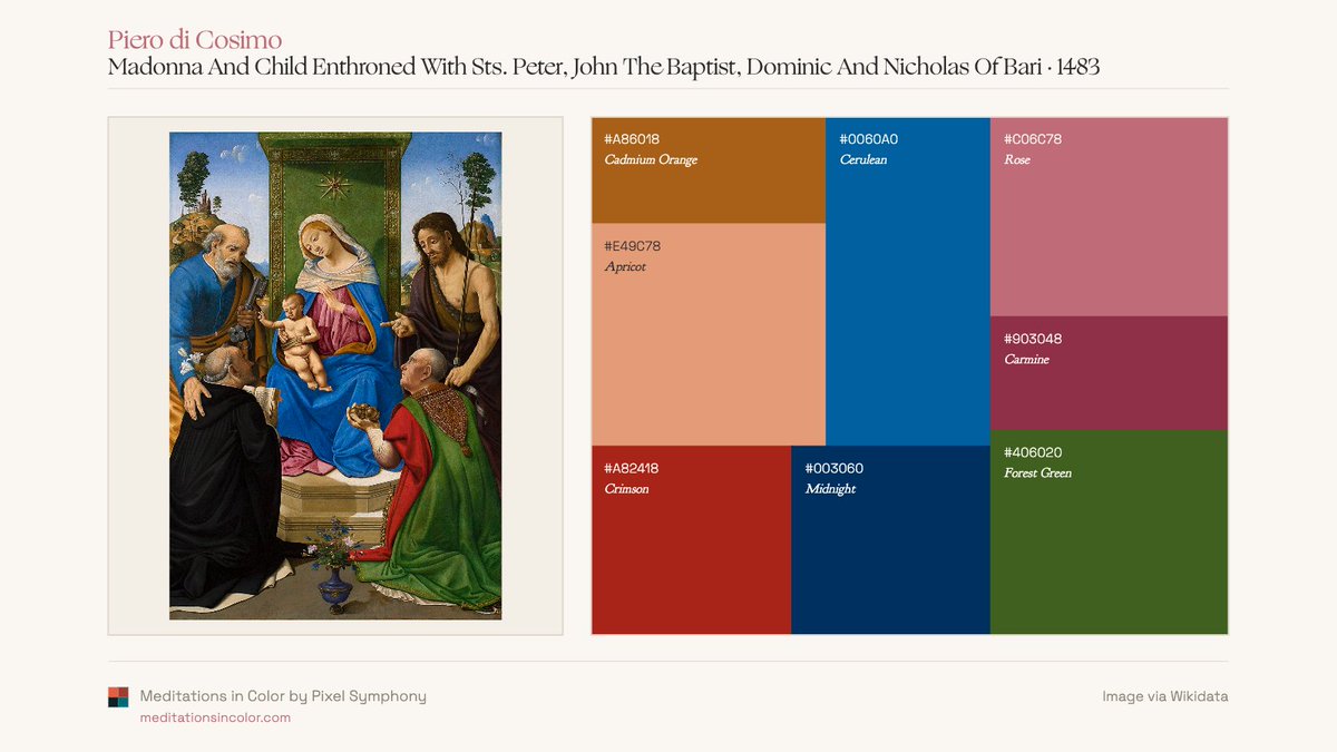
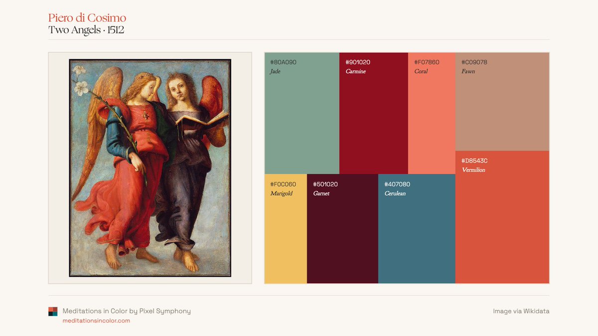
Piero di Cosimo.
Centuries before Impressionism, Piero was already using unexpected color contrasts: ultramarine blues against vermilions, pinks against greens, warm ochres against cool skies. These palettes feel surprisingly modern for the 1480s-1510s.


10
24
713
George Barnard, Table of Twenty-five Principal Colours. 1871.
Chromolithograph.
Published decades before Munsell, Ostwald, and Pantone, Barnard’s chart attempted to organize color. The palette includes 19th CE pigments such as Gamboge, Rose Madder, Indian Red, and Payne’s Gray.
7
44
1,407
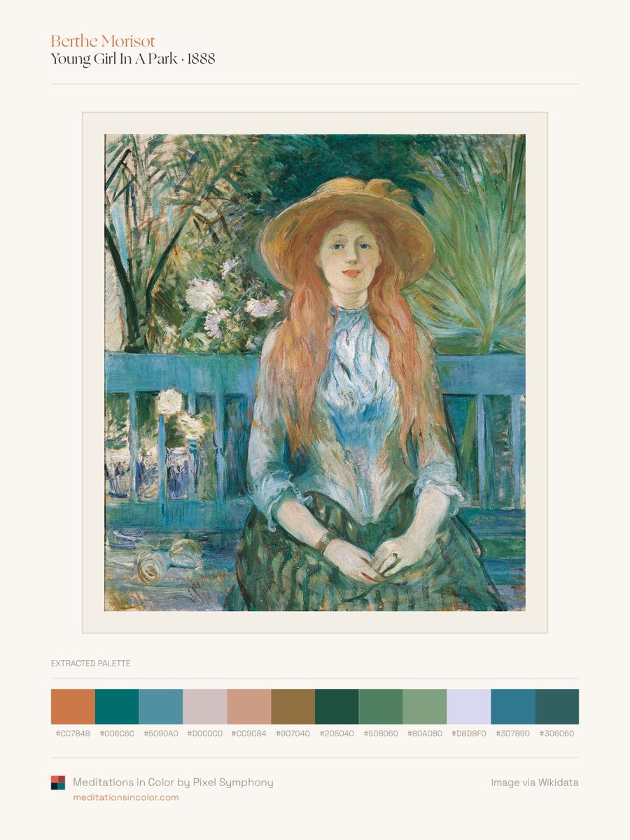
Berthe Morisot, Young Girl in a Park (1888).
Oil on canvas.
Unlike many Impressionists who favored broken complementary contrasts, Morisot often built her paintings from closely related blues, greens, and soft violets, creating a distinctive sense of luminosity and ease.
3
14
525
“I will try to grasp the flowers of the earth.”
- Hilma af Klint
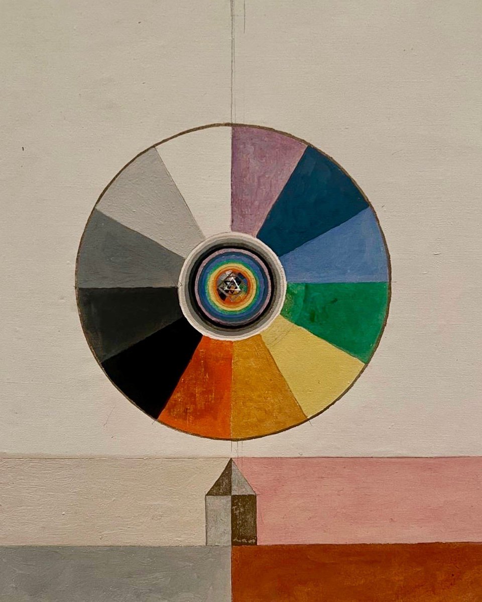
Series VII, No. 7d (1920). Oil on canvas.
Color wheels appear throughout af Klint’s late work as symbols of spiritual and cosmic order.
2
24
97
1,696
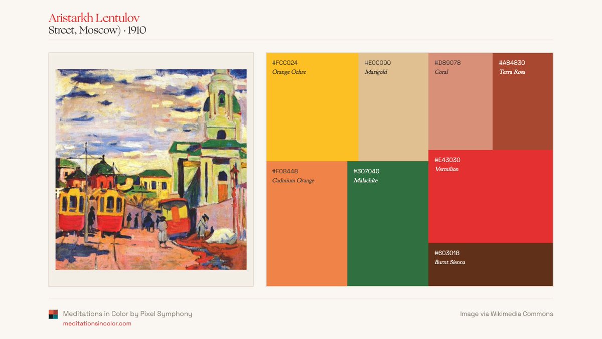
Aristarkh Lentulov.
Known as the “Russian Cézanne,” Lentulov combined the structural ambitions of Cubism and Futurism with the intensity of Russian folk color. Across landscapes, city scenes, and still lifes, color remains the primary force organizing the picture.


1
5
43
1,318
W. B. Yeats, Minutum Mundum Fundamentum Coloris (1895).
Ink and watercolor on paper.
Better known as a poet, Yeats was deeply interested in mysticism and symbolism. This diagram reflects his attempt to connect philosophy, personality, and cosmology through geometry and color.
2
28
124
2,424
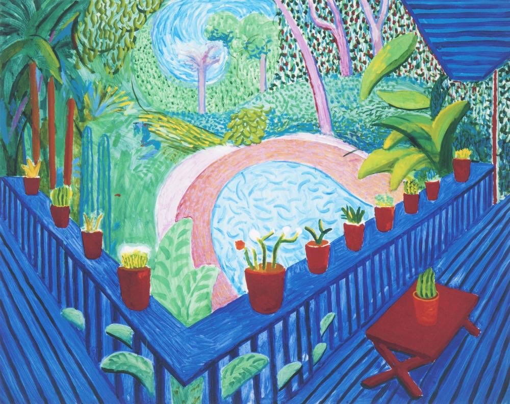
David Hockney’s Normandy gardens.
Looking at these palettes, it is hard not to think of Matisse and Derain. A century later, Hockney returns to the Fauvist idea that color need not describe nature to capture it.


David Hockney, American Collectors (Fred and Marcia Weisman), 1968.
Part of Hockney’s celebrated double portrait series. The painting captures two major Los Angeles collectors surrounded by the objects they lived with, making environment as important as likeness.
1
45
263
7,778
David Hockney, American Collectors (Fred and Marcia Weisman), 1968.
Part of Hockney’s celebrated double portrait series. The painting captures two major Los Angeles collectors surrounded by the objects they lived with, making environment as important as likeness.
We’ve decided to spend the day with Hockney’s work. Anything less wouldn’t quite do justice to our name.
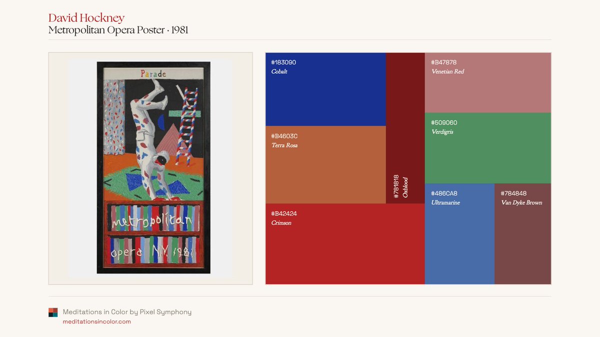
Few painters moved as comfortably between fine art and public design. These palettes come from Hockney posters made for opera houses, theaters, exhibitions, and Olympics.


1
10
43
10,193
We’ve decided to spend the day with Hockney’s work. Anything less wouldn’t quite do justice to our name.
Few painters moved as comfortably between fine art and public design. These palettes come from Hockney posters made for opera houses, theaters, exhibitions, and Olympics.
RIP David Hockney (1937–2026), one of the great colorists of the last century.
Yorkshire, Los Angeles, family, architecture, water, light. Different palettes, different subjects, unmistakably Hockney.
A selection of recurring accent colors drawn from across his work.

2
20
145
8,092
RIP David Hockney (1937–2026), one of the great colorists of the last century.
Yorkshire, Los Angeles, family, architecture, water, light. Different palettes, different subjects, unmistakably Hockney.
A selection of recurring accent colors drawn from across his work.
39
205
10,516
Robert Delaunay, Rythme n°1 (1938).
Delaunay called his approach Orphism, an abstraction built through color rather than line.
Oil on canvas.
19
85
1,092


William Blake’s Antaeus Setting Down Dante and Virgil in the Last Circle of Hell (1824).
Blake turns Dante’s underworld into a study of oppositions. Warm earth tones against deep blues, flesh against stone, gravity against transcendence.
9
33
830
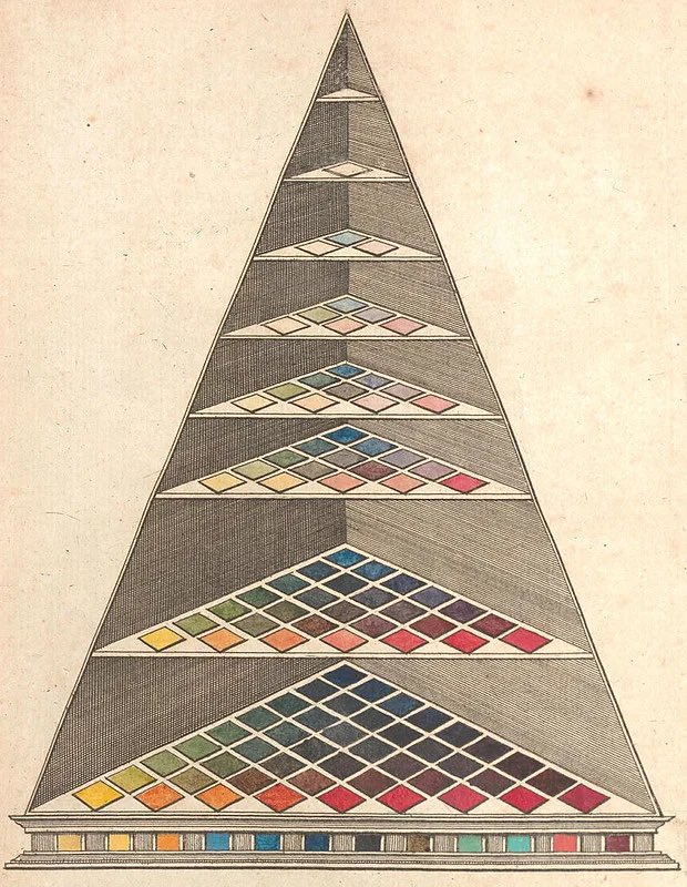
Johann Heinrich Lambert, Farbenpyramide (Color Pyramid), from Beschreibung einer mit dem Calauschen Wachse ausgemalten Farbenpyramide (Description of a Color Pyramid Painted with Calau Wax). 1772.
Engraving.
A three-dimensional color system based on the work of Tobias Mayer.
15
72
1,575
Henri-Edmond Cross, translated into palette fields.
Matisse credited Cross as an important influence. Looking across these palettes, you can see why; color shifts from observation toward something increasingly luminous, structural, and independent.


1
5
48
1,196