
Founder at @designcodeio and aura.build. I teach designers code and developers design.
Joined May 2007
- Tweets 28,244
- Following 425
- Followers 171,417
- Likes 37,152
1,449 Photos and videos


I vibe-coded for months. The sales never came.
A very personal livestream on me rambling about my failures and what I learned.
youtube.com/watch?v=Fs-nfTiW…
11
3
94
12,242
Liquid glass feels so much cleaner now
Back to the macOS I love. Finder is familiar again, the sidebar is cleaner, and the glass is less distracting with sharper details.
The black gradient blending the Dynamic Island into the liquid glass is a great touch. The icons are also more consistent while keeping their personality.
12
5
238
28,833
People ask what I use for screen recording.
I built one in Codex because I was tired of jumping between Screen Studio and CapCut every time I made content for X, YouTube, and Instagram.
One tutorial meant exporting 4:3, 16:9, and 9:16 versions, fixing audio, captions, layout, then re-exporting when something changed.
Now everything happens in one tool.
That's what I love about AI: you can build the tool you wish existed.

20
14
306
37,947
You can quickly test the design system workflow on aura.build
Templates mentioned:
sequra-fintech.aura.build
nereo-seafood-restaurant.aur…
nexora-ai-workflow.aura.buil…
Resources mentioned:
impeccable.style
getdesign.md
tasteskill.dev
23
4,916
Here's how I avoid these:
- Don't use GPT 5.5 to start a design
- Always use an image reference or site url
- Never prompt without a taste skill or DESIGN.md
- Set up design rules in AGENTS.md
- Get familiar with their names so you can change them


44
108
2,602
309,077
Best decision I made this year: switching to paid trials.
Free users were 50% of our token costs, brought abuse and spam, and rarely converted.
Paid trials converted better, lowered noise, and increased customers.
As a bootstrapped product, I’d rather serve serious users than compete with VC-funded free plans.

Remove your free plan.
Free users are leeches. They increase support, server costs, and make you build features your paying customers don’t want.
Less than 3% of free users ever convert.
VC startups can afford free plans because they’re optimizing for growth, not profit.
If you’re an indie founder, never give away your product for free.
18
2
107
17,134
I've been using Codex since day 1.
I built 3 massive web apps, 1 mac app and 1 iOS app with it. It's honestly the best app I've used this year.
Seriously thinking about creating a course on this. Anyone interested?

Building apps has never been easier.
With Sites, Codex can turn your work, ideas, and plans into an interactive website or app your team can explore, use, and share with a URL.
Rolling out to Business and Enterprise plans, before expanding more broadly.
38
5
240
27,034
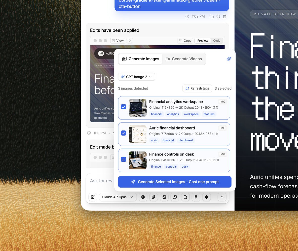
The images and videos were generated on aura.build
I used this DESIGN.md: aura.build/design-systems/au…
Here's the full prompt and workflow video:
Design system context: Treat this as supplemental design-system guidance for the prompt. Preserve its colors, typography, spacing rhythm, shapes, elevation, component styling, animation direction, polish rules, icon direction, accessibility cues, and motion preferences. If this conflicts with a direct screenshot, source HTML, or explicit user request, the direct source wins.
Selected design-system settings: Page section types to include: Hero, Features, Testimonials, Footer, Journey, Pricing, Contact. Treat these as content requirements, then choose the natural information architecture and page flow for the product instead of following the list order.
Hero: Use a strong above-the-fold hero that establishes the offer, visual direction, primary action, and brand tone. Features: Include a clear features section that turns capabilities into concrete user benefits with scannable structure.
Testimonials: Include testimonials or proof points that make the page feel credible without overwhelming the main conversion path. Footer: Include a polished footer with grounded navigation, contact paths, brand details, and any necessary secondary links.
Journey: Add a journey section that shows the customer path, transformation, or step-by-step process. Pricing: Add pricing with clear plan comparison, value framing, and confident call-to-action placement.
Contact: Add a contact section with a low-friction inquiry path and concise trust-building details.
Animation: Rich Interactions, Smooth Scroll. Rich Interactions: Add rich micro-interactions on every interactive element, including buttons, cards, links, controls, inputs, and media hovers. Smooth Scroll: Add smooth scroll with Lenis or locomotive-scroll, using refined scroll smoothing, momentum, and careful fallback behavior so the page feels premium without breaking native navigation.
Polish: Awwwards Polish, SVG Logo Branding, Agency Studio, Fully Responsive, Rich Images Avatars. Awwwards Polish: Apply Awwwards-level motion and visual polish with sophisticated pacing, refined composition, premium details, and memorable section transitions. SVG Logo Branding: Use SVG logo branding for the site logo and brand marks. Create crisp inline SVG symbols, wordmarks, or monograms with responsive sizing, monochrome and dark-mode variants, and consistent brand lockups. Agency Studio: Make it upscale, agency studio style with big headings, confident typography, premium spacing, polished imagery, and editorial composition. Fully Responsive: Make the page fully responsive across mobile, tablet, laptop, and desktop with no overlapping text, clipped controls, or broken layout states. Rich Images Avatars: Add rich images and photo avatars throughout the page. Use premium product, lifestyle, editorial, testimonial, team, or customer imagery where it improves credibility and visual depth.
Icons: Solar Linear. Solar Linear: Use Solar Linear icons for clean, consistent stroke-based interface and feature iconography.
Product description: I want to create a landing page for a FinTech company, a SaaS product called Sequra. Use this product context to shape the offer, section copy, feature framing, proof points, and visual examples.
x.com/MengTo/status/20588931…
I recorded a 27-min tutorial on how to prompt beautiful landing pages with animated images 2.0
2
3
47
6,455
You can find 4,700 templates that you can turn into DESIGN.md on aura.build
Here are the ones from the tutorial:
atelier-ai.aura.build
elara-footwear.aura.build
novi-saas-automation.aura.bu…
It’s been one year since I built Aura and started teaching people how to design better landing pages with AI. What a ride.
We’re the only AI site builder that can generate and host videos directly in the tool. It makes every page feel much more alive.
3
2
35
6,910