
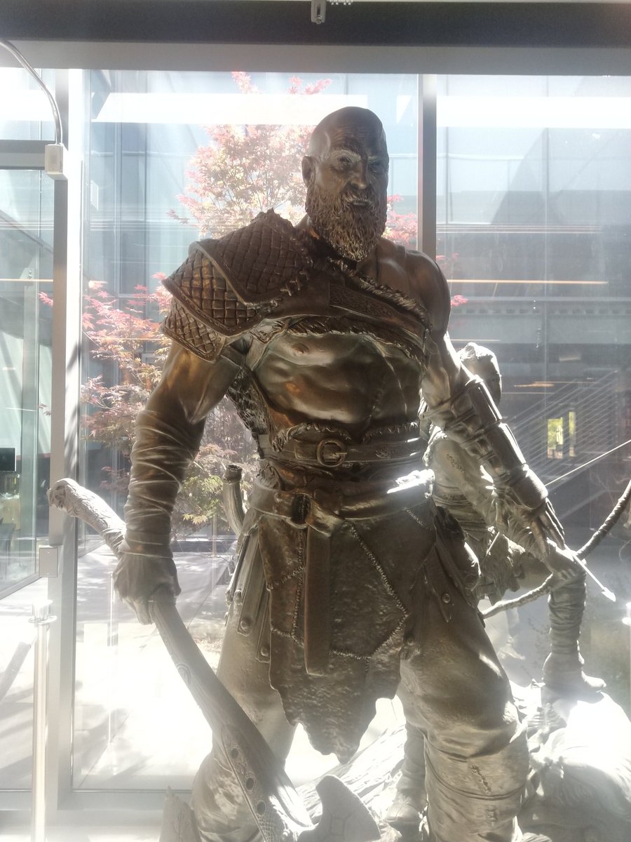
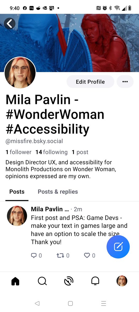
Former : Design Director UX on Wonder Woman @MonolithDev , Lead UX Designer @SonySantaMonica #GodOfWarRagnarök #Accessibility #UX
- Tweets 7,252
- Following 519
- Followers 5,399
- Likes 21,847


ALT Cover image title: Cartson and Peckron in the Vault of the Witch Hunter by M and J Pavlin. Two adventures stand in a cave. One, a tall lanky woman carries a club, while the other, a shorter man carries a torch. They both dress in medieval clothing.


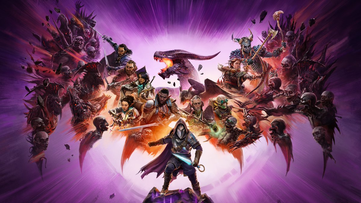
ALT Against a purple background, a dragon spreads its wings. The shapes of the wings are made up of a multitude of characters and creatures. An armored character stands on a rock in the foreground.


ALT #GAconf, IGDA-GASIG. Advancing accessibility for disabled players. Hybrid online & Redmond, October 28th - 29th 2024


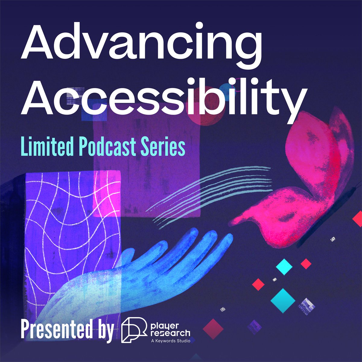
ALT Hand drawn podcast cover art in violet, blue and pink tones. Advancing accessibility - limited podcast series presented by Player Research


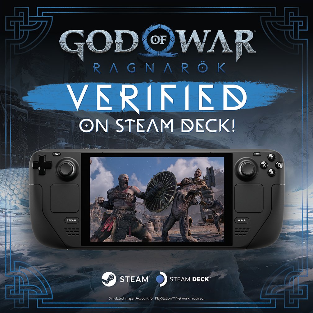
ALT An image showing the Steam Deck with a combat shot of Kratos and Atreus from God of War Ragnarök displayed on its screen. Text displays God of War Ragnarök verified on Steam!


ALT #GAconf, IGDA-GASIG. Advancing accessibility for disabled players. Hybrid online & Redmond, October 28th - 29th 2024


ALT #GAconf, IGDA-GASIG. Advancing accessibility for disabled players. Hybrid online & Redmond, October 28th - 29th 2024
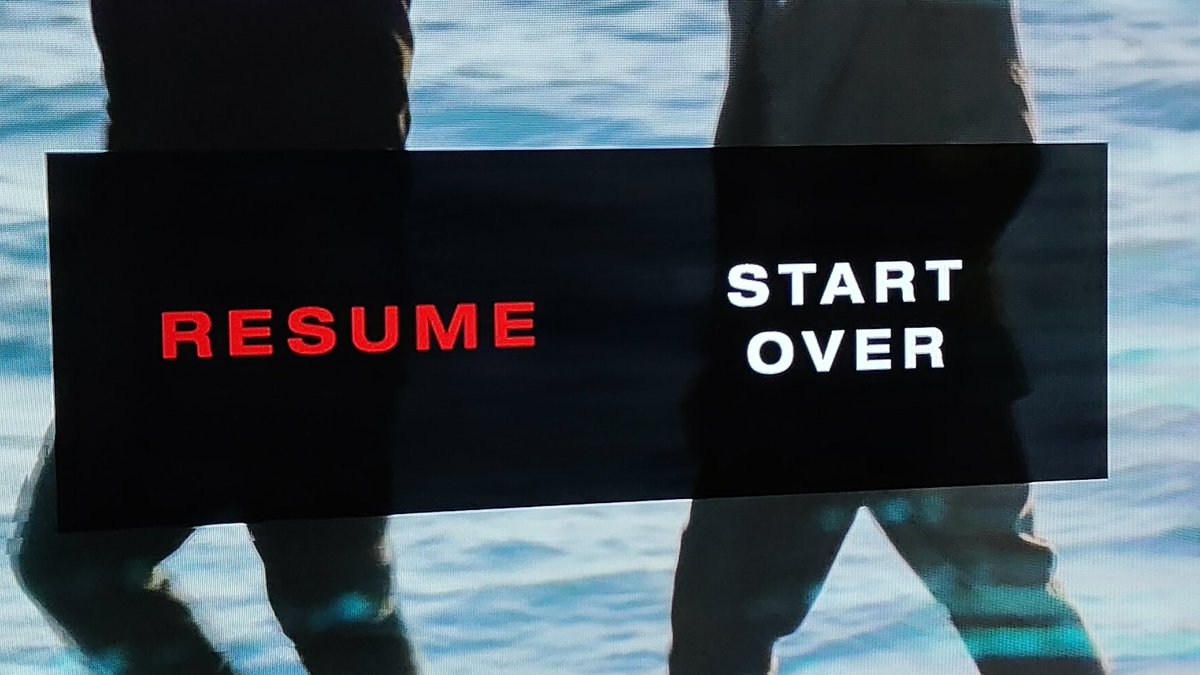
ALT Text on a black background over an image background, one side says Resume in dull red letters the other says Start over in bright white letter