
Data Analyst & BI Consultant | Power BI • Excel VBA & Macros | Building Custom Dashboards & Automation Solutions. 📩info@oboh.com.ng
Joined November 2021
- Tweets 10,215
- Following 422
- Followers 5,984
- Likes 38,984
550 Photos and videos


Pinned Tweet

May 19
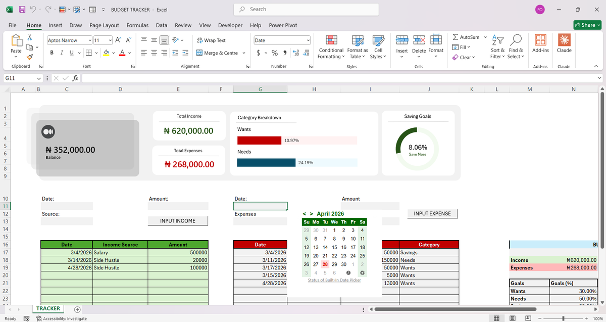
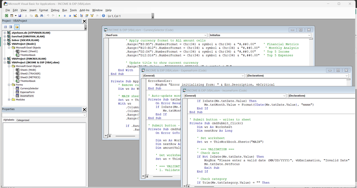
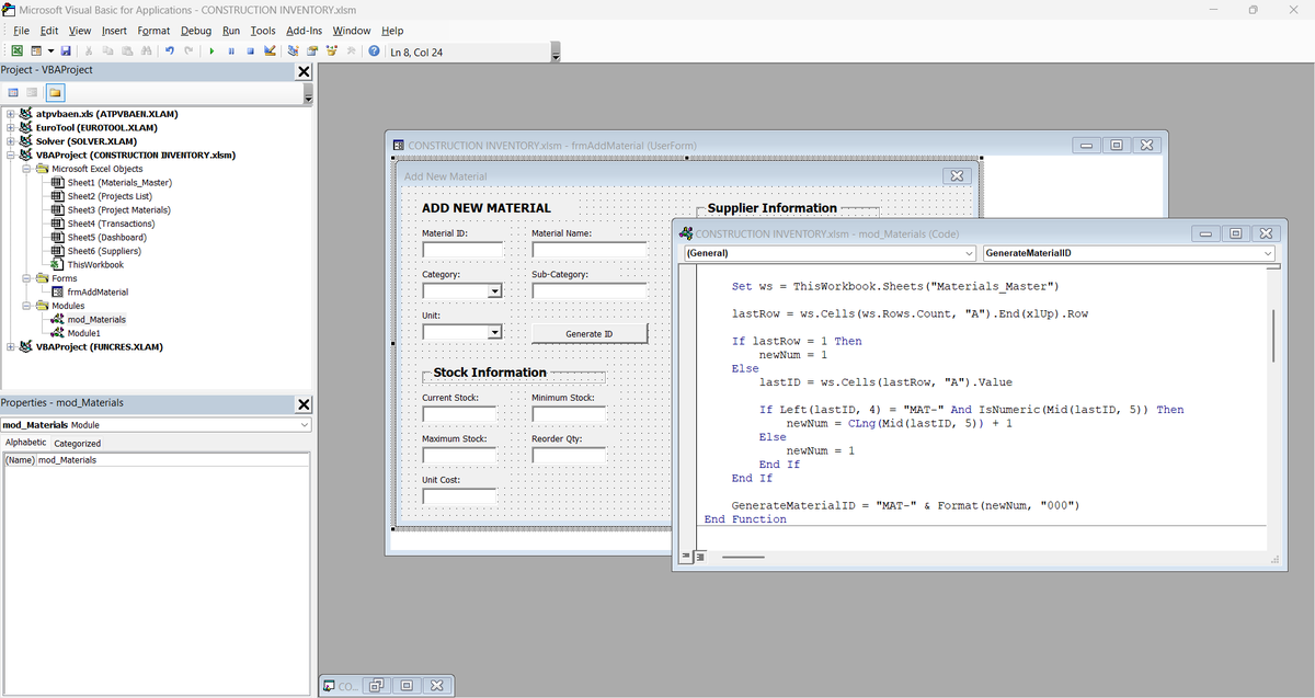
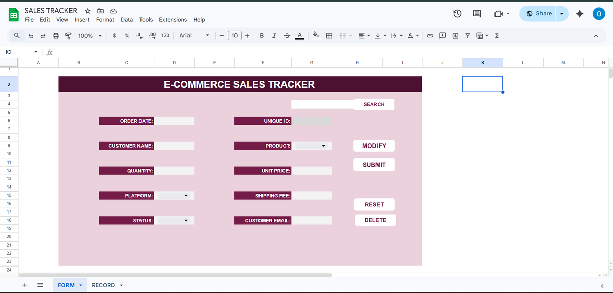
I build powerful, automated spreadsheet systems that save businesses and individuals hours every week, turning messy data, manual processes, and chaotic workflows into clean, intelligent, and fully automated solutions.
Whether you’re a small business owner drowning in spreadsheets or an individual who needs a smarter way to track finances, projects, inventory, or personal goals..I design tailor-made systems that work exactly the way you do.
What I Deliver:
Microsoft Excel solutions with VBA & Macros — advanced automation, interactive dashboards, custom forms, and intelligent reporting
Google Sheets systems powered by Apps Script — cloud-based, collaborative, real-time automation with seamless integrations (Zapier, APIs, databases, etc.)
Custom tools for inventory management, financial forecasting, CRM, project tracking, sales pipelines, budgeting, data analysis, and much more
Training & hand-holding so you (or your team) can confidently use and maintain the system
Who I Help: Businesses looking to scale without hiring extra staff
Entrepreneurs & Freelancers who want to reclaim their time
Professionals & Power Users tired of repetitive Excel drudgery
Teams needing collaborative, error-proof Google Sheets workflows
Result? Less time clicking, fewer errors, faster decisions, and more focus on what actually grows your business or life.
Ready to upgrade your spreadsheets?
Drop me a message with a quick description of your current pain point or goal. I’ll reply with: A short video audit of your existing sheet (if you share it) or we can jump on a call to discuss it..
Mail: info@oboh.com.ng
Let’s turn your spreadsheets from a headache into a superpower.
4
21
145
5,330
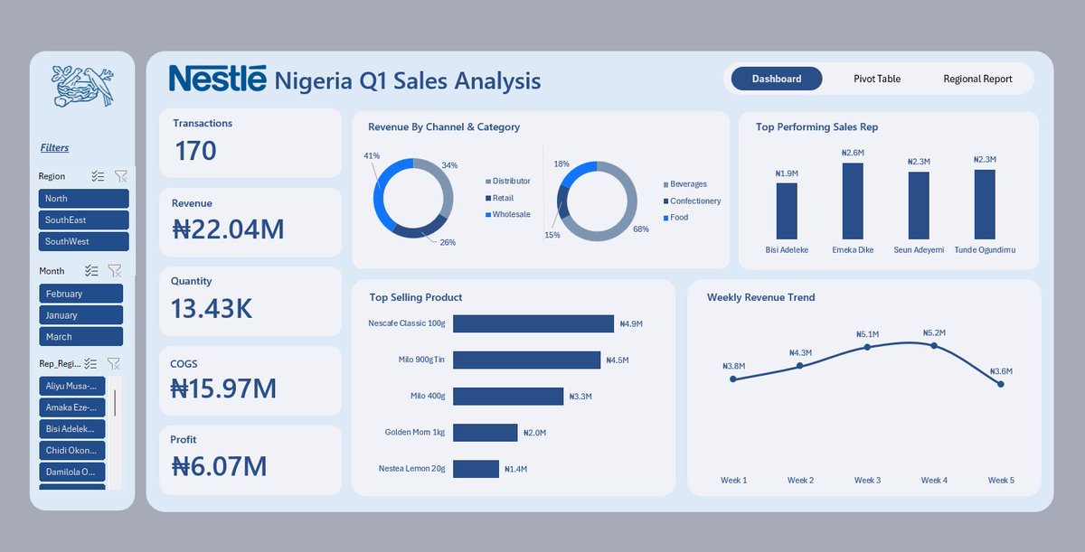
At the end of every quarter, Sandra has the same challenge.
As the Commercial Analytics Lead at Nestlé Nigeria, she's responsible for preparing performance reports for management.
The problem isn't the reporting itself.
The problem is that the data comes from different regions.
For Q1, sales reports arrived from the North, South-West, and South-East regions as separate CSV files. Each region maintained its own report, which meant slight differences in formatting, naming conventions, and data quality.
Before management could answer questions like:
• Which region generated the most revenue?
• Which products performed best?
• Who were the top-performing sales representatives?
• How did revenue trend throughout the quarter?
The data first had to be prepared.
This project started with three regional sales datasets.
Using Power Query, I imported the files, standardized the structure, corrected data types, cleaned inconsistencies, and appended all three datasets into a single master table.
Once the foundation was in place, I created additional fields to support analysis, including:
• Revenue
• Profit
• Profit Margin
• Week Number
• Month Name
• Performance Indicators
With the transformed dataset ready, the next step was analysis.
Before building any visuals, I summarized the data using PivotTables to identify the key insights and answer the business questions that mattered most.
Only after the analysis phase did I move into dashboard design.
I wireframed the layout, defined the KPI structure, selected the appropriate visualizations, and built an interactive dashboard featuring:
• Revenue, Profit, Quantity, and Transaction KPIs
• Revenue by Channel and Category
• Top Performing Sales Representatives
• Best Selling Products
• Weekly Revenue Trends
• Interactive filters for Region, Month, and Sales Representative
What began as three separate CSV files became a centralized reporting solution capable of delivering insights in seconds.
One lesson I keep reinforcing in my classes:
Most people think dashboards start with charts.
They don't.
Dashboards start with clean data, a structured process, and the right business questions.
Tools Used: Excel, Power Query, PivotTables, PivotCharts, Slicers, Dashboard Design
#DataAnalytics #Excel #PowerQuery #BusinessIntelligence
12
19
139
4,190
Freedom | Excel Boss retweeted

Week 4 of Excel101 was an interesting one.
Week 5 starts tomorrow, and it's going to be more interesting
Jun 12

Week 4 of EXCEL101 was the week students stopped cleaning data manually and started building systems.
Up until now, we had been working with datasets that were already structured enough to analyze.
This week introduced a different reality:
Data rarely arrives analysis-ready.
It comes from different files, different teams, different systems, and often in different formats.
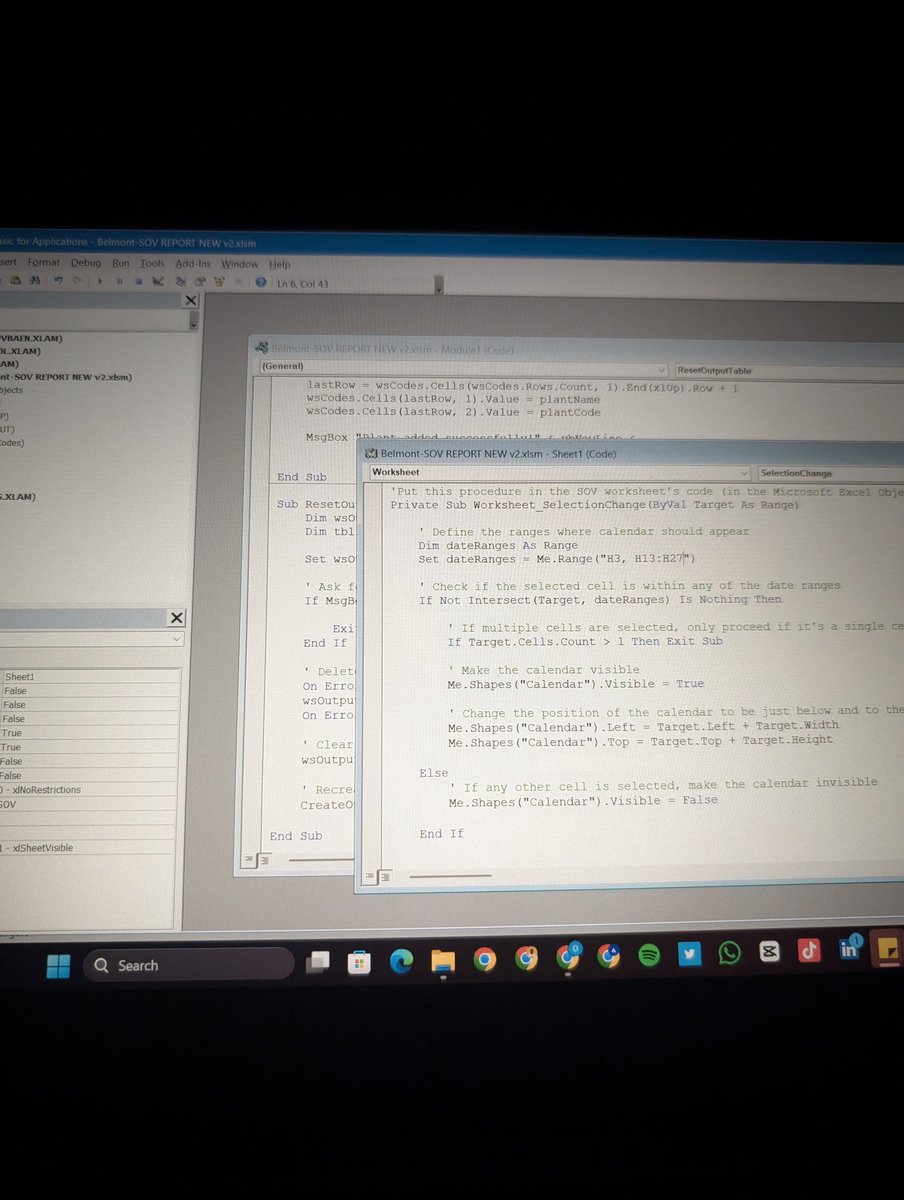
That's why we spent the week learning "Power Query" — Excel's built-in data transformation engine.
And once students saw what it could do, the conversation changed.
We started with the concept of ETL:
Extract – Bring data in from external sources.
Transform – Clean, standardize, reshape, and enrich the data.
Load – Push the refined dataset into Excel for reporting and analysis.
The most important lesson wasn't the buttons.
It was understanding that Power Query doesn't change your original data.
Every transformation becomes a recorded step.
Fix it once.
Refresh forever.
That's a completely different way of working.
For the practical session, students worked with multiple CSV files based on regional sales data.
The datasets were intentionally messy.
Different date formats.
Inconsistent name formats.
Extra spaces.
Blank rows.
The kind of problems analysts deal with every day.
Step by step, students learned how to:
* Remove blank rows
* Fix incorrect data types
* Standardize text fields
* Create calculated columns
* Generate date-based attributes
* Load clean datasets back into Excel
The highlight for many students was "Appending".
Instead of manually copying and pasting multiple reports into one sheet, they combined separate datasets into a single master table using Power Query.
More importantly, they learned the principle behind it:
Automation only works when structure is respected.
If column names, formats, and data types are inconsistent, automation breaks.
If the structure is right, the process scales.
From there, we moved into "Data Modeling concepts".
Students were introduced to Fact and Dimension tables and the idea that not all data belongs in one giant spreadsheet.
We discussed:
* Fact Tables (transactions and measurable events)
* Dimension Tables (descriptive information)
* Primary Keys
* Foreign Keys
These concepts laid the foundation for one of the most important topics of the week:
Merge.
Many students initially saw Merge as another lookup feature.
By the end of the session, they understood that it is much more than that.
Append adds rows.
Merge adds context.
Append is vertical.
Merge is relational.
We explored different join types and discussed why choosing the wrong join can change the results of an analysis without generating an error.
That insight alone was worth the session.
Then came the assignment.
Students received data from a fictional logistics company containing shipment transactions, customer information, route details, and driver records.
Their task was to:
* Clean and standardize the shipment data
* Merge multiple dimension tables into the fact table
* Create new calculated fields
* Build KPI summaries
* Develop PivotTable reports and charts
* Answer business questions using the transformed dataset
The objective wasn't simply to build reports.
It was to create a repeatable workflow that could handle changing data.
That's what analysts do.
They don't just analyze data.
They design processes that make analysis possible.
Week 4 introduced that mindset.
And with Power Query now in place, students are beginning to see Excel as more than a spreadsheet application.
They're starting to see it as a complete data transformation and reporting platform.
Next up: Power Pivot, Data Modeling, DAX, and KPI Reporting.


1
2
162
Freedom | Excel Boss retweeted

Jun 12
His channel took my Excel dashboard game from frame 1 to frame 2 💯🥰
@ObohX is whoever he thinks he is when it comes to Microsoft Excel.


5
3
35
1,584
Freedom | Excel Boss retweeted

Jun 12
Just go camp here.
Jun 12

As simple as excel dashboard looks it's not really easy to create... can't wait to be really Good at it !!!
If you have any resource that can help a beginner to create good dashboard in excel, please drop it in the comment section.
4
17
73
4,749
Jun 12
Week 4 of EXCEL101 was the week students stopped cleaning data manually and started building systems.
Up until now, we had been working with datasets that were already structured enough to analyze.
This week introduced a different reality:
Data rarely arrives analysis-ready.
It comes from different files, different teams, different systems, and often in different formats.
That's why we spent the week learning "Power Query" — Excel's built-in data transformation engine.
And once students saw what it could do, the conversation changed.
We started with the concept of ETL:
Extract – Bring data in from external sources.
Transform – Clean, standardize, reshape, and enrich the data.
Load – Push the refined dataset into Excel for reporting and analysis.
The most important lesson wasn't the buttons.
It was understanding that Power Query doesn't change your original data.
Every transformation becomes a recorded step.
Fix it once.
Refresh forever.
That's a completely different way of working.
For the practical session, students worked with multiple CSV files based on regional sales data.
The datasets were intentionally messy.
Different date formats.
Inconsistent name formats.
Extra spaces.
Blank rows.
The kind of problems analysts deal with every day.
Step by step, students learned how to:
* Remove blank rows
* Fix incorrect data types
* Standardize text fields
* Create calculated columns
* Generate date-based attributes
* Load clean datasets back into Excel
The highlight for many students was "Appending".
Instead of manually copying and pasting multiple reports into one sheet, they combined separate datasets into a single master table using Power Query.
More importantly, they learned the principle behind it:
Automation only works when structure is respected.
If column names, formats, and data types are inconsistent, automation breaks.
If the structure is right, the process scales.
From there, we moved into "Data Modeling concepts".
Students were introduced to Fact and Dimension tables and the idea that not all data belongs in one giant spreadsheet.
We discussed:
* Fact Tables (transactions and measurable events)
* Dimension Tables (descriptive information)
* Primary Keys
* Foreign Keys
These concepts laid the foundation for one of the most important topics of the week:
Merge.
Many students initially saw Merge as another lookup feature.
By the end of the session, they understood that it is much more than that.
Append adds rows.
Merge adds context.
Append is vertical.
Merge is relational.
We explored different join types and discussed why choosing the wrong join can change the results of an analysis without generating an error.
That insight alone was worth the session.
Then came the assignment.
Students received data from a fictional logistics company containing shipment transactions, customer information, route details, and driver records.
Their task was to:
* Clean and standardize the shipment data
* Merge multiple dimension tables into the fact table
* Create new calculated fields
* Build KPI summaries
* Develop PivotTable reports and charts
* Answer business questions using the transformed dataset
The objective wasn't simply to build reports.
It was to create a repeatable workflow that could handle changing data.
That's what analysts do.
They don't just analyze data.
They design processes that make analysis possible.
Week 4 introduced that mindset.
And with Power Query now in place, students are beginning to see Excel as more than a spreadsheet application.
They're starting to see it as a complete data transformation and reporting platform.
Next up: Power Pivot, Data Modeling, DAX, and KPI Reporting.
1
10
59
2,079
Jun 10
Having Mtn and using Airtel as backup is just a silly idea
Global Talent no fit even join Zoom meeting, useless 🤦♂️
6
1
7
432
Freedom | Excel Boss retweeted

Jun 8
I saw another @ObohX tutorial on YouTube on building an interactive Customer Segmentation Dashboard in Excel, and got curious enough to build one myself.
Great breakdown from @ObohX 🙌
#Excel #DataAnalyst #dashboard


2
5
48
2,167
Freedom | Excel Boss retweeted

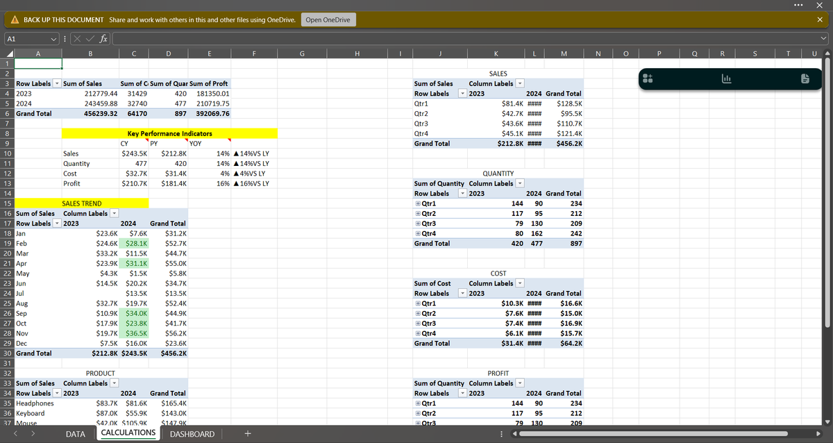
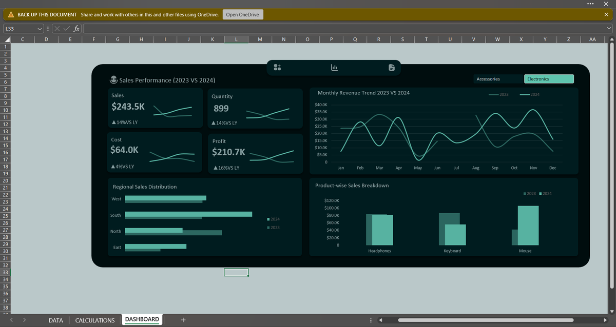
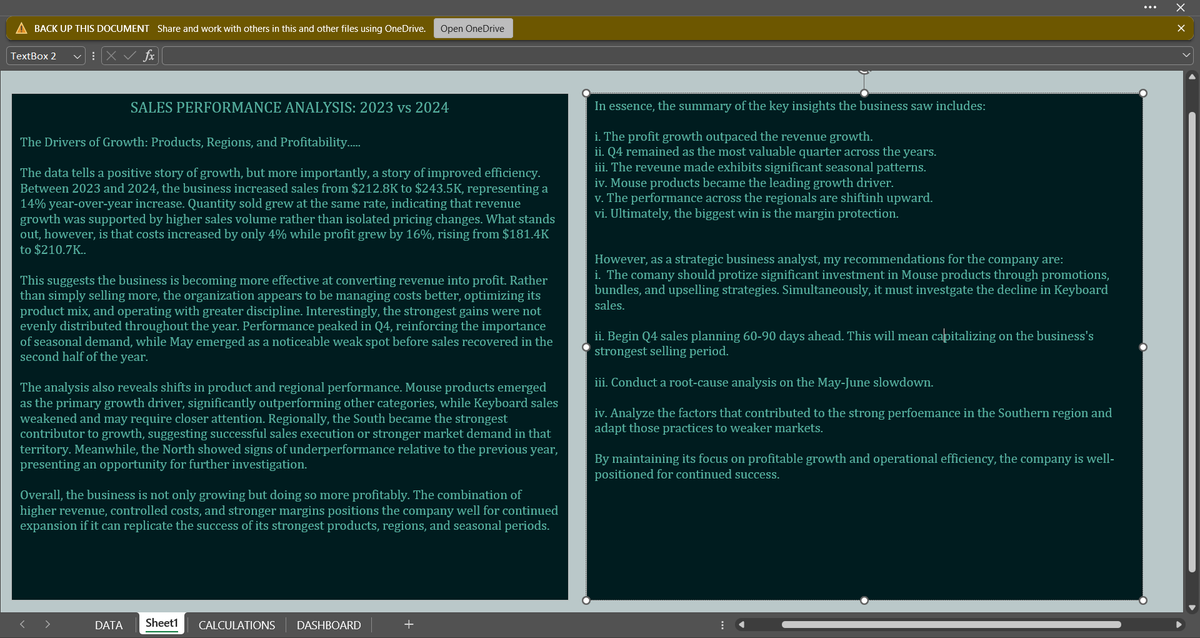
How did Sales Performance Change Between 2023 and 2024?
To answer this, I developed an interactive Excel dashboard, analyzing Sales, Profit, Cost, Quantity, Monthly Trend, Regional and Product Perf.
Credit to @ObohX for the original YouTube Project that inspired this recreation
5
3
36
971
Freedom | Excel Boss retweeted

I built something and I'm giving it away for free.
𝗔 𝗳𝘂𝗹𝗹 𝗗𝗮𝘁𝗮 𝗔𝗻𝗮𝗹𝘆𝘁𝗶𝗰𝘀 𝗿𝗼𝗮𝗱𝗺𝗮𝗽. Interactive. Browser-based. No login required.
𝟭𝟮 𝘀𝘁𝗮𝗴𝗲𝘀. 𝟯𝟮𝟳 𝘁𝗼𝗽𝗶𝗰𝘀. 𝟮𝟴 𝘄𝗲𝗲𝗸𝘀. 𝟲 𝗿𝗲𝗮𝗹 𝗽𝗿𝗼𝗷𝗲𝗰𝘁𝘀.
Every stage has a description, a progress tracker, and projects linked to real GitHub repos. Excel. SQL. Power BI. Python. AI integration built in from stage one.
I built this because the question I get most is "where do I start?"
Now there's an answer.
𝗖𝗼𝗺𝗺𝗲𝗻𝘁 "𝗿𝗼𝗮𝗱𝗺𝗮𝗽" 𝗮𝗻𝗱 𝗜'𝗹𝗹 𝘀𝗲𝗻𝗱 𝘆𝗼𝘂 𝘁𝗵𝗲 𝗹𝗶𝗻𝗸.
𝘕𝘵𝘦 𝘋𝘢𝘯𝘪𝘦𝘭 𝘋𝘢𝘯𝘪𝘦𝘭 · 𝘋𝘢𝘵𝘢 𝘌𝘯𝘨𝘪𝘯𝘦𝘦𝘳 & 𝘌𝘥𝘶𝘤𝘢𝘵𝘰𝘳 · 𝘈𝘣𝘶𝘫𝘢, 𝘕𝘪𝘨𝘦𝘳𝘪𝘢 · 𝘚𝘘𝘓 | 𝘗𝘺𝘵𝘩𝘰𝘯 | 𝘗𝘰𝘸𝘦𝘳 𝘉𝘐 | 𝘋𝘢𝘵𝘢𝘣𝘳𝘪𝘤𝘬𝘴
#Datafam


370
62
357
15,657
Jun 8
Last night I was ranting about not having money, I just woke up and spent the money I don’t have .. 😭
Fuck Adulthood man
3
13
314
Jun 6
One of the biggest upgrades you can make to a dashboard isn't a new chart.
It's making the dashboard "interactive".
And in Excel, one of the easiest ways to do that is with **Slicers**.
Most beginners build reports where users have to:
* Scroll through tables
* Apply filters manually
* Change chart settings
* Search for specific information
An interactive dashboard removes all that friction.
Instead of forcing users to dig through the report, the report responds to them.
That's where Slicers come in.
What is a Slicer?
A Slicer is a visual filter connected to a PivotTable or PivotChart.
Think of it as a dashboard control button.
Instead of opening filter dropdowns, users simply click:
📍 Region
📍 Product
📍 Store
📍 Year
📍 Sales Channel
And the entire report updates instantly.
No formulas.
No manual filtering.
No rebuilding charts.
Just one click.
Why Slicers Matter
Imagine you have a sales dashboard showing:
* Total Revenue
* Top Products
* Monthly Trend
* Customer Segments
Without slicers, users see everything at once.
With slicers, they can ask questions like:
👉 Show me only Lagos sales.
👉 Show me only Online transactions.
👉 Show me performance in Q2.
👉 Show me Product Category A.
The dashboard becomes a tool for exploration instead of a static report.
The Concept of Interactive Dashboards
An interactive dashboard allows users to investigate data themselves.
Instead of creating ten different reports:
* One report for Lagos
* One report for Abuja
* One report for Port Harcourt
You build one dashboard.
The user chooses what they want to see.
That's the power of interaction.
A well-designed dashboard should answer questions quickly.
Not force users to search for answers.
Taking It Further: Connected Reports
One of my favourite moments when teaching PivotTables is showing students that a single slicer can control multiple PivotTables at the same time.
Click "Lagos" once.
Revenue updates.
Product rankings update.
Monthly trends update.
KPIs update.
The entire dashboard responds.
That's when students realize they're no longer building spreadsheets.
They're building reporting systems.
The Real Goal
Slicers aren't just a nice visual feature.
They're part of a bigger idea:
"Interactive dashboards help decision-makers move from viewing data to exploring data."
And that's where analysis becomes valuable.
Because the best dashboards don't just display information.
They help people ask better questions.
3
19
785
Freedom | Excel Boss retweeted

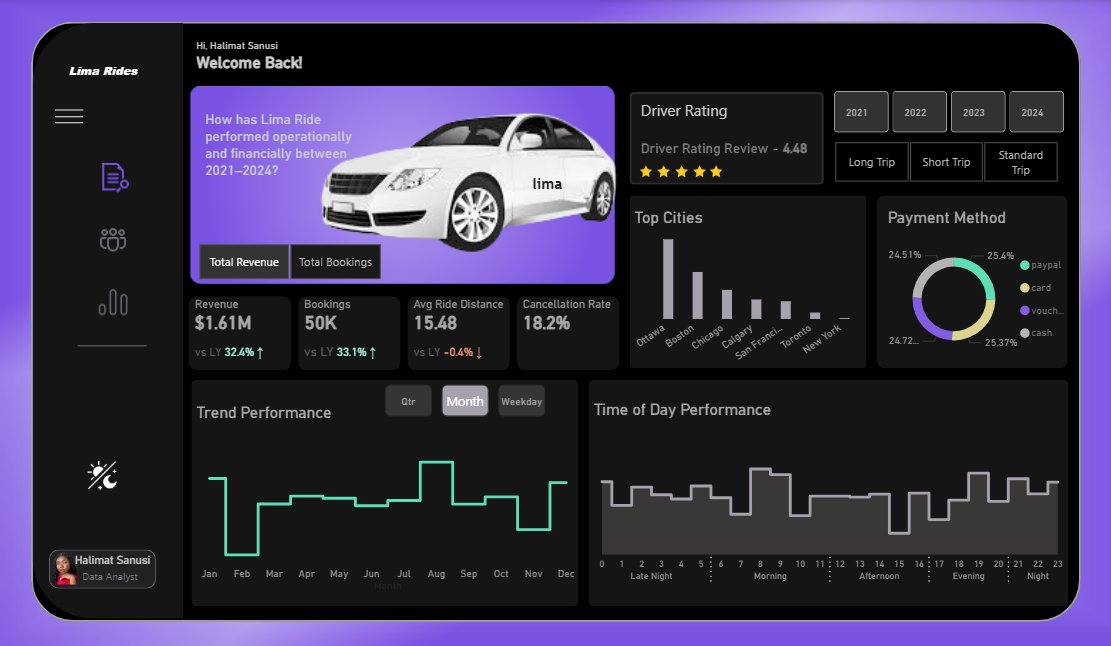
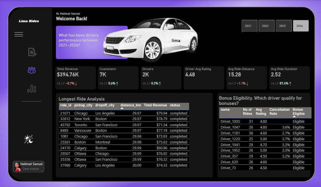
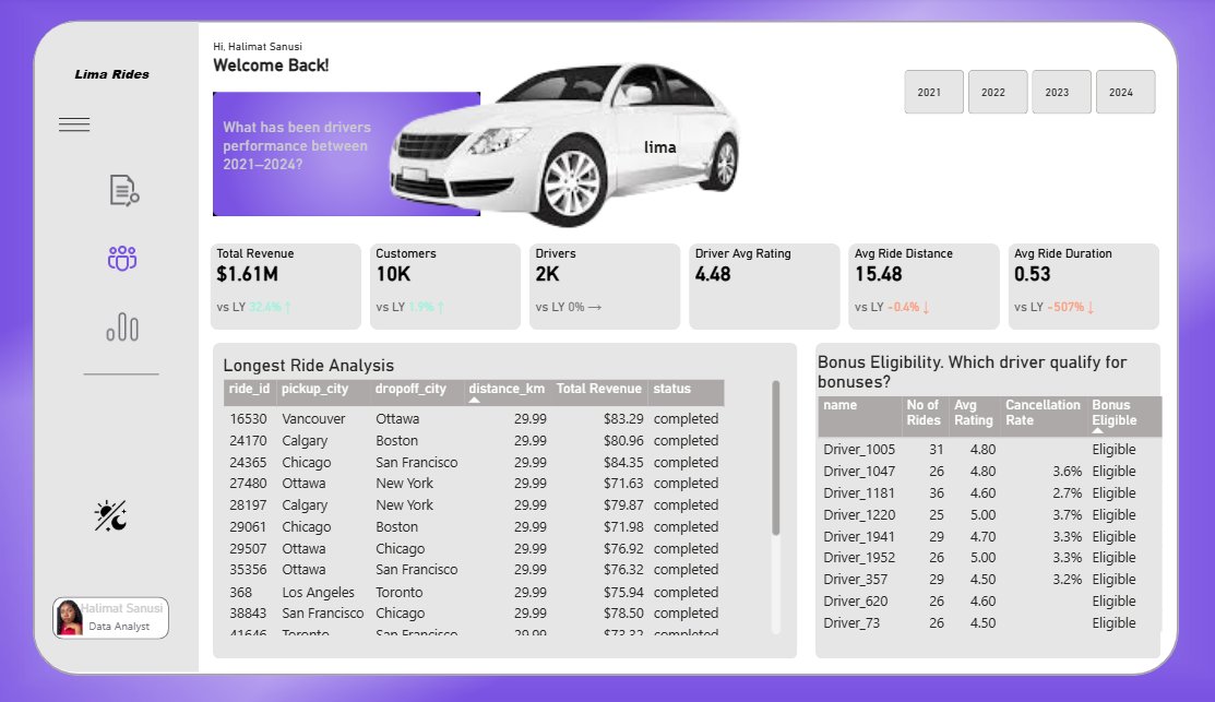
A ride-sharing company wanted to understand how its operations evolved over time.
Using four years of ride data, I uncovered insights around revenue growth, operational bottlenecks, driver performance, bonus eligibility, customer retention, etc.
Designed in dark and light mode.

17
9
49
2,149
Jun 5
Week 3 of EXCEL101 was where students began thinking less like spreadsheet users and more like analysts.
Before touching PivotTables, we focused on something more important: asking the right questions.
Because analysis doesn't start with charts or reports. It starts with understanding what problem you're trying to solve and what answer you're looking for.
From there, we explored PivotTables in depth.
@Lima_D_Analyst kicked off the class on Saturday
Students learned how to:
* Build PivotTables from scratch
* Use Rows, Columns, Values, and Filters effectively
* Group dates by Month, Quarter, and Year
* Calculate Running Totals and Percentage of Total
* Create Calculated Fields
* Manage multiple PivotTables from a single data source
The goal wasn't just summarizing data. It was learning how to turn large datasets into meaningful insights.
We then moved into PivotCharts and dashboard design.
We discussed how different visuals answer different questions and why effective dashboards focus on clarity rather than complexity.
Topics covered included:
* Bar, Line, Donut, and Clustered Bar Charts
* KPI Cards
* Visual Hierarchy
* Dashboard Layout
* Report Storytelling
One of the highlights of the week was introducing Slicers and Timelines.
Students learned how to connect a single filter to multiple PivotTables, allowing entire dashboards to update instantly with a few clicks.
That was the moment many began to see Excel as more than a spreadsheet tool. It became a reporting system.
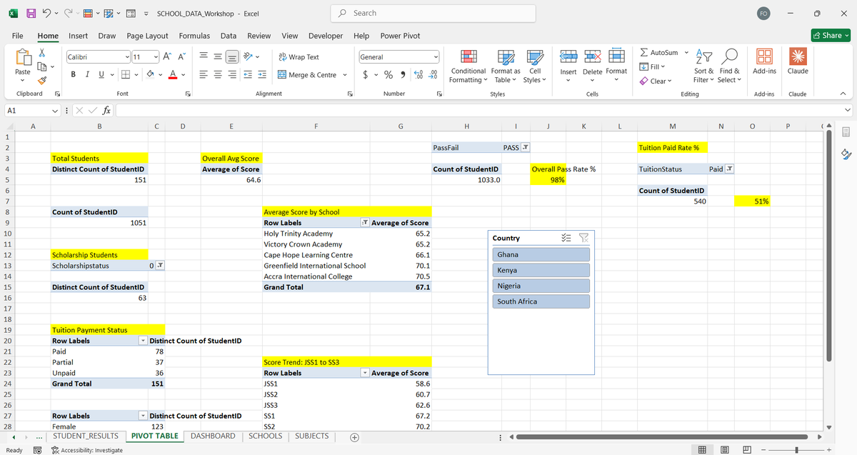
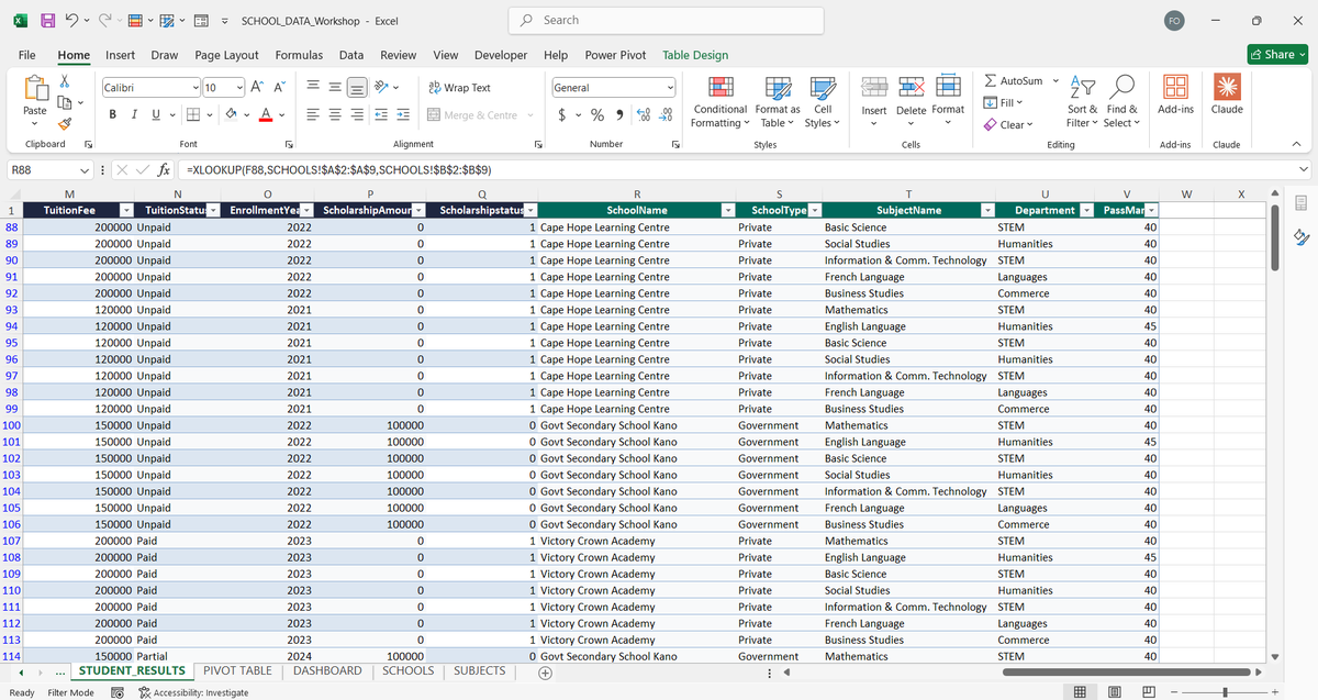
This week's assignment, designed and reviewed by @TheBoyAnalyst, involved a Retail Sales Data Workshop containing:
* 1,200 sales records
* 10 stores
* 12 products
* Multiple worksheets
Students were required to:
* Clean the dataset
* Enrich missing information using XLOOKUP
* Create performance metrics with IF and IFS
* Build a dashboard powered by five PivotTables
The final dashboard had to answer key business questions around:
* Store revenue performance
* Monthly sales trends
* Product category performance
* Payment method distribution
* Regional channel performance
The submissions demonstrated strong growth. The dashboards were structured, interactive, and focused on answering business questions rather than simply displaying numbers.
The final deliverable for Week 3 was a fully interactive dashboard capable of exploring data through slicers, visualizations, and dynamic reporting.
Next up: Power Query, ETL, and Descriptive Statistics.

9
11
89
3,560
Jun 4
One of the clearest signs that you're growing is becoming embarrassed by your old work.
A few days ago on TikTok Live, I started reviewing some of my old projects and dashboards.
At the time I built them, I was proud of every single one.
I thought they were clean.
I thought they were efficient.
I thought I had figured things out.
Then I opened them again with a few more years of experience.
Suddenly, all I could see were mistakes.
Charts I would never use today.
Metrics that didn't matter.
Processes that took 10 steps when they could have taken 3.
Entire dashboards that could have been simplified into something much more useful.
What's interesting is that the projects didn't change.
I did.
Experience has a funny way of doing that.
It gives you better context.
Better judgment.
Better questions.
And most importantly, a better understanding of what actually matters.
The goal isn't to look back and criticize your old work.
The goal is to appreciate it.
Because that version of you built the foundation that allowed the current version of you to see things differently.
If your old work makes you cringe a little, that's probably a good sign.
It means you've learned something.
I'm curious:
What's something you built, wrote, designed, or believed 2–3 years ago that you would approach completely differently today?
6
4
77
2,316
Freedom | Excel Boss retweeted
Jun 3
Excel is still doing more real work in data teams than half the tools people argue about online.
But nobody wants to admit it because it sounds “too basic.”
6
8
34
1,046
Jun 3
The Job is to apply for Job 😭

1
1
7
782
Jun 3
The Future is cooking.
Moments from HSL Executors Masterclass


8
3
64
2,071
Jun 2
Good visualization isn’t just about presenting data, it’s about making it meaningful.
1
3
13
409
Jun 1
Speaking at the Hebron Startup Lab Executors Masterclass at Covenant University was a fantastic experience! I also got to take a quick tour of the lab.
it's a really impressive space designed for founders, curators, and creative students. It's always inspiring to see initiatives that encourage students to become builders.
4
37
773