
Make it make sense
Joined September 2017
- Tweets 4,226
- Following 735
- Followers 25,314
- Likes 4,976
777 Photos and videos


Jun 10
Antoni Gaudí, who died one hundred years ago today, picked up a fondness for the catenary — the hyperbolic cosine, the shape of an idealized hanging chain — working on suspension bridges. observablehq.com/@toja/caten…
1
11
877
Jun 6
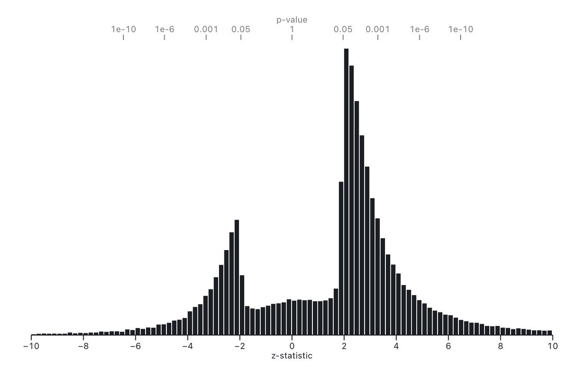
We’ll try to do our part. Here it is reproduced in a notebook, with a parquet file of the underlying million z-statistics. observablehq.com/@tophtucker…
Jun 4

I'm on a mission to make this plot as publicly recognizable as the one with the holes in the WW2 airplane
1
25
3,995
Jun 6
There’s probably already a notebook for most such famous recognizable plots. What would be in your canon? Keeling curve, Anscombe’s Quartet, Snow’s cholera map…
1
751
Jun 6
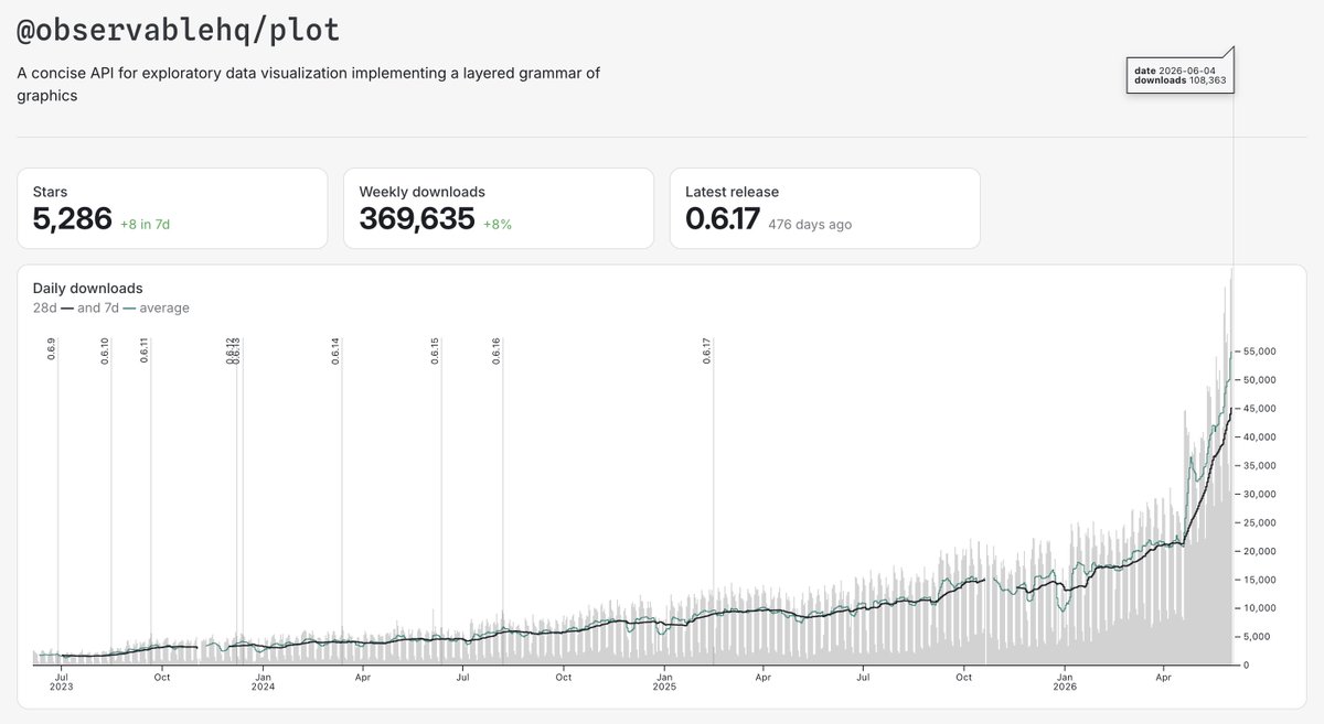
Observable Plot hit >100k daily downloads yesterday for the first time! Literally “off the chart”! (Because we set the maximum of the y domain to the 99.5th percentile in order to occasionally give ourselves this satisfaction.) Congrats to Mike and Fil! observablehq.github.io/oss-a…
1
2
13
1,333
Jun 6
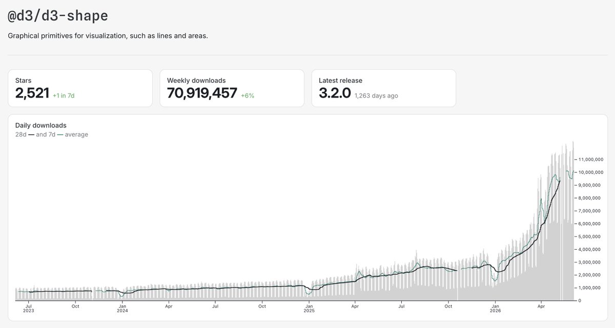
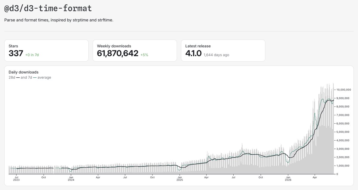
Some great D3 packages also booming. d3-array, d3-shape, d3-scale — love it, makes sense. We’re more surprised by the similar boom in d3-time-format, which — though also a classic! — has long since been largely obviated by Intl.DateTimeFormat & its ilk. observablehq.github.io/oss-a…

1
3
605
Jun 6
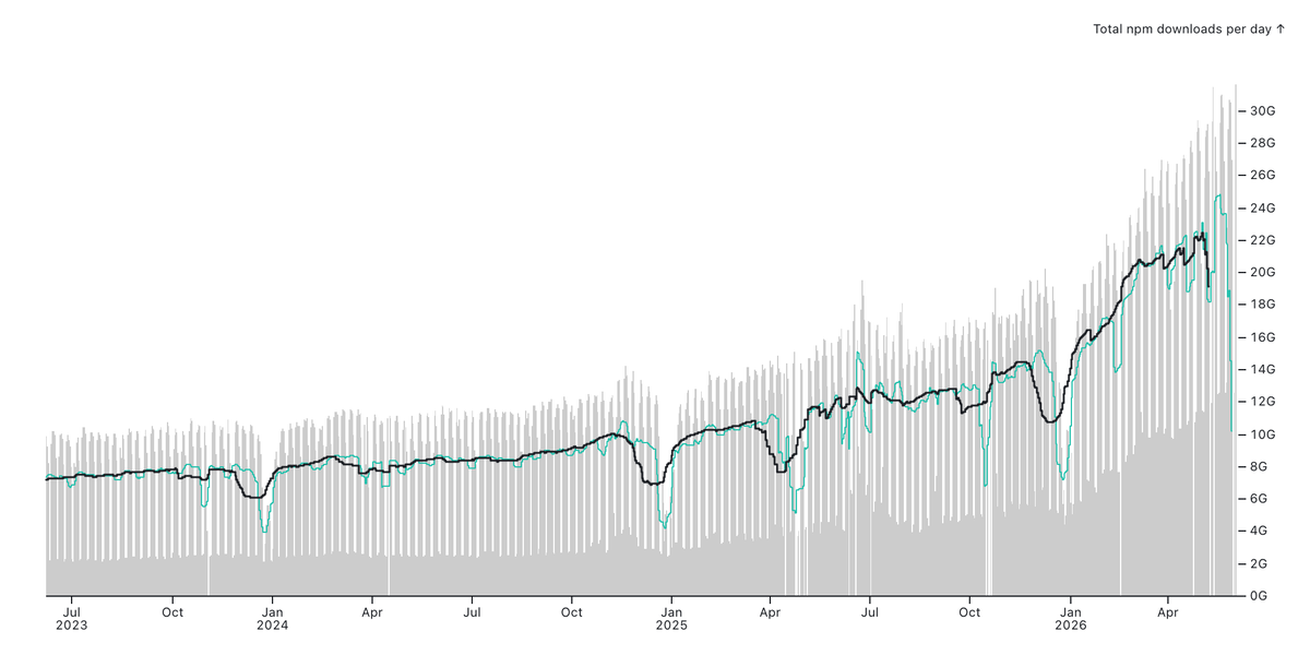
Ah, you ask, but how does that compare to the baseline growth of *all* npm packages (below)? Still relatively strong.
1
304
Jun 4
In 1943, Patrick Abercrombie wanted to describe “a general plan for creating ‘new towns’ but didn’t have the authority to designate specific sites for redevelopment. So, he decided blobs would do the trick.” Matt Khinda recreated the “potato plan” in D3: observablehq.com/@mpkhinda/d…
1
6
57
8,726
Jun 3
Congratulations to Pluto (reactive computational notebooks for Julia) on releasing version 1.0! 🎂discourse.julialang.org/t/pl…
1
6
625
Jun 3
In March, the U.S. Department of Homeland Security waived the Jones Act, which says only U.S.-made ships can ship between U.S. ports. The waiver stipulates that vessel movements be publicly disclosed. @LaoTzunami mapped them; they’re most commonly gasoline observablehq.com/d/3a8755883…
1
15
986
May 27
“[O]ur model is not the sphere, which is no greater than its parts, where every point is equidistant from the centre… Instead, it is the polyhedron, which reflects the convergence of all its parts, each of which preserves its distinctiveness.”
Explore: observablehq.com/@pamacha/pl…
1
5
15
1,936
May 27
That’s by @paulchaikin. Or here’s one by Mark McClure, showing cutting a polyhedron into a net. observablehq.com/@mcmcclur/u…
There are eleven ways to unfold a cube, which he collects here: observablehq.com/@mcmcclur/t…
1
7
638
May 27
See also @makio135’s “Polyhedrons & lasers” observablehq.com/@makio135/p… and Platonic solids lineup observablehq.com/@makio135/p…, or @mootari’s exploration of @ProfStemkoski’s polyhedra npm package observablehq.com/@mootari/po…, which in turn pulls from George W. Hart’s Encyclopedia of Polyhedra
8
471
May 20
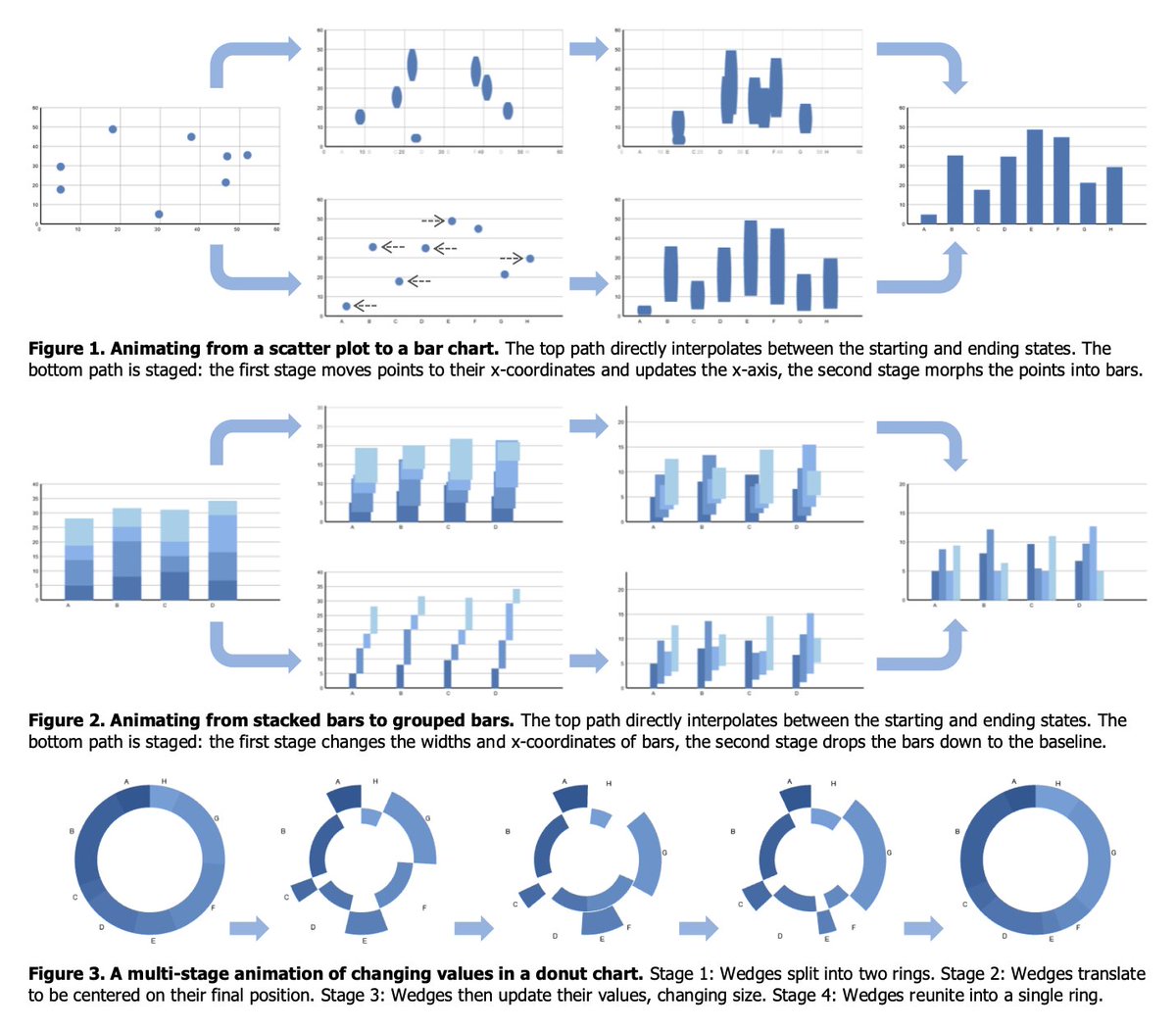
In this notebook, @LaoTzunami visualizes a state space of possible chart types and transitions among them along defined edges. Transitions between unconnected types are achieved by routing through intermediate types. observablehq.com/d/3c8b08281…
3
82
711
48,201
May 20
This resembles some of the transition diagrams in @jeffrey_heer’s classic “Animated Transitions in Statistical Data Graphics” idl.uw.edu/papers/animated-t…, but makes the diagram itself an interface for constructing the chart.
1
4
29
1,721
May 21
Also don’t miss that you can click on edges and adjust their easing, e.g. to make them all linear and fast so there’s no pause between successive transitions.
4
706
May 19
.@_mattneary wrote a couple notebooks about this
- observablehq.com/@mattneary/…
- observablehq.com/@mattneary/…

The Kelly criterion says you should take green if your net worth is over $10k.
3
948
May 19
Here @theohonohan ported Ken Perlin’s classic “vpuff” generative cloud Java applet mrl.cs.nyu.edu/~perlin/exper… to a notebook. observablehq.com/d/64d440b67…
6
906
May 19
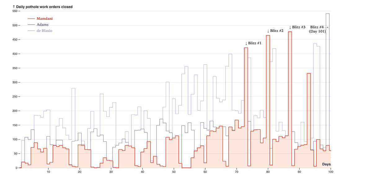
Matt Khinda’s notebook compares 311 service requests and DOT pothole work orders (from opendata.cityofnewyork.us) to explore the decline in pothole reports; the seasonality; the geographic distribution; and the first 100 days of the last three mayors. observablehq.com/@mpkhinda/n…

2
7
677