
Our World in Data is a free, nonprofit website with a mission to increase understanding of the world’s largest problems and drive informed action to solve them.
- Tweets 2,906
- Following 21
- Followers 306,164
- Likes 467


ALT Stacked area chart of the share of assessed global fish stocks classified as biologically sustainable versus overexploited from 1974 to 2021, where the overexploited share rises from the 1970s and is about 35% in 2021 while biologically sustainable is about 65%. Data source: Food and Agriculture Organization of the United Nations (2025). License: CC BY.

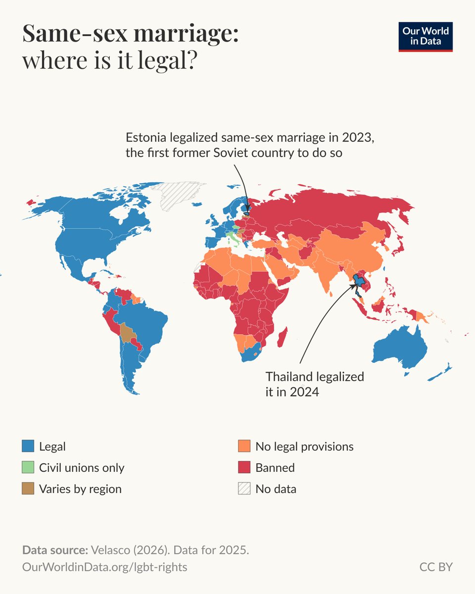
ALT Choropleth map of country-level Liberal Democracy Index for 2025 where it highlights global differences in democratic scores on a scale from 0 to 1. High scores are concentrated in North America, Western and Northern Europe, Australia and New Zealand, while lower scores appear across parts of Africa, the Middle East, and Central and East Asia; many countries in Latin America and southern Africa show intermediate values. A few areas are marked as having no data. The data source is the Varieties of Democracy (V-Dem) project (2026). The chart is licensed CC BY to Our World in Data.
ALT Line chart of the share of electricity generated from solar and wind in Spain and Portugal from 1985 to 2025 where both countries rise from near zero to over 40% by 2025, with Portugal at 44% and Spain at 42% in 2025. Data source: Ember (2026). License: CC BY to Our World in Data.
ALT Line chart showing the historical price of computer memory and storage from 1956 to 2023. Expressed in US dollars per terabyte (TB), adjusted for inflation. Shown: "Memory" refers to random access memory (RAM), "disk" to magnetic storage, "flash" to special memory used for rapid data access and rewriting, and "solid state" to solid-state drives (SSDs). Data source: McCallum (2023); U.S. Bureau of Labor Statistics (2026). Chart is licensed CC BY.
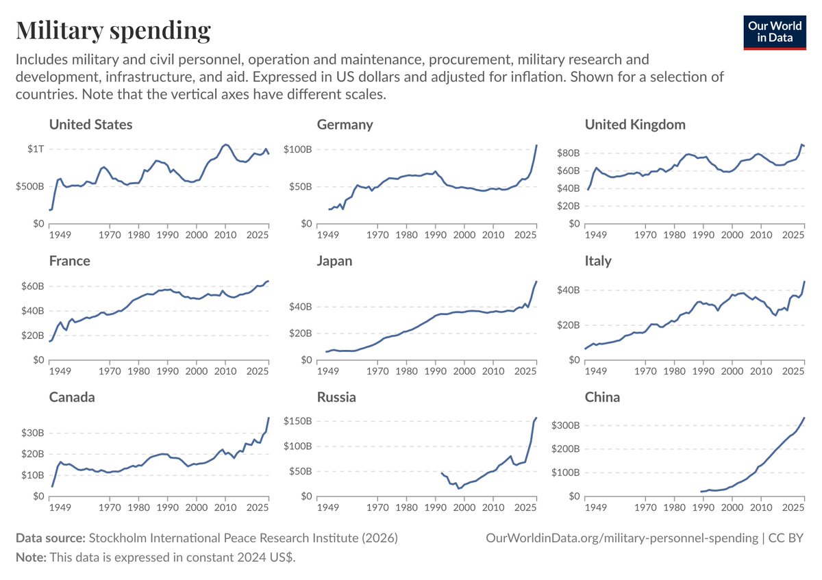
ALT Small multiples line charts of military spending by country where they compare annual spending from 1949 to about 2026 in constant 2024 US dollars to show long-term trends. Source: Stockholm International Peace Research Institute (2026). License: CC BY to Our World in Data.
ALT Choropleth world map of natural population growth showing where deaths now outnumber births in 2023, indicating countries that would have a shrinking population without immigration; it shows much of Europe, Central Asia and East Asia with more deaths than births while most of Africa, South Asia and the Americas have more births than deaths. Data source: UN World Population Prospects (2024), data for 2023. License: CC BY.
ALT Stacked bar chart of global annual death rates from natural disasters (decadal averages of deaths per 100,000 people) where the 1920s and 1940s show major peaks largely driven by droughts and floods and rates are much lower from about 1960 onward. Data source: EM-DAT, CRED / UCLouvain (2026); population data based on various sources (2024). License: CC BY. Coverage is more limited before the year 2000, so longer historical trends may partly reflect reporting improvements.
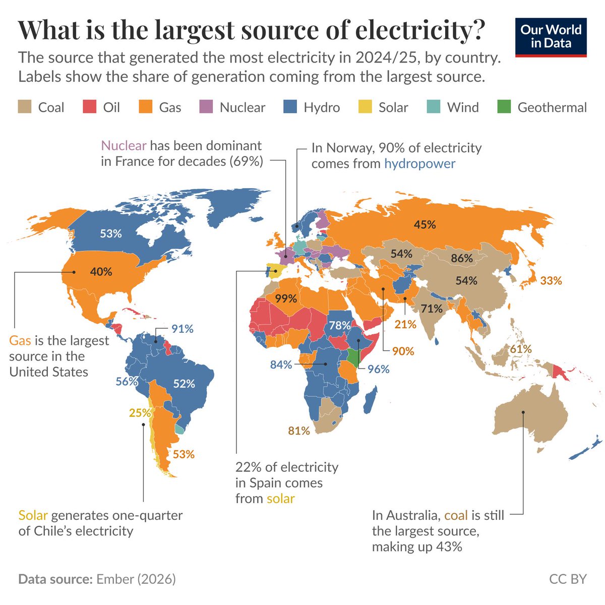
ALT World map of the largest source of electricity in 2024/25 by country, with country labels showing the share of generation coming from that largest source. The map shows many countries dominated by coal, gas, or hydropower, with notable examples labeled such as Norway at 90% hydropower, France about 69% nuclear, Chile about one-quarter solar, and Australia 43% coal. Data source: Ember (2026). License: CC BY.
