
#PCFGallery is a collection of controls created with the Power Apps Component Framework #PCF #PowerApps #PowerPlatform. Maintained by Guido Preite @crmanswers
Joined May 2019
- Tweets 787
- Following 89
- Followers 1,734
- Likes 56
334 Photos and videos
Pinned Tweet

9 Jun 2025
PCF Gallery site has been updated, read the announcement on LinkedIn 👉 linkedin.com/posts/pcfgaller…
#PowerApps #PowerPlatform #PowerAppsComponentFramework #PCFGallery
1
640
Jun 11
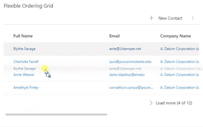
new #PCF control added: JJ Read Only Subgrid by Jeroen Jonckheer
pcf.gallery/jj-read-only-sub…
#PowerApps #PowerPlatform #PowerAppsComponentFramework #PCFGallery
1
80
Jun 9
new #PCF control added: Field Service Job Card List by Mark Christie
pcf.gallery/field-service-jo…
#PowerApps #PowerPlatform #PowerAppsComponentFramework #PCFGallery
1
1
85
Jun 8
new #PCF control added: Animated Accordion by Jose Mari Emmanuel Bernardo
pcf.gallery/animated-accordi…
#PowerApps #PowerPlatform #PowerAppsComponentFramework #PCFGallery
1
2
88
Jun 5
new #PCF control added: JJ Kanban by Jeroen Jonckheer
pcf.gallery/jj-kanban
#PowerApps #PowerPlatform #PowerAppsComponentFramework #PCFGallery
92
Jun 4
new #PCF control added: Traffic Light by Josh Bray
pcf.gallery/traffic-light
#PowerApps #PowerPlatform #PowerAppsComponentFramework #PCFGallery
1
1
95
Jun 3
new #PCF control added: Record Completeness Bar by Hakim Mouchquelita
pcf.gallery/record-completen…
#PowerApps #PowerPlatform #PowerAppsComponentFramework #PCFGallery
1
92
Jun 2
new #PCF control added: Multi-Channel Mobile Control by Friyank Parikh
pcf.gallery/multi-channel-mo…
#PowerApps #PowerPlatform #PowerAppsComponentFramework #PCFGallery
1
122
May 28
new #PCF control added: Nexplore CSV Dropdown Control by Roman Mellenberger (hosted by Nexplore)
pcf.gallery/nexplore-csv-dro…
#PowerApps #PowerPlatform #PowerAppsComponentFramework #PCFGallery
1
103
May 19
new #PCF control added: BT Action Button by Baktha Theja Kandati
pcf.gallery/bt-action-button
#PowerApps #PowerPlatform #PowerAppsComponentFramework #PCFGallery
1
106
May 15
new #PCF control added: Ishikawa Fishbone Control by AJ
pcf.gallery/ishikawa-fishbon…
#PowerApps #PowerPlatform #PowerAppsComponentFramework #PCFGallery
1
80
May 11
new #PCF control added: Timezone Display by Yurii Biriukov
pcf.gallery/timezone-display
#PowerApps #PowerPlatform #PowerAppsComponentFramework #PCFGallery
1
143
May 7
new #PCF control added: Text Area by Aric Levin @ALevin_BizApps
pcf.gallery/text-area
#PowerApps #PowerPlatform #PowerAppsComponentFramework #PCFGallery
1
113
May 4
new #PCF control added: Floating Action Button by Achraf Abid
pcf.gallery/floating-action-…
#PowerApps #PowerPlatform #PowerAppsComponentFramework #PCFGallery
2
139
Apr 30
new #PCF control added: PCF Image Viewer Control by Ronak Sharma
pcf.gallery/pcf-image-viewer…
#PowerApps #PowerPlatform #PowerAppsComponentFramework #PCFGallery
1
99
Apr 21
new #PCF control added: Year Selector Dropdown by Aric Levin @ALevin_BizApps
pcf.gallery/year-selector-dr…
#PowerApps #PowerPlatform #PowerAppsComponentFramework #PCFGallery
2
176
Apr 16
new #PCF control added: PowerImage Ultra-Light by Sunil Kumar Pashikanti
pcf.gallery/powerimage-ultra…
#PowerApps #PowerPlatform #PowerAppsComponentFramework #PCFGallery
1
96
Apr 13
new #PCF control added: Ultimate Google Maps Grid by Frédérick Grobost
pcf.gallery/ultimate-google-…
#PowerApps #PowerPlatform #PowerAppsComponentFramework #PCFGallery
1
147
Apr 9
new #PCF control added: FetchXML Query Builder by Manoj Kumar Gaduparthi
pcf.gallery/fetchxml-query-b…
#PowerApps #PowerPlatform #PowerAppsComponentFramework #PCFGallery
1
154
Apr 8
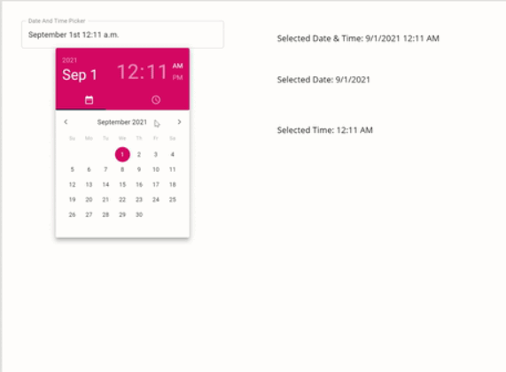
new #PCF control added: DateTimePicker by Achraf Abid
pcf.gallery/datetimepicker
#PowerApps #PowerPlatform #PowerAppsComponentFramework #PCFGallery
1
134
Apr 7
new #PCF control added: GradientButton by Thanh Long Nguyen
pcf.gallery/gradientbutton
#PowerApps #PowerPlatform #PowerAppsComponentFramework #PCFGallery
2
128