
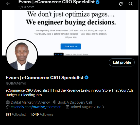
eCommerce CRO Specialist | I Find the Revenue Leaks in Your Store That Your Ads Budget Is Bleeding Into.
Joined August 2013
- Tweets 3,974
- Following 878
- Followers 1,050
- Likes 2,014
559 Photos and videos


Pinned Tweet

I changed 2 things on a supplement brand's landing page.
CVR: 1.4% → 5.8%
Same traffic. Same ads. Same price.
The fix had nothing to do with design.
🧵

1
1
179
I'm going to say something that might cost me followers:
Your ads are not the problem.
I know that's not what you want to hear after spending $3,000 with a creative agency.
But here's what the data shows me across every store I audit:
The average DTC store converts 1.2 - 1.8% of its traffic.
The top performers convert 4 - 6%.
Same traffic sources. Same ad platforms. Same demographics.
4x revenue difference.
The gap isn't the ad.
It's the 4 seconds after the click.
Here's a test I run on every store before I touch a single thing:
I pull up the best-performing ad.
I read the hook.
Then I immediately click through to the landing page.
And I ask: does this page feel like the natural next sentence of that ad?
80% of the time — it doesn't.
The ad is a thriller.
The page is an instruction manual.
The customer arrived ready to feel something.
The page made them think instead.
Emotion drives the click.
Logic justifies the purchase.
But if your page leads with logic, you've interrupted the emotional momentum that got them there.
Here's what that interruption costs you:
If you're doing $50k/month in revenue at 1.5% CVR —
Getting to 3% CVR (which is very achievable) doesn't double your revenue.
It doubles it WITHOUT spending an extra dollar on ads.
Same traffic. Twice the money.
That's the CRO opportunity most founders walk past every day.
---
What's your current CVR?
Drop it below. No judgment. Just data.
I'll tell you how far off benchmark you are for your niche.
Save this post for later.
You need convert more of your traffic?
Comment “SALES PAGE” and I will personally send you 50 optimized pages for your design inspiration.
Don’t re invent the wheel.
You must be following for me to share in your DM
30
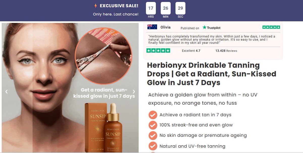
This advertorial has a 4.7 Trustpilot rating front and center.
13,428 reviews.
And they put it above the fold — next to the headline — before you've even read a single product claim.
Most brands put reviews at the bottom.
"We'll earn their trust first, then show social proof."
Wrong sequence.
You haven't earned the right to earn trust yet.
Social proof is what buys you the time to make your case.
Think about how humans actually work:
You walk into a restaurant. Empty. You feel uncertain.
You walk into a restaurant with a queue outside. You feel excited.
Same food. Same prices. Different proof signals.
Your landing page visitor is making that same snap judgment in 3 seconds.
If there's no proof signal above the fold, they categorize you as "unproven" — and most of them leave right there.
Here's what the Herbionyx advertorial does right — and why it converts:
→ Trustpilot widget (third-party validated — not "our customers love us")
→ Specific review count (13,428 — not "thousands of happy customers")
→ 4.7 not 5.0 (imperfect ratings are more believable — 5.0 triggers skepticism)
→ "Verified Company" badge (removes the biggest objection: "is this real?")
→ Benefit bullets in the sidebar (while you're reading the story, proof is in your peripheral vision the entire time)
That sidebar is doing 40% of the conversion work.
And most DTC brands don't have a sidebar at all.
They have a single column of copy and a prayer.
The question isn't whether your product is good.
Your customer doesn't know that yet.
The question is: does your page make a skeptic feel safe enough to keep reading?
---
3 things you can add above the fold today that will move your CVR before Friday:
1. A Trustpilot or Google rating widget (real, embedded — not a screenshot)
2. One specific customer result in quotes (not "great product!" — "I lost 12 lbs in 3 weeks")
3. A recognizable media badge or certification (even a single press mention changes perception)
Test these. Then DM me your before/after numbers.
Save this post for later.
You need convert more of your traffic?
Comment “SALES PAGE” and I will personally send you 50 optimized pages for your design inspiration.
Don’t re invent the wheel.
You must be following for me to share in your DM
3
54
This advertorial opens with:
"Dear Friend With Shoulder Pain,"
And I've seen marketers laugh at that opener.
"It's so old fashioned."
"Nobody writes like that anymore."
"It's too formal."
Those marketers are wrong.
Here's what "Dear Friend" actually does:
It slows the reader down.
In a world of 0.3-second scroll decisions, an opener that feels like a letter forces a micro-pause.
And in that pause — something shifts.
The reader stops being a consumer scanning for deals.
They become a person being spoken to by another person.
That shift is worth more than any design tweak you'll ever make.
The best converting advertorials I've ever seen don't look like ads.
They look like a friend who found something and just had to tell you.
No banner. No flashing CTA. No screaming headline.
Just: "Hey. I found something. Let me tell you about it."
That's the entire psychology behind native advertorials.
And most DTC brands are so obsessed with looking "premium" that they've lost the ability to sound human.
Premium design signals brand.
Human writing signals trust.
And trust — not design — is what makes someone hand over their credit card.
The brands winning at paid traffic in 2025 aren't the prettiest.
They're the most believable.
---
Is your landing page trying to impress visitors or convince them?
Those are two very different pages.
Save this post for later.
You need convert more of your traffic?
Comment “SALES PAGE” and I will personally send you 50 optimized pages for your design inspiration.
Don’t re invent the wheel.
You must be following for me to share in your DM
3
21
I've been inside 50 Shopify stores since 2024.
Here's something that would shock most media buyers:
The stores with the best ads usually have the worst landing pages.
Not because the founders don't care.
Because they were never taught to think past the click.
Every agency, every course, every guru teaches you how to get the click.
Nobody teaches you what happens after.
So you're running $500/day to a page that was built in 3 hours, never tested, and hasn't changed in 8 months.
And when sales dip, you do what you were taught:
New creative. New audience. New offer.
When the real problem is 4 seconds after the click.
🧵 The 7 things I look at in the first 60 seconds of any Shopify store audit:
1. Does the headline speak to a pain or a product?
Pain = conversion. Product = catalogue.
2. Is there proof above the fold?
Not a logo strip. A real human result. Before the buy button.
3. What does the CTA actually say?
"Add to Cart" is lazy.
"Start My 30-Day Trial" is psychology.
"Get Yours Before Stock Runs Out" is urgency.
Three different conversion rates. All the same button.
4. Does the hero image show the transformation or the product?
Show me the after. I'll imagine the before myself.
Show me the product. I'll go compare it on Amazon.
5. How fast does the page load on mobile?
Every extra second costs you 7% of conversions.
Most store owners don't know their own load time.
Go check yours. Right now.
6. Where are the reviews placed?
Below the fold is a graveyard.
One powerful quote above the CTA changes everything.
7. Is there a reason to buy TODAY — not someday?
Not a fake countdown.
A real, logical reason this offer is better right now than next week.
If your store fails 4 or more of these 7 —
You don't have a traffic problem.
You have a page problem.
And no ad budget in the world fixes a page problem.
---
No pitch. Just honest feedback.
Save this post for later.
You need convert more of your traffic?
Comment “SALES PAGE” and I will personally send you 50 optimized pages for your design inspiration.
Don’t re invent the wheel.
You must be following for me to share in your DM
2
3
200
Evans | eCommerce CRO Specialist retweeted

Jun 9
Top-quartile eCommerce stores run 2.6x more experiments than average.
Not because they have bigger teams.
Because they have faster loops.
Velocity beats headcount. Every time.
1
1
26
This headline stopped me cold.
"For Owners Who Think It's Too Late For Their Dog's Cloudy Eyes — This New Discovery Is Offering Hope."
Read it again.
Notice what's happening:
It's not talking to dog owners.
It's talking to dog owners who have already tried everything and given up.
That's a completely different human being.
And it's one of the most sophisticated targeting moves you can make in copy — without spending a single extra dollar on ads.
Here's why it's genius:
Most pet supplement ads say: "Improve your dog's vision naturally!"
That line reaches dog owners who are interested.
This line reaches dog owners who are desperate.
Desperate buyers convert at 3-5x the rate of interested buyers.
Same traffic source. Completely different buyer intent — unlocked through copy alone.
The phrase "who think it's too late" does something most copywriters never think about:
It acknowledges that the reader has tried other solutions and failed.
That acknowledgment does more for trust than any 5-star review ever could.
Because the reader thinks: "this brand actually understands me. They know where I've been."
After that? The sale is almost inevitable.
🧵 The 3-part formula behind this headline:
Part 1: [Identity qualifier] — "For owners who think it's too late"
This filters out browsers and pulls in buyers.
Part 2: [Specific pain] — "Dog's cloudy eyes"
Not "eye problems." Not "vision issues." The specific, visual, emotional symptom the owner sees every day.
Part 3: [Hope bridge] — "This new discovery is offering hope"
Not "cure." Not "solution." Hope. Because desperate people don't need certainty. They need permission to try again.
Apply this to your brand:
Who is your customer AFTER they've already failed with your competitors?
Write to that person.
That's your highest-converting audience. And they're invisible to every brand that writes generic headlines.
---
I rewrote a headline exactly like this for a pet brand last month.
CTR went up 2.1x in 48 hours.
Same ad. Same creative. Same audience.
Just different words.
Save this post for later.
You need convert more of your traffic?
Comment “SALES PAGE” and I will personally send you 50 optimized pages for your design inspiration.
Don’t re invent the wheel.
You must be following for me to share in your DM
1
1
93
Unpopular opinion:
Most Shopify CRO advice on this timeline is getting your store killed.
I see it every week.
"Add a sticky ATC button"
"Use exit intent popups"
"Put a countdown timer on everything"
Yes. All of those can help.
But you're optimizing the window display while the foundation is cracked.
Here's what actually matters — in order:
1. Does your headline match the exact emotion your customer arrives with?
2. Is your first screen earning the second scroll?
3. Does your social proof answer the specific objection that stops people from buying?
4. Is there a real reason to buy today — not just "20% off"?
If any of those answers is no — your sticky ATC button is rearranging deck chairs on the Titanic.
I've audited stores doing $300k/month that failed all four.
Imagine what they'd do if they fixed them.
The unsexy truth about CRO:
It's not about adding things.
It's about removing everything that creates friction between a curious visitor and a confident buyer.
That's it.
That's the whole job.
---
Which of the 4 do you think is your biggest leak right now?
Comment below — I read every reply.
Save this post for later.
You need convert more of your traffic?
Comment “SALES PAGE” and I will personally send you 50 optimized pages for your design inspiration.
Don’t re invent the wheel.
You must be following for me to share in your DM
80
She called me at 11pm EST on a Tuesday.
"Evans, I have a 4.8-star product. Over 3,000 reviews. The ad is working — I'm getting traffic. My CVR is 1.1%. I'm bleeding $400 a day. I don't understand."
I asked her one question:
"Does your landing page headline match the emotion your ad creates?"
Silence.
Then: "...what do you mean?"
That silence told me everything I needed to know.
I looked at her page.
The ad hook: "Your pillow might be silently damaging your spine while you sleep"
The landing page headline: "Ergonomic Memory Foam Pillow — Premium Neck Support"
Same product. Two completely different conversations.
The ad creates fear. The page delivers a catalogue listing.
The customer clicks in a state of concern. Lands in a state of confusion. Leaves.
We changed one thing. Just the headline.
New headline: "Your Pillow Is Silently Destroying Your Neck: The Shocking Discovery by Japan's Leading Pain Expert"
Same traffic. Same ads. Same product.
CVR: 1.1% → 4.6% in 6 days.
She texted me at 7am on day 6: "what did you do"
I told her the truth:
I didn't do anything to the product.
I just made the page speak the same language as the ad.
That gap — between what your ad promises and what your page delivers — is silently draining your revenue every single day.
I call it the Congruence Gap. It's the #1 thing I fix on every client store before I touch anything else.
Want me to check if your store has one?
Drop "AUDIT" in the comments or DM me.
First 3 this week get a free congruence review.
Save this post for later.
You need convert more of your traffic?
Comment “SALES PAGE” and I will personally send you 50 optimized pages for your design inspiration.
Don’t re invent the wheel.
45
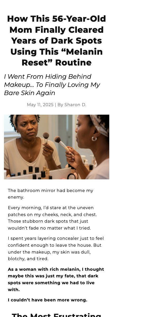
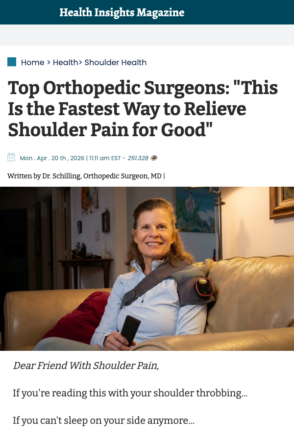
"The bathroom mirror had become my enemy."
That's the first line of this advertorial.
No product name.
No discount.
No "introducing."
Just 8 words that made a 56-year-old Black woman put down her phone, sit up straight, and read every single word that followed.
Here's the psychology of why it works — and why your PDP headline is probably doing the opposite:
🧵
That line does 4 things simultaneously:
1. It names a daily ritual (the mirror)
Most women look in the mirror every morning. The writer turned a familiar object into a villain. Now the reader has a villain too. Shared villains create loyalty faster than shared values.
2. It uses past tense ("had become")
Past tense signals that something changed. The problem existed — and now it's resolved. The reader is already leaning in to find out what happened. You created a story gap in 8 words.
3. It leads with emotion, not information
The reader doesn't know what product this is yet. Doesn't matter. She already feels something. And people buy feelings, not features.
4. It filters instantly
A man reads that line and scrolls past.
The exact right woman reads it and whispers "me too."
That's not wasted reach. That's surgical targeting through copy.
Most Shopify store owners open their PDP with:
"Premium [Product Name] for [Generic Audience]."
Meanwhile their customer is standing in the mirror every morning hating what she sees.
Meet her there.
That's where conversions live.
What does your hero headline actually say?
Drop it below. I'll tell you if it's selling or just describing.
Save this post for later.
You need convert more of your traffic?
Comment “SALES PAGE” and I will personally send you 50 optimized pages for your design inspiration.
Don’t re invent the wheel.
You must be following for me to share in your DM
69
Day 3/30 — Landing My First $10K CRO Client
Every day for 30 days I'll
share: → Exactly what I'm doing to land a $10K/month client → What's
working and what isn't → Real numbers.
Why am I doing this?
Because most "how I landed
clients" posts come after the win.
I'm documenting the before,
during, and messy middle in real time.
Here's June 3: Day 2 Results
📊 Posts published: 3
👥 X Followers: 1,050 (plus 1)
📩 DMssent: 0
💬 Client conversations: 0
💰Monthly retainer income: $0
LINKEDIN POST
📊 Posts published today: 3
👥Linkedin Followers: 1,036 (plus 1)
📩 DMs sent: 1
💬 Client conversations: 2
1 Interview from Linkedin
💰Monthly retainer income: $0
Target: $10,000/month by July
Day 3 Report
Day i was so engaged with my ecommerce stores creating ad creatives, reseaching audiences and i had 1 interview scheduled.
Still waiting for feeding from the process.
Meanwhile i had already scheduled posts.
On x i had no much actities.
On Linkedin i had about 10 reactions across all posts.
Most post engagements came from linkedin.
My timeline: 30 days.
Follow along if you want the unfiltered version of what it actually takes.
Day 4 tomorrow. June 5th
#BuildInPublic #CRO #eCommerce
#Freelance #Day3
1
94
Scaling ads without CRO is ego spending.
Here's what that looks like:
$200/day → $500/day → "why is ROAS dropping?"
Same broken page.
Just more traffic hitting it.
You don't scale your way out of a conversion problem.
Before you increase budget — answer 3 things:
1. What's your current CVR?
2. What's the benchmark for your niche?
3. What's the gap?
Close the gap first.
Then scale.
That's not a strategy.
That's just math.
Save this post for later.
You need convert more of your traffic?
Comment “SALES PAGE” and I will personally send you 50 optimized pages for your design inspiration.
Don’t re invent the wheel.
You must be following for me to share in your DM
#CRO #topCRO #ConversionRateOptimization
1
38
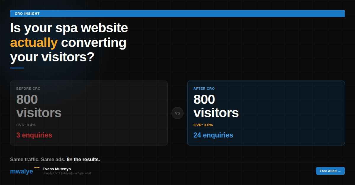
Most media buyers never think about this.
This advertorial image shows a split face.
Left: dull skin.
Right: glowing skin.
The ad driving traffic to it?
Also shows a split face.
Same visual language.
Same emotional arc.
Same transformation.
Click → land → see same image → feel same emotion.
That is message match done perfectly.
When your ad and page share visual language —
the brain does zero work.
No "is this the right page?" moment.
Just: "Yes. This is for me."
That moment is the difference between 1.5% and 4.5% CVR.
Run your top ad and landing page side by side.
Do they feel like the same conversation?
Save this post for later.
You need convert more of your traffic?
Comment “SALES PAGE” and I will personally send you 50 optimized pages for your design inspiration.
Don’t re invent the wheel.
You must be following for me to share in your DM
#CRO #topCRO #ConversionRateOptimization
2
25
Most of you think trust is built with reviews.
Not its not. Youre wrong!
Reviews just confirm trust.
They don't create it.
Trust is created in the first 3 seconds.
Before anyone reads a review.
Before they see your price.
Before they scroll past your hero image.
It's built — or broken — by one thing:
Does this page feel like it was made for me?
If the answer is yes, they stay.
If the answer is uncertain, they leave.
And most pages answer: uncertain.
Generic headline.
Stock photography.
Copy that could be about any product for anyone.
The visitor looks at it and thinks:
"This isn't really for me."
And they're gone before your reviews even load.
Your social proof isn't the problem.
Your first impression is.
#CRO #topCRO #ConversionRateOptimization
24
Your bounce rate isn't a traffic problem.
It never was.
I've said this to 50 Shopify founders and every
single time I get the same look.
The one that says: "then what is it?"
It's a promise problem.
Your ad made one.
Your page broke it.
In under 3 seconds.
The visitor didn't leave because they weren't
interested.
They left because what they found didn't match
what they expected.
That gap — between the ad promise and the page
reality — is where 80% of your revenue is leaking.
Not in your targeting.
Not in your budget.
Not in your creative.
In the 3 seconds after the click.
Fix the gap. The bounce rate fixes itself.
What's your current bounce rate?
Drop it below — I'll tell you if it's a traffic
problem or a promise problem.
#CRO #topCRO #ConversionRateOptimization
43
I've audited 50 Shopify stores this year.
Same problems. Different brands.
So I'm going to do something I don't
usually do publicly.
I'll audit your store for free this week.
Not a loom video with generic feedback.
A proper breakdown:
→ Which gate in your buying journey
is closed (and why)
→ The exact headline change I'd test first
→ Where your page is breaking trust
before the customer even scrolls
→ One specific fix you can implement today
I have 5 spots.
To qualify:
→ You're running paid traffic
(Meta, Google, TikTok)
→ Your store is doing at least £5k/month
→ Your CVR is under 3%
If that's you —
Comment "AUDIT" below or DM me your URL.
First 5 get a full breakdown. No pitch.
Just the truth about what your page
is doing wrong.
#CRO #topCRO #ConversionRateOptimization
100
Every buying decision goes through 3 gates.
Gate 1: Is this for me?
Gate 2: Does this work?
Gate 3: Is now the right time?
Most pages only open Gate 2.
Features. Ingredients. Clinical studies.
Proof that the product works.
But the visitor is still stuck at Gate 1.
"Is this actually for someone in my situation?"
They can't open Gate 2 until Gate 1 is open.
And they can't open Gate 3 until both
1 and 2 are open.
Your page needs to open all 3 gates
in the right order.
Gate 1 = Your headline and hero image.
Gate 2 = Your proof and product explanation.
Gate 3 = Your urgency and CTA.
One gate closed = no conversion.
Check your page right now.
Which gate are you leaving closed?
#CRO #topCRO #ConversionRateOptimization
10
"Add more urgency to your page."
I hear this constantly.
Countdown timers. Low stock warnings.
Flash sale banners. "Only 3 left!"
And yes — urgency works.
When it's real.
When it's explained.
When it's earned.
But fake urgency — the timer that resets
when you refresh the page — does something
you can't see in your analytics:
It trains your customers not to trust you.
They see the countdown.
They refresh.
It resets.
They think: "This brand is lying to me."
And they buy anyway sometimes.
But they never fully trust you again.
And they never refer anyone.
And they return more.
And they leave worse reviews.
The short-term CVR bump from fake urgency
costs you long-term brand equity.
Real urgency — stock limits, genuine deadlines,
actual launch windows — converts AND builds trust.
Fake urgency converts once and then slowly
poisons everything after.
#CRO #topCRO #ConversionRateOptimization
1
1
390
I can tell if a Shopify store will hit £100k/month
by looking at one thing.
Not the product.
Not the traffic numbers.
Not the ad account.
The headline on the landing page.
It tells me everything:
A product headline = founder who thinks
in features. Hard ceiling on growth.
A pain headline = founder who thinks
in customers. Scalable.
A transformation headline = founder who
understands buying psychology. This one prints.
"Advanced Magnesium Complex" — product.
"Sleep Better Tonight" — pain.
"Wake Up Actually Rested for the First Time
in Years" — transformation.
Three versions of the same product.
Three completely different growth trajectories.
Which one is yours?
#CRO #topCRO #ConversionRateOptimization
57
She had the best product in her niche.
Clinically tested.
Media coverage.
Loyal customers who repurchased every month.
CVR: 0.7%.
I looked at her page for 4 minutes.
Found the problem immediately.
She was leading with the science.
Clinical studies. Ingredient breakdowns.
Lab certifications. Patent pending.
All real. All impressive.
All completely irrelevant to a first-time visitor
who doesn't know if they have the problem yet.
The science doesn't sell until the problem is felt.
You earn the right to show proof
AFTER you've made the visitor feel understood.
Not before.
We moved the science section to the middle.
Led with the pain and the transformation instead.
CVR: 0.7% → 3.1% in 12 days.
The science didn't change.
The order did.
Sequence is everything.
#CRO #topCRO #ConversionRateOptimization
27
The most powerful word in ecommerce copy is not "FREE."
It's not "guaranteed" either.
It's "finally."
"Finally sleep through the night."
"Finally feel confident in your skin."
"Finally move without the pain."
Here's why it works:
"Finally" implies your customer has been
trying to solve this for a long time.
It validates their struggle.
It acknowledges the failed attempts.
It says: I know you've been here before.
This time is different.
And for someone who has tried three products
and given up hope — that single word is the
difference between scrolling past and stopping.
You're not selling a product.
You're selling the end of a long frustration.
Does your headline use "finally"?
If not — try it today.
Test it against whatever you're running.
I've seen it move CVR by 0.8% on its own.
#CRO #topCRO #ConversionRateOptimization
13