
Joined January 2025
- Tweets 63
- Following 20
- Followers 561
- Likes 45
10 Photos and videos


Sugarloaf Social Club retweeted

Jun 12
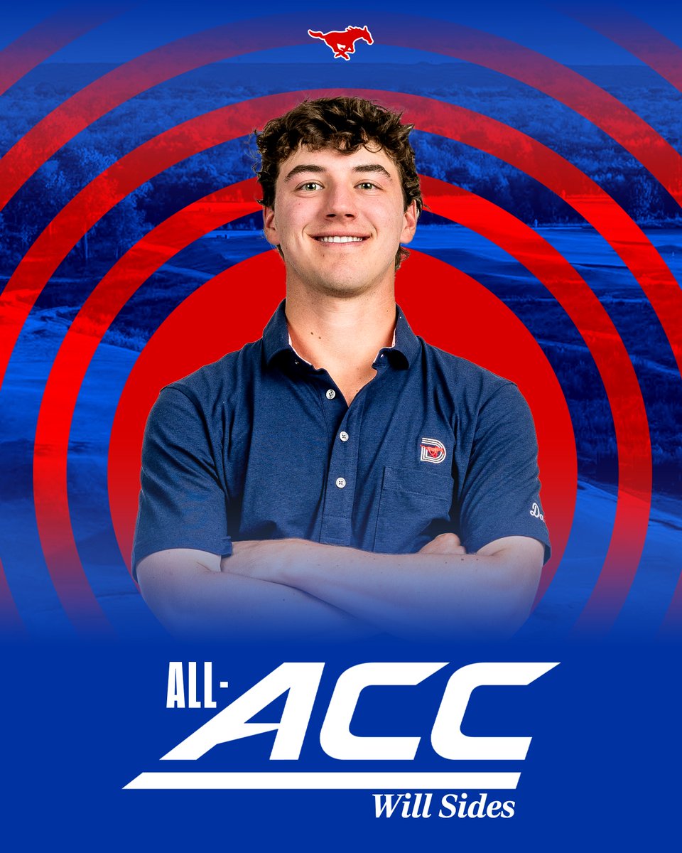
Will Sides is a two-time All-ACC honoree 🔥
1
3
44
1,342
Sugarloaf Social Club retweeted
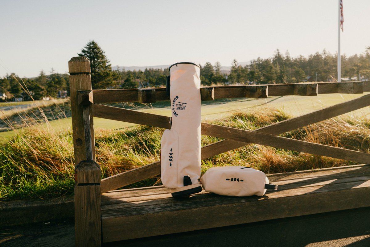
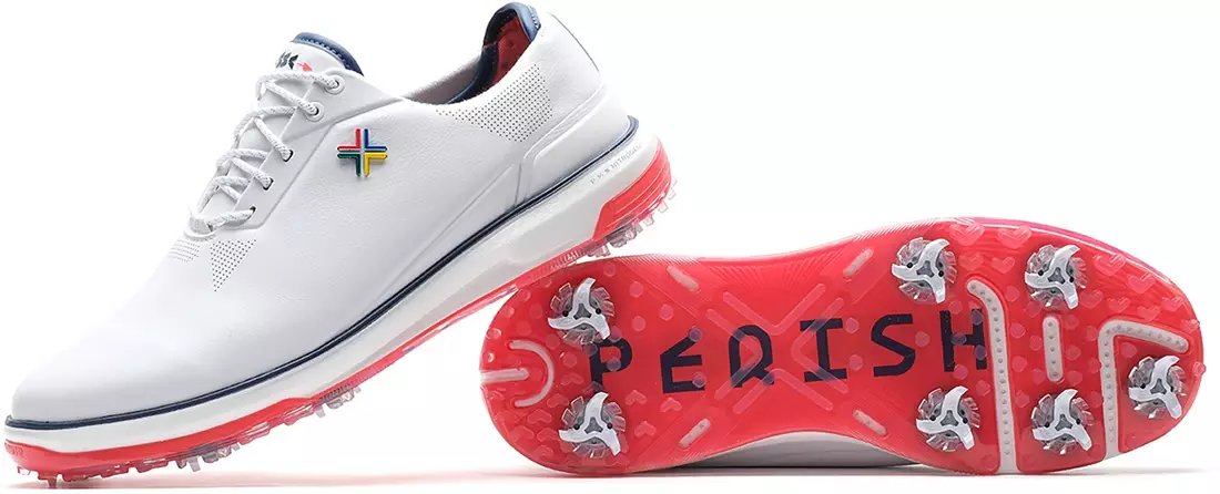
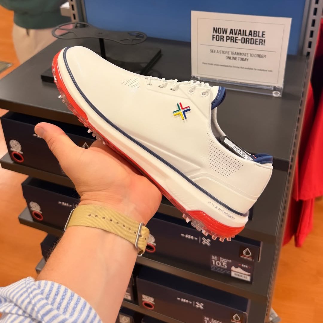
Thoughts on the upcoming @SLoafSocialClub x @PayntrGolf Limited Edition Eighty Seven SC?


7
2
73
23,247
Sugarloaf Social Club retweeted
One of the better full-circle moments I've seen in golf.
Ian Gilley remembers his mom driving him to @golfgalaxy so he could buy the Scotty Cameron he'd spent months saving for. Now, @SLoafSocialClub sits on those same shelves. Bonus, they have a collaboration with @PayntrGolf on the way too!

1
2
24
11,010
Our guy! 💪


2
861
Sugarloaf Social Club retweeted
May 21
Will Sides makes his PGA Tour debut playing as an professional at the CJ Cup Byron Nelson!
#GoMustangs #SMU2PGA

3
11
92
20,485
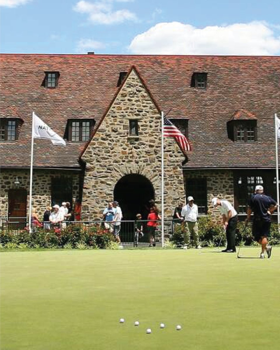
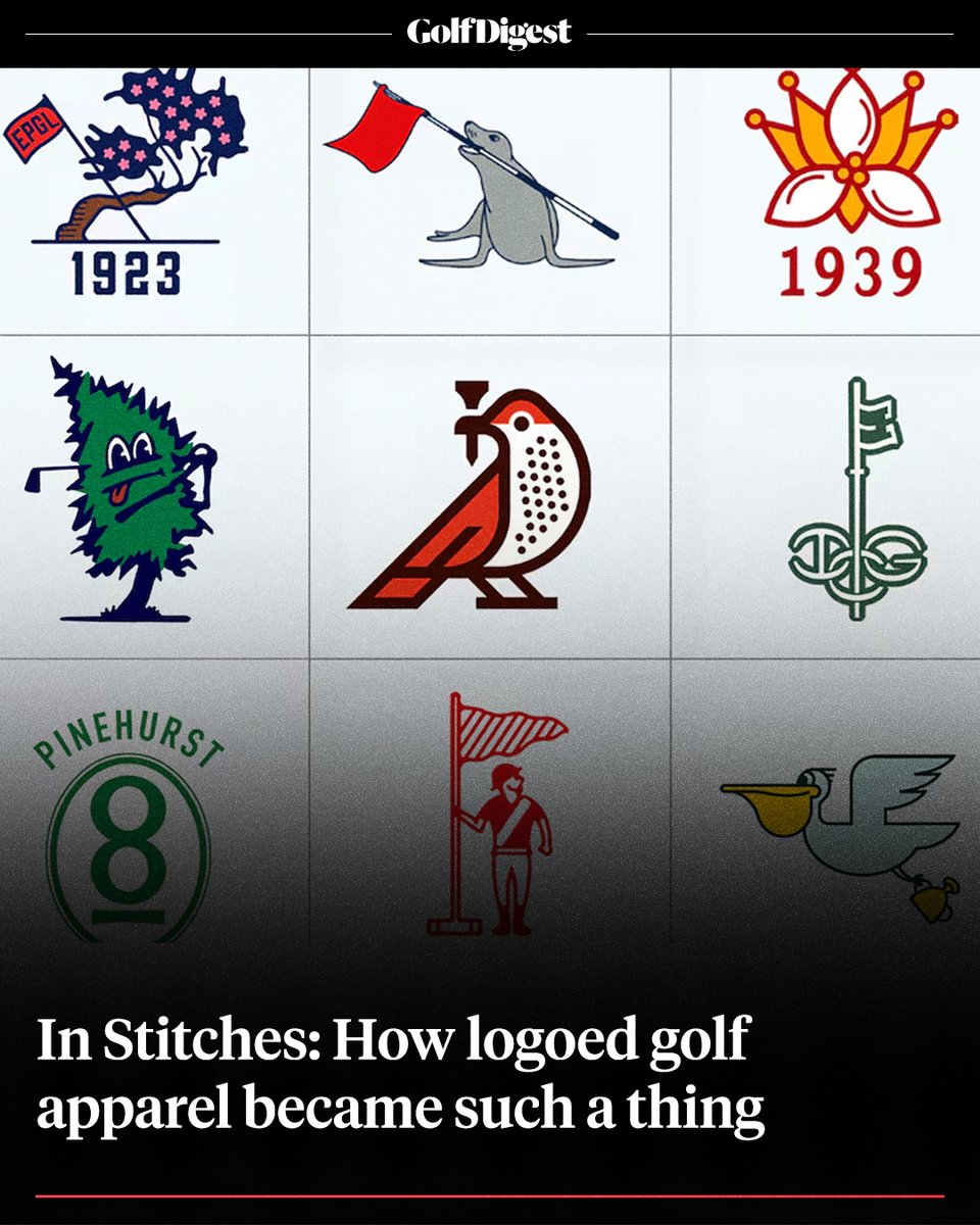
For a club of Aronimink's stature, I always thought this was one of the laziest/most generic logos ever. They deserve better!
Their clubhouse seems to be "the picture" -- and the famous main entrance has a prominent "A" shape.
IDK, I threw this together quickly 🤷♂️


20
8
542
97,405
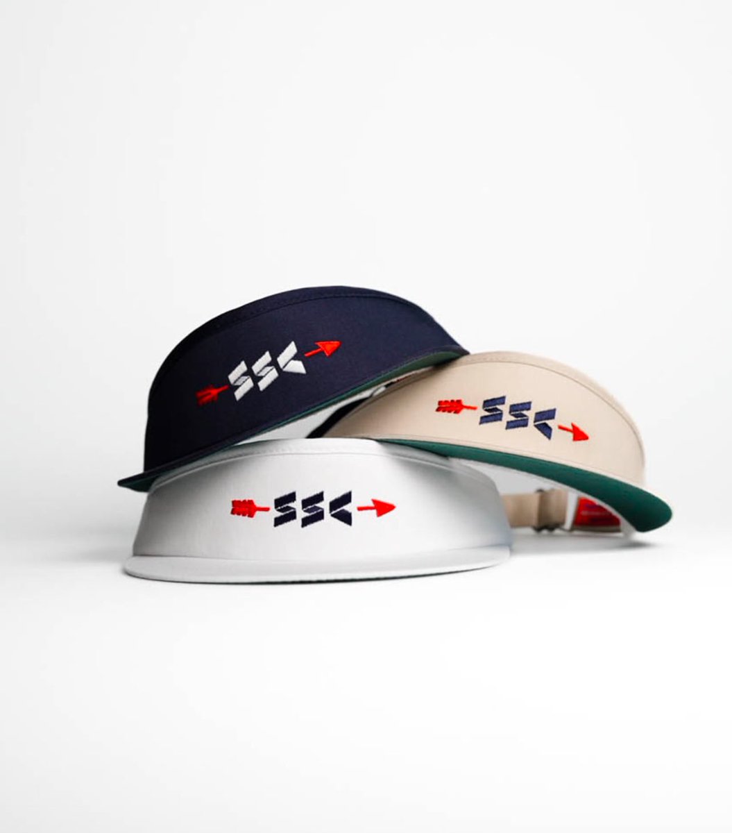
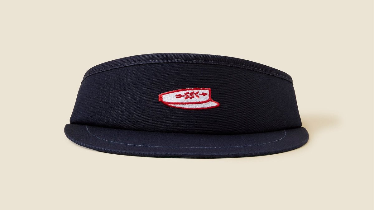
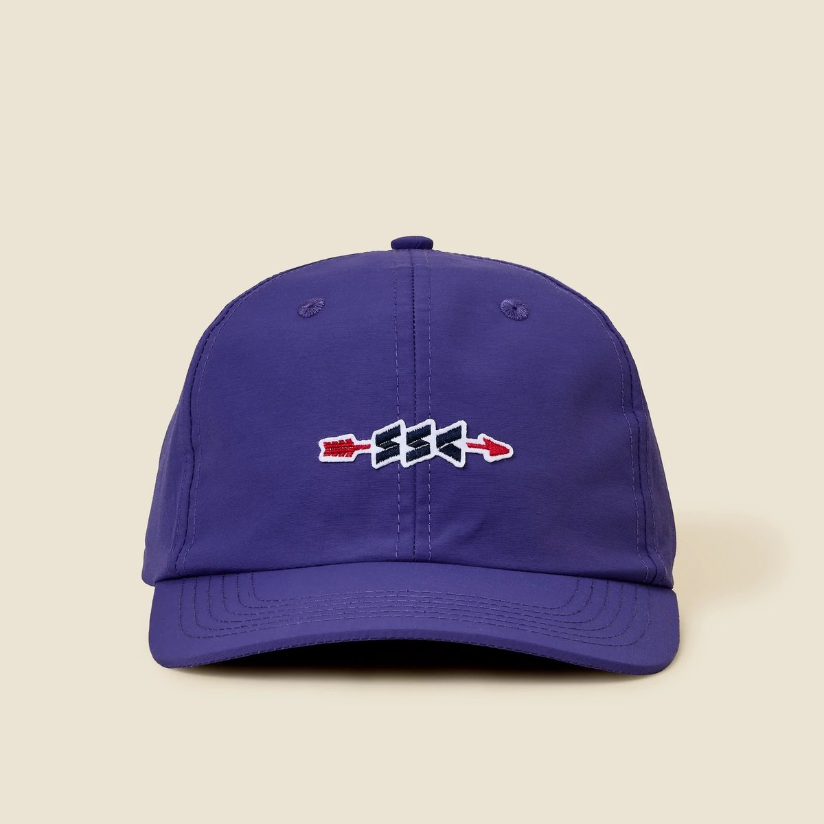
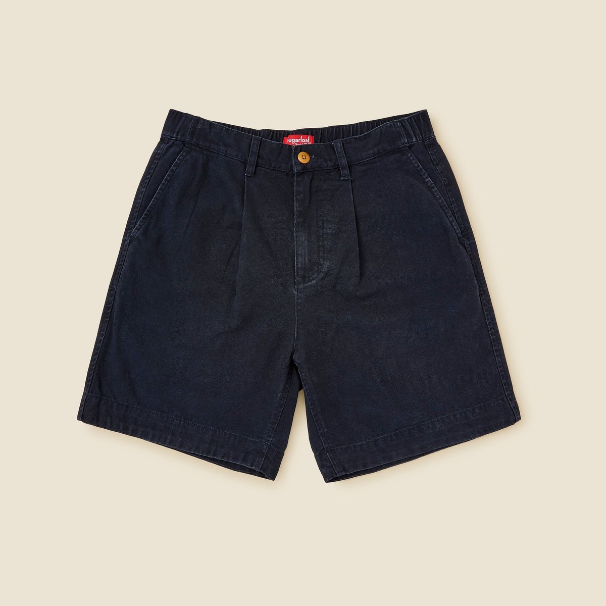
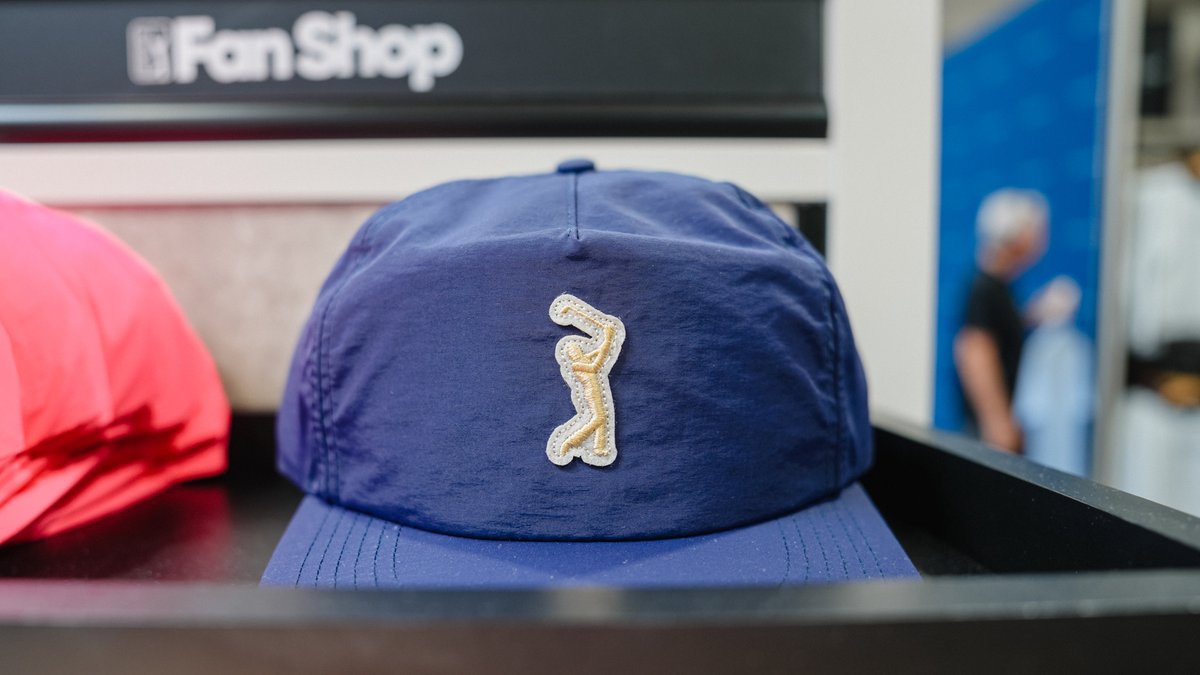
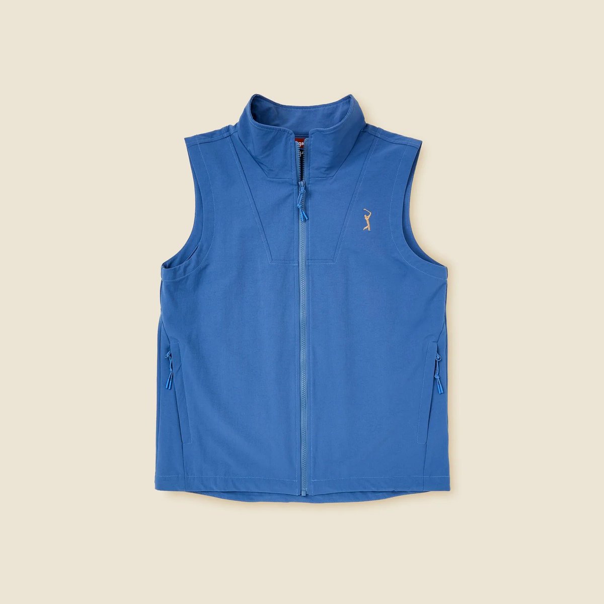
Brought back our cult classic Worldwide Caps, plus some sick High Crown Visors and some other useful caps for your summer golf needs
hashtag expand SSC High Crown Visors
hashtag shrink big letter hats
sugarloafsocialclub.com/coll…

4
1,354
Sugarloaf Social Club retweeted

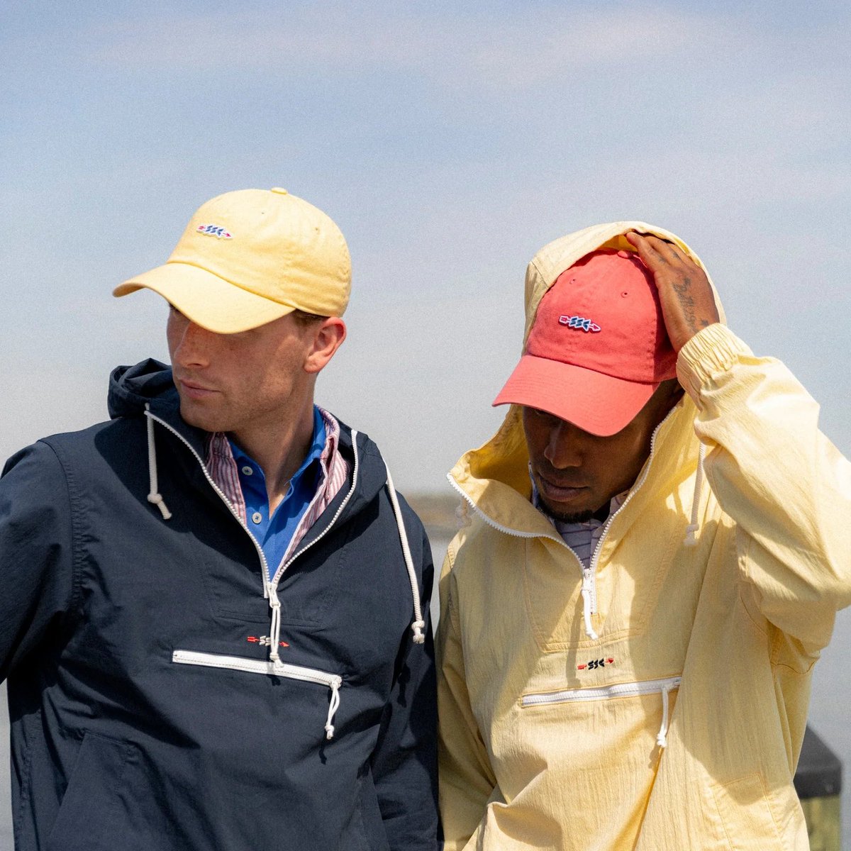
May 11
🚨 Golf Drops:
@SLoafSocialClub unloaded a bunch of new headwear.


1
41
8,218
East Potomac -- America's Muni, and our home golf course since 2011 -- is still open... for now
Play or Perish!
1
11
107
5,975
Sugarloaf Social Club retweeted
Apr 21
This might be the clearest version of @SLoafSocialClub we’ve seen. I get the blessing of seeing things early, & when this came through, my exact words were, "This is the team’s best work to date."
In a space where noise and influence can shift brands, they’ve stayed true to who they are. A golf purist brand through and through. One of the most tasteful in the sport.

3
2
76
13,502
Well hello!

5
1,348
You may find some of our work in here... :)
Great article from @GolfDigest on course logos, one of our favorite things to nerd out about!
Apr 15

Course logos on golf shirts were once a radical idea. Not anymore. 🤔
Read more: glfdig.st/zzoi50YJ5ix
4
1,312

Sugarloaf Social Club retweeted
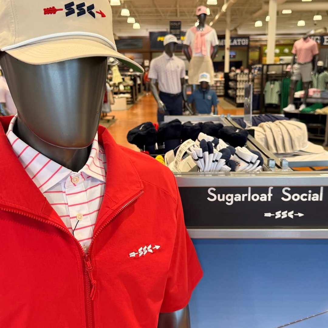
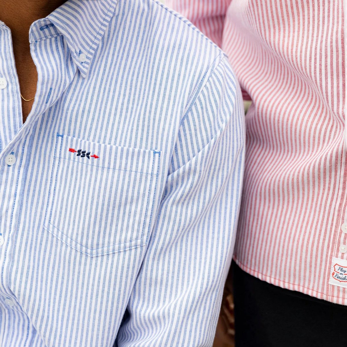
🛍️ Store Alert:
@SLoafSocialClub just opened their SSC Locker Room in McLean, VA. The appointment-only wave for these boutique brands is a major unlock. Thoughts?


3
2
29
10,792
Sugarloaf Social Club retweeted
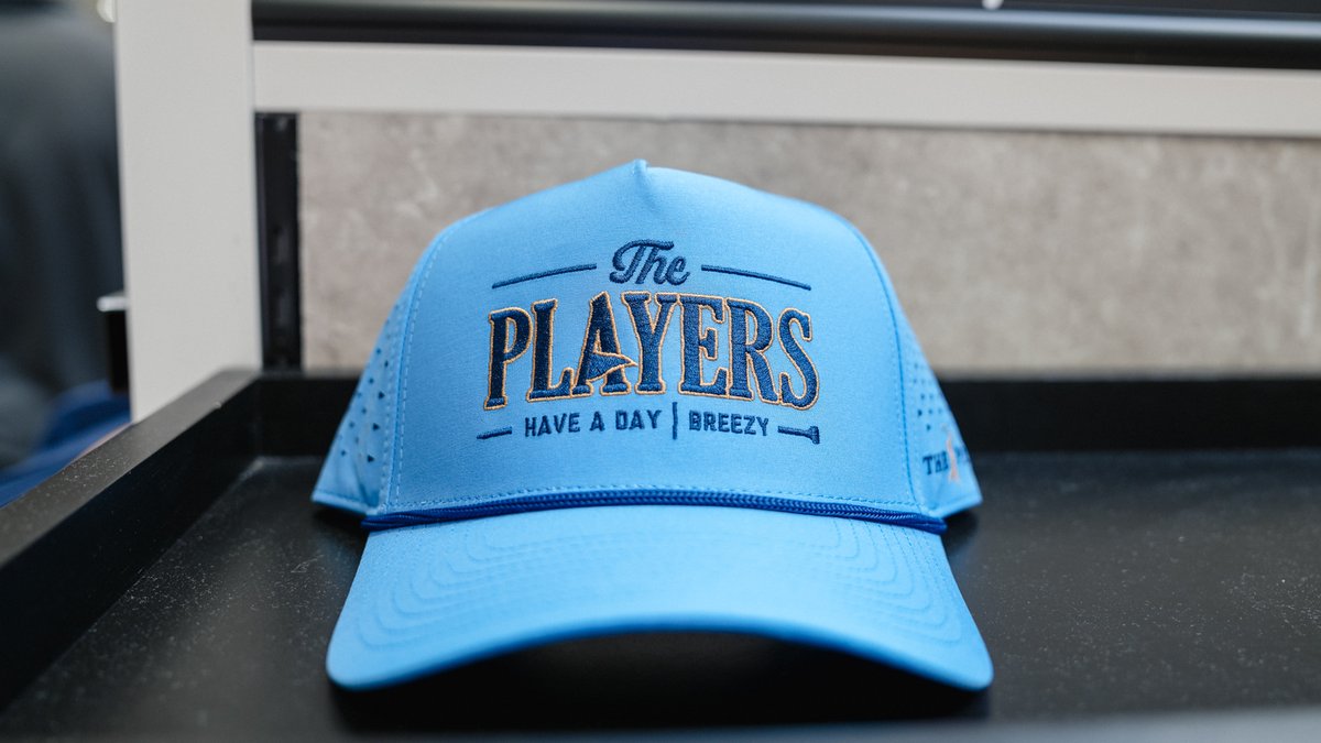
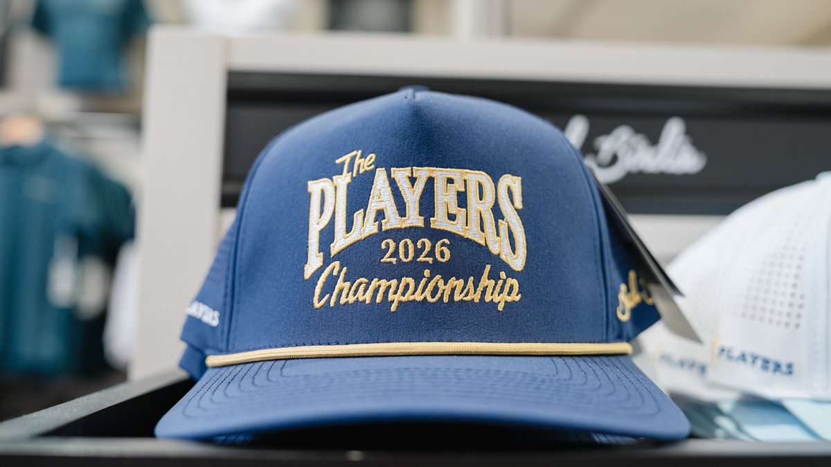
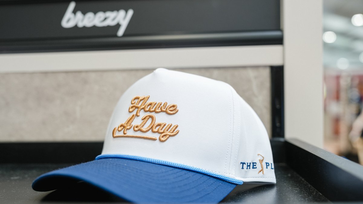
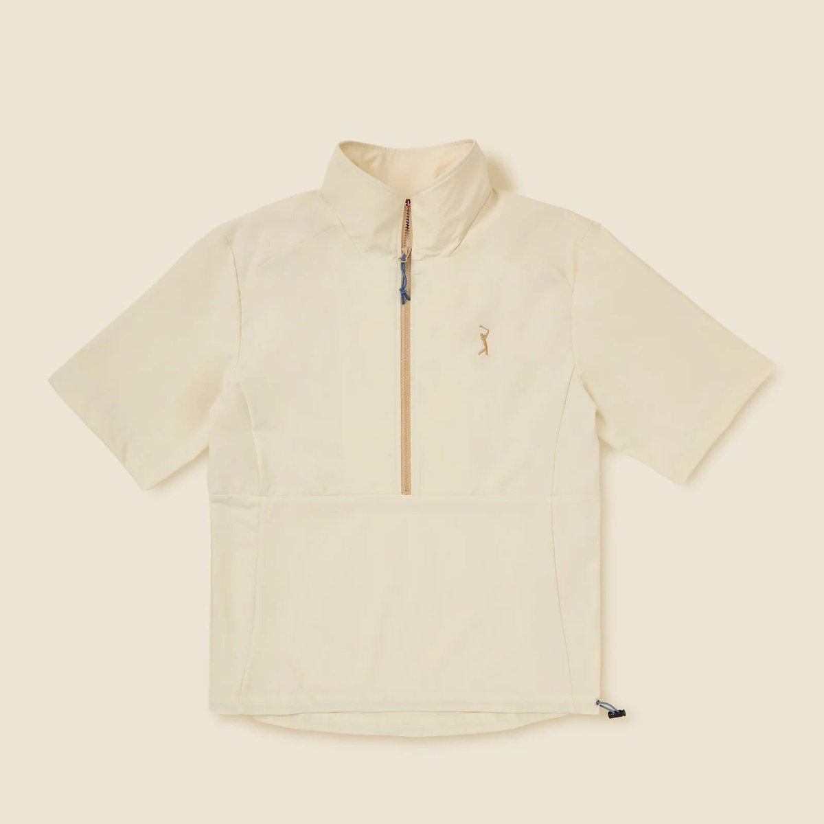
🚨 Drop Alert
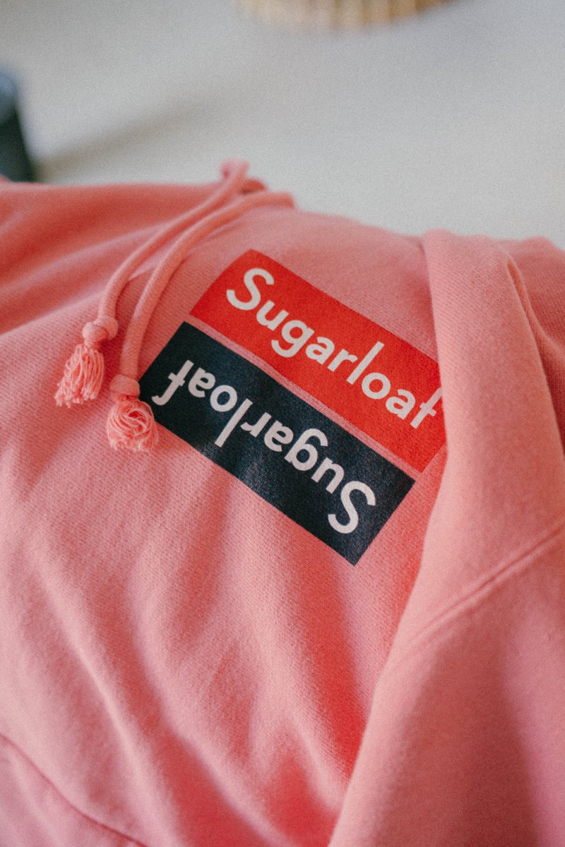
@SLoafSocialClub x @THEPLAYERS collection has landed. Fun Fact: The most I've ever been stopped at a tournament was last year at THE PLAYERS, where I was wearing a sample version of the Cream Windshirt.


1
1
21
13,288
Sugarloaf Social Club retweeted
Feb 24
This @SLoafSocialClub x Makino TOUR 3 Putter is..........delicious 🔥


1
1
21
3,425

.@SLoafSocialClub x Makino unveil latest batch of putters
golfwrx.com/773604/sugarloaf…
1
9
10,501

20 Mar 2025
I hope I never have to try this 🤣

2
3,346

14 Mar 2025
hitting the club twirl in the VR metaverse is a little bit crazy but honestly I dig it

1
1
1,655