
Sharrie Williams, author of "The Maybelline Story," shares her life with Leo the Lab and Ziggy the healing cat. SWMaybelline has also been promoting, The Coron
Joined September 2010
- Tweets 67,692
- Following 37,342
- Followers 38,143
- Likes 17,928
13,449 Photos and videos


Depression-Era Pivot: The 10-Cent Tin (1932)
In 1932, during the hard years of the Great Depression, Tom Lyle Williams made one of his smartest moves: he introduced a smaller, more affordable Maybelline tin for just 10 cents.
The package was lean and practical. The tin used less metal, had simpler stamping, and often came with a cardboard backing or sleeve. Even with the stripped-down design, the Maybelline name remained front and center.
This shift reflected Mabel’s original spirit. Her coal-dust-and-Vaseline beauty fix was all about resourcefulness, and the 10-cent tin carried that same message: beauty should still be possible, even when money was tight.
The design favored function over glamour. Any decoration was minimal, though some versions included small red accents that hinted at Maybelline’s later use of stronger color in packaging.
The purpose was clear: keep Maybelline affordable, accessible, and everywhere. Smaller tins meant lower costs, more units, and wider drugstore reach. Tom Lyle understood the times and responded with practical genius.
Evolution Driver: Economic hardship pushed Maybelline toward a leaner, lower-cost design without sacrificing the strength of the brand name.
1
31
Leo the Lab Report:
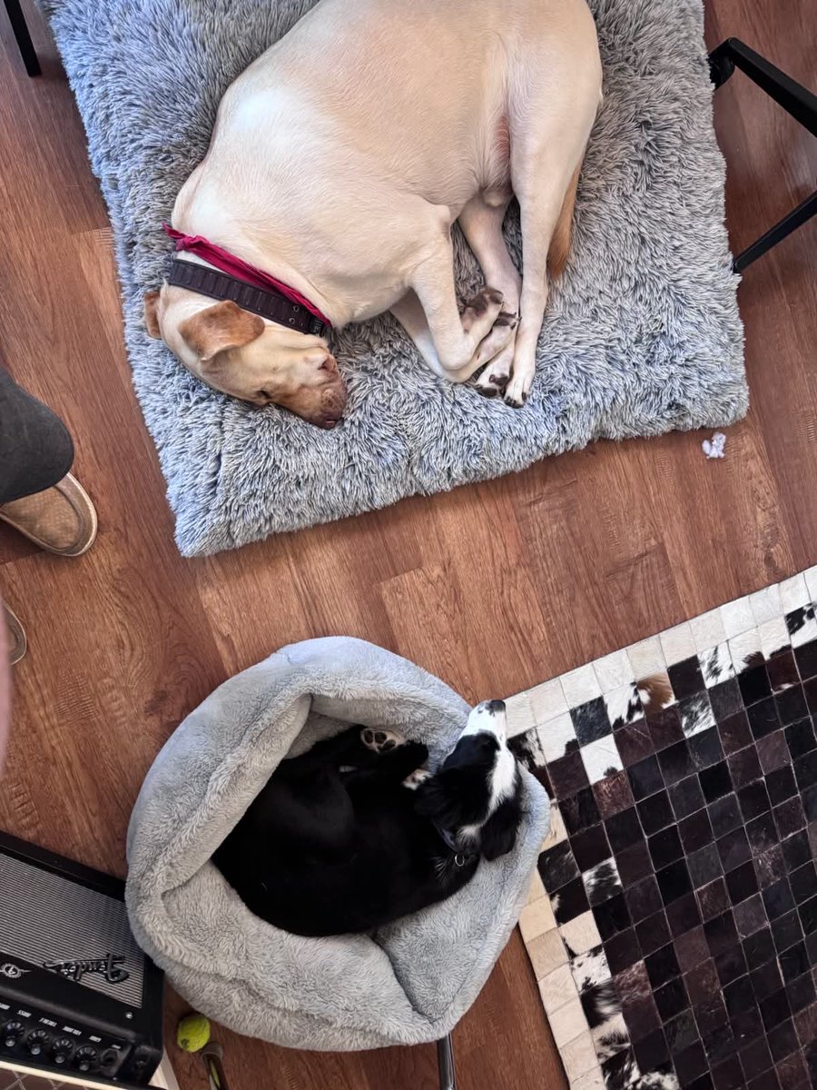
I don't give enough kudos to my right-hand man, Deputy Ziggy, who tirelessly works to protect the premises from rodents and unwanted bird invasions. He's loyal to me, his superior officer, as well as to Jr. Deputy Guarddog-in-Training Marco.
Ziggy is always willing to give his time to help train and strengthen Marco, teaching him wrestling techniques, stealth moves, and the finer points of security work. Every successful guarddog needs a good mentor, and Deputy Ziggy is one of the best.
#Guardkitty #DeputyZiggy #Guarddog #Marco #Training #Lakeboss #SecurityTeam
3
36

Jun 14
maybellinebook.com
1. The Tin Era: #Functional Beginnings (1915–1920s)
When Tom Lyle launched Maybelline Cake #Mascara in 1915, the #packaging was simple and #practical: a small rectangular metal tin, roughly two inches long, often silver or black, with Maybelline stamped boldly on the lid. Inside was a solid cake of mascara made from pigments, waxes, and oils, paired with a separate flat brush for application.
The tin reflected Mabel’s #original #homemade #beauty solution—compact, portable, #affordable, and easy to use. At 25 cents, it was designed for mail-order #customers who wanted a reliable eye-beauty #product they could apply at home.
The Maybelline name dominated the packaging, tying the product directly to Mabel’s #inspiration. Early tins were #utilitarian, but by the 1920s, they began to show more polish, with embossed details and subtle Art Deco touches that matched Tom Lyle’s growing #Hollywood-inspired vision.
Built to survive #shipping and later stand out on #drugstore shelves, the tin represented Maybelline’s scrappy beginning: practical, inexpensive, and full of #promise.
1
2
51
Jun 13
Leo the Lab Report:
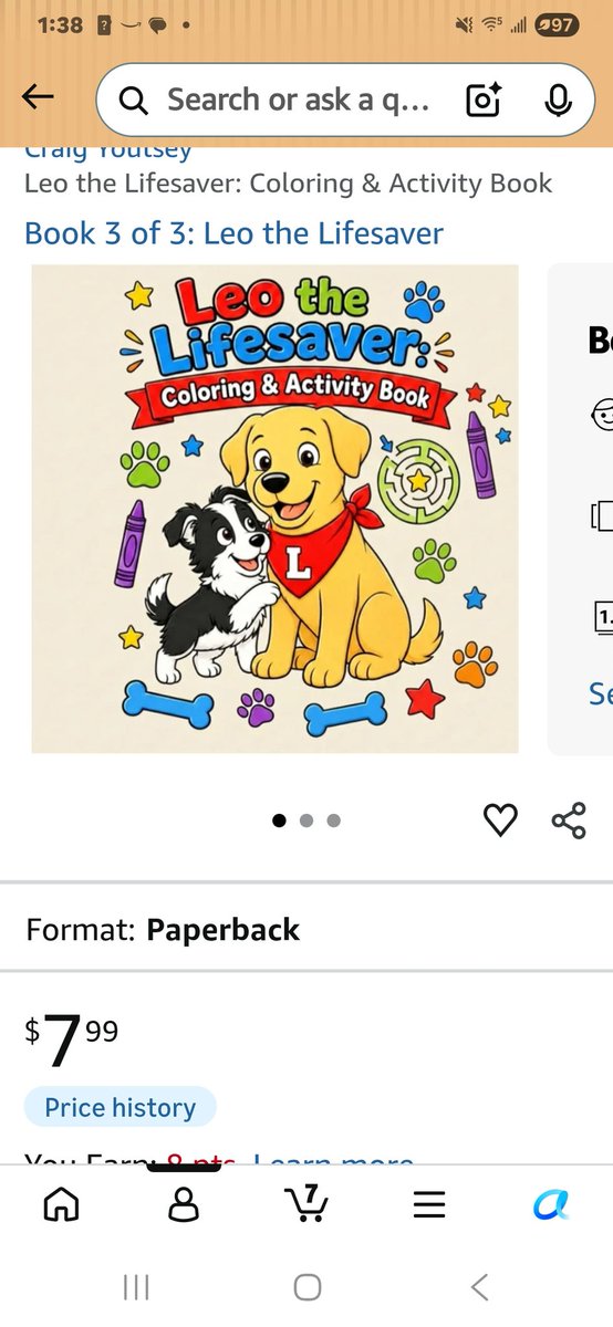
The books contain just enough material for little minds to absorb while learning valuable life lessons about kindness, helping others, and making good choices in different situations. The colorful illustrations and bright, engaging artwork help keep children interested, while the stories offer lessons that become even more meaningful as they grow older and gain a deeper understanding. I love both of 's Leo books, especially the coloring and activity book that complements them so perfectly.
#LeotheLabReport #childrensbooks
#coloringbook #CraigYoutsey #author
2
63
Jun 13
maybellinebook.com
Tom Lyle, the founder of Maybelline and #patriarch of the Williams #family, discovered the idea for #mascara after witnessing an incident involving his #sister, Mabel Williams. Recognizing its #potential, he transformed the #idea into a #business #venture and launched a #successful mail-order #marketing #campaign. He named the company Maybelline in her honor. Over the years, the business experienced both remarkable #growth and difficult setbacks, but each time it was brought back to success through Lyle's business #instincts, #determination, and marketing #genius. He was the very definition of an #entrepreneur.
41
Jun 12
Leo the Lab Report:
Leo the Lab Report:
Why is the door locked? I can outwait the best of them, but somebody please get a clue! Marco needs to pee, and so do I. You don't want the floodgates opening on that freshly washed floor, do you?
OPEN THE DOOR!
#guarddog #Marco #emergency #bathroombreak #lakeboss #guarddogproblems
#cutedogs #LeotheLabReport #emergencies #guarddog #lakeboss
1
61
Sharrie Williams retweeted

Jun 11
This case has so many twists.
1
1
112
Jun 12
maybellinebook.com
The extended Williams family is filled with fascinating and colorful #personalities. Many are involved in the Maybelline Company in one way or another—or depend upon their share of the #family #fortune. Their relationships, #rivalries, #loyalties, and personal #dramas create a compelling narrative that keeps the pages turning. The author leaves no skeletons in the closet and no stone unturned, revealing a family #saga as captivating as the rise of the iconic #beauty #empire itself.
48
Jun 12
Leo the Lab Report:
Marco the Border-Collie puppy, my Jr. Deputy Guarddog-in-Training, was put in charge of overseeing tonight's special dinner of salmon, swordfish, mashed potatoes, and green beans. You can never be too careful when delicious food is involved. Rodents and other suspicious characters have been known to appear out of nowhere looking for a free bite. Fortunately, Marco took his duties very seriously and guarded the meal like a true professional. Another gold star on his training report!
#guarddog #JrDeputy #Marco #BorderCollie #securitydetail #lakeboss #LeotheLabReport
4
58
Jun 11
maybellinebook.com
The circumstances surrounding Miss Maybelline's death remain shrouded in #mystery, intertwining #family #drama, #corporate #legacy, and elements of true #crime. Despite years of #speculation and conflicting accounts, no definitive #evidence has emerged to prove whether her death was a tragic #accident or something more #sinister. As a result, the #case remains #unsolved and continues to #intrigue those fascinated by the #hidden #stories behind one of #America's most #iconic #beauty families.
1
1
83
Jun 11
Leo the Lab Report:
Sometimes after a long night patrolling the premises with my Jr. Deputy Guarddog-in-Training, Marco, I'm extra famished. I don't ask for much and I rarely complain. But when I say I'm hungry, take me seriously.
I'm a big guy with a big job. Protecting the family and securing the property takes energy. A professional guarddog needs plenty of calories to keep operating at peak performance.
#guarddog #workingdog #lakeboss #LeotheLabReport #securityteam #goodboys :::
4
83
Jun 10
maybellinebook.com
By any measure, Tom Lyle Williams probably ought to be one of the revered #American #businessmen of the 20th century—not just for his #innovations and #industriousness in the world of #cosmetics, but for what he likely had to endure as a gay man, in a committed #partnership, having to keep his personal life in the shadows to sustain his #business. It’s a fascinating and potentially #inspirational story, and yet, compared to the competitors who put their own names on their products—i.e., Coco Chanel, Estee Lauder, Max Factor, etc.—Williams’ #legacy has continued to languish in #obscurity.
1
49
Leo the Lab Report:
Huge breakthrough! Ever since the doggy door was locked because Ziggy—only doing his job—continually brought in rats and dead birds, Marco and I have been at the mercy of someone being available to open the slider for us.
However, Marco suggested I try opening the slider myself. After some serious determination and professional guarddog ingenuity, I mastered the move! We're now free to go outside whenever duty calls without bothering anyone.
There is one small problem, however...
I haven't quite mastered how to close it yet!
#guarddog #breakthrough #doggydoor #lakeboss #Marco #Guardkitty #LeotheLabReport
2
1
6
155
maybellinebook.com
Sharrie Williams rarely discusses #packaging #evolution on X, where her posts tend to focus on #family #stories, such as Leo the Lab, or #mysteries like Miss Maybelline’s alleged #arson. However, in The Maybelline Story, she connects Maybelline’s early packaging to Mabel Williams’ #inspiration and Tom Lyle Williams’ #vision. To Williams, the Maybelline name appearing on every package remains Mabel’s enduring #legacy—a deeply #personal reminder of the sister whose idea launched a #beauty #empire.
1
46
Leo the Lab Report:
I was sick a few days ago. Loose bowels, to say the least. In other words, I was completely out of commission.
Luckily, I had trained Marco, my Jr. Deputy Guarddog-in-Training, to patrol the premises and report any suspicious activity to Sr. Guardkitty Ziggy. While I recovered, they handled security with professionalism and dedication.
We're a well-trained team, and our family can always count on us.
#leothelabreport #guarddog #JrDeputy #Guardkitty #securityteam #lakeboss
4
82
maybellinebook.com
Tom Lyle Williams didn't just #sell #mascara—he built a #brand that #consumers #trusted and #remembered.
56
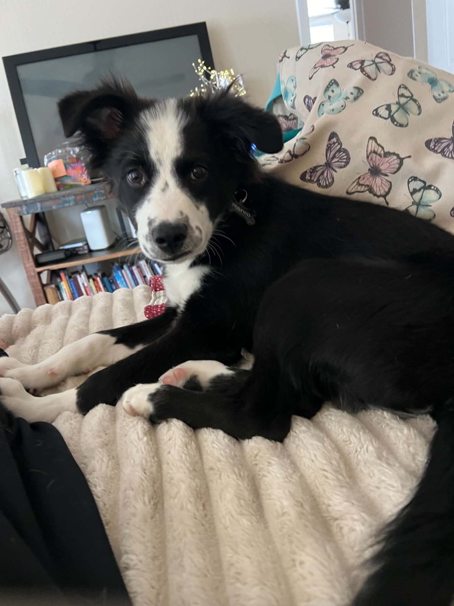
Leo the Lab Report:
Today is Sunday, but in the guarddog business it's a 24/7 operation—holidays, weekends, whatever.
Marco the Border-Collie puppy, my Jr. Deputy Guarddog-in-Training, may look like he's lounging around, but don't be fooled. One ear is always up and listening for action. One yelp from me and he's immediately by my side.
That's loyalty. That's dedication. That's being a true professional.
#guarddog #goodboys #professional #lakeboss
1
6
79