
West Ham United Supporter | WHU Views & Opinions | Long Live the Boleyn | Londoner | Oasis Enthusiast
Joined October 2020
- Tweets 35,406
- Following 2,107
- Followers 18,108
- Likes 44,586
5,685 Photos and videos


A new era at West Ham has truly begun. Křetínský is now the majority shareholder, further distancing the club from the Sullivan era.
We desperately needed a reset, and it finally feels like we’re getting one. A fresh start, a new direction, and a chance to move the club forward!
16
40
473
12,363
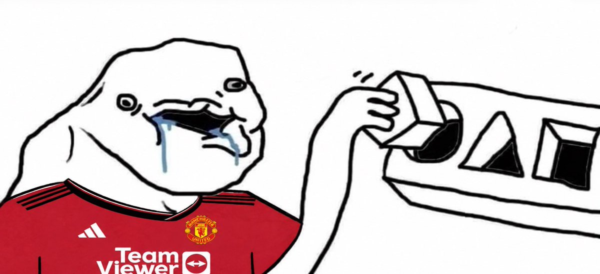
M. Fernandes.
• Cost us £40M plus 15% sell on, so selling him for less than £65M does not benefit us financially.
• 5Y contract with no release clause.
• His team have agreed that price with the club.
Do I think he’ll sell for £85M? No! but it needs to be more than £60M.

64
4
229
35,406
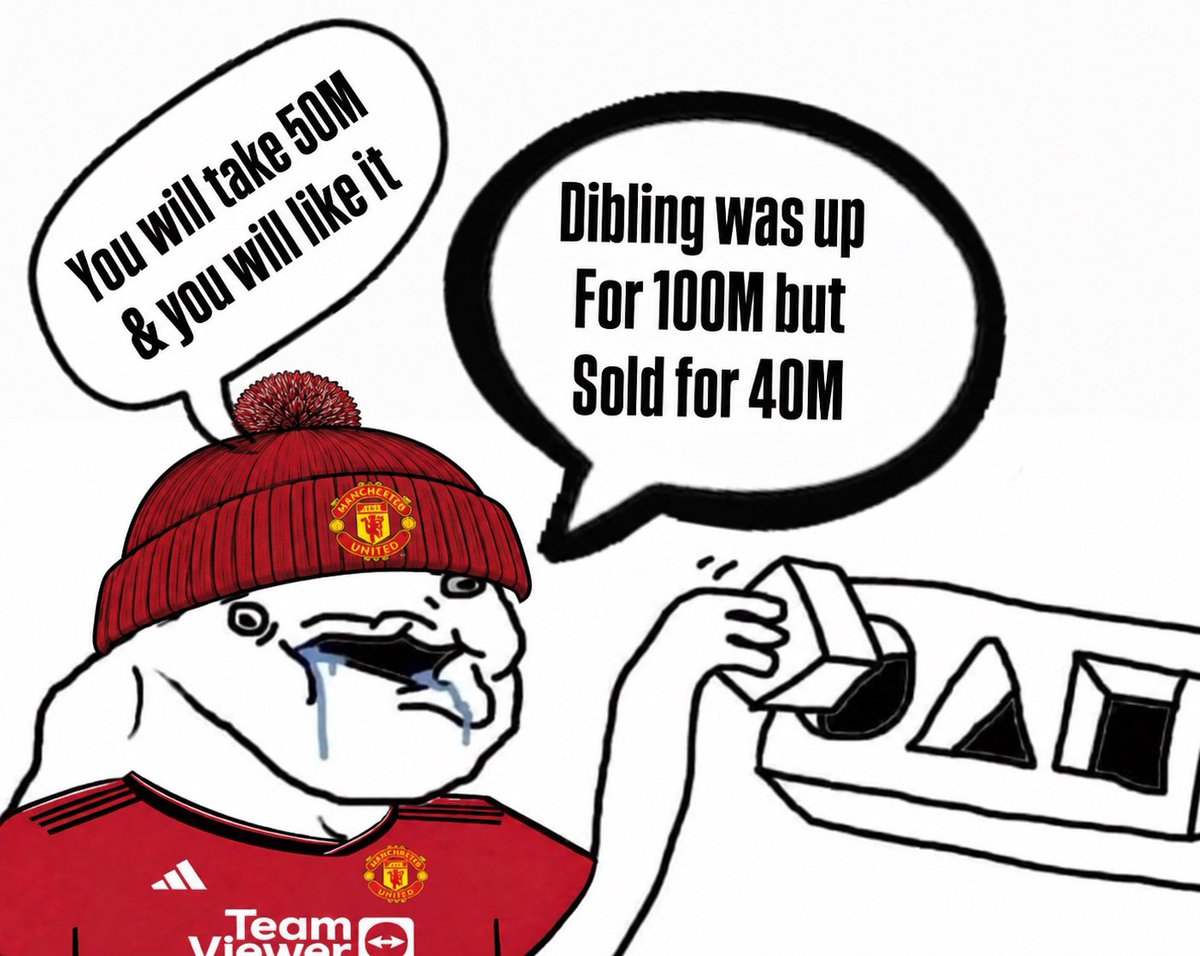
It’s always the same with privileged fan-bases. They expect other clubs to give up their assets for peanuts.
The absolute pony these entitled, glory-hunting cheesy helmets come out with is hilarious.
£85M is what he’s worth to us. He’s on a 5 year contract. He signed for 40M.

Big clubs should just refuse to pay these insane prices. Force the players to run down their contracts / have lower release clauses.
This market cannot continue.
9
12
142
10,296

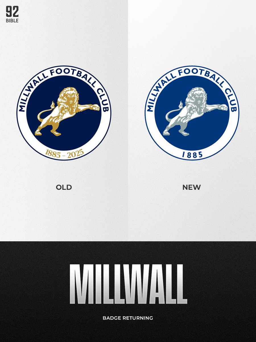
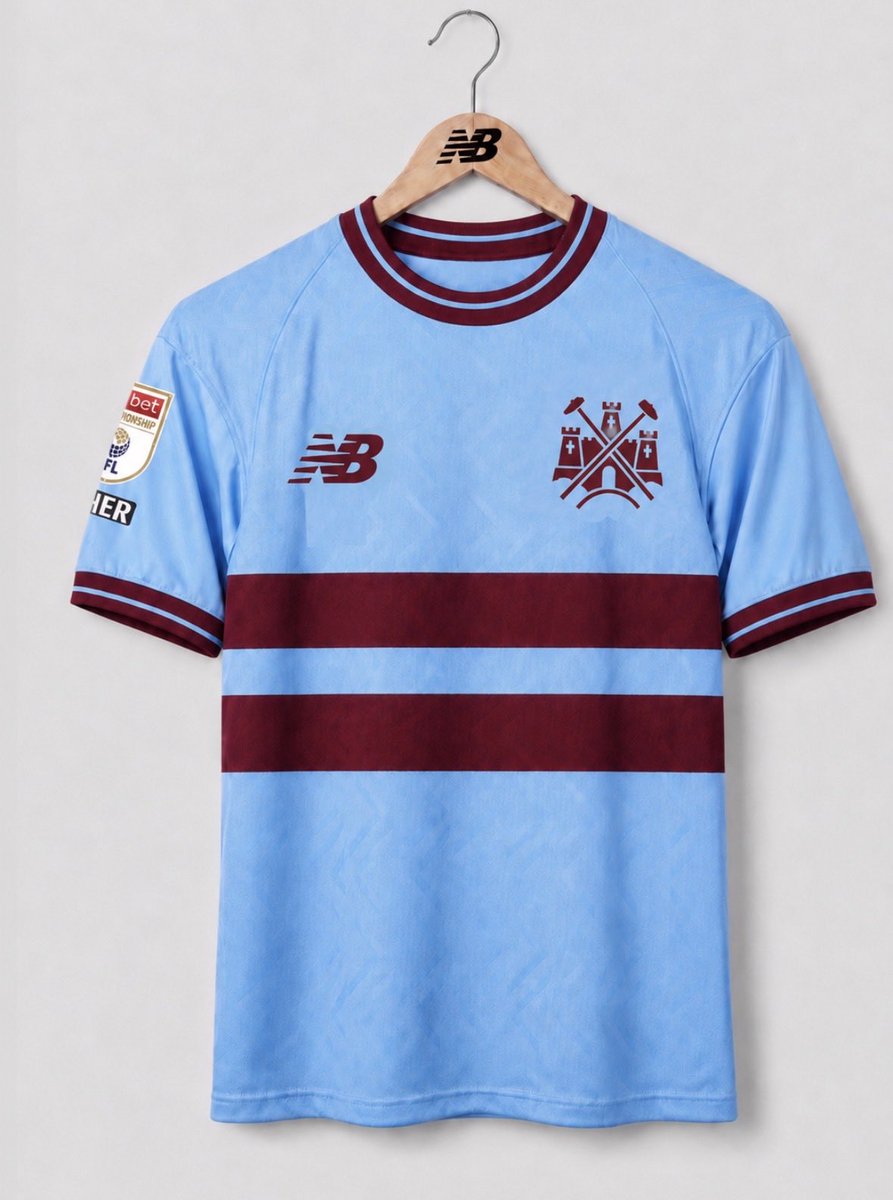
Some people aren’t keen on the wording above, and I have to agree - it looks better without it.
It would also look great in white or sky blue.


I adapted our early 90s badge to give it a more modern look.
It feels modern while still retaining a classic look, and the bold gold against the claret looks stunning.

10
72
8,168

When this day comes, I’ll celebrate it.


15
22
745
96,978


Danny you absolute helmet.
Funny how every trophy becomes “pointless” when it’s a club outside the elite winning it.
If your club won a European trophy after decades waiting, you’d celebrate it too. Football isn’t only valid when billion-pound clubs lift the Champions League.
May 27

It does. It means so much to Palace. Going ahead in a recently manufactured pointless corporate tournament.
All those fans would have dreamed of one day winning this bullshit cup.
21
21
451
51,110