
366 Photos and videos


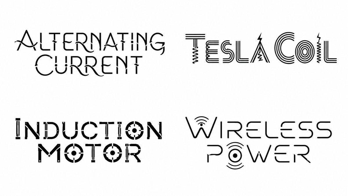
Science inspired fonts, made with GPT Image 2.
<instruction> Input A: [Topic Entity] (e.g., poet, mythology, film, city, game, scientist, brand) Optional Input B: [Typography Bias] (e.g., "high-contrast serif", "monoline sans", "blackletter", "stencil", "calligraphic") Goal: Generate a 2×2 grid. Each cell is ONLY typography on a pure white background: - Write ONLY the chosen title/name in a newly invented font derived from that item’s world. - No icons, no illustrations, no extra shapes, no borders, no textures, no scenery, no props. - The “world-building” must be encoded strictly inside letterform design (strokes, terminals, counters, ligatures, diacritics, texture implied via negative space only). Process (Semantic → Typeface Engineering): 1) Select 4 representative items from Input A (semantically inferred; do not ask the user): - If Input A is a creator: choose 4 famous works. - If Input A is a world/topic: choose 4 iconic sub-entities (eras, locations, characters, principles, episodes, artifacts). 2) For each item, extract a “World Motif Profile”: - tone/mood, environment physics, materials, cultural cues, signature symbols, recurring shapes, motion language. - translate motifs into typographic primitives (curve vs angle, contrast, axis, stress, serif logic, aperture behavior, terminals, joins). 3) Build a per-item “Font DNA Sheet” (must remain consistent within that one word): - Skeleton: geometric/humanist/romanic/blackletter/etc (inferred) - Contrast: low/med/high; stress angle; stroke modulation - Proportions: x-height, ascenders/descenders, width - Signature Features: 2–4 repeatable rules (e.g., “triangular ink traps,” “broken crossbars,” “looped descenders,” “knife terminals”) - Legibility Gates: must remain readable at a glance; no excessive distortion. 4) Render Output: - 2×2 grid, equal margins, perfectly centered type. - Pure white background (# FFFFFF). - Type only, single color ink (near-black). - No shadows, no gradients, no 3D, no paper grain. - Each cell: the item title only. Negative Rules (hard): - No additional words (no author name, no captions, no dates). - No decorative frames, ornaments, icons, or pictograms. - No imagery or “logo marks.” - No background tone other than pure white. </instruction>
1
1
5
377
shaoso retweeted

Jun 9
【もはや事件】
"After Effectsで何時間もかけてた仕事"が
プロンプト1発で終わる時代、ガチで来ました😳
その名も
ーーー text-to-lottie!
x.com/konstipaulus/status/20…
Codex / Claude Code から呼ぶだけで
本番環境に貼れるLottieアニメーションが生成されます!
何がヤバいかというと👇
・OSS/完全無料
・Codex でも Claude Code でも動く
・出力は本番JSONそのまま
・Web・モバイル・LP・LINEリッチメニュー全部使える
導入は1行👇
$ npx skills add diffusionstudio/lottie
最高ですね!!!!!
8
64
882
80,644
shaoso retweeted

Jun 9
エコーを使ったモーション作品

42
472
17,344


shaoso retweeted

Jun 8
I tried Higgsfield MCP by creating a full campaign for a fictional perfume
I called it “Higgsfield MCP” and treated it like a real product launch
The goal was not to make one pretty image. I wanted to see if I could go from a simple product idea to a full campaign direction in one workflow
So I created:
product visuals
a premium photoshoot
a cinematic ad video direction
a landing page concept
What I liked most was how connected the process felt
Usually, when I work on something like this, I keep moving between tools, saving files, rewriting prompts, adjusting ideas, then starting again somewhere else
With Higgsfield MCP connected to Claude, the process feels more like directing a creative assistant inside one conversation
You give the idea, then you keep building on it step by step
The setup is simple:
1. Open Claude
2. Go to Settings, then Connectors
3. Add a custom connector
4. Name it Higgsfield
5. Paste this URL: mcp.higgsfield.ai/mcp
6. Click Connect
7. Sign in with your Higgsfield account
8. Start asking Claude to generate images, videos, campaign visuals, or creative assets
For me, the most interesting part is not just that AI can create nice visuals, but it is the fact that you can start thinking in campaigns, not single assets
A product idea can become visuals, videos, ad concepts, and landing page direction without breaking the flow every few minutes
I can see this being useful for creators, small brands, marketers, product launches, beauty campaigns, fashion drops, food visuals, and quick client previews 🔥
23
8
80
13,979

shaoso.blogspot.com/2026/06/… 簡單寫了AE 的 AI 外掛 #higgsfield 不過月費太便宜 無法使用的model 太多 只好傳上這種的啦~
2
56

shaoso retweeted

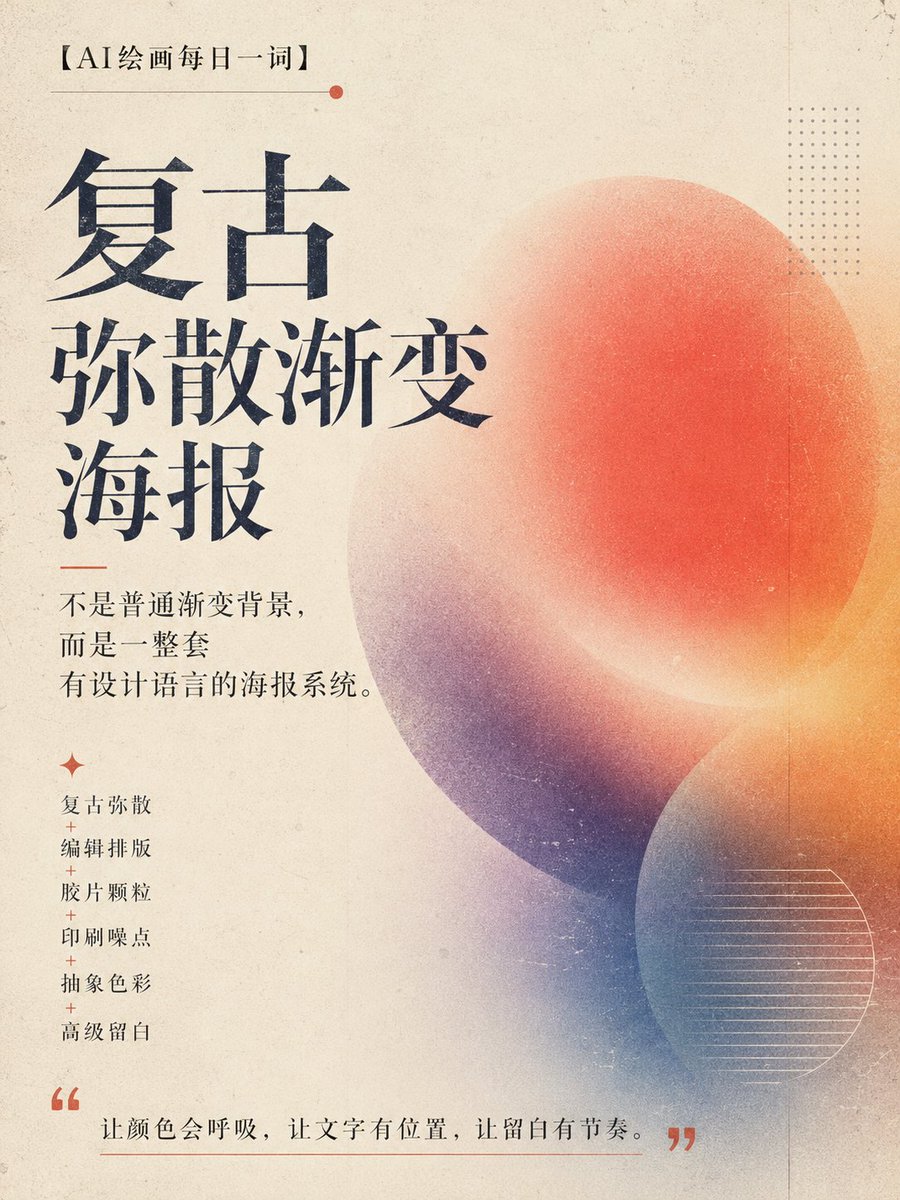
最近发现一种特别适合做海报、封面、品牌视觉的 AI 设计方向:
复古弥散渐变。
它不是普通渐变背景,
不是 PPT 封面,
也不是廉价赛博霓虹图。
它更像一张独立杂志封面、艺术展海报、实验音乐海报,或者设计工作室作品集里的视觉稿。
核心气质是:
复古弥散 编辑排版 胶片颗粒 印刷噪点 抽象色彩 高级留白。
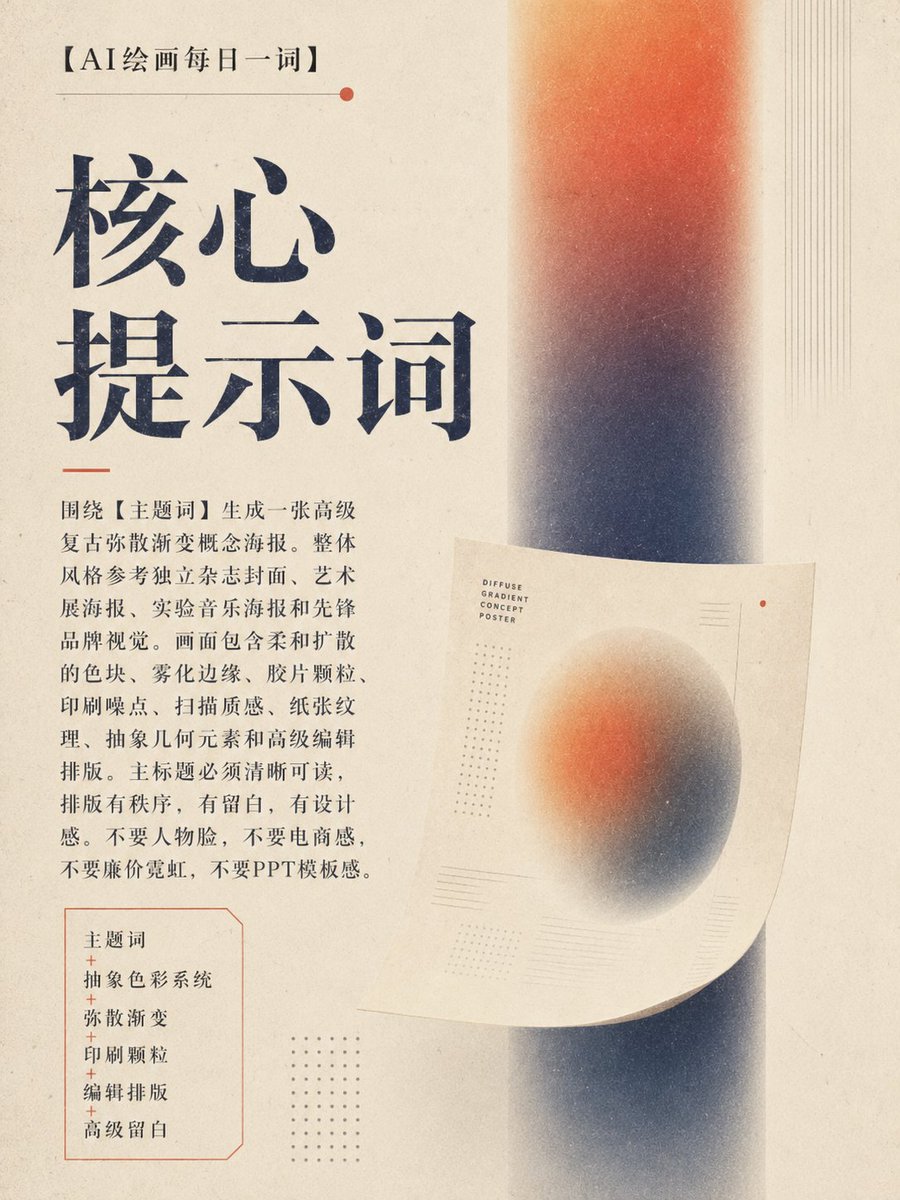
🎯 核心提示词:
请围绕【主题词】生成一张高级复古弥散渐变概念海报。整体风格参考独立杂志封面、艺术展海报、实验音乐海报和先锋品牌视觉。画面包含柔和扩散的色块、雾化边缘、胶片颗粒、印刷噪点、扫描质感、纸张纹理、抽象几何元素和高级编辑排版。主标题必须清晰可读,排版有秩序,有留白,有设计感。不要人物脸,不要电商感,不要廉价霓虹,不要PPT模板感。
这类提示词的核心结构是:
主题词 抽象色彩系统 弥散渐变 印刷颗粒 编辑排版 高级留白。
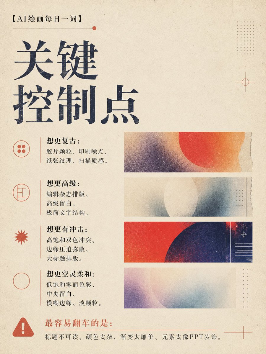
💡 核心逻辑
这个玩法的关键,不是“做一个好看的渐变背景”,而是建立一套完整的视觉系统。
第一,颜色要有主逻辑。
可以高饱和,也可以低饱和;可以单色系,也可以双色冲突。但不能变成廉价彩虹渐变。
第二,弥散要有方向。
颜色可以横向扫描、纵向雾化、边缘压入、中央留白,也可以像胶片显影一样慢慢浮出来。
第三,文字要站得住。
主标题必须清晰可读。设计感不是让字看不懂,而是让文字和画面形成秩序。
一句话理解:
让颜色会呼吸,让文字有位置,让留白有节奏。
🔁 延伸玩法
🎵 实验音乐海报
可以用强烈对比色、重颗粒、压迫式大标题,适合演出、派对、声音艺术主题。
🖼️ 艺术展海报
适合低饱和雾面色彩、大留白、细字体和抽象几何,整体更克制、更高级。
📚 知识卡片封面
可以用浅色底、清晰标题、柔和弥散背景,适合做“每日一词”“研究笔记”“专题观察”。
🛍️ 品牌视觉主图
用统一色彩系统和排版结构,可以延展成品牌活动海报、社媒封面、公众号头图。
🌐 X / 微博封面
横版可以强调标题识别度,竖版可以做成杂志封面感,适合个人IP栏目包装。
📌 一句话总结
复古弥散渐变海报的魅力,不在于渐变本身,而在于它能把抽象色彩、印刷质感和编辑排版,变成一张真正有设计语言的作品。

35
27
135
7,331
# higgsfield.ai 看不懂程式語法 叫gemini 換得~

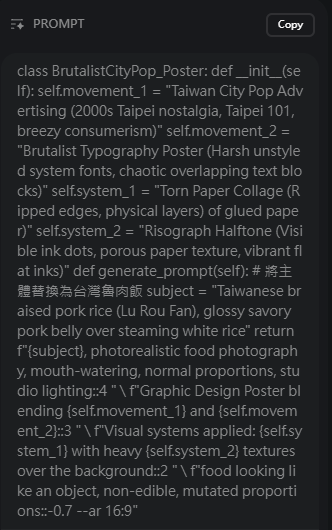
I have done thousands of prompts on all these different topics and I learn new techniques all the time. Here is another prompt for GPT Image 2 for 4 famous international foods.
class BrutalistCityPop_Poster: def __init__(self): self.movement_1 = "Japanese City Pop Advertising (1980s Tokyo nostalgia, pastel sunsets, breezy consumerism)" self.movement_2 = "Brutalist Typography Poster (Harsh unstyled system fonts, chaotic overlapping text blocks)" self.system_1 = "Torn Paper Collage (Ripped edges, physical layers of glued paper)" self.system_2 = "Risograph Halftone (Visible ink dots, porous paper texture, vibrant flat inks)" def generate_prompt(self): subject = "[$cusines]" return f"{subject}, photorealistic food photography, mouth-watering, normal proportions, studio lighting::4 " \ f"Graphic Design Poster blending {self.movement_1} and {self.movement_2}::3 " \ f"Visual systems applied: {self.system_1} with heavy {self.system_2} textures over the background::2 " \ f"food looking like an object, non-edible, mutated proportions::-0.7 --ar 16:9"

2
6
238
shaoso retweeted

Jun 7
【アップデート】PathOffset Pro v1.183 を公開しました🚀
AE内でイラレライクなマスクパスオフセットを実現する拡張が、念願のCJK文字(漢字・かな)に対応。
✅精度・安定性を大幅強化(連続オフセットでも崩れにくく)
✅筆文字級の複雑形状もOK
✅処理速度アップ
✅Outline刷新+新スライダー「Curve Fit」
既存ユーザーは無料アップデートです👇
takecinema.com/products/path…
#AfterEffects #Pathoffsetpro
3
16
82
19,439
shaoso retweeted

画像をバキバキに割れるツールを公開しました。割った画像の書き出しも可能です。シャッフルで好みの設定を探しても良いですし、細かくパラメーターをいじることも可能です。
amix-design.com/tl/tool-d-ba…
14
940
4,935
350,417

shaoso retweeted

Jun 6
대한민국 경찰이 아닙니다. 중국 공안입니다.
MOU 체결후 엄청난 인원이 중국 공안이
한국 경찰로 둔갑하여 국민들을 걷어차고
폭행을 일삼고 있습니다.
전세계 여러분들이 반드시 알아야합니다
리트윗 재인용 부탁드리며,
널리 알려주시면 감사하겠습니다.
It's not the Republic of Korea police. It's the Chinese police.
After signing the MOU, a huge number of people were sent to the Chinese public
He's turned into a Korean police officer, kicking the people
They are assaulting each other.
You must know this from all over the world
Please re-use the retweet,
I'd appreciate it if you could let me know widely.
850
2,753
6,670
291,161
shaoso retweeted

Jun 5
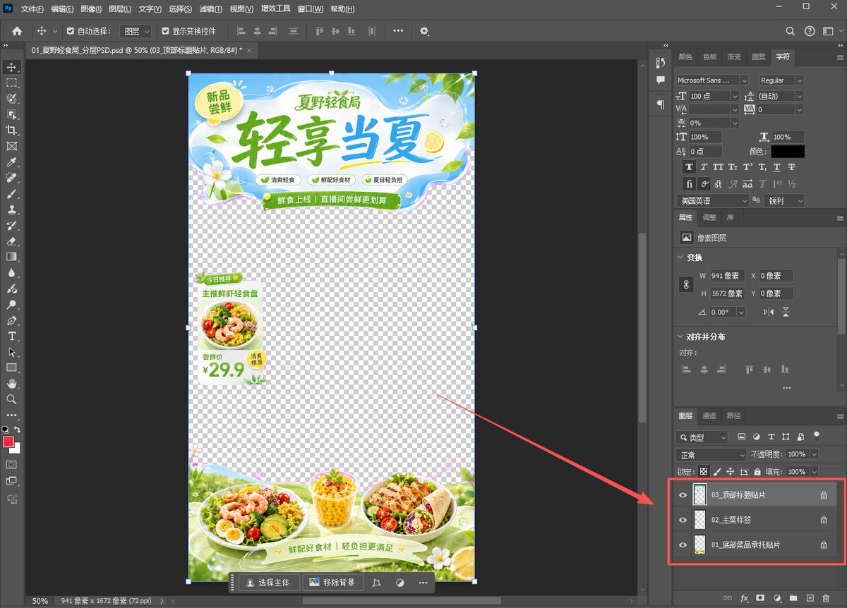
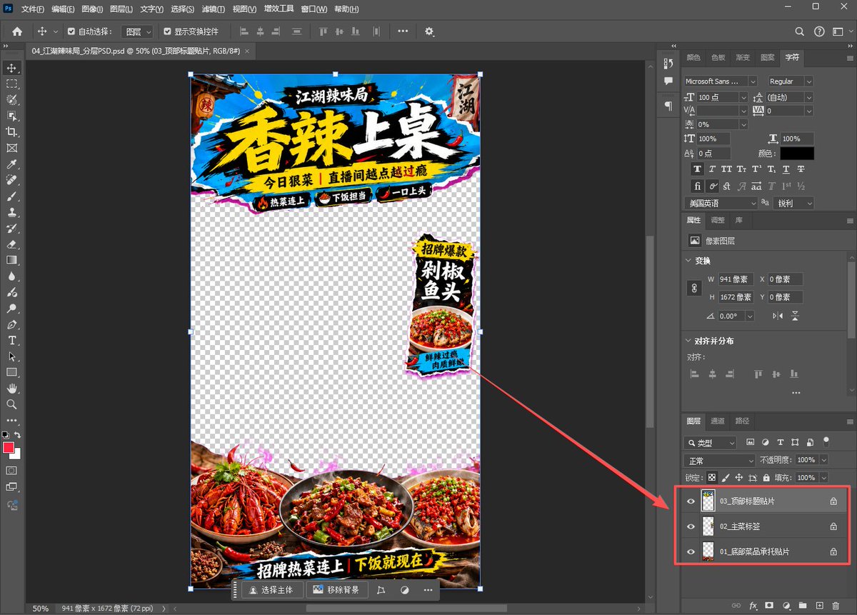
💡热知识!
用ChatGPT-Image2生成直播间贴片后,一句话下载PNG和PSD!
你可以继续回复一句:
“现在提供这张图的真透明 PNG 和区域分层 PSD,打包给我下载。”
这样就能拿到:
1、可直接叠加直播画面的真透明 PNG
2、可在 PS 里移动调整的区域分层 PSD
比如顶部贴片、底部承托、侧边悬浮标签,都可以拆出来单独调整。
适合做直播贴图、异形挂件、商品承托、促销标签这类素材!
Jun 5

🔥逆天!用 Image2 生成直播间贴片,透明PNG格式,直接可用!
再也不用到处找模板改了,设计网站会员也不用续了!🤣
使用这个提示词,ChatGPT就能直接生成:
顶部标题贴片、底部商品承托、侧边悬浮标签,中间留给主播画面
关键是提示词里一定要明确:
不要假透明网格,要输出带 Alpha 通道的真透明 PNG
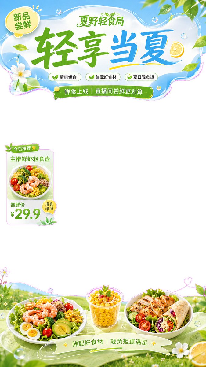
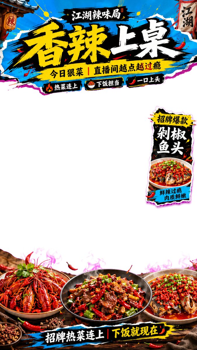
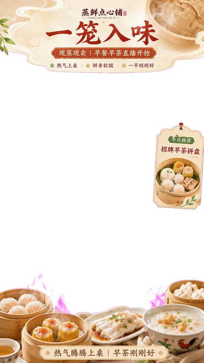
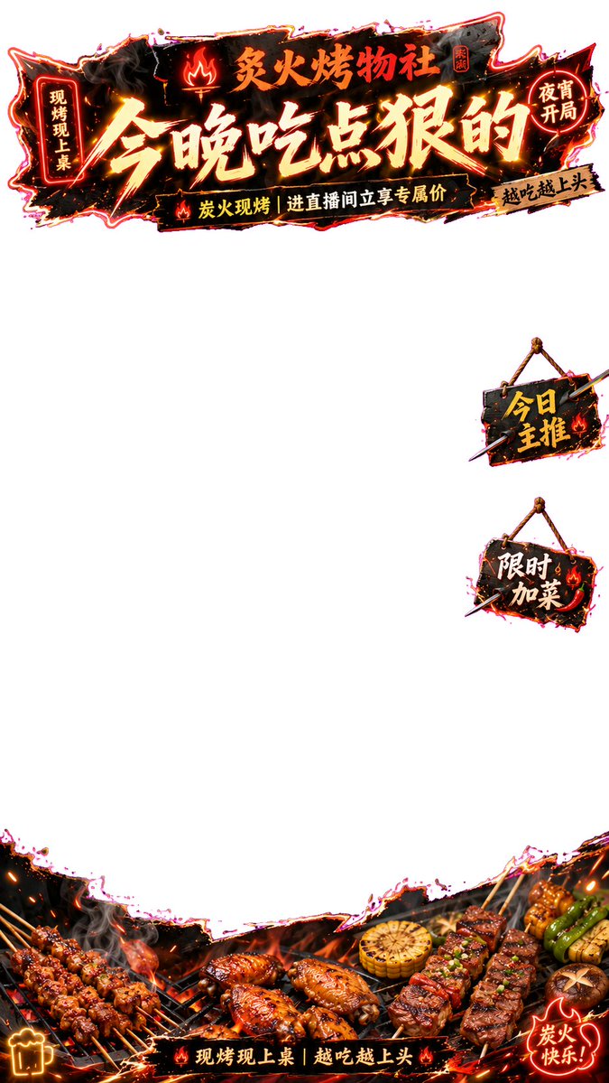
我做了 4 个餐饮直播间案例:
1、清爽轻食
2、夜宵烧烤
3、早茶点心
4、江湖辣味
直播间贴片核心结构是:
上方异形标题贴片 下方产品承托贴片 单侧少量漂浮标签
适合餐饮团购、本地生活直播、直播间装修、直播带货贴片参考!✨
Demo为PNG格式,上传X后被转为JPG
通用提示词 方法 在评论区👇
26
14
112
21,004
shaoso retweeted
Jun 3
🤯Which coworker would you actually want on your team?
One office. 8 coworkers from different countries.
The camera glides through the room like an FPV tour.
But here’s the wild part:
The entire camera movement was generated from a single red line I drew on the image!
Workflow below 👇
Jun 2
I used AI to make a first-person Quidditch POV chase. 🧹
V1 got 2.3M views in 15 hours, but many of you caught the broom orientation issue.
So I made V2:
Fixed broom orientation, smoother chase, better POV.
The main workflow change:
I added a POV reference frame to lock the broom orientation.
Breakdown in the comments 👇
72
215
1,504
267,836