
Joined July 2015
- Tweets 1,366
- Following 190
- Followers 6,060
- Likes 16,506
506 Photos and videos


Pinned Tweet

5 Nov 2025
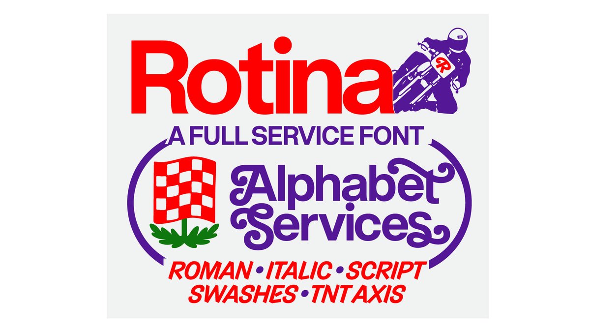
NEW RELEASE: ♦️🔷🔸 Introducing Rotina 🔸🔷♦️
Rotina is a sturdy modernist sans with a playful secret. Built on the solid foundation of a novel and clean utilitarian neo-grotesque, Rotina is an aesthetically cohesive Swiss army knife of tools that brings workhorse fundamentals, robust utility, and a heavy dose of aura to your daily design routine.
Designed by: @ErikMarinovich
Explore Rotina: shrptyp.co/Rotina
1
1
5
868
May 26
Major update to our future-forward hauntological sans: the Ghost Superfamily is now a 4 axis variable designspace with Display-Text, Mono-SemiMono-std (with the weight and slant also ofc)
sharptype.co/typefaces/ghost…
sharptype.co/typefaces/ghost…
sharptype.co/typefaces/ghost…
sharptype.co/typefaces/ghost…
sharptype.co/typefaces/ghost…
sharptype.co/typefaces/ghost…

2
24
1,325


Sharp Type retweeted

Mar 5
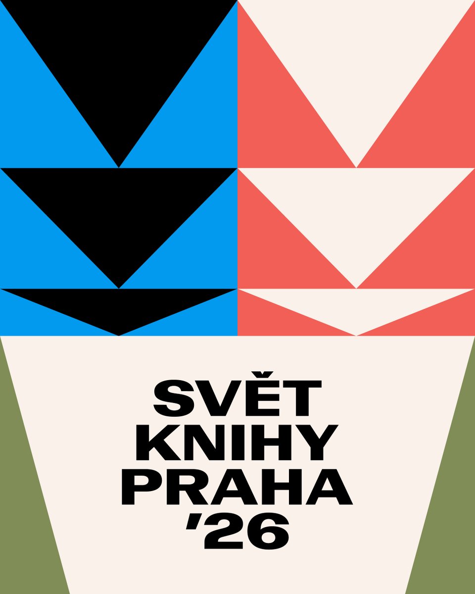
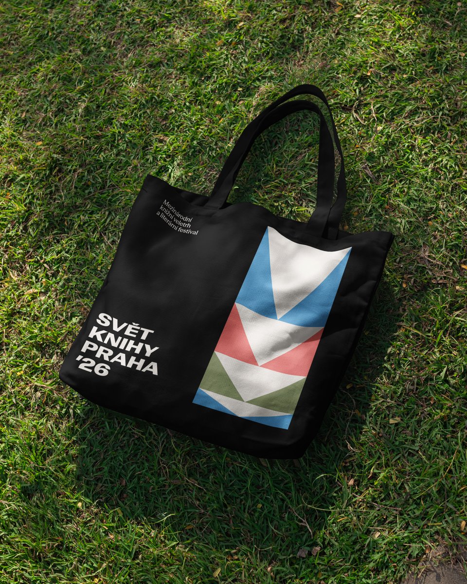
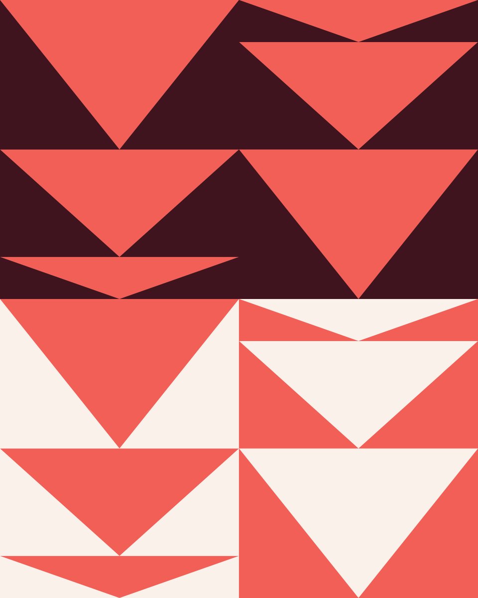
Svět knihy 2026 gets a new visual language. In an unexpected twist, the main character is a book. Muahahaha!
I reduced the opened books of all sizes and formats to triangles. A small typographic Rorschach test: arrows, pages, open books, or whatever your brain insists on seeing.
More pieces from the system coming soon.
Typeface: Record Disc by @SharpTypeCo / Season Mix by Displaay
Client: @svetknihypraha
3
2
15
1,097
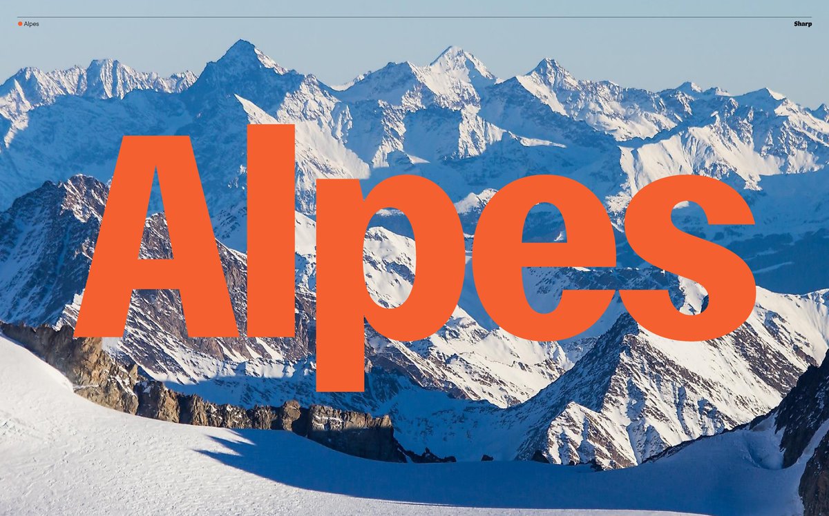
Feb 25
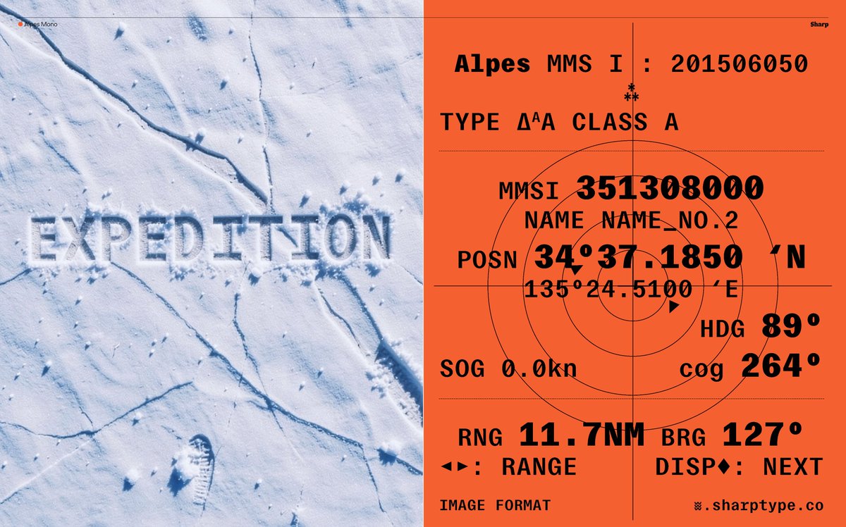
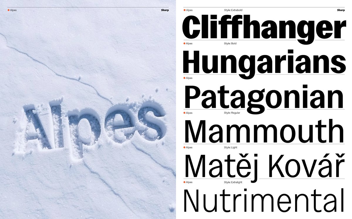
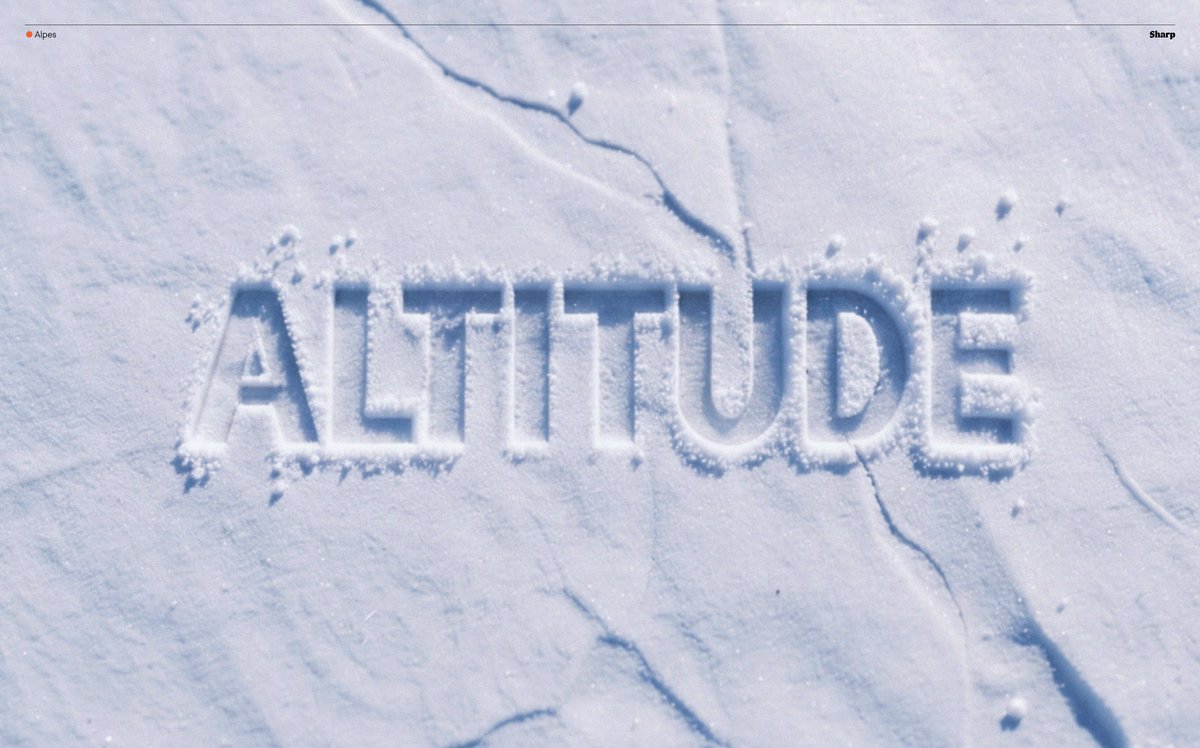
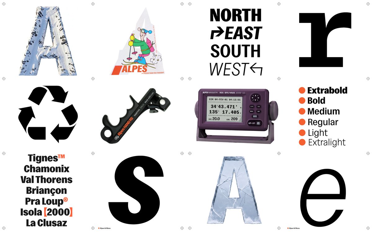
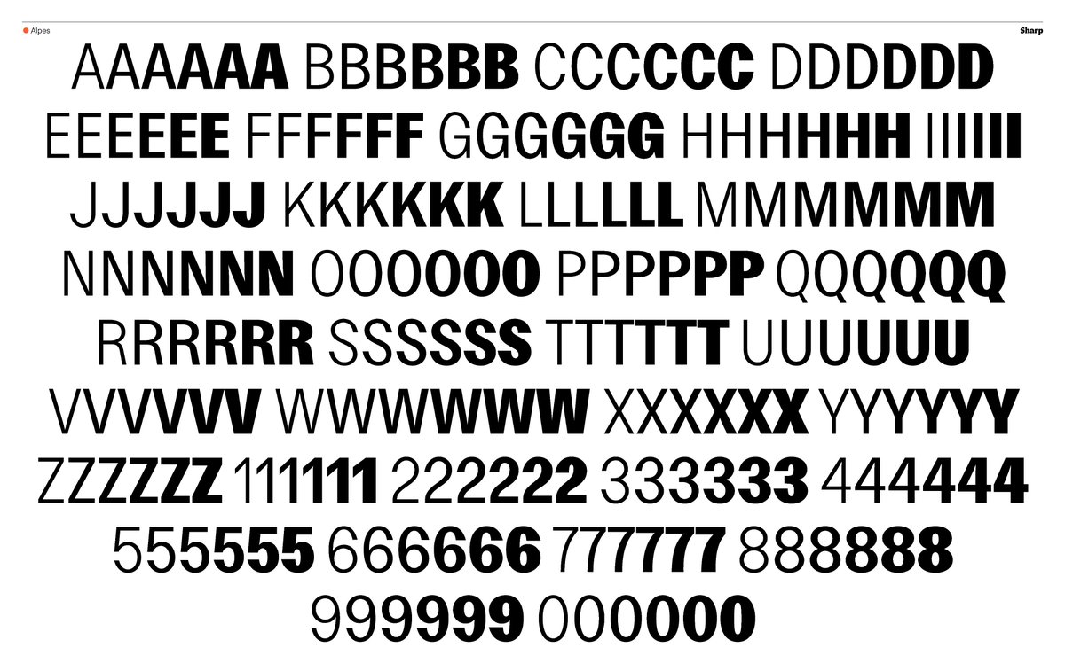
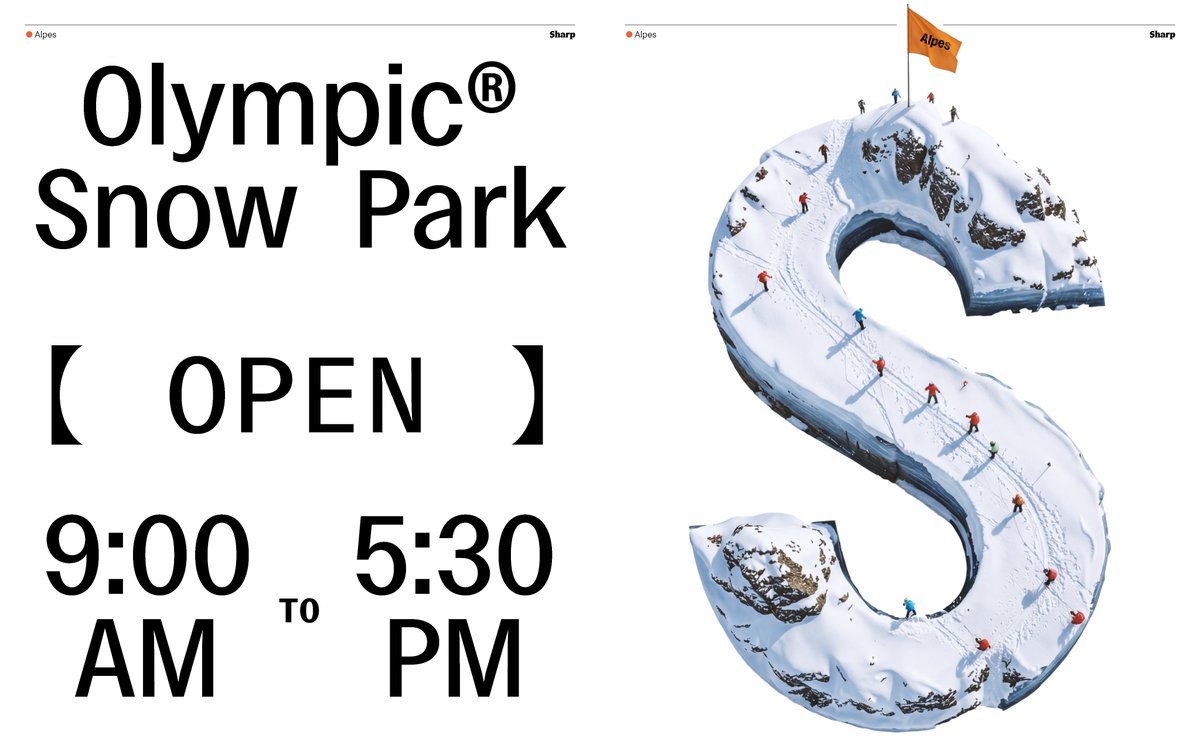
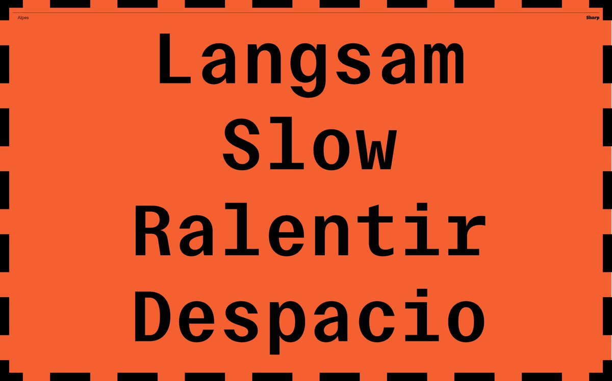
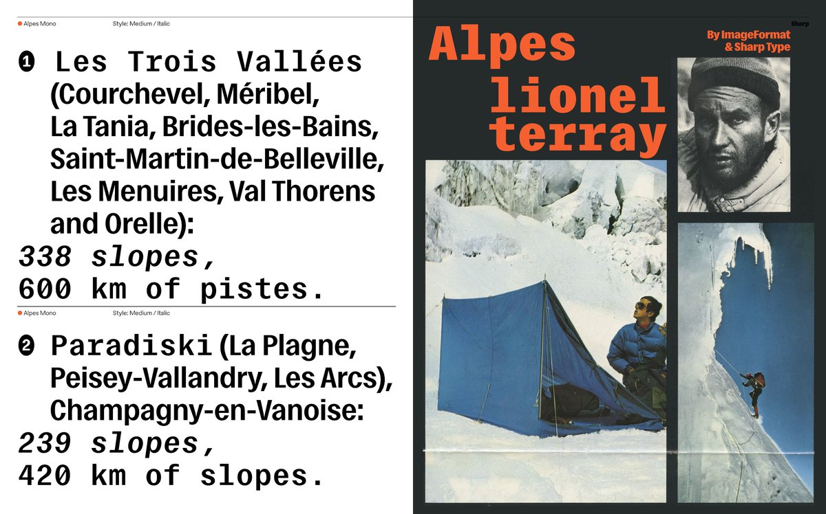
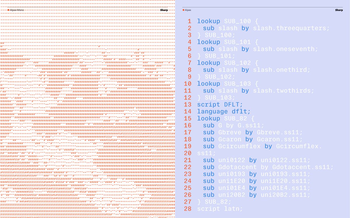
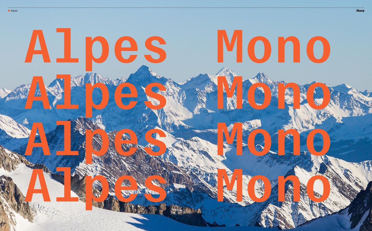
Introducing Alpes — a condensed grotesque superfamily in six weights with both standard and mono cuts, designed by Johan Mossé and Quentin Berthelot of Image Format.
shrptyp.co/alpes / shrptyp.co/alpesmono
1
1
31
1,461
Feb 25
Alpes works at scales monumental to miniature, from editorial summits to technical base camps.
shrptyp.co/alpes / shrptyp.co/alpesmono

1
3
353
Feb 25
Alpes Mono is the fraternal twin peak with a cooler climate, refined for coding legibility and branding that needs a chiseled quality without losing liveliness.
shrptyp.co/alpes / shrptyp.co/alpesmono
249
30 Nov 2025
28 Nov 2025

New on our site: Things Of Quality XXV (GIC-224)
"...my first typeface led me to a deep interest in how form can hold an inner tone or emotional resonance. Ceraph continues to evolve quietly...for this run, I developed a one-off heavier cut of the phrase." - Emma Piercy


3
13
3,744
10 Nov 2025
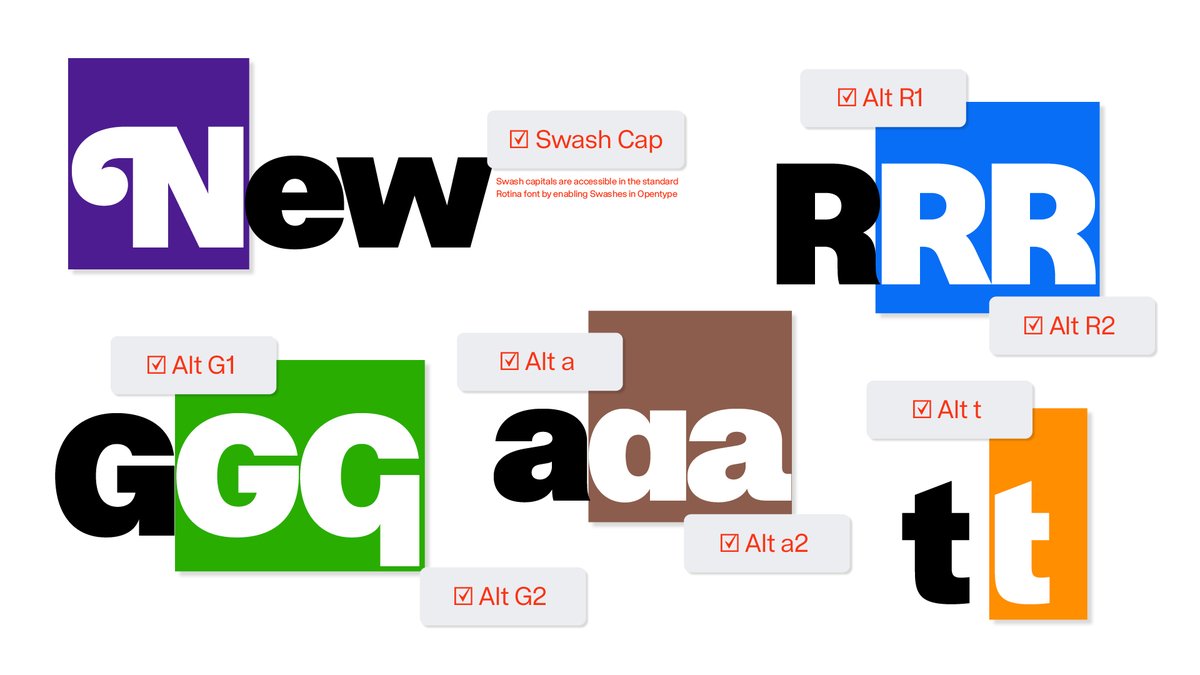
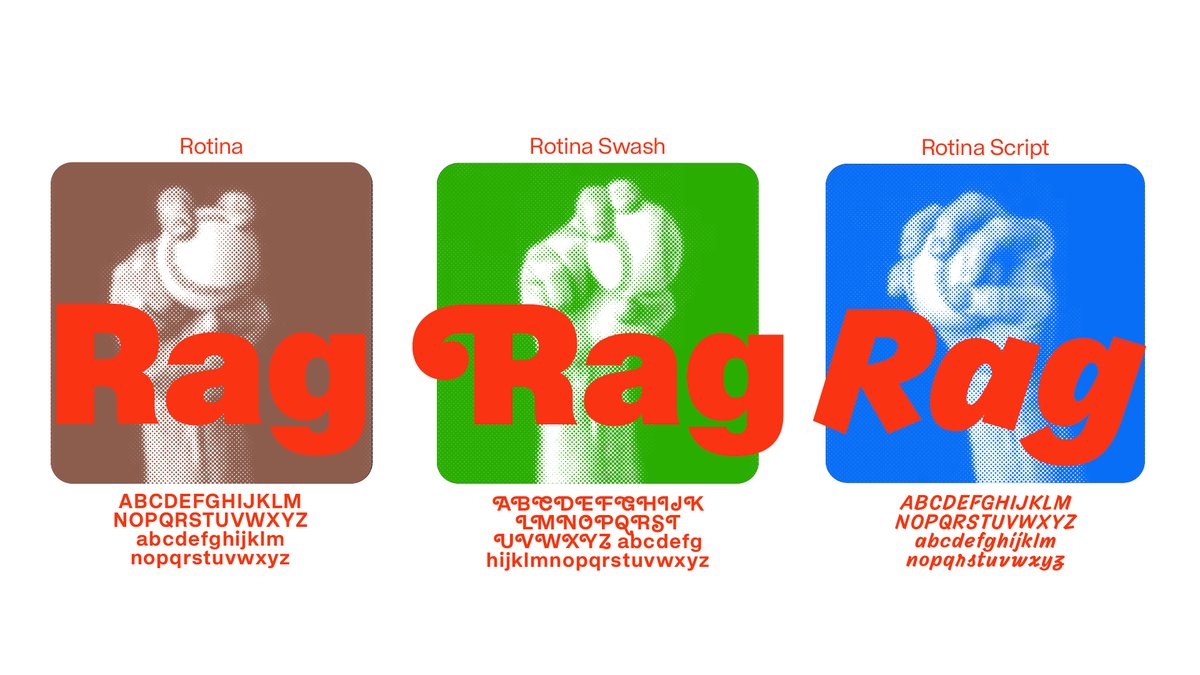
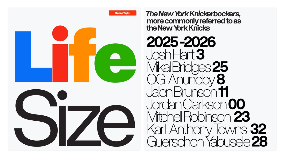
🏁Rotina Standard 🏁
The foundation of the Rotina ecosystem.
The standard cut of Rotina is a high-IQ sans that brings a fresh set of eyes to the most everyday style of type. Rotina was drawn with care, discipline, and a quiet friendliness that sets it apart from the classics that inspired it.
Designed by: @ErikMarinovich
Explore Rotina: sharptype.co/typefaces/rotin…
1
9
500
10 Nov 2025
It was created to be functional yet full of character - the dependable sans you reach for instinctively, but one that rewards playfulness.🎯🎯🎯
1
291
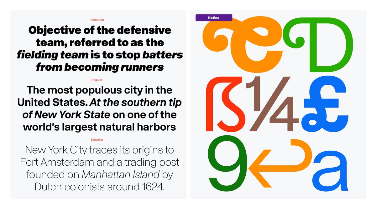
5 Nov 2025
NEW RELEASE: ♦️🔷🔸 Introducing Rotina 🔸🔷♦️
Rotina is a sturdy modernist sans with a playful secret. Built on the solid foundation of a novel and clean utilitarian neo-grotesque, Rotina is an aesthetically cohesive Swiss army knife of tools that brings workhorse fundamentals, robust utility, and a heavy dose of aura to your daily design routine.
Designed by: @ErikMarinovich
Explore Rotina: shrptyp.co/Rotina
1
1
5
868
5 Nov 2025
Every style of Rotina is a 2-for-1… including both a standard spacing and a fully tracked-in ‘Tight’ variation… built into a show-stopping trifecta of Variable Fonts.
1
2
262
5 Nov 2025
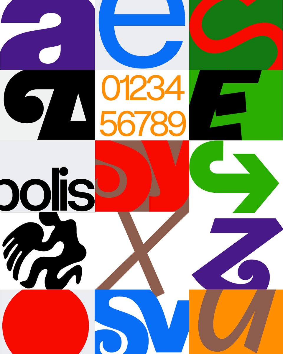
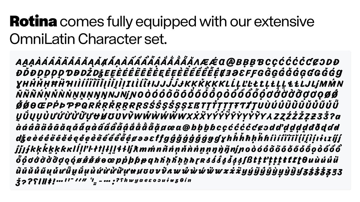
Rotina is built out to our OmniLatin character set for extended language coverage of all Latinized languages on Earth including Native American, African and Antipodean.
1
257