
Designer
Joined April 2025
- Tweets 232
- Following 17
- Followers 43
- Likes 167
87 Photos and videos


30 Sep 2025
September Dump
Category: Design


1
1
9
697
30 Sep 2025
September Dump
Category: Design

1
2
150
28 Sep 2025
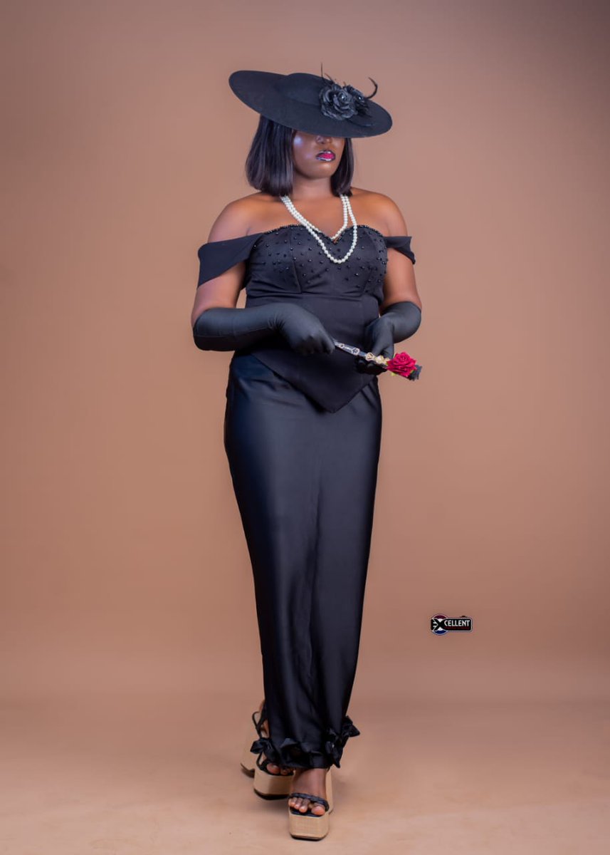
I designed this cover 🤭
28 Sep 2025

TOP TREND SETTERS IN AFROBEATS THIS WEEK
1. Happy birthday King Sunny Ade
2. Ayra Starr x Tyla
3. Tiwa Savage
4. Spotify launches Afrobeats: Culture in Motion
5. For Broken Ears is 5
6. Industry Machine Tracklist
7. Tovia - Don't Touch ft @ZILLA__OAKS
#TBNAfrobeatsTrendMetric

2
1
7
133
14 Sep 2025
Moved from Awka to Lagos.
Not the easiest transition, but growth never happens in comfort.
Still finding my footing, but showing up anyway.
New city, new journey. #LagosLife #NewBeginnings
24

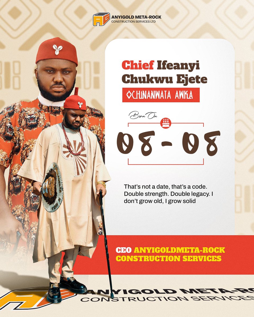
8 Aug 2025
Left or right - which one’s louder? 👀
For Chief Ifeanyi Chukwu Ejete’s birthday, I went all in; royal tones, cultural accents, every detail screaming presence before you read his name.
Still learning how to design sha
#GraphicDesign #Branding
1
35
1 Aug 2025
4 clients. 4 industries. One August.
Luxury, real estate, construction & gaming - each needed a different visual voice.
Good design isn’t just "fine." It’s strategic. It sells.
If you're ready for design that moves, not just decorates
let’s talk.
#DesignTwitter #BrandDesign
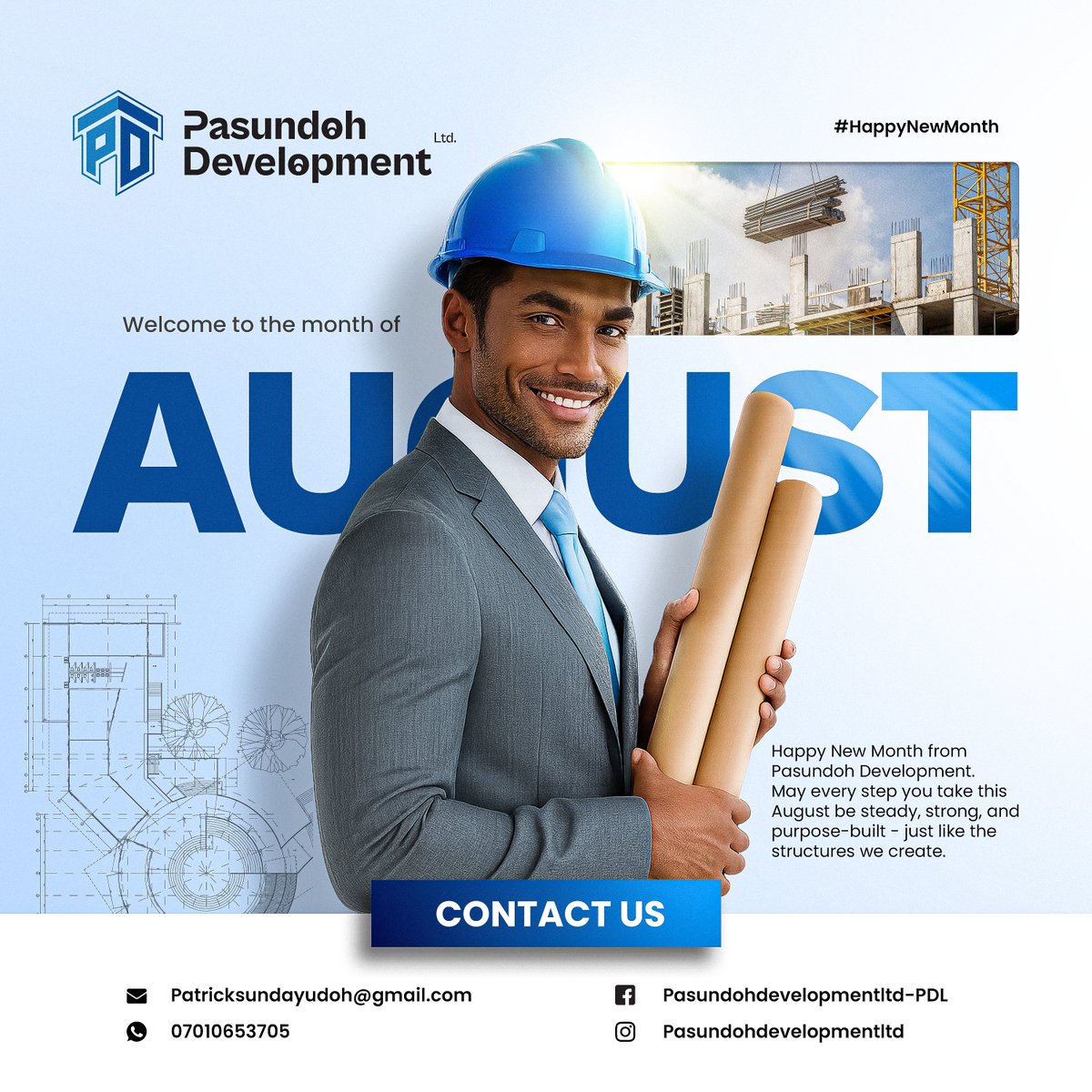
26
18 Jul 2025
3AM thoughts
Is being a designer even worth it?
Tbh, I think I'm still doing this cos this is all I know how to do
1
25
17 Jul 2025
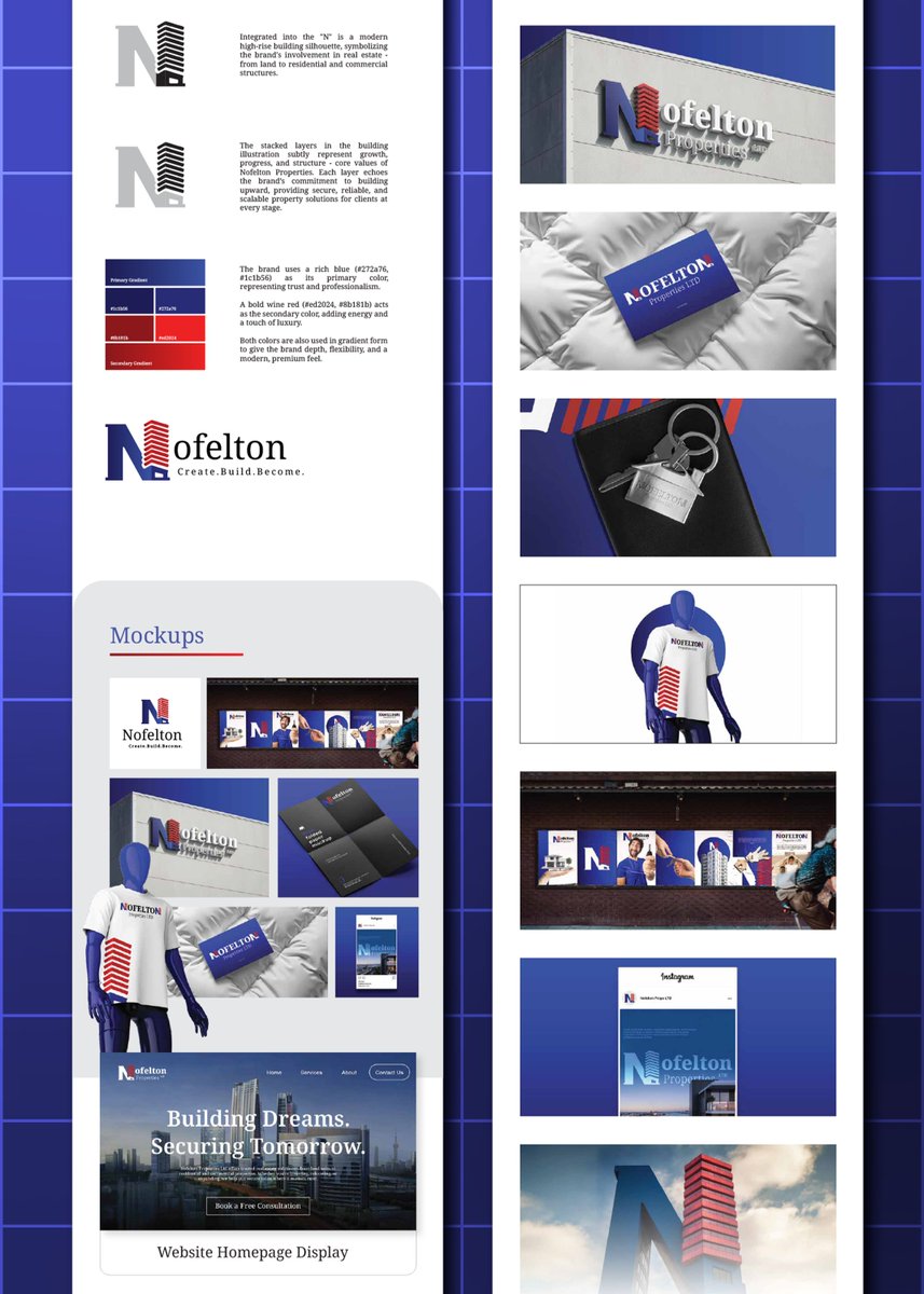
Your business doesn’t need a logo.
It needs a presence people respect - before they even meet you.
In real estate, people don’t just invest in property -
They invest in brands they believe can build their future.
So your logo isn’t decoration.
It’s your first handshake, your unspoken promise, your credibility.
When I worked on the Nofelton identity,
The goal wasn’t to just look “modern.”
It was to look like a brand that owns tomorrow.
📐 A bold “N” - shaped like a high-rise
🔵 Navy Blue - for trust, professionalism, stability
🔴 Deep Red - for value, ambition, and strength
🧱 Stacked lines - symbolizing building progress, stage by stage
And everything ties back to the promise:
Create. Build. Become.
𝙄𝙩’𝙨 𝙣𝙤𝙩 𝙖𝙗𝙤𝙪𝙩 𝙡𝙤𝙤𝙠𝙞𝙣𝙜 𝙜𝙤𝙤𝙙 - 𝙞𝙩’𝙨 𝙖𝙗𝙤𝙪𝙩 𝙨𝙩𝙖𝙣𝙙𝙞𝙣𝙜 𝙛𝙤𝙧 𝙨𝙤𝙢𝙚𝙩𝙝𝙞𝙣𝙜.
When people trust your visual presence,
They’re more likely to trust your offer,
…your price,
…and your promise to deliver.
Does your logo speak your mission?
Or is it just sitting on your Instagram bio doing nothing?
𝘽𝙤𝙩𝙩𝙤𝙢 𝙡𝙞𝙣𝙚: 𝘽𝙧𝙖𝙣𝙙𝙨 𝙬𝙞𝙩𝙝 𝙘𝙡𝙖𝙧𝙞𝙩𝙮 𝙙𝙤𝙣’𝙩 𝙘𝙤𝙢𝙥𝙚𝙩𝙚 — 𝙩𝙝𝙚𝙮 𝙖𝙩𝙩𝙧𝙖𝙘𝙩. 𝙏𝙝𝙚𝙮 𝙘𝙤𝙣𝙫𝙞𝙣𝙘𝙚. 𝘼𝙣𝙙 𝙩𝙝𝙚𝙮 𝙘𝙡𝙤𝙨𝙚.

1
1
88
15 Jul 2025
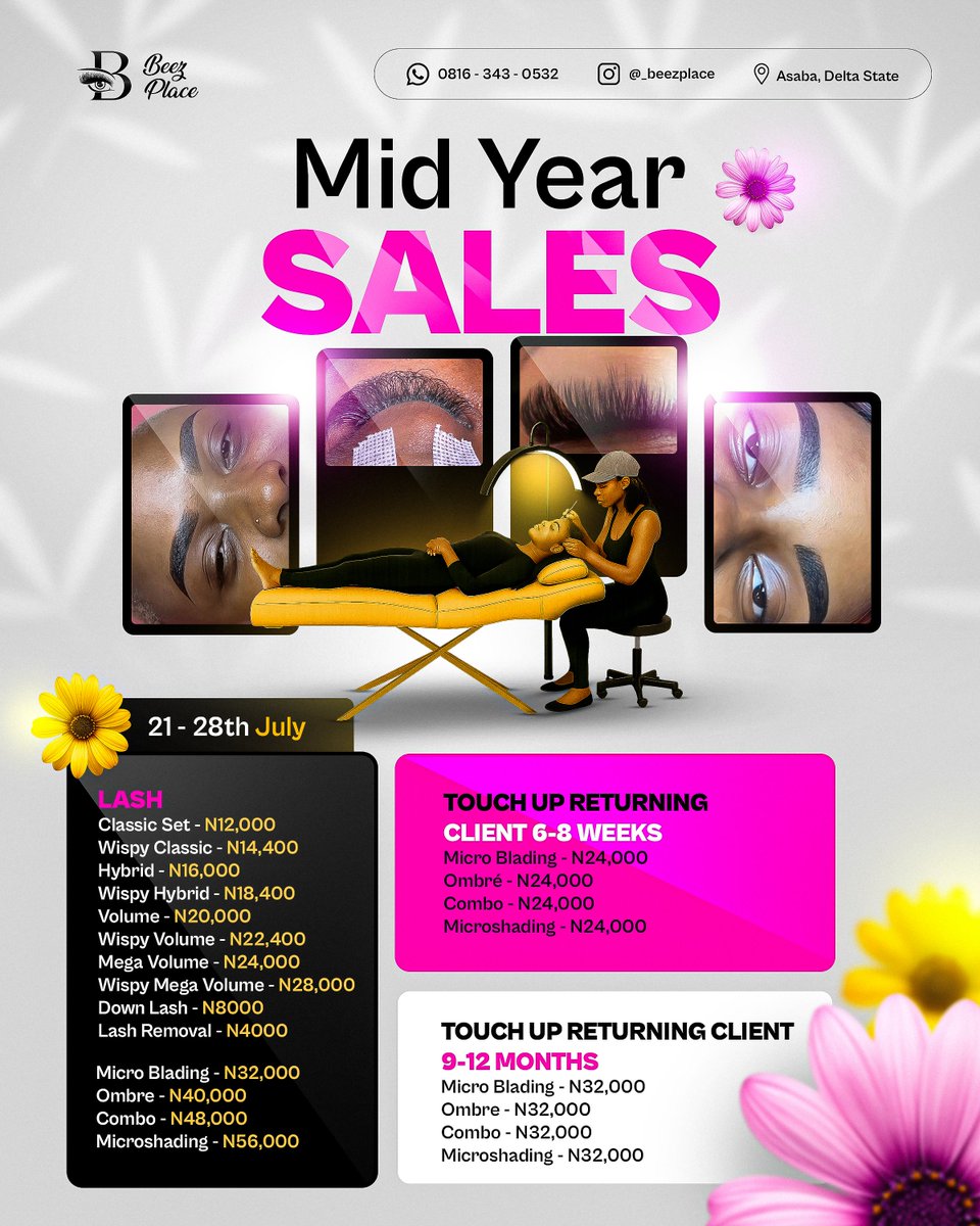
𝗡𝗼𝗯𝗼𝗱𝘆 𝗶𝘀 𝗽𝗮𝘁𝗿𝗼𝗻𝗶𝘇𝗶𝗻𝗴 𝘆𝗼𝘂 𝗯𝗲𝗰𝗮𝘂𝘀𝗲 𝘆𝗼𝘂’𝗿𝗲 𝗱𝗼𝗶𝗻𝗴 𝘁𝗵𝗶𝘀 𝗼𝗻𝗲 𝘁𝗵𝗶𝗻𝗴 𝘄𝗿𝗼𝗻𝗴.
I’ve seen it happen over and over.
A business drops a “Mid-Year Sales” flyer.
New prices. Great offers. Big discount energy.
But nothing happens.
People like. People scroll. People move on.
No bookings. No DMs. No “How much is combo?”
Not because the service isn’t worth it.
But because the design is working against them.
That’s what we fixed with this flyer for Beez Place:
💡 We didn’t just post a price list - we built a visual sales system.
💨 Services grouped by client type (so people instantly find what applies to them)
💨 Colors that separate tiers without making it messy
💨 A premium vibe that says “discount,” but still whispers “luxury”
💨 Real photos that make people see the experience
💨 A layout that guides the eyes like a good sales page
The result?
More saves. More inquiries. More people saying “Now I get it.”
So here’s the thing:
People aren’t ignoring your offer.
They’re just confused by how it’s presented.
Clarity is what converts.
Not clutter. Not noise. Not chaos in a cute font.
I’m Sammy. I design visuals that help your audience say yes - before you even speak.
If you’re ready for your flyer to actually do the work, DM me.
1
4
886
11 Jul 2025
This looks like a flyer.
But it works like a funnel.
Cmogul Global didn’t just want “branding.”
They wanted people to get it - fast.
Because when your business touches crypto, property, and physical merch... you’ve got to simplify or lose attention instantly.
So I broke the whole thing down into 3 moves:
🔹 Clarity first.
Bold headline. 4 words. No guesswork.
→ Crypto. Property. Merchandise. One Brand.
🔹 Trust triggers.
✅ RC Number
✅ Recognizable platforms (Amazon, PayPal, BTC, Apple Pay)
✅ No clutter - just credibility.
🔹 Visual hierarchy.
Icons are big. The text guides the eye.
Colors match brand presence but also segment the offer clearly.
Now? People aren’t just viewing it - They’re understanding it.
And when people understand? - They buy.
This is how you design for attention, clarity, and conversion.
I’m Sammy. I design visuals that don’t just get seen - they get results.
If your brand needs that kind of intentional energy, DM me. Let’s build it right.
3
965
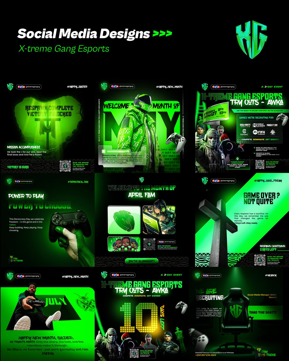
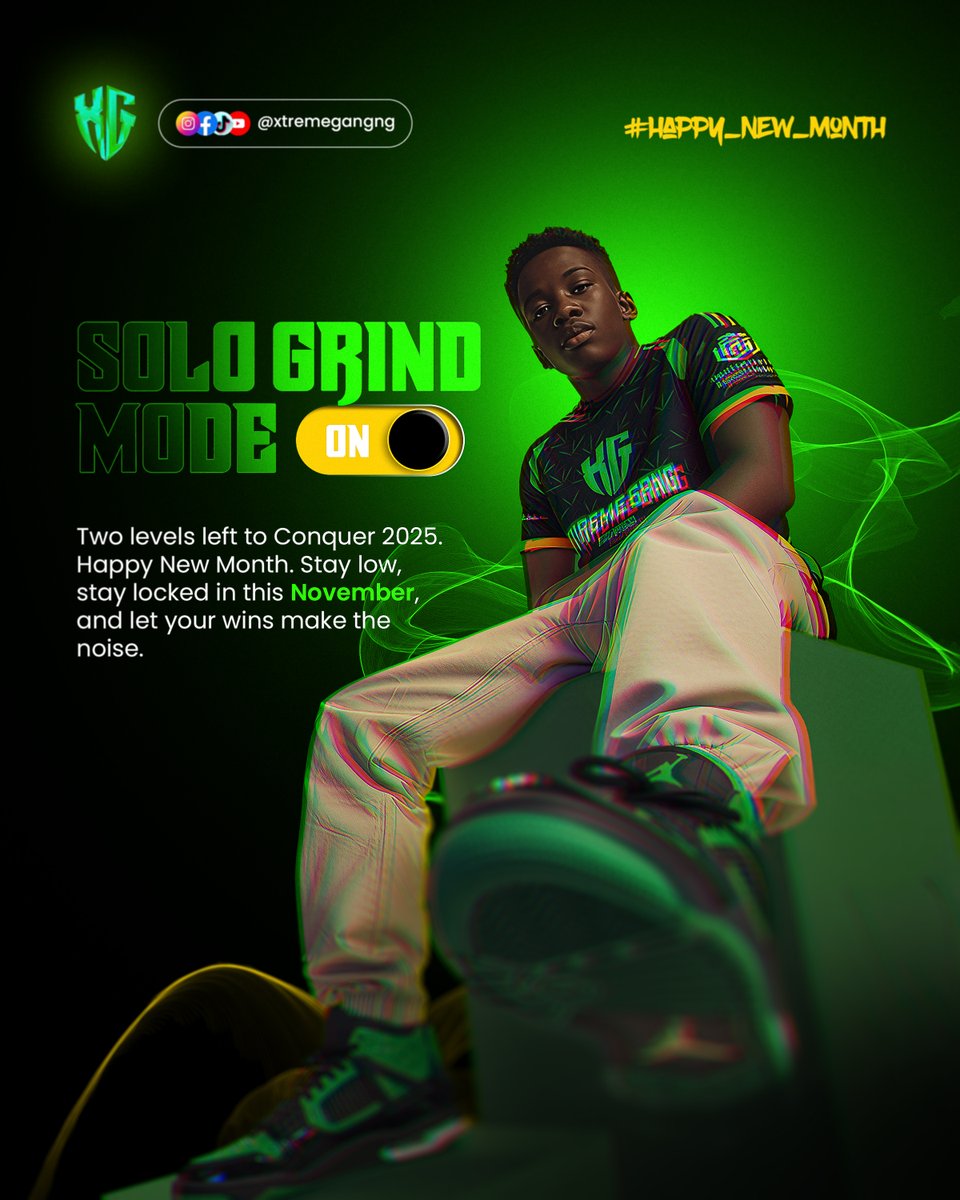
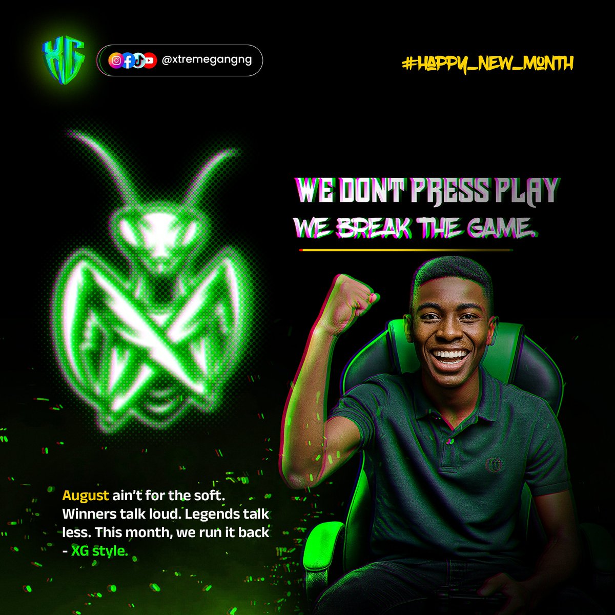
5 Jul 2025
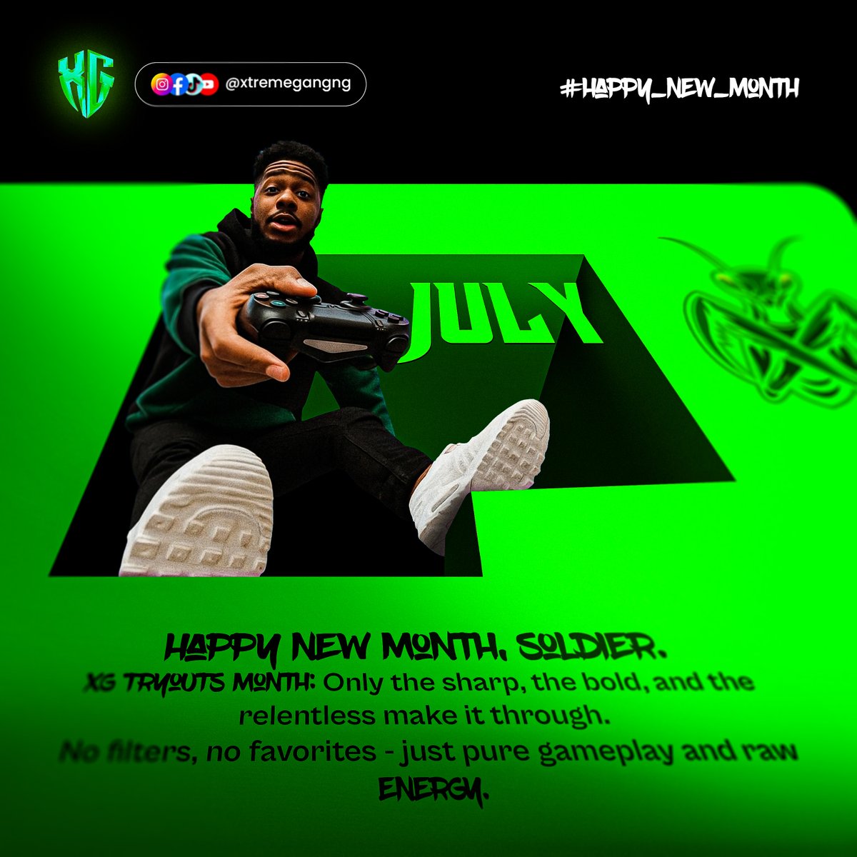
𝗲𝗦𝗽𝗼𝗿𝘁𝘀 𝗯𝗿𝗮𝗻𝗱𝘀 𝗱𝗼𝗻’𝘁 𝗷𝘂𝘀𝘁 𝗻𝗲𝗲𝗱 “𝗴𝗼𝗼𝗱 𝘃𝗶𝘀𝘂𝗮𝗹𝘀.”
𝗧𝗵𝗲𝘆 𝗻𝗲𝗲𝗱 𝗮𝘁𝘁𝗶𝘁𝘂𝗱𝗲. 𝗣𝗿𝗲𝘀𝗲𝗻𝗰𝗲. 𝗔𝘂𝗿𝗮.
Because in this space - if you don’t stand out, you don’t exist.
When I started designing for X-treme Gang, the mission was clear:
Make every post feel like a level-up screen.
Bold. Tactical. Game-coded.
So I built a visual system that hit like a controller vibration:
🎮 Greyscale Nuclear Green = Authority Energy
📅 Monthly themes crafted to match gamer moods - not just calendar dates
🎯 Event flyers that read like missions: “Dominate. Get Signed.”
🕹️ Every layout guided by the same rule: No fluff. No filler. All presence.
And the best part?
These aren’t just for hype - they’re for conversion.
Signups went up. Engagement cracked.
People started taking XG seriously - as they should.
Because when I design, I’m not just doing “content.”
I’m building a universe around your brand.
I’m Sammy. I design bold, intentional visuals that make your brand impossible to ignore - especially in loud spaces like gaming.
DM me if your brand needs that extra-level energy.
2
1
13
1,607
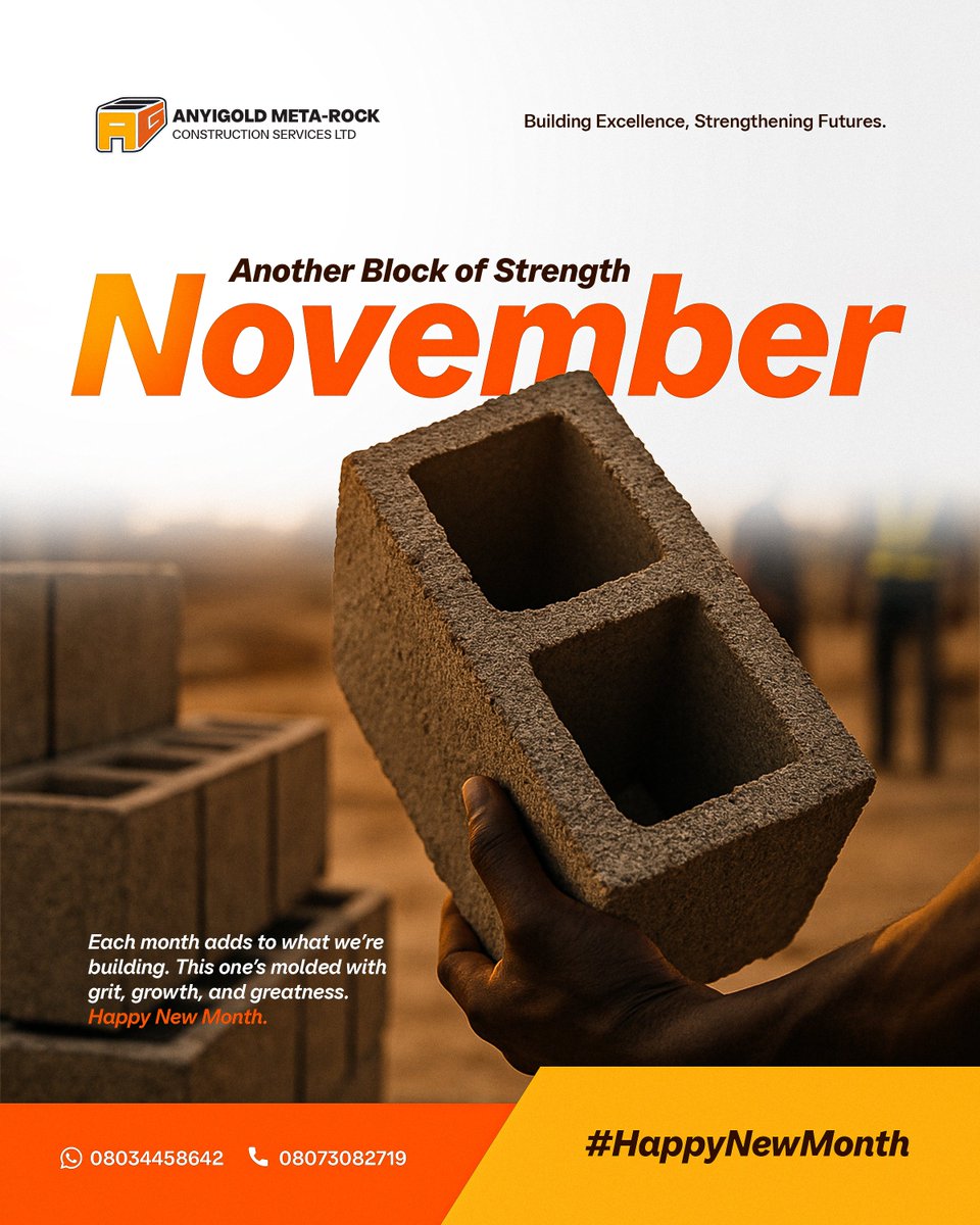
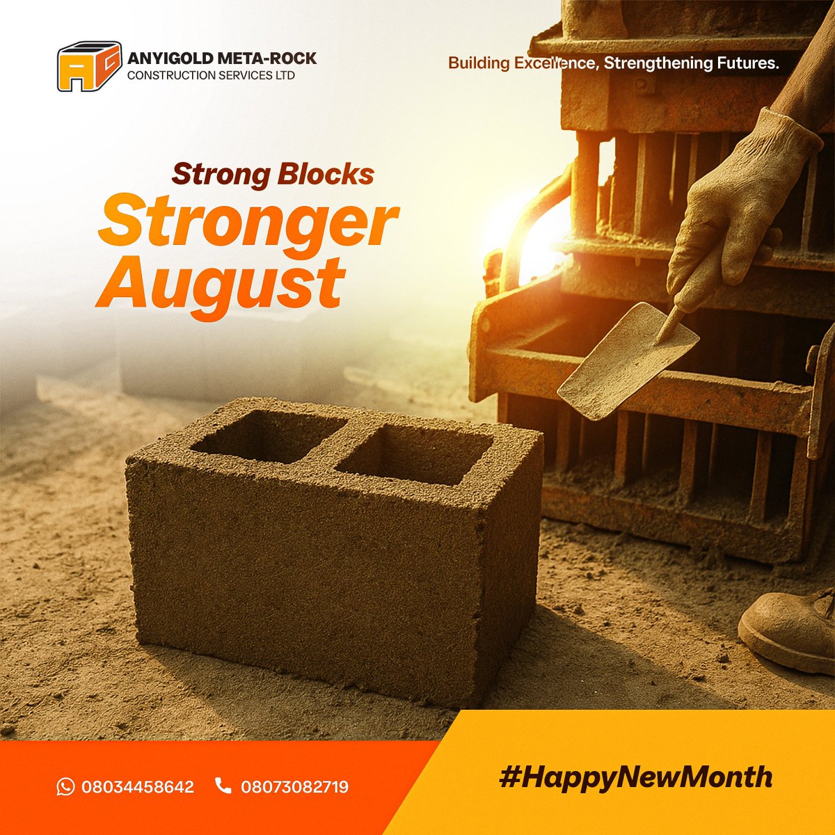
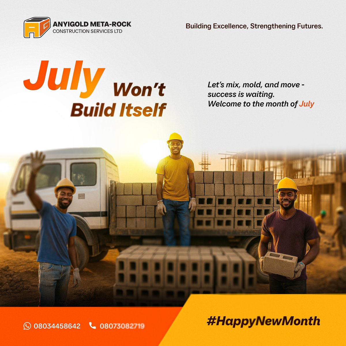
3 Jul 2025
𝗪𝗵𝗲𝗻 𝘁𝗵𝗲𝘆 𝘀𝗮𝗶𝗱 𝘁𝗵𝗲𝘆 𝘄𝗮𝗻𝘁𝗲𝗱 𝘁𝗼 𝗯𝗲 “𝗺𝗼𝗿𝗲 𝘃𝗶𝘀𝗶𝗯𝗹𝗲,” 𝗜 𝘀𝗮𝗶𝗱 -
“𝗟𝗲𝘁’𝘀 𝗺𝗮𝗸𝗲 𝘆𝗼𝘂 𝘂𝗻𝗳𝗼𝗿𝗴𝗲𝘁𝘁𝗮𝗯𝗹𝗲.”
I’ve been designing monthly content for Anyigold Meta Rock Construction and from Easter to Father’s Day, every post was crafted with more than just vibes.
Because when you’re a construction brand in a digital space, your audience doesn’t care about just bricks and blocks. They want to know what you stand for.
So that’s what I built into the designs.
🦺 Tone that balances trust with strength
🧱 Messaging that feels grounded, not generic
📅 Consistent layouts that allow the brand to evolve month by month
👷🏽♂️ Real faces, real warmth - because buildings don’t build loyalty, stories do.
Now, Anyigold isn’t just showing up online. They’re showing up with purpose. This is what happens when you treat content like brand architecture.
9
491
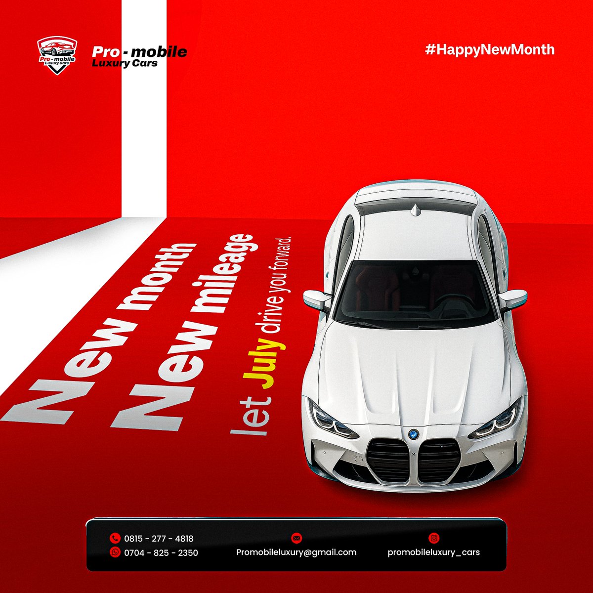
1 Jul 2025
𝗜 𝗱𝗼𝗻’𝘁 𝗷𝘂𝘀𝘁 𝗱𝗼 “𝗛𝗮𝗽𝗽𝘆 𝗡𝗲𝘄 𝗠𝗼𝗻𝘁𝗵” 𝗳𝗹𝘆𝗲𝗿𝘀.
𝗜 𝗱𝗲𝘀𝗶𝗴𝗻 𝘁𝗵𝗲 𝗼𝗻𝗲𝘀 𝘁𝗵𝗮𝘁 𝘀𝗹𝗮𝗽 𝗯𝗲𝗳𝗼𝗿𝗲 𝘆𝗼𝘂 𝗲𝘃𝗲𝗻 𝗿𝗲𝗮𝗱 𝘁𝗵𝗲 𝘁𝗲𝘅𝘁.
This July, I showed up for my clients the only way I know how - with designs that carry presence.
Some wanted soft.
Some wanted loud.
Some had no clue what they wanted
but they knew they wanted it from me.
Because when you book me, you're not just paying for a “graphic.”
You're paying for:
→ Strategy
→ Audience-matching vibes
→ Layouts that make people stop scrolling
→ And energy that feels like your brand
By the time I was done, their DMs were doing numbers.
And guess what? We’re just getting started.

1
14
30 Jun 2025
30 Jun 2025

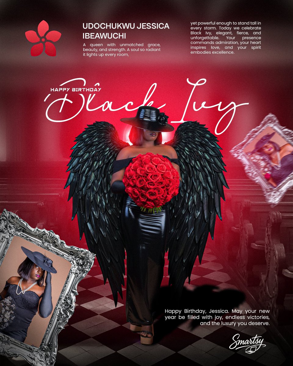
Some birthdays deserve more than a text post.
They deserve a whole experience.
Sharon’s energy?
Soft but strong. Subtle but unforgettable.
So I built a birthday design that wasn’t just pretty - it was intentional.
From the layout to the colors, every detail was picked to feel like her - elegant, feminine, and full of light.
She didn’t ask for much - but I wasn’t going to give her average.
Not on her day.
Because when I design for someone I value?
It shows. Loudly.

2
32
30 Jun 2025
Some birthdays deserve more than a text post.
They deserve a whole experience.
Sharon’s energy?
Soft but strong. Subtle but unforgettable.
So I built a birthday design that wasn’t just pretty - it was intentional.
From the layout to the colors, every detail was picked to feel like her - elegant, feminine, and full of light.
She didn’t ask for much - but I wasn’t going to give her average.
Not on her day.
Because when I design for someone I value?
It shows. Loudly.
1
2
59
28 Jun 2025
Created this video with AI
Yeah - I may like Asians a lil too much than I'd like to admit😏
1
1
60
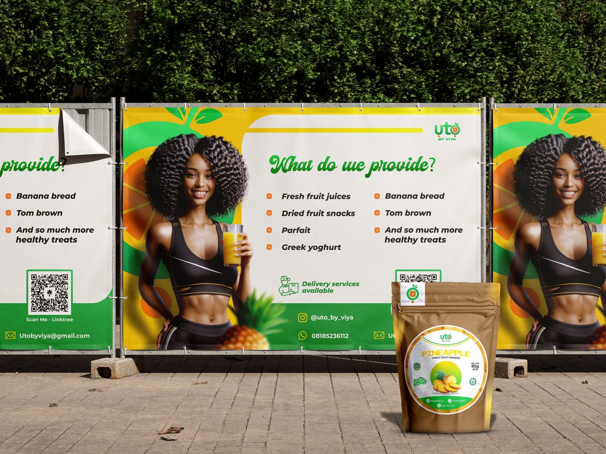
27 Jun 2025
𝗪𝗵𝗲𝗻 𝘀𝗵𝗲 𝗺𝗲𝘀𝘀𝗮𝗴𝗲𝗱 𝗺𝗲, 𝘁𝗵𝗲 𝗳𝗶𝗿𝘀𝘁 𝘁𝗵𝗶𝗻𝗴 𝗜 𝘀𝗮𝗶𝗱 𝘄𝗮𝘀:
“𝗧𝗵𝗶𝘀 𝗰𝗮𝗻’𝘁 𝗹𝗼𝗼𝗸 𝗹𝗶𝗸𝗲 𝗷𝘂𝘀𝘁 𝗷𝘂𝗶𝗰𝗲 - 𝘁𝗵𝗶𝘀 𝗵𝗮𝘀 𝘁𝗼 𝗳𝗲𝗲𝗹 𝗹𝗶𝗸𝗲 𝗹𝗶𝗳𝗲𝘀𝘁𝘆𝗹𝗲.”
𝗩𝗶𝘆𝗮 𝘄𝗮𝘀𝗻’𝘁 𝗽𝗹𝗮𝘆𝗶𝗻𝗴.
She had the products: fresh juices, dried fruit snacks, parfait, banana bread, tom brown - all clean, natural, premium.
But when you looked at her brand online? It didn’t reflect that richness.
No vibe. No energy. No visual taste.
The goal was simple:
Make people feel healthy before they even order.
Make the visuals scream: “this is for you - if you care about what goes in your body.”
So I rebuilt everything from scratch.
🍊 I chose a color palette that instantly hits: tropical citrus, sunlit greens, soft gradients - vibrancy you can sip
📦 I structured the content so you don't get lost- your eyes glide through the list like you’re shopping happiness
👀 I placed the QR, icons, and handles where they belong - because a clean design with poor UX is a broken billboard
🧃 I used real-life, energetic models to push identity: not “just buy”- but “see yourself in this.”
Then I mocked it up in real-world spots so the brand could breathe even outside the screen.
Now?
The rollout is loud.
People aren’t just seeing juice - they’re seeing a movement.
A healthy shift, designed to stand out in markets where everyone is whispering.
My name is Sammy. I design bold, intentional visuals that make your brand stand out - and I can help you do the same.
DM me if you’re ready.

1
21
26 Jun 2025
𝗦𝗵𝗲 𝘄𝗮𝘀𝗻’𝘁 𝗮 𝗯𝗲𝗴𝗶𝗻𝗻𝗲𝗿. 𝗦𝗵𝗲 𝗵𝗮𝗱 𝘁𝗵𝗲 𝘀𝗸𝗶𝗹𝗹, 𝘁𝗵𝗲 𝗿𝗲𝘀𝘂𝗹𝘁𝘀, 𝘁𝗵𝗲 𝗽𝗮𝘀𝘀𝗶𝗼𝗻.
𝗕𝘂𝘁 𝘁𝗵𝗲 𝗿𝗶𝗴𝗵𝘁 𝗰𝗹𝗶𝗲𝗻𝘁𝘀? 𝗧𝗵𝗲𝘆 𝘄𝗲𝗿𝗲𝗻’𝘁 𝘀𝗵𝗼𝘄𝗶𝗻𝗴 𝘂𝗽.
Beez had worked with other designers before.
She posted, promoted, tried to push her classes.
But somehow, the only people reaching out were the ones saying:
“Can I pay in parts?”
“Do you have a discount?”
“I really want to learn but...”
Month after month, the effort wasn’t matching the results.
No buzz. No energy. No pull.
Just frustration.
Then she found me.
She said, “Sammy, I don’t just want it to look good. I want people to feel it. I want this flyer to speak money. Speak value. Speak serious people.”
I got to work.
🎯 I cleaned up the entire structure so anyone - even at a glance - could know:
→ What the course is
→ What they’ll learn
→ Why it’s worth the price
🧠 I used warm, premium tones that scream expert, not trial-and-error.
📦 I grouped the benefits and features clearly - because when people understand, they buy.
📢 Then I made sure her flyer didn’t just inform. It commanded attention.
Now? The class hasn’t even started yet - but serious people are already lining up.
She told me:
“Sammy… I’ve never seen this kind of response before.”
And I smiled - because that’s what intentional design does.
It’s not just for views. It’s for value.
My name is Sammy. I design bold, intentional visuals that make your brand stand out - and I can help you do the same.
DM me if you’re ready.

1
1
37