
Passionate entrepreneur & publicist. I craft compelling brand narratives with AI strategy & live selling flair.
Joined September 2008
- Tweets 7,027
- Following 784
- Followers 3,847
- Likes 309
77 Photos and videos


1 Aug 2025
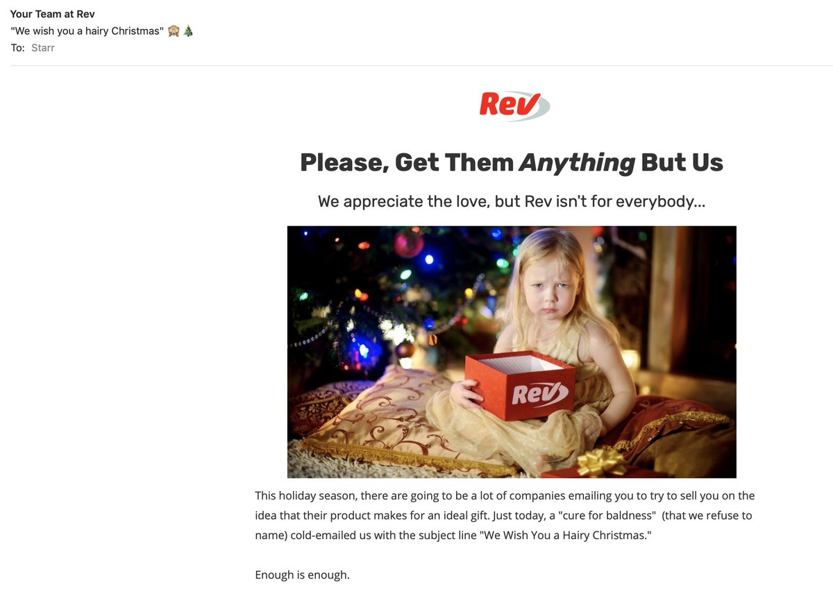
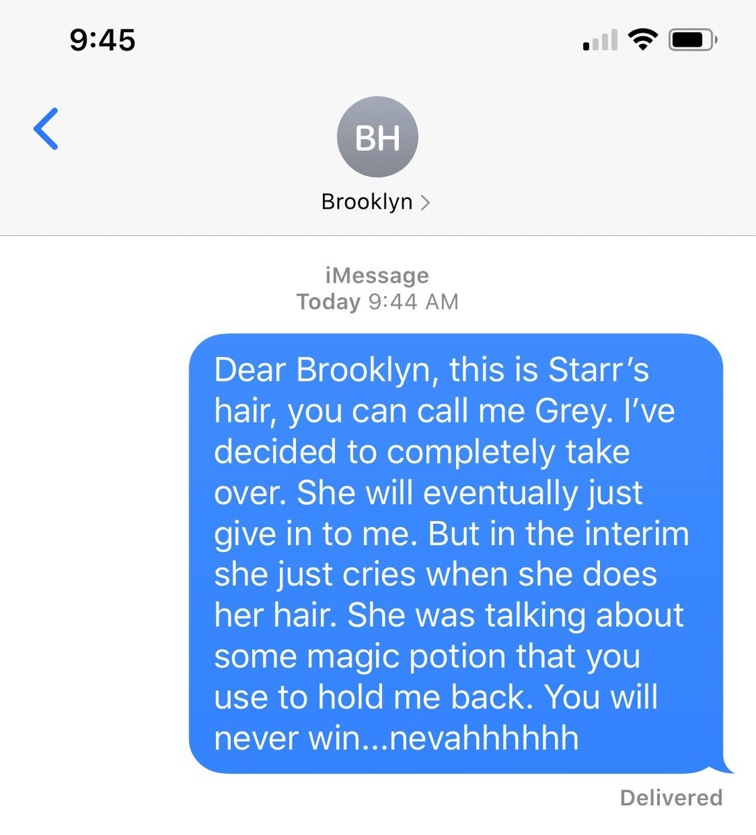
someone just tried to hack my account. Errrr....authentication set up now, I was a little late on that one. Nice try though, E for effort...
1
1
55
22 Apr 2025
Ever tried meditating with a potato under your pillow? I have. 😂
I documented 15 hilariously useless (but weirdly creative) insomnia "cures" I've tested at 3 a.m.
👉 starrhall.com/confessions-of…
#InsomniaChronicles #SleepFail #EntrepreneurLife
1
73
22 Apr 2025
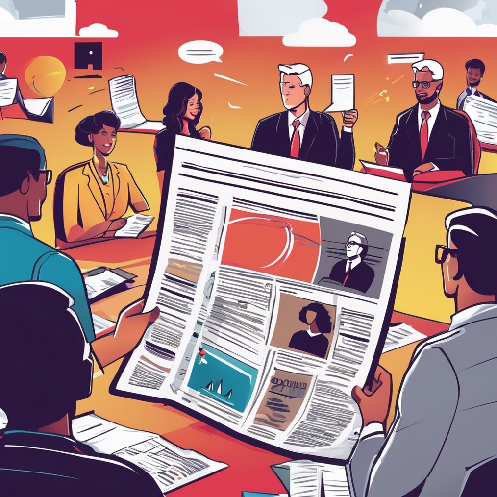
Think op-eds are old school? Think again. 🗞️
They’re PR gold for building authority, getting press, and boosting SEO. Here’s how to write one that actually works 👇
starrhall.com/what-is-an-op-…
#PRtips #OpEd #EarnedMedia #MarketingStrategy
1
68
25 Mar 2025
HOT TAKE: Playing it safe in PR & marketing is the fastest way to get ignored.
I’ve built my career (and landed major press for clients) by embracing the weird—using humor, bold pitches, and unexpected angles. Because let’s be real: no one remembers the safe, boring, cookie-cutter brands.
So, in true Starr Hall fashion, I decided to make AI my latest “client” and gave it a PR rebrand.
Inside this post: Why quirky sells, how AI can boost your marketing, and a press release that might make you question everything you thought you knew about robots.
Read blog post- starrhall.com/ai-hires-starr…
P.S. AI helped me write this… but only the parts that didn’t require sarcasm or actual wit. 📷 #PRwithPersonality #AI #MarketingTips
4
54
12 Mar 2025
📣 Calling All Designers and Creatives – Need Your Input! 🎨
I’m honestly shocked right now and could use some advice. I recently ran a logo contest on 99designs where I provided clear instructions, requested a stacked logo, and even uploaded the exact font I wanted. Naturally, several designs ended up with similar elements — which makes sense since they were all following the same brief.
Now, one designer is demanding payment, claiming their design was copied — even though they followed the exact instructions I provided. This feels like nothing short of extortion — bullying users into paying for something they didn’t steal.
Has anyone else experienced this with 99designs? How did you handle it? This feels incredibly unfair, and I’m not about to give in to these tactics. I'd love to hear your thoughts!
#DesignCommunity #99designs #CreativeProcess #UnfairPractices
9
5
523
17 Mar 2025
the red black and white is the one i chose, the orange and black one the designer said i used their logo to inform the winning design i chose. It is just so odd, there were like 50 others that looked similar, it was all off or from the design brief and fonts i uploaded etc...
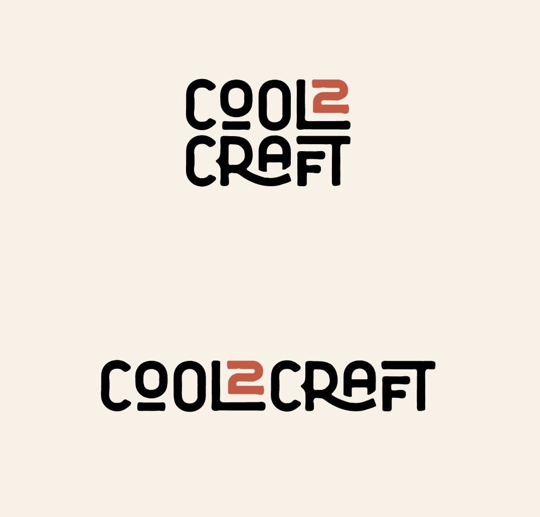
1
51
Starr Hall retweeted

17 Mar 2025
Life is about the mindset - pls watch this - pls share this with someone who needs it and pls share this with someone who exemplifies that proper perspective … @ one person in the comments who “gets this”
PS: It would mean the world to me if you could check out @VeeFriends and let me know which is your favorite character in the comments below!
#perspective #optimism #mindset #garyvee
73
59
279
24,363
Starr Hall retweeted

14 Mar 2025
If you don't make time to build for yourself, you'll be assigned time to build for someone else.
76
8
136
3,666
Starr Hall retweeted
14 Mar 2025
Looking to buy that new watch? Buy it.
Looking to buy that new car? Buy it.
Looking to give more to charity? Do it!
You don’t have to cut back. Make more money!
60
4
88
2,926
13 Mar 2025
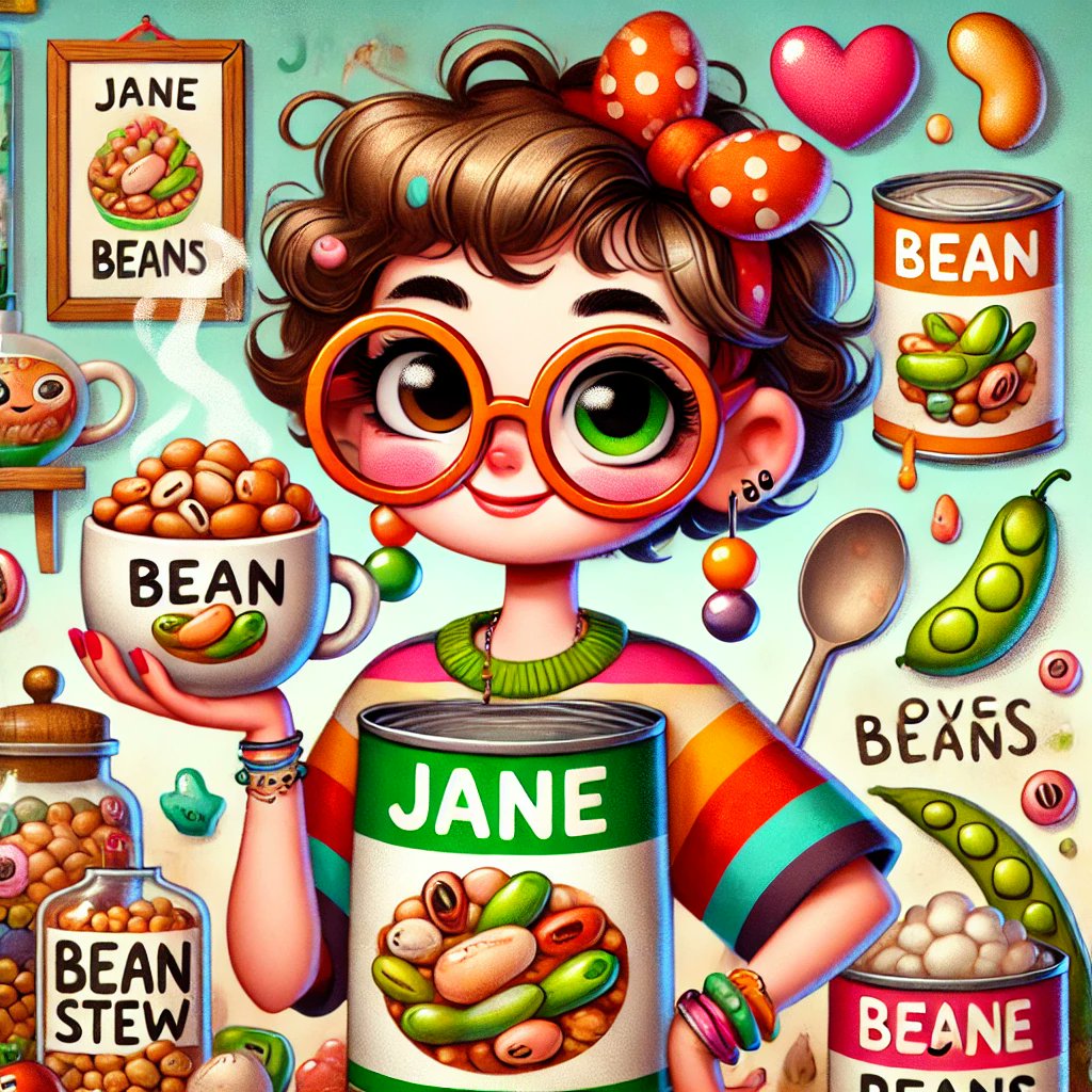
Meet Jane: The Bean Queen 👑🫘
What started as a quirky joke turned into a full-blown AI-powered story — voiceover by @elevenlabs, visuals by @chatgpt, and creativity by me.
Moral of the story? Embrace your weird ideas — they just might become your brand.
starrhall.com/be-more-like-j…
#BeMoreLikeJane #AIStorytelling #BrandBuilding
1
47
Starr Hall retweeted

11 Mar 2025
How to get ahead of 99% of people:
Stop watching videos telling you how to get ahead of 99% of people.
Start doing the things you know you should be doing instead.
96
17
239
13,067
11 Mar 2025
Spent 3 hours yesterday setting up audio, lighting and testing for new podcast we are about to launch. Most people would have given up.
I was laughing so hard by the end of set up that we couldn’t even record. Tears streaming down my face.
Fail. Fail fast. Cry a little. Laugh a lot. #hiaipodcast coming soon!
52
Starr Hall retweeted
11 Mar 2025
Don’t be friends with people who think $100k is a lot of money.
90
11
189
8,434
10 Mar 2025
Going LIVE on @Whatnot testing out this app with some random items tonight 7pm pt- whatnot.com/live/62d4dc36-b9…
32
Starr Hall retweeted

24 Feb 2025
Change your habits.
Change your environment.
Change your information diet.
130
27
304
8,103
Starr Hall retweeted
24 Feb 2025
99% of reading is procrastination disguised as productivity.
161
24
474
33,506

Starr Hall retweeted

24 Feb 2025
Your peace will cost you people.
Choose it anyway.
86
11
185
2,917