
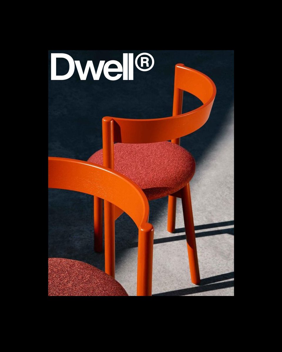
Branding, Motion & Packaging studio. We love working closely with people who get excited about design and see how it can impact their business.
Joined April 2022
- Tweets 397
- Following 351
- Followers 708
- Likes 233
238 Photos and videos


13 Oct 2025
Plug-and-play Motion templates with creative control, music with stems, mockups with smart objects and tidy layers.
Drop in your content, swap and customize in a few clicks.
Visit size-assets.com for more.
1
3
16
817
22 Jul 2025
Part of our ongoing Labs series.
This is where we explore ideas across client work and internal experiments.
Some are tests. Some are studies. Some will become something more.
It’s all part of how we work. Playing, breaking, learning, repeating.
1
5
263
15 Jul 2025
Another round from the lab. More glimpses into the in-between.
We’re continuing to explore how design and motion can speak, shift, pause, and evolve. This batch includes new directions, unexpected detours, and a few pieces that are starting to find their voice. Some are tests. Some are studies. Some will become something more. It’s all part of how we work—playing, breaking, learning, repeating.
Thanks for following along 🖤
1
4
187
7 Jul 2025
Motion branding and brand film for the Xposure International Photography Festival in Sharjah.
Check out excerpts from the brand film we’ve created to showcase the festival’s new aesthetic and motion design.
Xposure is a pivotal event for photography enthusiasts worldwide. This year marked its 8th edition, the largest to date, held at the Expo Centre Sharjah and covering approximately 33,000 square meters.
1
2
3
282
16 Jun 2025
TWENTY1 production is a stage production design studio that creates immersive environments through light, form, and motion.
We developed a new visual identity and website that reflects their ambition to raise the standard in their field. The system had to bridge both sides of their work—the digital precision of screens, lights, and technical planning, and the physical craft of sketches, tape, and backstage coordination.
Previously known as 21 Productions, we proposed writing the name as TWENTY1—a compact, distinctive form that feels more ownable and brand-ready. The logotype is set in Aeonik with custom spacing and a refined lining numeral, forming a strong typographic signature.
A high-contrast palette of bold yellow and deep black takes cues from stage markings and gear, while Aeonik’s structure ensures clarity across formats—from browser to backstage.
2
2
280
12 Jun 2025
TWENTY1 production is a stage production design studio that creates immersive environments through light, form, and motion.
We developed a new visual identity and website that reflects their ambition to raise the standard in their field. The system had to bridge both sides of their work—the digital precision of screens, lights, and technical planning, and the physical craft of sketches, tape, and backstage coordination.
Previously known as 21 Productions, we proposed writing the name as TWENTY1—a compact, distinctive form that feels more ownable and brand-ready. The logotype is set in Aeonik with custom spacing and a refined lining numeral, forming a strong typographic signature.
A high-contrast palette of bold yellow and deep black takes cues from stage markings and gear, while Aeonik’s structure ensures clarity across formats—from browser to backstage.
1
1
4
338
9 Jun 2025
We’ve won Silver at the European Design Awards 2025 — Motion Graphics category!
This recognition means a great deal, especially coming from a jury that reviews and evaluates some of the best work across Europe every year.
Big congratulations to our partners at @hottypeco , and thank you for the ongoing trust and collaboration.
The awarded project is part of an ongoing series we create with Hot Type. Each time they release a new font, we design kinetic videos that push the typeface through a range of styles and motion techniques—both 2D and 3D. The goal is to explore its visual potential and give it a distinctive voice in motion.
Finally, thank you to the @europeandesign jury for recognizing the craft behind the work.
5
171
6 Jun 2025
05/25 WIP & Explorations
We’ve been exploring new visual languages and experimenting with motion, sound, and storytelling. This piece isn’t part of a project or client work — just an idea, an exercise, a moment of curiosity. It keeps us sharp, makes us happy, and reminds us why we love what we do.
6
216
5 Jun 2025
05/25 WIP & Explorations
We’ve been exploring new visual languages and experimenting with motion, sound, and storytelling. This piece isn’t part of a project or client work — just an idea, an exercise, a moment of curiosity. It keeps us sharp, makes us happy, and reminds us why we love what we do.
1
7
181
3 Jun 2025
Our motion piece for @hottypeco is nominated for the 2025 European Design Awards!
We’re shortlisted in the Motion Graphics category of the ED-Awards, one of Europe’s most respected recognitions in communication design. Since 2007, the awards have been judged by a panel of design journalists and critics from across the continent, offering a unique perspective on creative excellence.
The nominated work is part of our ongoing collaboration with Hot Type. Whenever they release a new typeface, we create a kinetic video that showcases it in action, examining how it behaves in motion across various visual styles and dimensions. From minimal to expressive, 2D to 3D, we explore what the font can do, beyond static specimens.
Thanks to the @europeandesign jury for the recognition. Winners will be announced this Saturday in Ljubljana.
See you there!
6
175
27 May 2025
05/25 WIP & Exploration
We’ve been exploring new visual languages and experimenting with motion, sound, and storytelling. From early sketches and tests to building systems that move and evolve, this is a glimpse into the process. Some directions lead to finished pieces, while others just open new questions.
Either way, we follow where the work takes us. This is a collection of those in-between moments, works in progress, ideas taking shape, and pieces that may never be finished, but still matter.

2
7
220
26 May 2025
A lot has been happening behind the scenes.
We’ve been exploring new visual languages and experimenting with motion, sound, and storytelling. From early sketches and tests to building systems that move and evolve, this is a glimpse into the process. Some directions lead to finished pieces, while others just open new questions.
Either way, we follow where the work takes us. This is a collection of those in-between moments, works in progress, ideas taking shape, and pieces that may never be finished, but still matter.
1
9
189
15 Apr 2025
Words with weight.
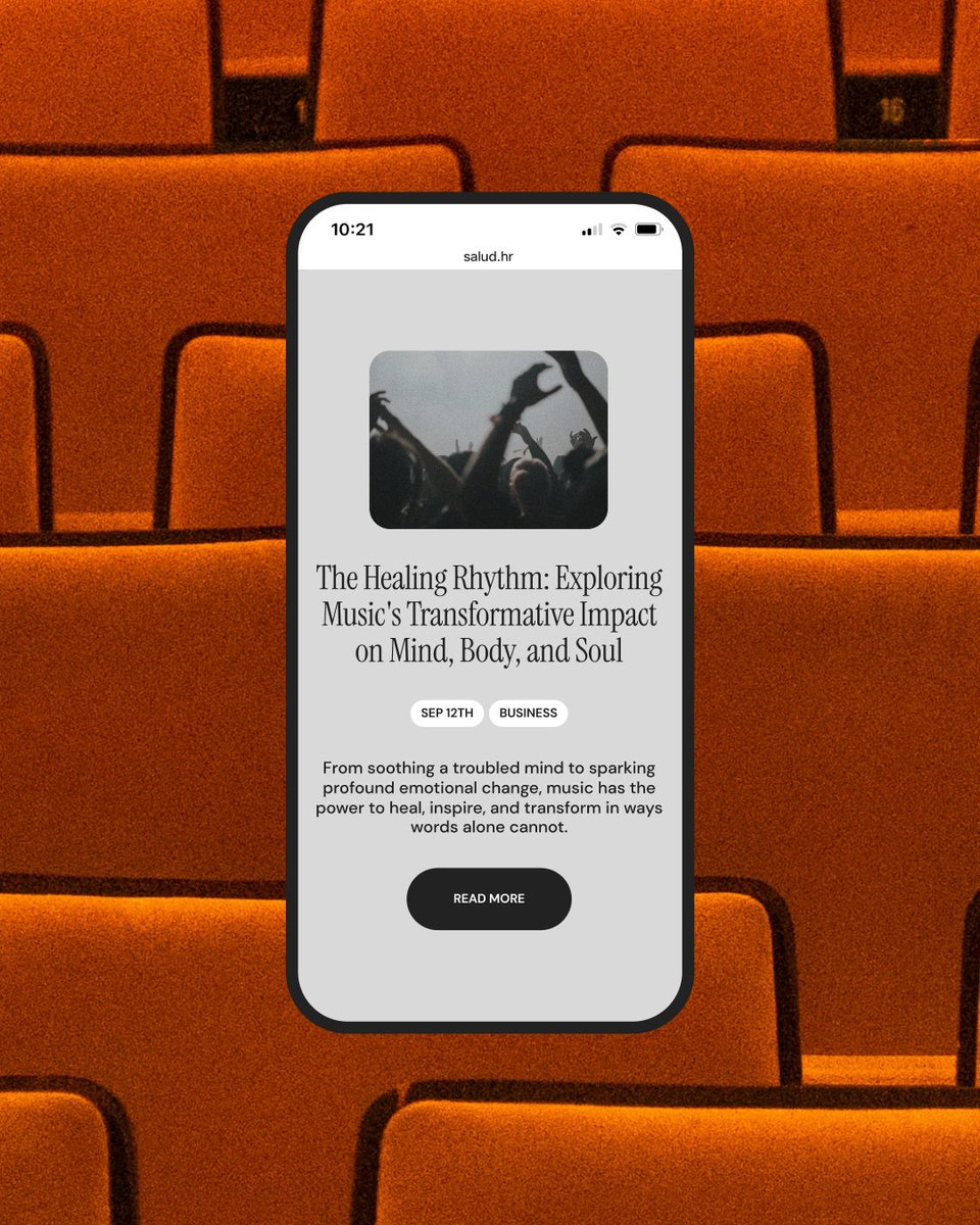
Salud is a digital magazine for modern reflection, a place where stories unfold slowly and with intention. Inspired by the tactile world of printed newspapers, we designed a visual identity & website that translates analog warmth into a contemporary web experience.
The UI bridges analog motifs and digital function. Structured around a familiar 12-column grid, the layout bends just enough to breathe. Oversized components, rounded corners and spacious breaks create a rhythm that feels curated, not coded.
The goal was not to replicate the past, but to borrow its texture: off-whites instead of whites, washed-out blacks instead of true black, and a rich typographic system that makes reading feel like a ritual. It’s a space that breathes, invites, and never rushes. A digital publication that feels human.
2
3
295
3 Apr 2025

#ORPETRON_SOTD
a Masterpiece web design project by Studio Size from Croatia was awarded the Site Of The Day certification on Apr 3 - 2025. Congratulations, @Studio__Size 🎊
—
Exat
orpetron.com/sites/exat/
—
#Promotional #Animation #Colorful #Menu #Graphic #Intro #Landing_Page
3
164
3 Apr 2025
Site of the Day award 🖤

Today’s #SOTD goes to @Studio__Size and RISE2 Studio for "Exat Typeface".
awwwards.com/sites/exat-type…
A kinetic journey through Exat, a typeface inspired by modernist ideals and the avant-garde EXAT 51 movement.
Congratulations! 🏆
#experimental #typography #animation
4
162
31 Mar 2025
Trends come and go. What’s more interesting is the space just outside of them. The place between familiar and weird. That’s where new languages start to form.
That’s what Labs is about for us. A place to explore without pressure. To follow ideas sideways. To let intuition lead.
Staying curious and unafraid matters more than staying current.


1
1
5
213
26 Mar 2025
To support the release of Exat, a typeface by Hot Type, we created diverse promotional visuals, including kinetic typography, posters, letter construction studies, and signage examples.
Each piece explores a different side of the typeface and how it performs across formats, from expressive to functional.
The goal was to show not just how Exat looks but how it behaves. How it moves, holds structure, adapts, and communicates.
Rooted in the legacy of EXAT 51 and the New Tendencies movement, the typeface carries a system of clarity and experimentation. We approached its presentation with the same mindset.
5
194
25 Mar 2025
To support the release of Exat, a typeface by @hottypeco, we created diverse promotional visuals including kinetic typography, posters, letter construction studies, and signage examples.
Each piece explores a different side of the typeface and how it performs across formats, from expressive to functional.
The goal was to show not just how Exat looks, but how it behaves. How it moves, holds structure, adapts, and communicates.
Rooted in the legacy of EXAT 51 and the New Tendencies movement, the typeface carries a system of clarity and experimentation. We approached its presentation with the same mindset.
1
3
158
24 Mar 2025
We designed a series of posters as part of the promotional work for Exat, exploring the typeface through bold compositions, expressive typography, and mid-century inspired structure.
The project was created to support the launch of Exat, a typeface by @hottypeco, inspired by the legacy of EXAT 51 and the New Tendencies movement.
Alongside the posters, we developed motion pieces, layouts, and a dedicated microsite to present the typeface in various contexts, from expressive to functional.
2
3
148