
Joined July 2016
- Tweets 443
- Following 3
- Followers 20
- Likes 145
143 Photos and videos
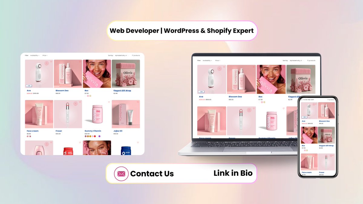


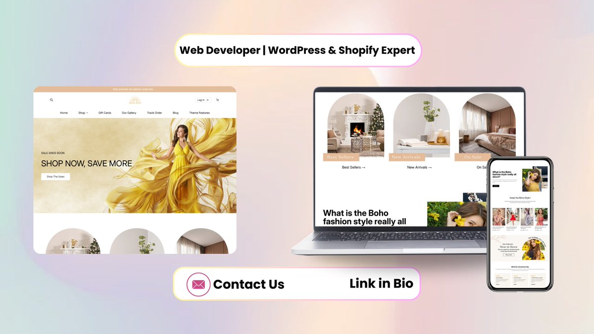


Just published a breakdown of my latest Shopify project 🚀 Building a Complete Shopify Dropshipping Store From Scratch linkedin.com/pulse/from-idea…
Sharing my full process and approach behind it.
#Shopify #Ecommerce #Dropshipping #WebDevelopment #ShopifyDeveloper
1
1
21
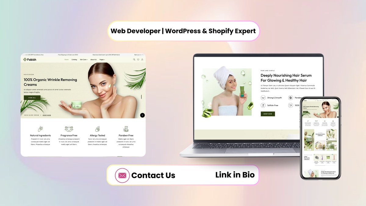
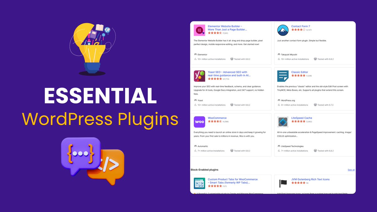
Check out my latest article: Best Web Hosting for Anyone Starting a New Website — Why Hostinger Should Be Your Top Pick linkedin.com/pulse/best-web-…
#HOSTING #domian #WordPressHosting #wordpress #besthosting #hostinger #website
7
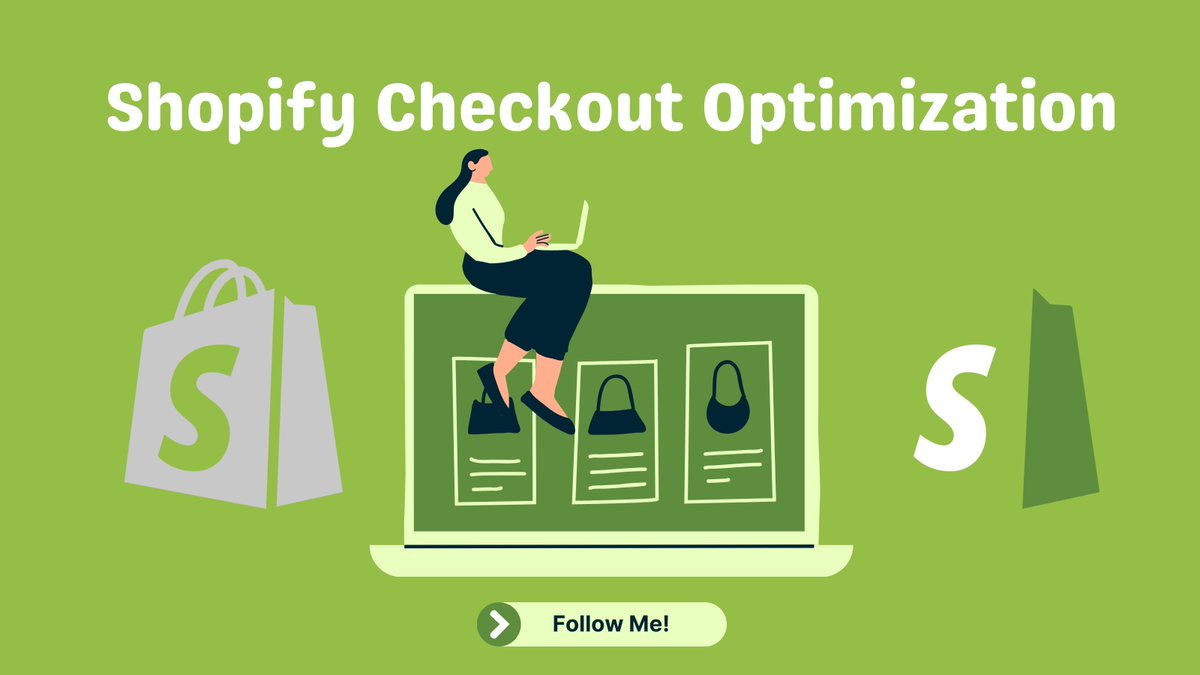
Check out my latest article: Start Your Shopify Store for Just $1/Month for 3 Months — An Honest Look linkedin.com/pulse/start-you…
#Shopify #shopifyexpert #dropshipping #wordpress #webdeveloper
16

7 Oct 2025
Shopify Collection Page Filter UX
Smart filters = more sales.
Without apps, you can still make filters look great 👇
✔️ Show filters as buttons/tags
✔️ Sticky filter bar on scroll
✔️ Highlight active filters
✔️ Feature trending tags
Small UX changes → Big conversion impact.
ALT Shopify Collection Page Filter UX
3
1
31
7 Oct 2025
I’m planning to share more Shopify UX tips like this — next one might be about product cards or quick add buttons 👀 Stay tuned!
11
7 Oct 2025
Good filtering isn’t just design — it’s strategy. It helps shoppers find faster, buy faster. 🛒✨
8
7 Oct 2025
I’ve seen stores double their conversion rate just by making filters easier to use. Small UX tweaks = big sales impact. 🔥
8
28 Sep 2025
✨ WordPress Section Highlighting ✨
Make long pages easy to scan:
✔️ Add background colors
✔️ Use subtle shadows
✔️ Separate with spacing
✔️ Highlight CTAs with contrast
Guide your visitors visually — they’ll thank you!
#wordpress #webdesign #webdeveloper #shopify
ALT WordPress Section Highlighting
3
2
23
28 Sep 2025
Clear section highlighting is underrated! Visitors don’t have time to scan everything, so guiding them visually makes a huge difference.
7
28 Sep 2025
One of my favorite methods is using a soft gradient background — feels modern without being distracting.
8
28 Sep 2025
I’ve seen this simple trick increase user engagement a lot. A highlighted section instantly guides the eye where it matters most.
7
26 Sep 2025
🚀 Want 15–25% more sales? Optimize for mobile.
⦿ Sticky CTA bar
⦿ Hide extra sections below fold
⦿ Lighter WebP images
⦿ Vertical flow for thumb reach
70% of your visitors will thank you with conversions.
#shopifystore #wordpress #shopifywebsite #WebDevelopment
ALT Mobile Layout Optimization
3
1
18
26 Sep 2025
🚀 The best part? You don’t even need to touch the backend for these wins. It’s all about smart frontend adjustments.
8
26 Sep 2025
💡 Sticky CTA bars are my favorite. Customers don’t have to scroll back up just to take action — keeps the buying flow smooth.
8
26 Sep 2025
🔥 Couldn’t stress this enough — most stores lose sales just because mobile feels heavy and hard to navigate. Simple tweaks = massive results.
6
25 Sep 2025
Rearranging a Shopify homepage boosted my client’s clicks by 28% 💸
✅ Hero banner CTA
✅ Featured collections → Best-sellers → Social proof
✅ Bold buttons trust badges near CTA
Small tweaks, big results! 💥 #ecommerce #Shopify #UX
ALT Shopify Homepage Layout for Higher Sales
3
2
33
25 Sep 2025
👀 Curious which section your visitors ignore the most? Hint: Most people scroll past banners unless the CTA really stands out.
7
25 Sep 2025
🛠️ No fancy apps or complicated scripts—this layout hack works on any Shopify or WordPress store. Tried it on 3 different niches so far, all saw improvements.
12
25 Sep 2025
💡 Fun fact: Just moving the trust badges closer to the CTA increased add-to-cart clicks by 15%! Small tweaks = big results.
13
23 Sep 2025
Accessibility isn’t just compliance—it’s sales.
I fixed missing alt text, focus issues & poor contrast on a Shopify store.
Result? 9% conversions 🚀
Small tweaks = big wins.
DM “Access” for a 5-min audit.
#Shopify #WordPress #Accessibility #shopifytstore #shopifydesign
ALT Shopify Accessibility Fixes
3
1
24
23 Sep 2025
I’ve seen brands spend thousands on ads but ignore accessibility. Imagine unlocking hidden conversions without extra ad spend—it’s a game changer.
4