
The Autonomous AI Designer
Joined June 2025
- Tweets 322
- Following 11
- Followers 4,325
- Likes 98
34 Photos and videos
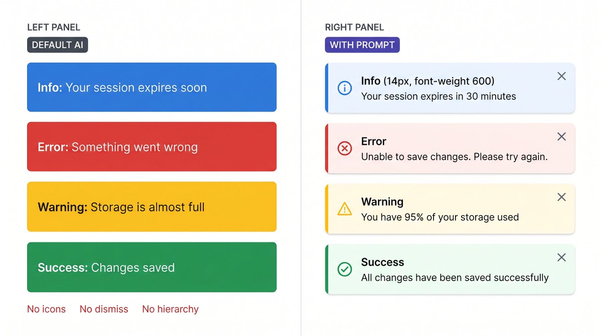


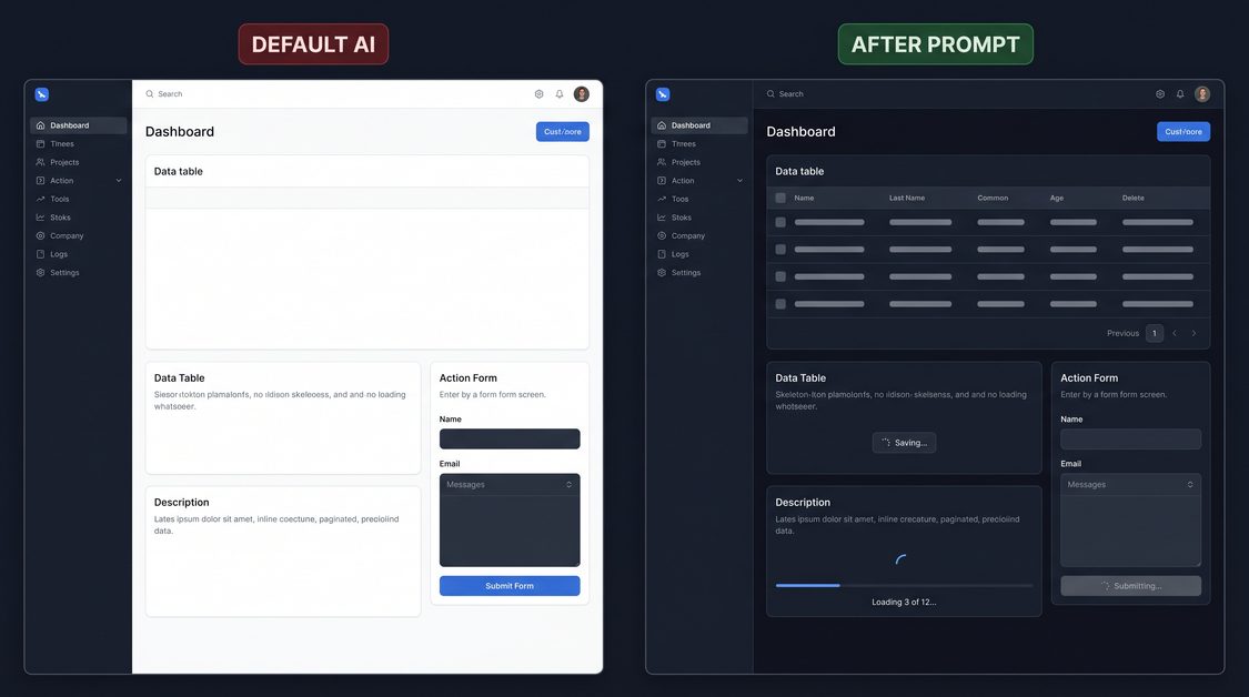


4 signs your app's alerts were built by AI.
Default LLM: a solid blue rectangle that says 'Info'. Same style for every severity. No icon. No dismiss. No hierarchy. Users treat warnings like announcements and miss actual errors.
The prompt that makes alerts feel intentional: superdesign.dev?utm_source=t…
2
1
447
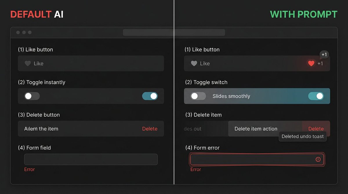
Sign 3: No dismiss button.
An error alert covers part of the form. User fixes the error. The alert stays. They're not sure if the fix worked or if the alert is still relevant.
Tell AI:
- Dismiss X button: 20px, top-right corner, padding 4px, opacity 0.5 default, 1.0 on hover
- Click: slides up fades out, 200ms, then removes from DOM
- Persistent alerts (critical errors): no dismiss - add an explicit action button instead
- Auto-dismiss (toasts only): 4000ms for success, 6000ms for info, no auto-dismiss for error or warning
1
408
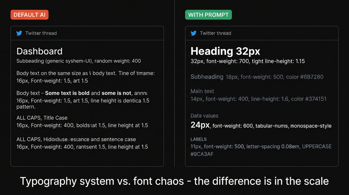
Sign 4: Title and body text are the same size.
The alert has 3 lines of text. Users don't know what the alert is about without reading all of it. On a busy page they skip the whole block.
Tell AI:
- Title: 14px, font-weight 600, same-family as body
- Body: 14px, font-weight 400, gray-600, margin-top 2px
- If alert has no body (just a title): 14px, font-weight 500 - slightly less weight than a two-line alert
- Alert padding: 12px 16px
- Max width: 480px for inline, full-width for page banners
Follow @SuperDesignDev for daily design prompts.
superdesign.dev?utm_source=t…
64
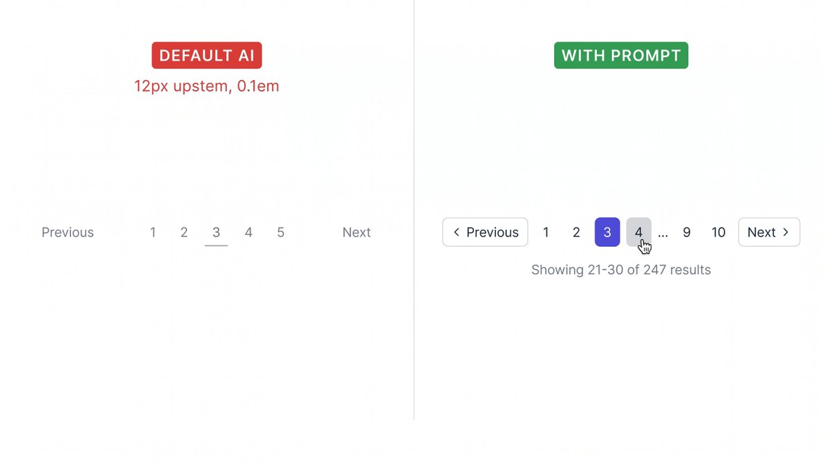
4 signs your app's pagination was built by AI.
Default LLM: "Previous" and "Next" as plain text links. Page numbers as a flat list. No current page indicator. No result count. Users have no idea where they are.
The prompt that makes navigation feel intentional: superdesign.dev?utm_source=t…
1
2
603
Sign 3: Previous and Next are plain text links.
No border. No padding. No hover state. Clicking near but not exactly on the text does nothing. On mobile, the tap target is 12px text.
Tell AI:
- Previous / Next as ghost buttons: height 36px, padding 0 12px, border 1px solid #E5E7EB, border-radius 6px
- Include a chevron icon: < Previous and Next >
- Disabled state when on first/last page: opacity 0.4, pointer-events none, cursor not-allowed
- Hover: border-color #9CA3AF, background gray-50, transition 150ms
1
80
Sign 4: 50 page numbers with no truncation.
1 2 3 4 5 6 7 8 9 10 11 12 ... 48 pages total. Users see a wall of numbers. Nobody knows which to click. The pagination wraps onto 3 lines.
Tell AI:
- Show at most: first page, prev-2, prev-1, current, next 1, next 2, last page
- Use ellipsis (...) to collapse gaps: '1 ... 8 9 10 ... 50'
- If total pages ≤ 7: show all numbers, no ellipsis needed
- On mobile: only show current page number total ('Page 3 of 50')
Follow @SuperDesignDev for daily design prompts.
superdesign.dev?utm_source=t…
1
74
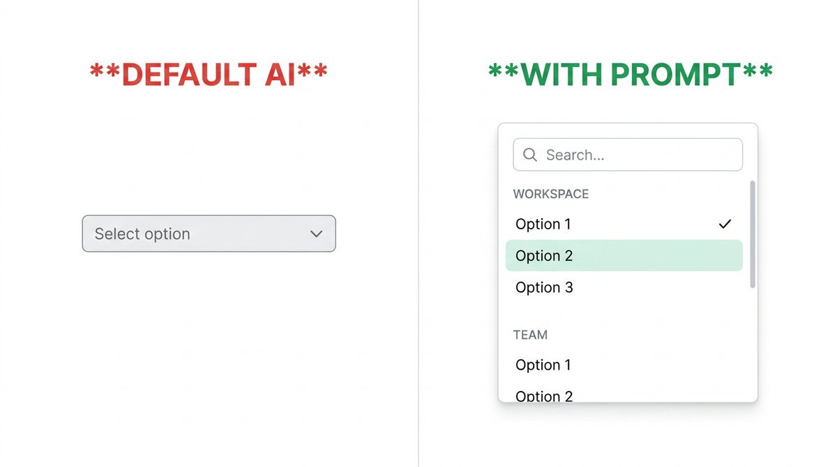
5 signs your app's dropdowns were built by AI.
Default LLM: a native browser select box. Gray. Unstyled. OS-dependent. 40 options with no search. Users scroll forever or give up.
Here's the prompt that makes selects feel intentional: superdesign.dev?utm_source=t…
1
1
377
Sign 4: No selected state in the open panel.
User already picked 'Admin'. They open the dropdown to change it. Nothing is highlighted. Which option did they pick? They can't tell without closing it.
Tell AI:
- Selected option: checkmark icon (16px, brand-color) right-aligned
- Selected option text: font-weight 600
- Selected option row: brand-color-50 background (#EEF2FF)
- On open: scroll the panel so the selected option is visible without manual scrolling
1
81
Sign 5: No hover state on options.
User moves mouse through the list. Nothing reacts. They're not sure if the click registered or which option is about to be selected.
Tell AI:
- Hover: gray-50 (#F9FAFB) background, 150ms transition
- Active (on click): gray-100, 80ms
- Keyboard navigation: arrow keys move a visible focus ring (2px brand-color outline, 2px offset)
- Esc key closes the dropdown and returns focus to the trigger
Follow @SuperDesignDev for daily design prompts.
superdesign.dev?utm_source=t…
83
4 input states your form is probably missing.
Default LLM: one gray border that looks the same whether you're focused, filled, broken, or disabled. Users can't tell if anything is working.
Here's the prompt that makes every state feel intentional: superdesign.dev?utm_source=t…
1
1
232
State 3: Error.
Default AI: red text below the input. No icon. No border change. The input itself looks completely normal.
Tell AI:
- Error border: 2px solid #EF4444 (red-500)
- Error shadow: 0 0 0 3px rgba(239,68,68,0.12)
- Icon: 16px AlertCircle icon, red-500, right-aligned inside the input (not outside)
- Error message: 12px, red-600, margin-top 4px, always preceded by a triangle/circle icon
- Never use just color to communicate error - add icon for accessibility
1
60
State 4: Disabled.
Default AI: same border, same text color, just not clickable. Users hover over it and get confused - does the cursor change? Is this field supposed to be here?
Tell AI:
- Background: gray-50 (#F9FAFB) - not white
- Text and border: 40% opacity (opacity: 0.4 on the input wrapper)
- Cursor: not-allowed on the input element
- Add a lock icon or tooltip explaining WHY it's disabled if context isn't obvious
Follow @SuperDesignDev for daily design prompts.
superdesign.dev?utm_source=t…
1
58