
Creative graphic designer @Mazerance • Web designer .
Joined January 2024
- Tweets 32,377
- Following 1,812
- Followers 13,340
- Likes 59,099
2,057 Photos and videos


Pinned Tweet

Jan 17
I found a Design Goldmineeee 💃🏽✨
Photoshop free course from beginner to advanced level!!!!
Here’s the link for those interested! ⬇️
drive.google.com/drive/folde…

213
1,243
6,917
1,548,992

There is one thing this world cup has taught me already about most designers
And this helps differentiates the OG designers from the normal ones
Now the World cup just started and a lot of designers are on it creating mad visuals, which is interesting.
I took my time to do a little bit of research about the entire stuff and I realized that most designers just wake up and start designing without much conceptualization and proper research.
Now the 2026 world Cup branding has some kind of minimalistic, futuristic retro feel in it's entirety.
This spoke from the logo to the stadiums itself.
Now checking the designs people are dishing out, most designers didn't even notice this part of the world cup
They just went ahead to design "what is fine".
Flying gradients everywhere, with some dark shades of neons.
And then on the other hand they're OG's like @SafwanAlghazal, @TariusNG etc. creating some consistent visuals.
You can't even tell if it's actual FIFA designs or not.
If you're a designer and you're reading this, learn to understand design concepts.
Because there is one design concept you have in mind that is very dope, doesn't mean it's the best concept for every design you want to do
Your welcome.

6
4
43
1,240
The Local Designer 👹 retweeted

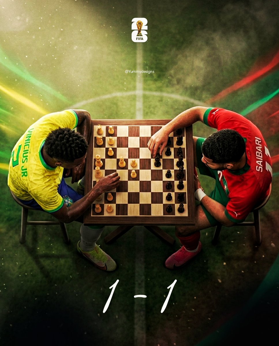
It ends in level
I want Brazil to win but I will take the draw 😎
Cooked by yours sincerely.

Weekends are for resting, but not for us. Show me a design of the team you’re supporting today.
Quote your work with the #Tariusfifachallenge and tag @FIFAWorldCup 🔥
1
9
88
The Local Designer 👹 retweeted

Here we go.
I supported Morocco but I love Brazil🌚🏄🏽♀️❤️
Happy Sunday 👌🏼❤️
@TariusNG
@FansTribeHQ
@FIFAWorldCup


Weekends are for resting, but not for us. Show me a design of the team you’re supporting today.
Quote your work with the #Tariusfifachallenge and tag @FIFAWorldCup 🔥
4
1
11
135
Would’ve used Vini but I already designed before the match started soooo yeah.
Showed up for Brazil 🇧🇷
@FIFAWorldCup #Tariusfifachallenge
(Loads In 4K)
2
3
78
1,190
The Local Designer 👹 retweeted

#Tariusfifachallenge I believe it's not too early for Day 4 @TariusNG @FIFAWorldCup
Australia V Turkiye...

1
2
8
95
The Local Designer 👹 retweeted


Weekends are for resting, but not for us. Show me a design of the team you’re supporting today.
Quote your work with the #Tariusfifachallenge and tag @FIFAWorldCup 🔥
7
18
135
4,046

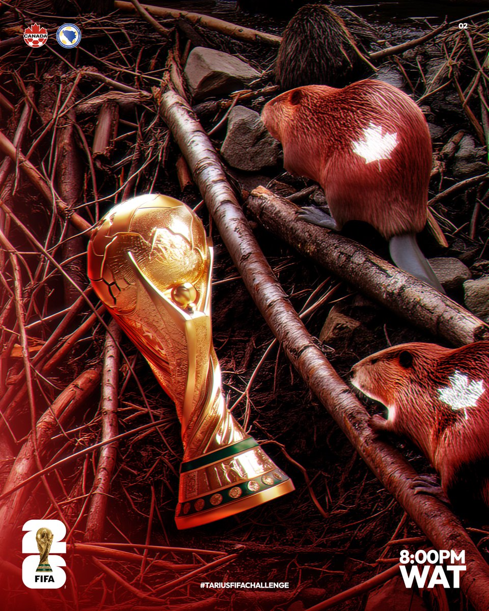
The Local Designer 👹 retweeted
A last minute withdrawal at the Swiss bank🎨
@QFA_EN
@nati_sfv_asf
@FIFAWorldCup
#Tariusfifachallenge

Weekends are for resting, but not for us. Show me a design of the team you’re supporting today.
Quote your work with the #Tariusfifachallenge and tag @FIFAWorldCup 🔥
2
12
87
1,439
The Local Designer 👹 retweeted

Finally got some free time & decided to hop in on #Tariusfifachallenge
Like the saying goes, "Better late than never" 😤
Vamos Samba boys! 👊🏽
@FIFAWorldCup 🔥
Weekends are for resting, but not for us. Show me a design of the team you’re supporting today.
Quote your work with the #Tariusfifachallenge and tag @FIFAWorldCup 🔥
1
5
103


The Local Designer 👹 retweeted

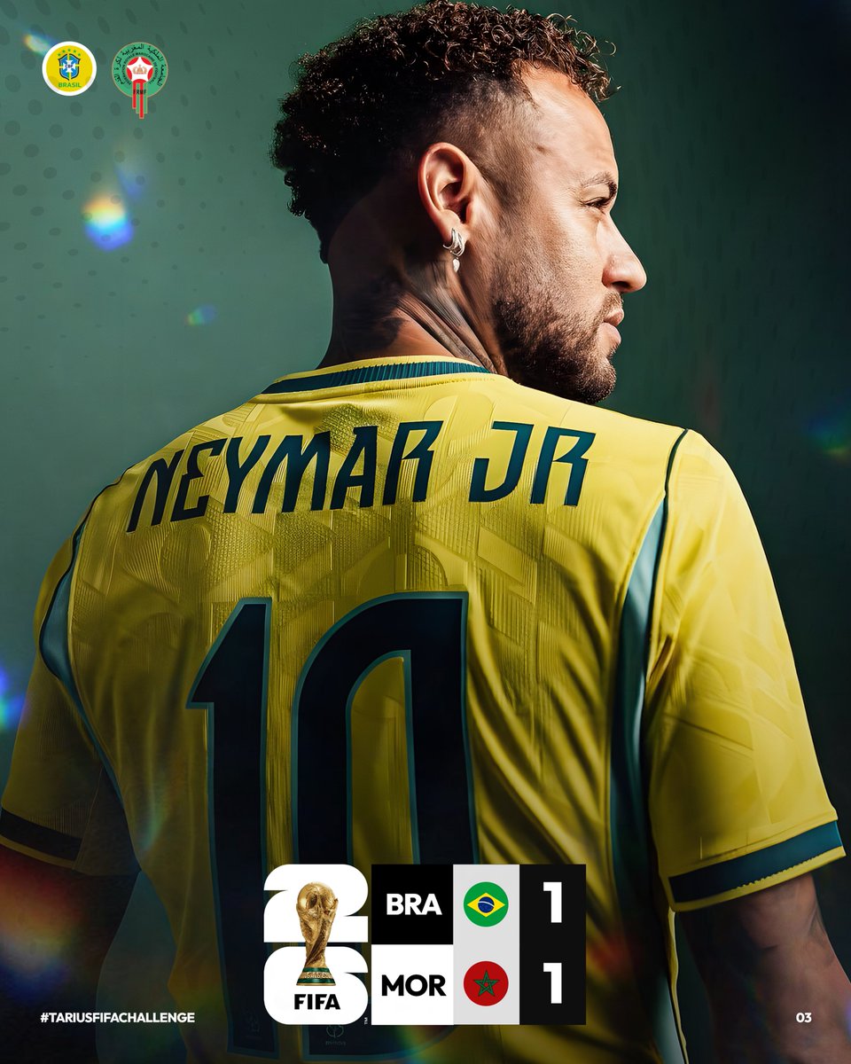
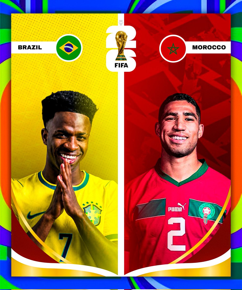
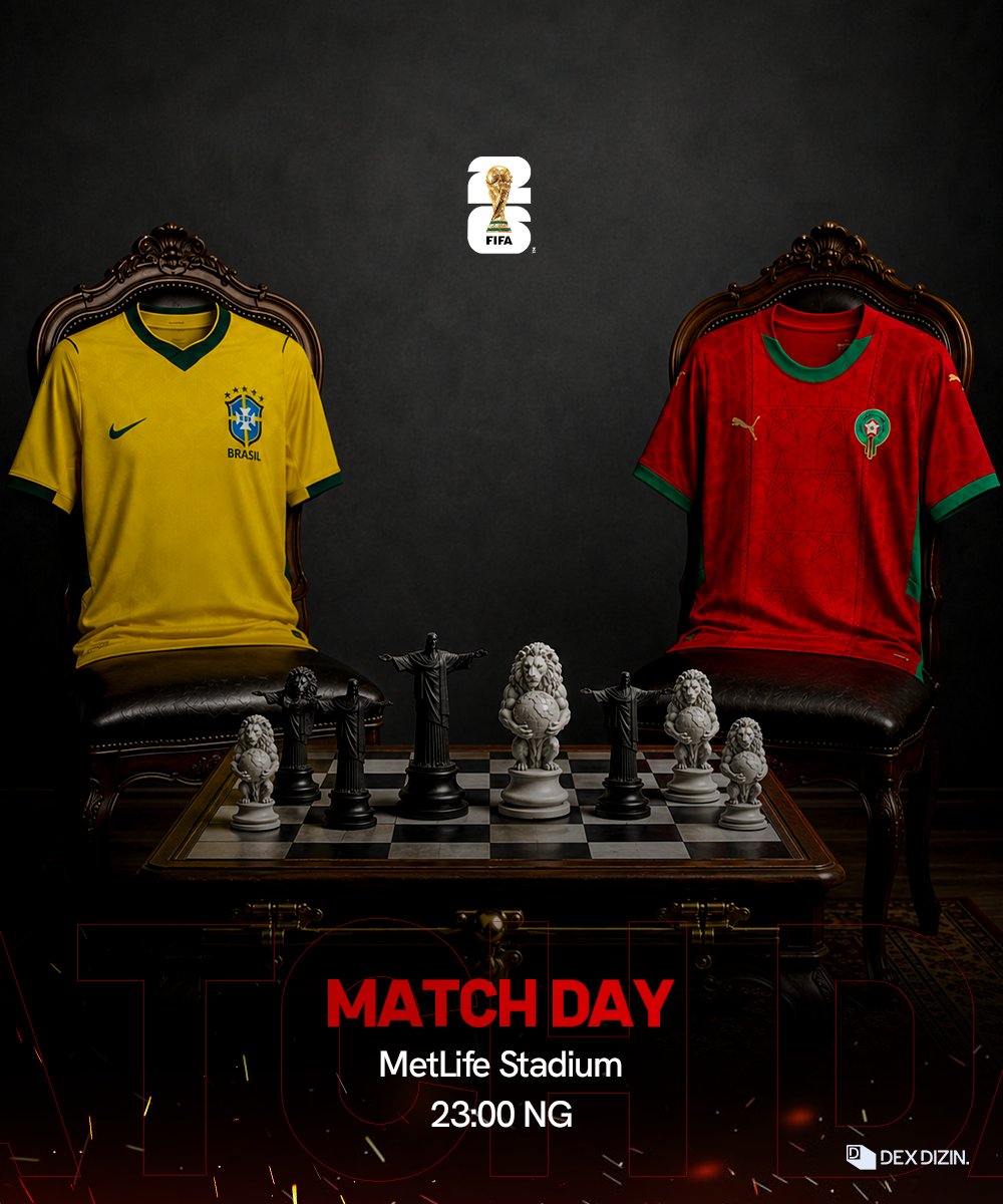
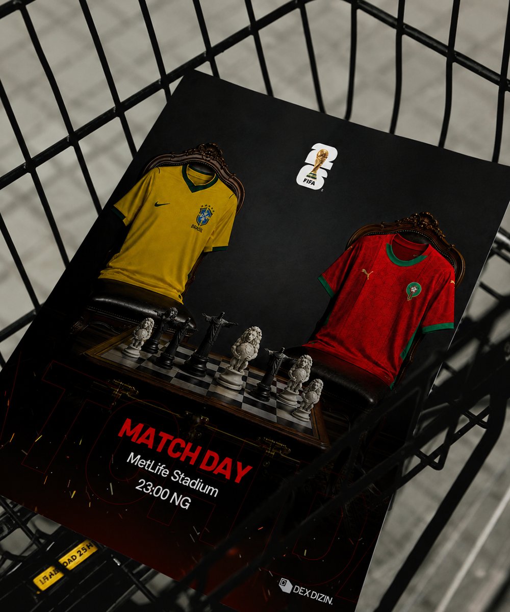
Brazil🇧🇷 Vs 🇲🇦Morocco
#Tariusfifachallenge @FIFAWorldCup
🇧🇷

Weekends are for resting, but not for us. Show me a design of the team you’re supporting today.
Quote your work with the #Tariusfifachallenge and tag @FIFAWorldCup 🔥
6
12
174

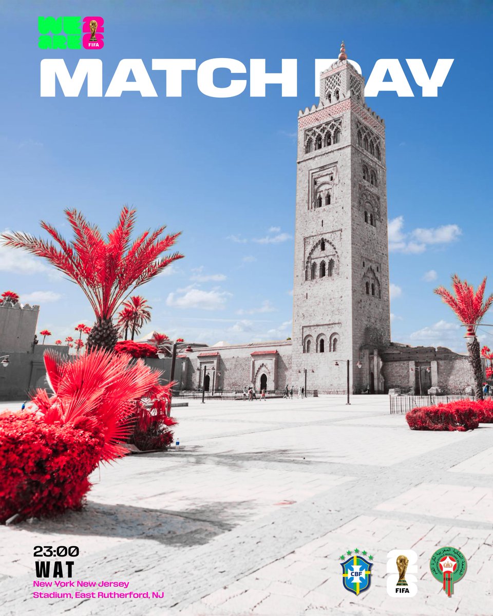
Day 3
Rooting for the Brazilians of Brazil 💪
#Tariusfifachallenge
@FIFAWorldCup
Weekends are for resting, but not for us. Show me a design of the team you’re supporting today.
Quote your work with the #Tariusfifachallenge and tag @FIFAWorldCup 🔥
2
6
96
The Local Designer 👹 retweeted

My Day 3 submission for #Tariusfifachallenge
I started this design barely an hour ago, didn't have light most of the day but had to show up regardless.
@FIFAWorldCup @TariusNG

Weekends are for resting, but not for us. Show me a design of the team you’re supporting today.
Quote your work with the #Tariusfifachallenge and tag @FIFAWorldCup 🔥
1
2
8
165
The Local Designer 👹 retweeted


Weekends are for resting, but not for us. Show me a design of the team you’re supporting today.
Quote your work with the #Tariusfifachallenge and tag @FIFAWorldCup 🔥
1
2
74

Signing off🧍🏽
#Tariusfifachallenge

Weekends are for resting, but not for us. Show me a design of the team you’re supporting today.
Quote your work with the #Tariusfifachallenge and tag @FIFAWorldCup 🔥
2
6
112
The Local Designer 👹 retweeted
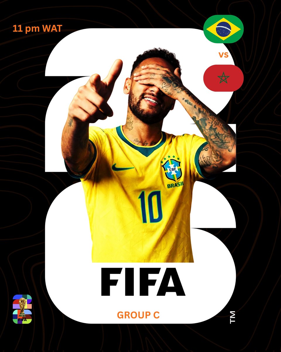
Day 3🔥#Tariusfifachallenge @FIFAWorldCup
Brazil V Morocco, LETS GOOOOOO

Weekends are for resting, but not for us. Show me a design of the team you’re supporting today.
Quote your work with the #Tariusfifachallenge and tag @FIFAWorldCup 🔥
3
9
170
The Local Designer 👹 retweeted

Weekends are for resting, but not for us. Show me a design of the team you’re supporting today.
Quote your work with the #Tariusfifachallenge and tag @FIFAWorldCup 🔥
1
10
230
The Local Designer 👹 retweeted

15h
Line up design ✨

Showed up for Brazil 🇧🇷
@FIFAWorldCup #Tariusfifachallenge
(Loads In 4K)
1
1
8
215
The Local Designer 👹 retweeted

15h
We are all team Morocco right?
Day 3
#Tariusfifachallenge @FIFAWorldCup

Weekends are for resting, but not for us. Show me a design of the team you’re supporting today.
Quote your work with the #Tariusfifachallenge and tag @FIFAWorldCup 🔥
1
5
181
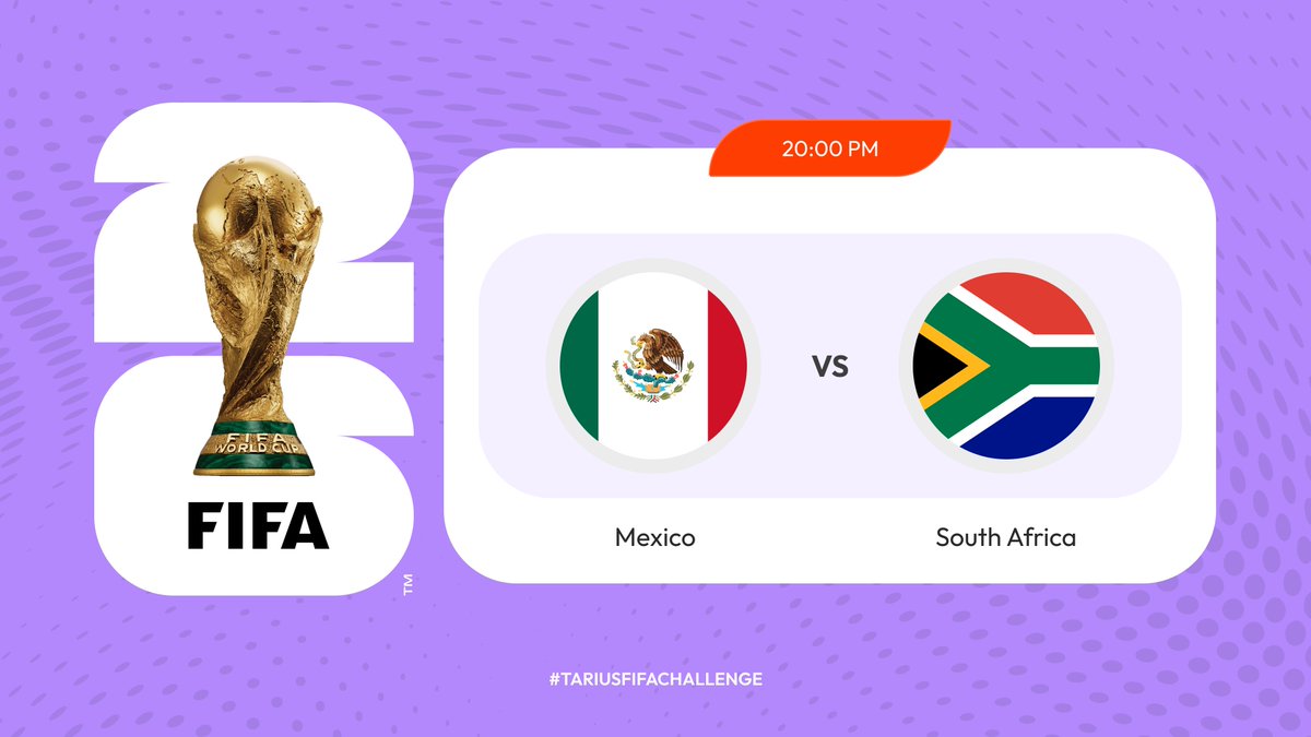
The Local Designer 👹 retweeted

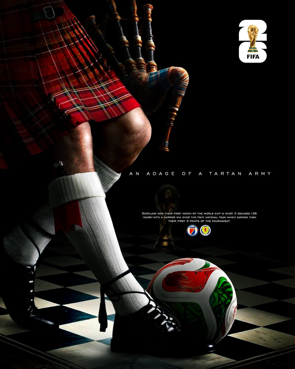
Pressure? What Pressure!!!
#TariusFIFAChallenge


Weekends are for resting, but not for us. Show me a design of the team you’re supporting today.
Quote your work with the #Tariusfifachallenge and tag @FIFAWorldCup 🔥
2
12
264