
Joined August 2011
- Tweets 34
- Following 50
- Followers 30
- Likes 77
4 Photos and videos


12 Aug 2019
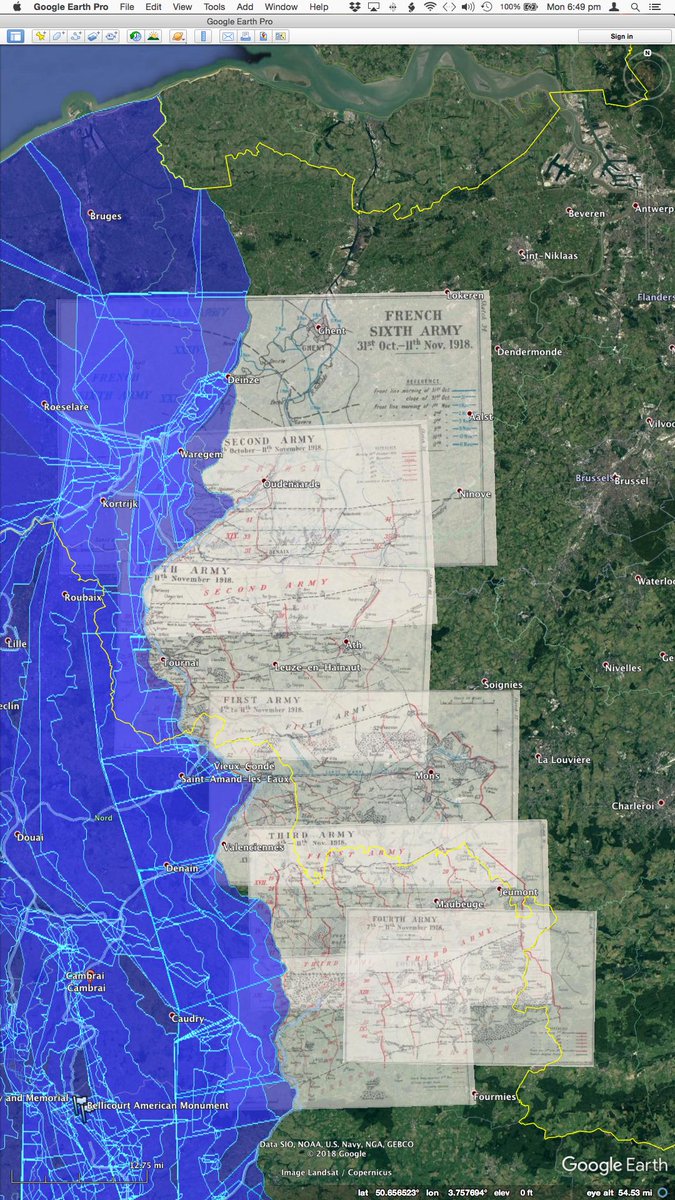
About to begin the final assault on the Western Front, November 1918. Maps from the British Official History 1948.
1
Temporal Earth retweeted

7 Aug 2019
Thanks for the tip David! Ideally, @MapWarper might develop a contributory interface similar to that of Wikipedia, where it’s easy to roll-back a novice user’s mistaken efforts, and even lock a page if it happens repeatedly.
2
1
22 Jul 2019
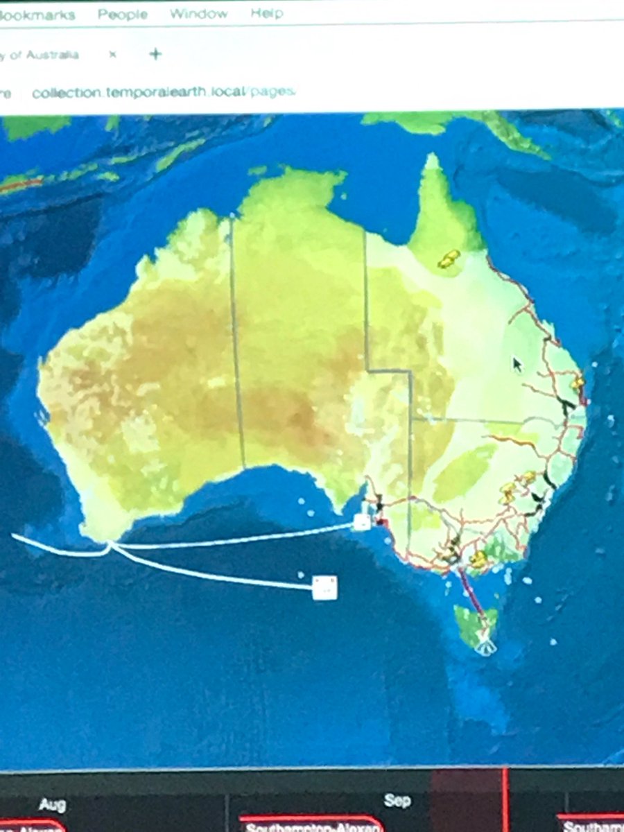
If historical opening- and closing-date attributes could be added to each section of railway line on @openrailwaymap, we could animate the construction of railways around the world from the 19th Century to today. Try Time-machine.Earth to see how this looks for Australia.
1
1
19 Jul 2019
The OpenLayers Editor by @geops is a really nifty piece of interactive design. I don't normally like tool-based interfaces, but the mouse-over effects make up for that. Try it out and let me know what you think! openlayers-editor.geops.de
1
Temporal Earth retweeted

13 Jul 2019
@mattcoller I think I found what you were referring to yesterday
1
1
12 Jul 2019
Thanks @newCardigan for the opportunity to present @TemporalEarth at tonight’s #cardiParty !
Great to get some feedback from across the #GLAMR sector.
1
Temporal Earth retweeted

12 Jul 2019
Talking @CreativeCommons, the importance of open source data and the amazing ways it can be used. Fun Friday at @newcardigan #CardiParty!
1
1
12 Jul 2019
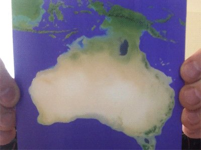
Ancient Australia in your hand!
These 'lenticular' cards contrast the Greater Australian continent #Sahul 20,000 years ago (ice-sheets and drier climate included) with how the region looks today.
Hoping someday to do a big print-run for schools and museums.
1
30 Jun 2019
Three hours scouring the @Library_Vic microfilms, to fill one more gap in my dataset of the world’s first feature film touring Australia and the world.
Visualisation coming soon!
1
1
24 Aug 2016
Just traded some user-interface feedback with the guys from @proquoAU on our respective systems. I guess that shows they walk their talk!
1
22 Apr 2015
Temporal Earth now has a meetup group! Inaugural meetup happening now as part of Open Knowledge Melbourne @okfnau meetup.com/Temporal-Earth-Me…
1
2
2 Oct 2014
Well, it's been a long time between tweets, but Temporal Earth is rebooting. Presenting on Sunday, as an application for a future TED talk.
1
1
25 Aug 2011
Yep, @GerryGannon really made the #ISDE7 conference, with his entertaining yet insightful comments to kick off discussions.
25 Aug 2011
Now that #ISDE is over, perhaps we can keep in touch via the #digitalearth tag, as inaugurated by @hfsummers and @ruthjelley
24 Aug 2011
Awesome singer at the #ISDE7 Gala Dinner. Hey you - YES YOU - stop tweeting - get dancing!!!!
24 Aug 2011
Pretty transitions... but why give a presentation on motion capture without showing any video of the results?!?