
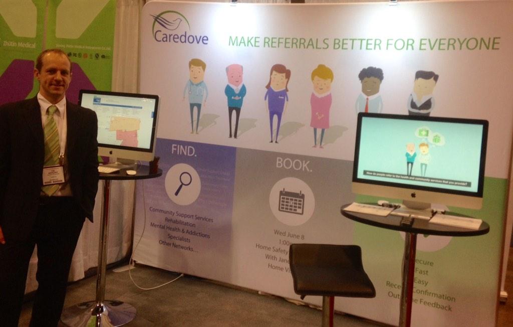
Discussing the business of healthcare, with a focus on home & community care, quality and technology. CTO and co-founder with @caredove
Joined June 2009
- Tweets 296
- Following 190
- Followers 219
- Likes 49
11 Photos and videos


21 Mar 2022
"Virtual Visits" aren't words normal people use, we should just call online health appointments "Video Calls". Language is UX.
1
18 Nov 2021
Tim's 1st law of screen-sharing: When typing while everybody is watching, every 11th letter will be a typo.
13 Oct 2021
"Fly-in" is the only PowerPoint animation you ever need.
30 Aug 2021
What's next for #FHIR? Find out at #FHIRNorth, where I'll be presenting on "How to build a FHIR iGuide that gets adopted". Join me: bit.ly/3hsAZcW
1
1
23 Jul 2021
New Canadian eReferral guide is out! It has a greatly improved narrative, and a few technical changes.
simplifier.net/guide/ca-on-e…
3 Jun 2021
eConsult is a subset of eReferral. Applications and interoperability specifications should be designed as such.
1
21 May 2021
It's good to step away from a UI design for a week to get some distance from my own brain. When I come back it's easier to see it with user eyes - and figure out if I really love it or hate it. I had a "love it" feeling this morning on some recent work.
18 May 2021
Looking for a DevOps engineer who would likes helping people in healthcare. Message me if interested.
28 Apr 2021
I find that committee-style meetings contribute a lot more to "Zoom fatigue" than highly focused problem-solving meetings - which energize me. Probably not just a Zoom thing, just a thing thing.
23 Apr 2021
How many thousands of people are currently in this vaccine booking death loop at the @ShopprsDrugMart website?:
13 Apr 2021
I have to say, I really love this idea - Cancel your parking ticket by supporting local restaurants during COVID!
barrie360.com/parking-ticket…
11 Apr 2021
Had a head cold last week (wasn’t COVID). First time I’ve been sick in a year. Weird.
2
6 Apr 2021
Does anybody else feel a rush of excitement when you only have 6 seconds left to quickly enter your one-time-password? No? Just me? ok...
1
1
29 Mar 2021
It’s easy to say what we should do more of. It’s harder to say what we should do less of.
24 Mar 2021
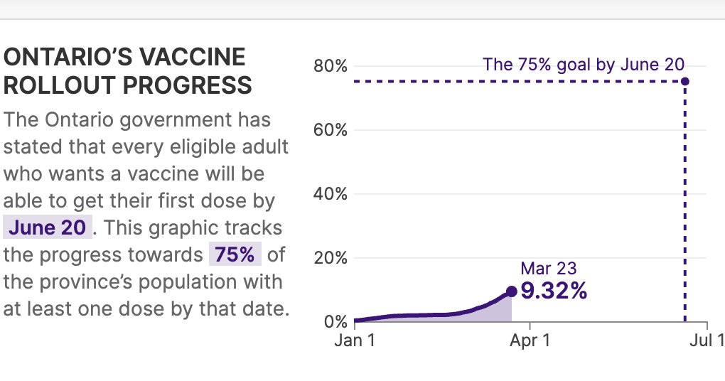
Issue 3 - To find determine our progress on 1st dose you have to do math.
Issue 4 - Why show only % receiving BOTH doses when the focus right now is on first dose?
1
24 Mar 2021
Issue 5 - These stats don't answer any questions directly (except for FULL vaccination), without doing further manipulation of the numbers, which completely defeats the purpose of a dashboard infographic.
18 Mar 2021
Web designers: If you have a design system, then wireframing is a waste of time. Agree or disagree?
4 Jan 2021
What were this patient's needs at home? "Cleaning, medication delivery, meal delivery and social support". Community support services (which are underutilized and often unknown) can make an enormous difference in the patient journey.
30 Dec 2020

Not everything needs to be #Innovative in Healthcare...a patient of mine who was admitted after being kept at home for almost 2 years with end stage kidney disease and cognitive impairment. How did we do it?