
Joined February 2020
- Tweets 2,452
- Following 643
- Followers 1,520
- Likes 8,935
364 Photos and videos


Pinned Tweet

14 Jan 2021
Day 83 - 88 #100DaysOfCode
Since it's my birthday today, I worked on a colour theme and finally published it. Hahah Nairobi Night is a gift to me and you, I love the feedback so far.
THE CITY UNDER THE SUN. #HappyBirthdaty to me 🎂.
marketplace.visualstudio.com…
#CodeNewbie
6
5
22
Jane Tracy 👩💻 retweeted

Jun 10
キラキラ水面が本物みたいに揺れるWebアプリ作っちゃいました!
Claude Fable 5の作例でいろんな人の美しい作品を見てたら、 「これ、自然な表現めっちゃ上手いなぁ✨」となって、 勢いでインタラクティブな水面リップルアプリを作ってみた。
マウスで撫でると波紋が広がって、 花びらがゆらゆら動きます🌸
これがHTML?画面にあるのが不思議な感覚。
※背景画像はGPT Image 2で生成しました。
31
158
1,397
97,958
Jun 11
Arcus is a cinematic full-screen page loader for Framer, built around a signature three-layer curved panel wipe. Each coloured panel sweeps upward in sequence. 👌🔥
framer.com/marketplace/compo…
#Framer
#Buildinginpublic
3
31
Jun 11
Drop in up to 8 PNG images with transparent backgrounds ingredients, products, icons, anything with shape.
It's responsive to all devices too.
Have fun with nimbus 🌟🎨✨️
framer.com/marketplace/compo…
#framer #Buildinginpublic
4
30

Okay, haters saying this is a shitpost and fake. Well no, I don't do these kind of posts 😭
HERES THE PROMPT
Use the image-to-code web skill. github.com/Leonxlnx/taste-sk… (for image gen)
Create a landing page using the materials I provide. Please read everything completely.
Generate 8 images total. Each image should represent one section of the website, so there should be 8 sections in total.
The website should be ultra-clean, modern, and at the level of these references:
landonorris.com/
mindmarket.com/
shopify.com/editions/winter2…
oryzo.ai/
floema.com/en
mistral.ai/
Please generate the images based on the reference images I provide from these websites. Then, your task is to recreate the generated images in code.
Extract all individual elements from the generated images and regenerate them with image generation so they can be used as separate assets. Then use those assets to build the final website with extremely smooth animations.
The site can be about anything. Just make it creative, animated, aesthetic, and really cool.
Please make the website awesome and check everything carefully.
-----
YES just like that. Inspo image2code Fable is CRAZY


27
17
415
35,634
x.com/LexnLin/status/2064695…
HERE'S THE PROMPT
Okay, haters saying this is a shitpost and fake. Well no, I don't do these kind of posts 😭
HERES THE PROMPT
Use the image-to-code web skill. github.com/Leonxlnx/taste-sk… (for image gen)
Create a landing page using the materials I provide. Please read everything completely.
Generate 8 images total. Each image should represent one section of the website, so there should be 8 sections in total.
The website should be ultra-clean, modern, and at the level of these references:
landonorris.com/
mindmarket.com/
shopify.com/editions/winter2…
oryzo.ai/
floema.com/en
mistral.ai/
Please generate the images based on the reference images I provide from these websites. Then, your task is to recreate the generated images in code.
Extract all individual elements from the generated images and regenerate them with image generation so they can be used as separate assets. Then use those assets to build the final website with extremely smooth animations.
The site can be about anything. Just make it creative, animated, aesthetic, and really cool.
Please make the website awesome and check everything carefully.
-----
YES just like that. Inspo image2code Fable is CRAZY
2
17
2,617
Jun 11
This time round, i know video editing and 3d projects gonna be amazing 👏

Introducing Claude Fable 5: a Mythos-class model that we’ve made safe for general use.
Its capabilities exceed those of any model we’ve ever made generally available.
31
Jane Tracy 👩💻 retweeted

Jun 9
Claude Fable 5 changed how we work on the Claude Code team day to day.
We used to verify that Claude did the work right. Now we verify that it's doing the right work.
Here’s the 3 biggest changes:
288
766
11,321
999,867
Jane Tracy 👩💻 retweeted

Jun 9
BREAKING:
Anthropic just dropped Claude Fable 5—this is Mythos, made safe for public release. It is the best coding model in the world.
We've been testing it internally @every for the last week or so across coding, writing, marketing, editing, and more—here's our vibe check:
- It broke our benchmarks. Fable scored a 91/100 on our Senior Engineer benchmark—this is human senior engineer level. The previous high score was Opus 4.8 at 63. GPT-5.5 is a 62.
- It's a one-shot wonder. You can set it and forget for hours or overnight on huge coding tasks, and come back to completed work. It cleared entire production bug backlogs, built a playable 3D, and even made a 2-minute animated film—all one-shot.
- Taste and attention to detail. In coding and knowledge work tasks, it has much better taste and attention to detail than we've ever seen. It gets subtle things right, adds little features you might not have thought of, and generally understands the assignment in ways that surprised us.
- Great use of context. We set it loose analyzing customer feedback surveys and our website data and it came back with a crisp, clean report that identified a. our biggest problem and b. a concrete testable solution—and then we sent it off to build that.
- It's best for power users. If you're already used to orchestrating multiple agents in your work, this model can do things that you've never seen before. If you're a knowledge worker or vibe coder with a more basic setup, you're not going to notice a huge difference—in fact, it probably isn't the right model for you.
- It's very slow, token-hungry. Using this thing for regular knowledge work is like squashing an ant with a rocket launcher. It also routinely uses 500k to 1M tokens on tasks. That's why it's best for your heaviest jobs—but not as good for tasks like collaborative writing.
- It's expensive. It's about twice as expensive as Opus, and it's also incredibly token hungry—so expect it to be something you'll use sparingly unless your company pays for it.
Overall, I think of it like a warp drive for coding: It can get you across the galaxy in a few hours, when it used to take months or years. But it's not appropriate for getting around town—you need something faster, cheaper, and more maneuverable.
The ceiling is extraordinarily high on this model though. Even our most advanced testers like @kieranklaassen felt like they were only scratching the surface of it.
Want our full vibe check with all of our testing and benchmarks? Read it on @every: every.to/vibe-check/anthropi…
172
310
3,531
610,917
Jun 4
Vela is a premium page intro loader for Framer. Tilted photo cards drift in across two waves, your logo holds centre stage, then the entire scene fades smoothly into your page content.
#Framer #Buildinginpublic
#coding
framer.com/marketplace/compo…
26
Jun 3
A choreographed, editorial page loader that turns your site's first second into a brand moment.
#Framer #coding #Buildinginpublic
framer.com/marketplace/compo…
47
Jane Tracy 👩💻 retweeted

May 29
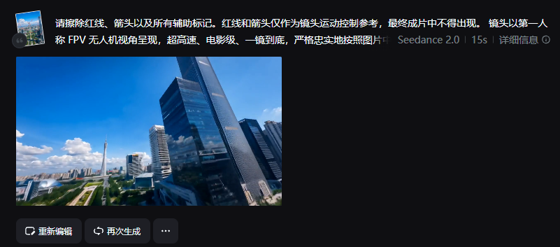
Step 2:把画线图 提示词放到Seedance
可参考这个提示词模板:
请擦除红线、箭头和所有辅助标记。红线和箭头仅作为镜头运动路径参考,最终成片中不得出现。镜头以第一人称 FPV 视角呈现,超高速、电影级、一镜到底,严格沿着图片中的红色路径运动,不要偏离、不要跳步、不要简化路线。镜头从【起点】开始,经过【节点1】,随后【节点2】,再到【节点3】,最后到达【终点主体】并完成【收尾动作】。画面要求超写实、运动顺滑稳定、速度感强、空间连续清晰,不要重复建筑、不要变形、不要文字、不要水印。
把【起点 / 节点 / 终点 / 收尾动作】换成你自己的场景就行。
4
15
117
13,889
May 31
This is mind blowing 🤯.
Ai videos are getting better everyday. 🔥
May 29

🤯一个控制 AI 航拍镜头的新玩法!
直接在图片上画线, 让 AI 按红线生成无人机镜头💥
我做了一段广州中轴线 FPV 航拍:
低空穿过花城广场 → 贴楼拔高 → 穿楼顶结构 → 绕楼俯冲 → 掠过珠江 → 冲向小蛮腰 → 绕塔上升
城市航拍、景区穿越、商业地产、楼宇宣传片…全都能这么玩!
先画路线,AI先替你飞一遍,航拍自由!🚁
工作流和提示词放评论区👇
1
38
Jane Tracy 👩💻 retweeted

May 29
Claude Opus 4.8 vs GPT 5.5
Prompt 👇
13
9
233
27,098
Jane Tracy 👩💻 retweeted
May 6
Usage limits are up, effective today we're:
1) Doubling Claude Code's 5-hour limits for Pro, Max, Team and seat-based Enterprise plans
2) Removing peak hours limit reduction on Claude Code for Pro and Max plans
3) Substantially raising our API rate limits for Opus models
We’ve agreed to a partnership with @SpaceX that will substantially increase our compute capacity.
This, along with our other recent compute deals, means that we’ve been able to increase our usage limits for Claude Code and the Claude API.
1,511
3,201
41,205
3,955,764
Jane Tracy 👩💻 retweeted

May 6
INSTEAD OF WATCHING NETFLIX TONIGHT.
Spend 1 hour with this.
Claude AI FULL COURSE that teaches you how to BUILD and AUTOMATE anything.
The people who watch this tonight will wake up tomorrow with a new skill.
Watch it and Bookmark it now.
87
1,267
8,914
1,041,906
Jane Tracy 👩💻 retweeted
Mar 15
Access ALL prompts for stunning animated websites in one click: motionsites.ai
Build a modern, futuristic landing page using React Vite TypeScript Tailwind CSS. Use lucide-react for icons. The page has 3 sections: a Hero, an About section, and an Insights section. The overall page background is black (bg-black). No custom fonts -- use the Tailwind default (system sans-serif).
SECTION 1: HERO (full viewport height, light background)
The hero wrapper is a relative container. On mobile it has min-height: 100vh. On desktop (md: breakpoint) it has height: 100vh and min-height: auto. It has overflow: hidden.
Background layers (stacked with z-index):
z-index 0: A solid background fill #FBFDFD covering the entire wrapper (absolute inset-0).
z-index 1: A background video positioned absolute right-0 top-0 bottom-0. On mobile it is full width with opacity-30. On desktop it is w-[55%] with full opacity. The video element has object-cover object-top. The video URL is: d8j0ntlcm91z4.cloudfront.net… (autoPlay, loop, muted, playsInline). The video container and video both have a CSS class video-plus-darker with mix-blend-mode: normal !important.
z-index 2: The content layer. This is a relative div with min-h-screen md:h-screen flex flex-col. It contains the Navbar and HeroSection.
Navbar (inside content layer):
relative z-10, flex row, justify-between, padding px-5 py-4 md:px-12 md:py-6
Left side: Logo image (/image.png, height h-7 md:h-8), followed by hidden-on-mobile nav links: Home, About, Services, Contact. Links are text-sm text-neutral-500 hover:text-neutral-900. Gap between logo and links: gap-12.
Right side: A search input (hidden on mobile, shown on desktop). Rounded-full, w-72, placeholder "I am looking for...", with a Search icon from lucide-react positioned absolute right inside. Border border-neutral-300, text text-neutral-600.
Mobile: A hamburger button (Menu icon from lucide-react) in a 40px circle with border-neutral-300. When toggled, a dropdown shows the nav links vertically and a full-width search input.
HeroSection (inside content layer, flex-1):
relative z-10 flex-1 flex flex-col justify-between with padding px-5 pt-8 pb-20 md:px-12 md:pt-16 md:pb-36
Top: Label "Futuristic" -- text-xs font-medium tracking-[0.3em] text-neutral-500 uppercase
Main heading area: Flex row with a small "05" number on the left (text-sm text-neutral-400 mt-2 md:mt-4), then the heading: text-[2.75rem] md:text-[5.5rem] leading-[0.95] font-light tracking-tight text-neutral-900 reading "NEW DIGITAL" (line break) "UNIVERSE". Below the heading: a "Get Started" button (bg-neutral-900 text-white text-sm font-medium rounded, px-6 py-3 md:px-8 md:py-3.5) and a "Contact Us" text link.
Middle stat: "47.2%" with "Reality" label underneath. The stat group uses a custom CSS class hero-stat-group that on desktop has margin-right: 20% and justify-center. On mobile, margin-right: 0 and justify-start.
Bottom bar: Flex col on mobile, flex row on desktop with justify-between. Left side: "Trusted by Clients" label with 4 overlapping avatar circles (Pexels photos: 415829, 1222271, 1239291, 2379004 at w=100) using -space-x-2, each w-8 h-8 md:w-9 md:h-9 rounded-full border-2 border-neutral-100 object-cover, followed by "20 " text. Right side: A link icon (lucide Link) in a w-10 h-10 md:w-12 md:h-12 circle with border-neutral-300, next to a description paragraph "In this futuristic realm, users can explore hyper-realistic virtual environments, interact with AI-driven avatars." (text-xs md:text-sm text-neutral-500 max-w-[200px] md:max-w-sm). This group uses custom class hero-description-group which on desktop has margin-right: 50%.
Diagonal Section Divider (between Hero and About):
The SectionDivider is positioned absolute bottom-0 left-0 w-full with z-index: 3, inside the hero wrapper.
Contains an SVG with viewBox="0 0 1440 120", preserveAspectRatio="none", height h-[60px] md:h-[120px].
The SVG has a single polygon: points="0,0 0,120 1440,120 1440,80 920,80 680,0" filled with #0F0F0F. This creates a diagonal cut from the left side going down to the black About section.
SECTION 2: ABOUT (dark background #0F0F0F)
Full-width section, backgroundColor: '#0F0F0F'
Two-column layout on desktop (lg:flex-row), stacked on mobile. Min-height 600px (lg: 700px).
Left column: A video that fills the space (object-cover mix-blend-lighten). Video URL: d8j0ntlcm91z4.cloudfront.net… (autoPlay, loop, muted, playsInline). On mobile the video area is h-[400px].
Right column: Padding px-8 py-16 md:px-16 lg:px-20 xl:px-28, vertically centered content with max-width max-w-lg:
Label: "About Us" (text-xs font-medium tracking-[0.3em] text-neutral-500 uppercase, mb-8 md:mb-10)
Heading: "THE DIGITAL FRONTIER" (text-4xl md:text-5xl lg:text-6xl xl:text-7xl font-light tracking-tight text-white leading-[1.05], mb-10 md:mb-12)
Three pill tags: "Digital", "Reality", "Next" -- px-5 py-2 rounded-full border border-neutral-700 text-sm text-neutral-300 hover:border-neutral-500
Paragraph: "Step into The Digital Frontier, where the boundaries between reality and virtual innovation disappear. This is the next era of immersive technology." (text-sm md:text-base text-neutral-400 leading-relaxed max-w-md)
Actions: "Learn More" button (bg-neutral-800 text-white text-sm font-medium rounded px-7 py-3.5 hover:bg-neutral-700) and a "Watch a Video" link with a Play icon (lucide Play) inside a w-10 h-10 bordered circle.
SECTION 3: INSIGHTS (dark background #0F0F0F, tabbed content)
Same backgroundColor: '#0F0F0F'. Padding px-8 md:px-16 lg:px-20 xl:px-28 pt-24 pb-32.
Large italic heading: "LIMITLESS POSSIBILITIES WITH NEOVISION" (text-4xl sm:text-5xl md:text-6xl lg:text-7xl xl:text-[5rem] font-light italic tracking-tight text-white leading-[1.05] max-w-5xl, mb-20 md:mb-28).
Below: a flex layout (col on mobile, row on desktop).
Left: Tab buttons (vertical list) for 3 tabs: "Innovation", "Technology", "Experience". Active tab is text-white font-medium, inactive is text-neutral-500 hover:text-neutral-300. Width lg:w-[160px] xl:w-[200px].
Right: Content area with an image and text side by side on desktop.
Image: lg:w-[420px] xl:w-[480px] aspect-[4/3] rounded-2xl overflow-hidden. Images are local files /Mask_group.jpg, /Mask_group-1.jpg, /Mask_group-2.jpg for the 3 tabs respectively.
Text side: Title (text-2xl md:text-3xl font-light text-white leading-snug max-w-sm), description (text-sm md:text-base text-neutral-400 leading-relaxed max-w-sm), "Learn More" underlined link (text-sm text-white font-medium underline underline-offset-4). At the bottom: date and author separated by a border-t border-neutral-800.
Tab data:
Innovation: "How VR is Transforming Our Digital World" / "Virtual Reality (VR) is no longer a concept of the future..." / 08 February 2025 / Henry Leonardo
Technology: "The Rise of Spatial Computing in Everyday Life" / "Spatial computing is bridging the gap..." / 15 March 2025 / Sarah Mitchell
Experience: "Designing Immersive Worlds That Feel Real" / "From haptic feedback to photorealistic rendering..." / 22 April 2025 / James Park
CUSTOM CSS (index.css):
.video-plus-darker {
mix-blend-mode: normal !important;
}
.app-hero-wrapper {
min-height: 100vh;
overflow: hidden;
}
@media (min-width: 768px) {
.app-hero-wrapper {
min-height: auto;
height: 100vh;
}
}
.hero-description-group {
margin-right: 0;
}
.hero-stat-group {
margin-right: 0;
}
@media (min-width: 768px) {
.hero-description-group {
margin-right: 50%;
}
.hero-stat-group {
margin-right: 20%;
}
}
KEY DETAILS:
Tech stack: React 18, Vite, TypeScript, Tailwind CSS 3, lucide-react for all icons
No custom fonts -- default Tailwind sans-serif stack
Color palette: White hero (#FBFDFD), dark sections (#0F0F0F), neutral grays from Tailwind for text
The diagonal divider SVG polygon creates an angled transition from the light hero to the dark about section. It is positioned absolutely at the bottom of the hero wrapper.
Both videos are autoPlay, loop, muted, playsInline
The hero section has pb-20 md:pb-36 bottom padding to prevent the diagonal divider from overlapping the "Trusted by Clients" content
The SectionDivider component is rendered inside the hero wrapper div (not between wrapper and AboutSection)
Logo image at /image.png in the public folder
Insight images at /Mask_group.jpg, /Mask_group-1.jpg, /Mask_group-2.jpg in the public folder
1
6
54
6,790

Jane Tracy 👩💻 retweeted

Apr 25
So freaking cool. I have Claude Code, Cowork & Travis (OpenClaw) all working together, talking to eachother, giving eachother tasks, using Obsidian as a shared brain. Creating more openclaw subagents next.
I couldn't even imagine this stuff two years ago.
39
35
438
21,213

Introducing Claude Design by Anthropic Labs: make prototypes, slides, and one-pagers by talking to Claude.
Powered by Claude Opus 4.7, our most capable vision model. Available in research preview on the Pro, Max, Team, and Enterprise plans, rolling out throughout the day.
4,138
14,995
148,121
63,898,361