
Joined November 2023
- Tweets 2,300
- Following 1,632
- Followers 638
- Likes 14,515
768 Photos and videos


Jun 14
I know it's just for me, but this now exists. Pretty happy today down at the Two Seam household.
twoseammerch.com/products/ne…
1
97
Two Seam Merch retweeted

Jun 12
Just saw three @WVUBaseball players walking through the crowd on the way back to their hotel from the stadium in the midst of throngs of fans going to the night game at the @CWSOmaha. No one was bothering them. No police escort. No armed security. Just three ball players in dirty uniforms laughing and strolling home after winning a ballgame. That’s not something you see at other major sporting events. That’s the charm of baseball. That’s the charm of Omaha. Never change.
#MCWS
41
242
4,524
180,850
Two Seam Merch retweeted

Jun 11


1
2
134
Jun 11
This was almost as good as the Frager finish.
2
3
226
Jun 11
That was one of the greatest plays I've ever seen in a basketball game.
2
76
Two Seam Merch retweeted
Jun 10
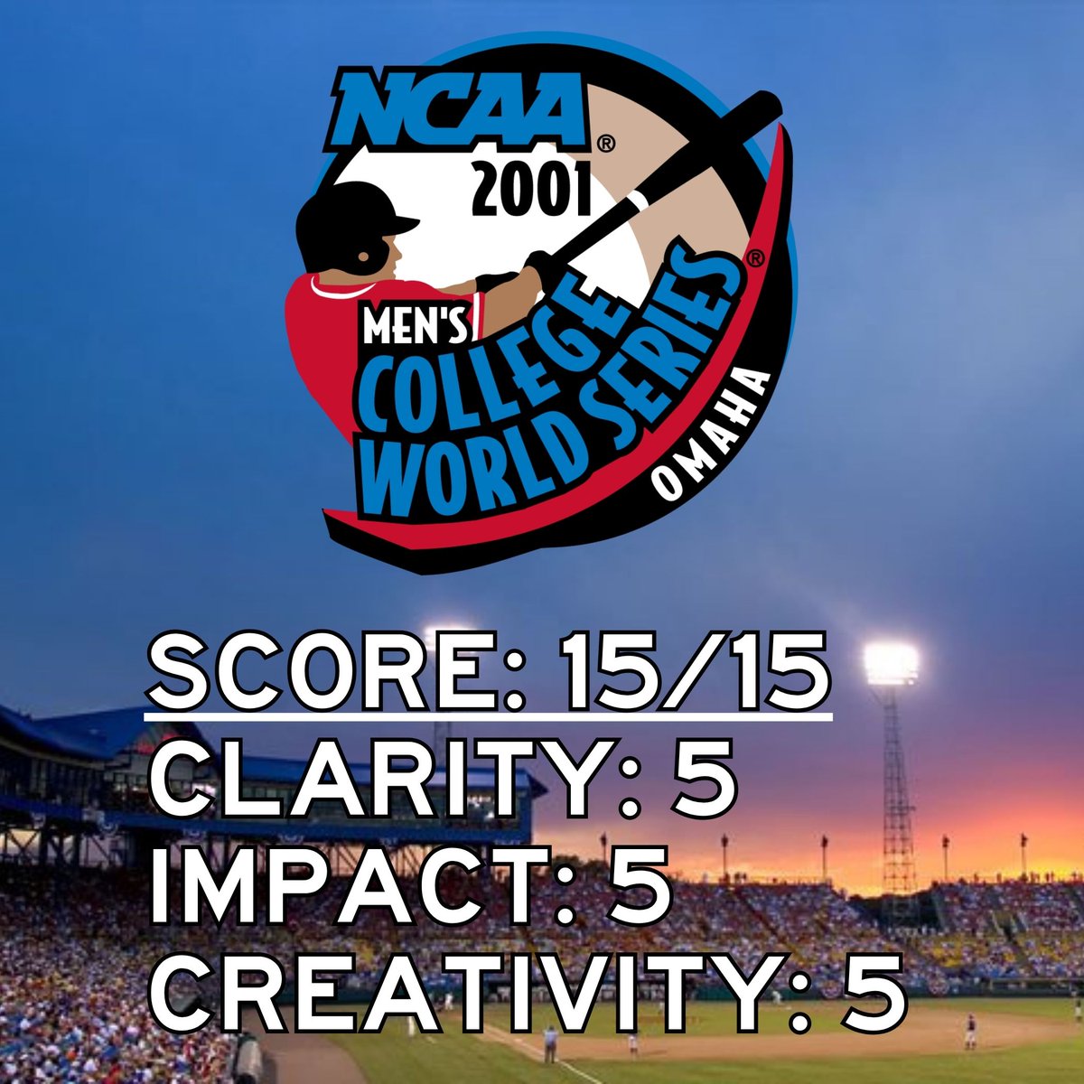
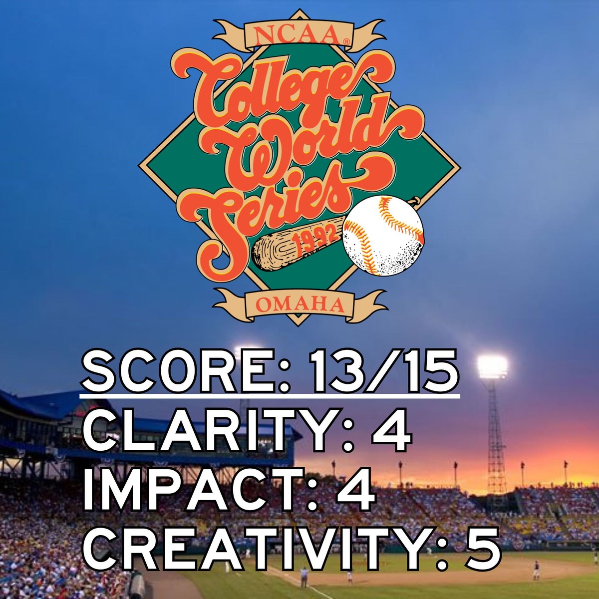
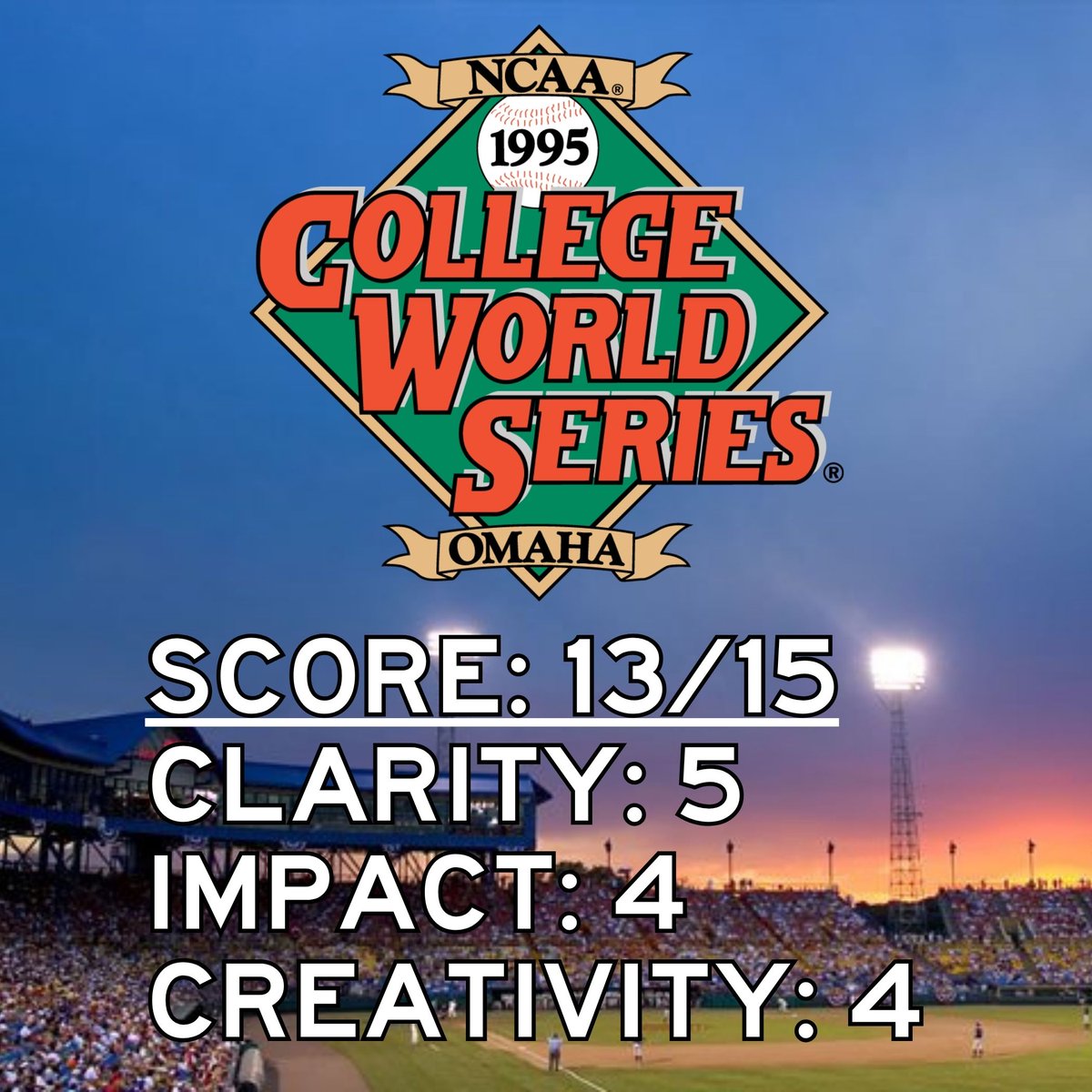
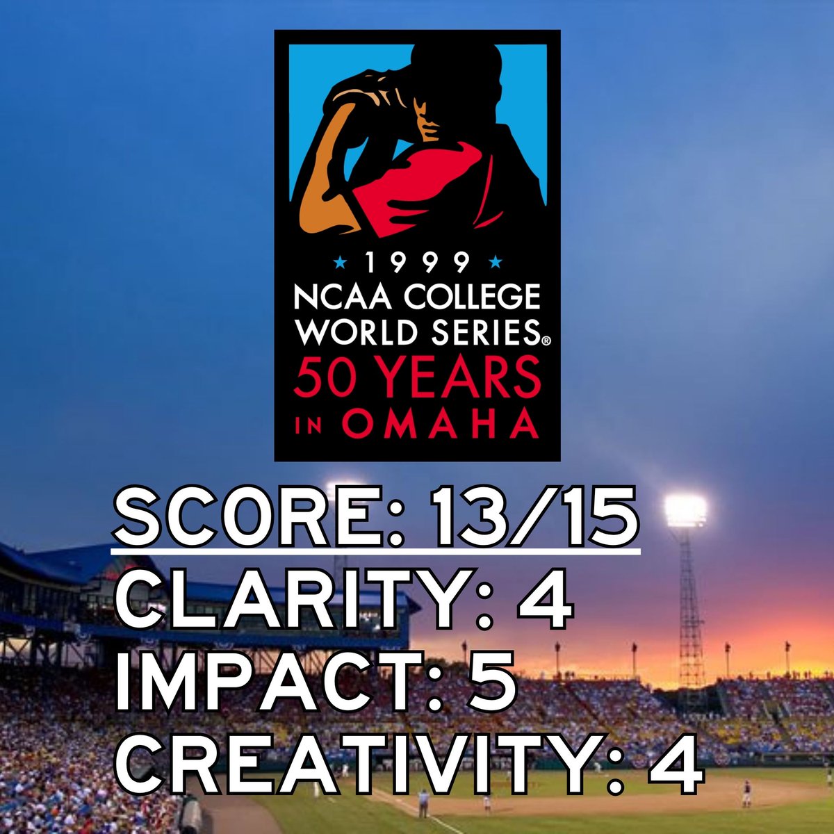
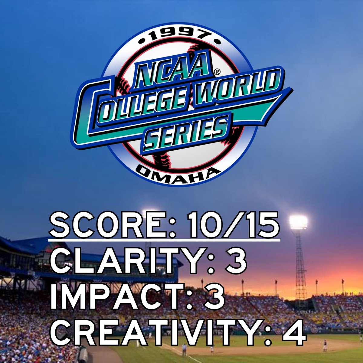
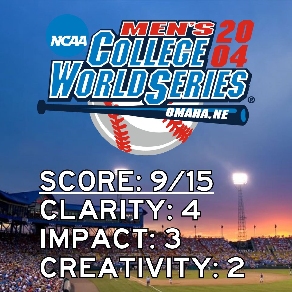
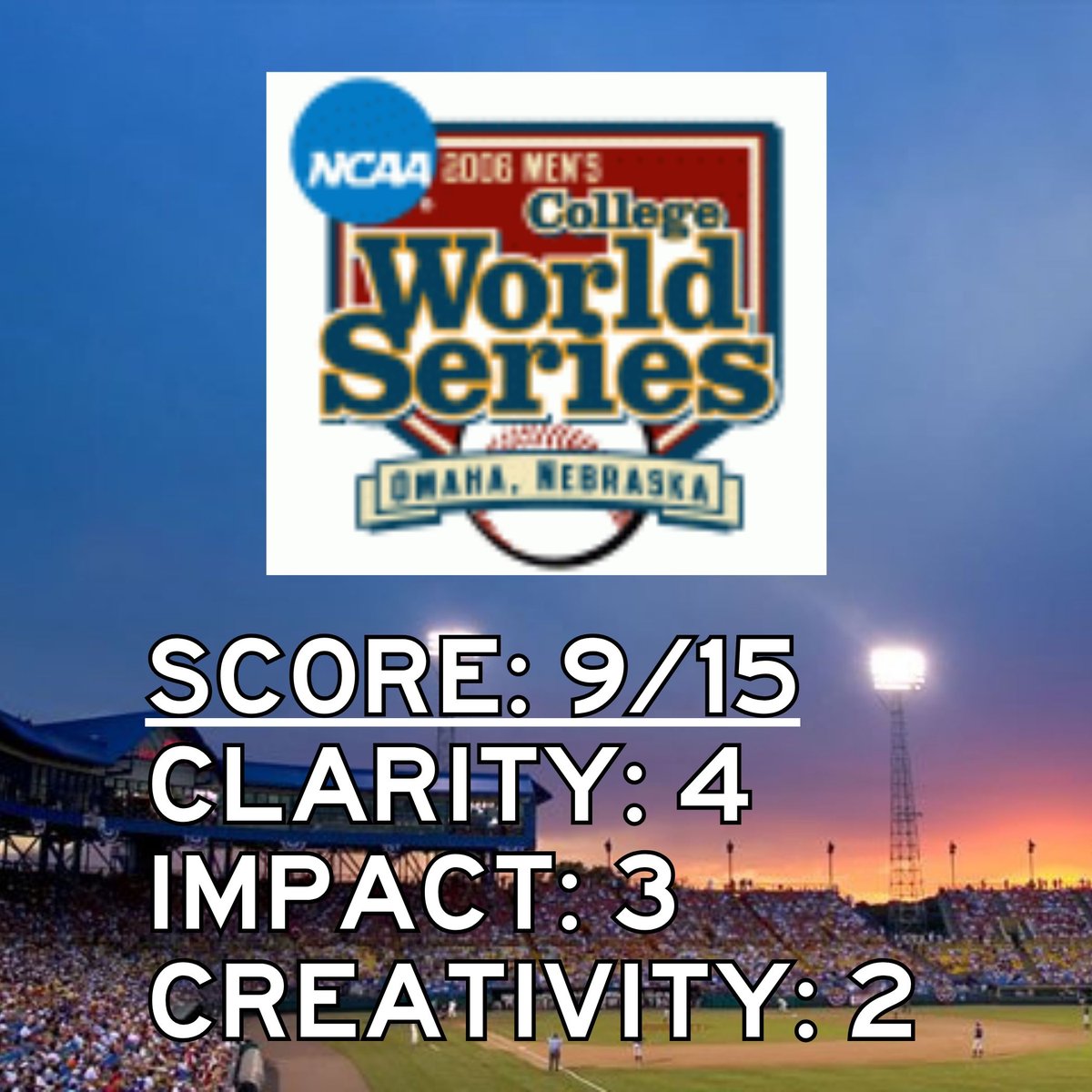
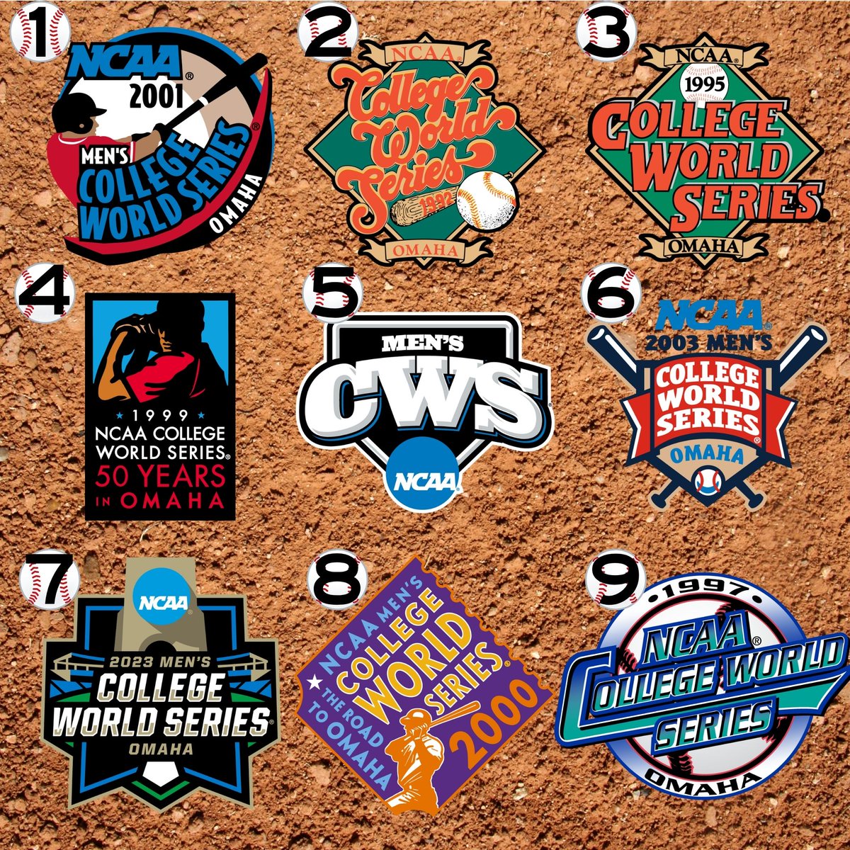
They are all ranked based on clarity of the logo, visual impact as in how it stands out, and creativity. Details on all of them below from worst to best. All logos obtained from the incomparable @sportslogosnet at sportslogos.net/logos/list_b…
1
1
2
379
Two Seam Merch retweeted

Jun 10
Wait until the Europeans discover Runza.
2
3
409

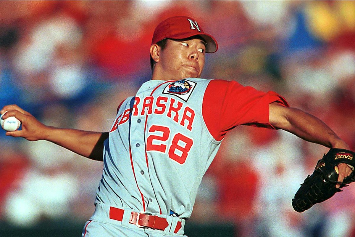
Jun 10
Number 1: Recognizable from a distance. Great use of color. Super creative. It's a perfect logo. I admit the Husker bias here. Looked great on Shane Komine's jersey.
1
58
Jun 10
After doing this ranking, my wish list for CWS logos is they make something unique for the men's and women's CWS. Give it the Final Four treatment. If it's the same every year, fine, but make it unique to Omaha (and OKC).
75